Monthly Archives: November 2014

lost edges

mystery_writer_9760

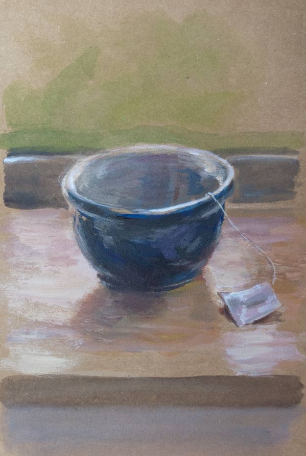
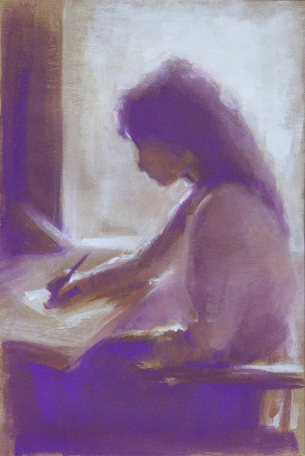
A gouache on Seawhite Kraft paper copy of a picture that I found somewhere on the internet. I forgot to note down the artist’s name when I saved it, something I do religiously now (usually) because it’s frustrating not to be able to find more of their work or to give credit in a blog post.

The Seawhite gouache (04 Mauve) looks almost fluorescent when lit by a daylight bulb. The other colours were burnt umber, burnt sienna (close to the tone as the Kraft paper background), and titanium white, painted with a 3/8 inch flat brush to keep it loose.

I recently discovered the work of Terry Miura who paints in a style I love: a mixture of loose painterly expressionistic brush strokes with areas of tightness and detail. I love the effect of moving from abstraction to realism within a painting. Oh, to be able to paint like him! His blog is a fascinating insight into his working methods and vision. Here’s a list of sticky notes he has taped to his easel to help him with composition:

-Unequal distribution of dark and light masses. Don’t make them 50 – 50.
-Have one dominant color. Additional color masses need to be clearly lesser in visual impact.
-Use a variety of edges on every shape. Lose an edge on every shape if you can.
-Paint the concept, not things.
-Have a hierarchy of interesting areas.
-Manipulate this hierarchy with value contrast, hue choices, saturation, edges, opacity, impasto, brush activity, and textures.
-Big passive area vs. small active area
-You don’t need two big passive areas.
-If the focal point is in light, simplify the shadow. If it’s in shadow, simplify the light.
-If the focal point is in light, lower the key. If it’s in shadow, raise the key.
-Connect shapes wherever you can. (Same thing as losing edges)
-Whenever you break a rule, make sure it looks intentional.
-Repetition and variation. Over do them. Then pull back.
-Less is more.
-Make Only One Statement!

On the top his easel, in big black letters, he has written the word MYSTERY.

clouds

clouds-800_9706b

Some isolated clouds out to sea, viewed from a Cornish cliff top.

I’d like to say I made this postcard sized oil sketch on the spot as a pochade, but it was based on a series of photos. A quick underpainting of acrylics was overlaid with layers of oil.

The titanium white is the slowest drying of all the oils in this palette and only goes tacky after a few days. This can lead to problems if extra glazing is attempted too soon. I’ve heard that the slower drying walnut oil is sometimes used for whites instead of linseed oil as it is less yellowing, but I don’t know if this is the case with these Holbein Duo Aqua oils.

The finished painting was hard to photograph accurately. Subtle changes in the ambient light makes the colours and contrast look markedly different.

join the dots

seaworld-900_9695

Various critters snapped in a Cornish rockpool earlier this year, drawn with a dip pen and ink.

I used the ink straight from the bottle, so the nib (Gillot 404) had to be cleaned before each change of colour to keep the bottles pure, but I also cleaned the nib after prolonged use of one colour to avoid the build-up of dried shellac.

Previous sketches showed how even a light pencil lay-in would get trapped under the ink and could not be erased, so everything had to be drawn directly on the page, but the pointillist gradual build-up of dots prevents too many quick mistakes.

brown paper

bowl_9681

plant_pot_9683

Trying out a Seawhite Kraft sketchbook, which has 40 pages of 175gsm brown ‘Kraft’ card suitable for wet and dry media according to the blurb.

The card is slightly rough but doesn’t have much texture. Despite the spiral binding the pages have a slight warp and don’t lie completely flat even when new, but I find this encourages more experimentation and quick sketches as I’m not daunted by a perfect blank page.

The main reason for trying this sketchbook was to experiment with a toned background. With the midtones already there, the paint mostly adds highlights and shadows. These sketches in acrylic were to practice mixing the right range of values in the various areas of reflected light and cast shadows.