Category Archives: acrylic

Tea break

acrylic-tibetan-1200_8428

Painted in acrylic from an old magazine cutting taken from an article about Tibet. It looked like such a satisfying moment.

The photo in the cutting was so dark that the figure was just a silhouette. I had to take it into Photoshop to bring out enough detail to paint. In some ways this made it easier as the noise-filled image was already broken down into large blocks of colour, the digital equivalent of squinting – another example of how a poor reproduction can make a good practice subject.

 

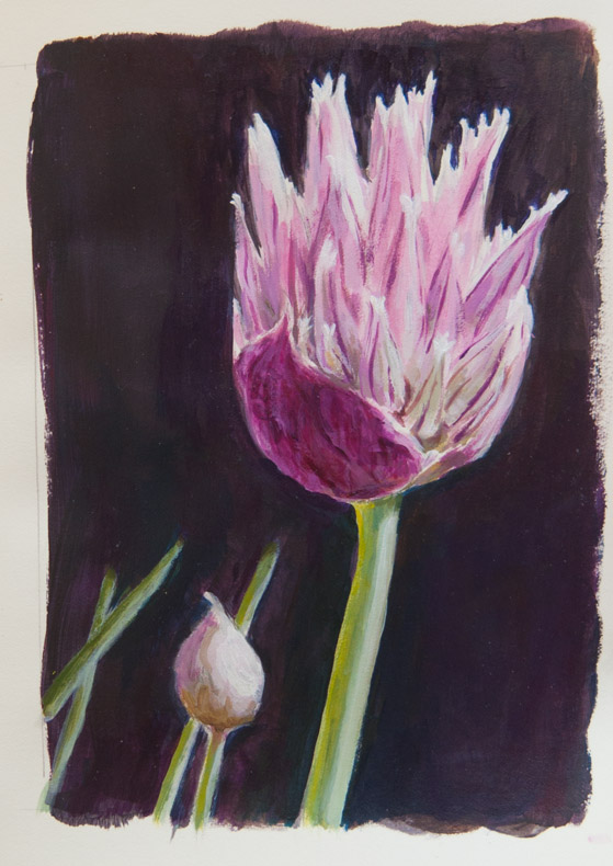
Chives

chives_8438

Painted in acrylics, from a photo. I wanted the flower tips to be glowing bright, and relied on the titanium white paint to create the highlights instead of letting the paper show through as with watercolour.

Scanning and displaying onscreen makes them glow even more. These paintings often look better on screen than they do held in the hand. The luminous glow of the screen can boost the highlights and hide the imperfections. I don’t know if that’s a good thing or a bad thing.


EDM 8 revisited

daliwatch_8400

More acrylic shenanigans, copying Dali’s Melancholy, 1945 from an old poster which is big enough to see the brush strokes. Minus the ants. I never did like Dali’s ants, plus I haven’t got a brush fine enough for the legs. UniPins? But that would feel odd.

before the fall

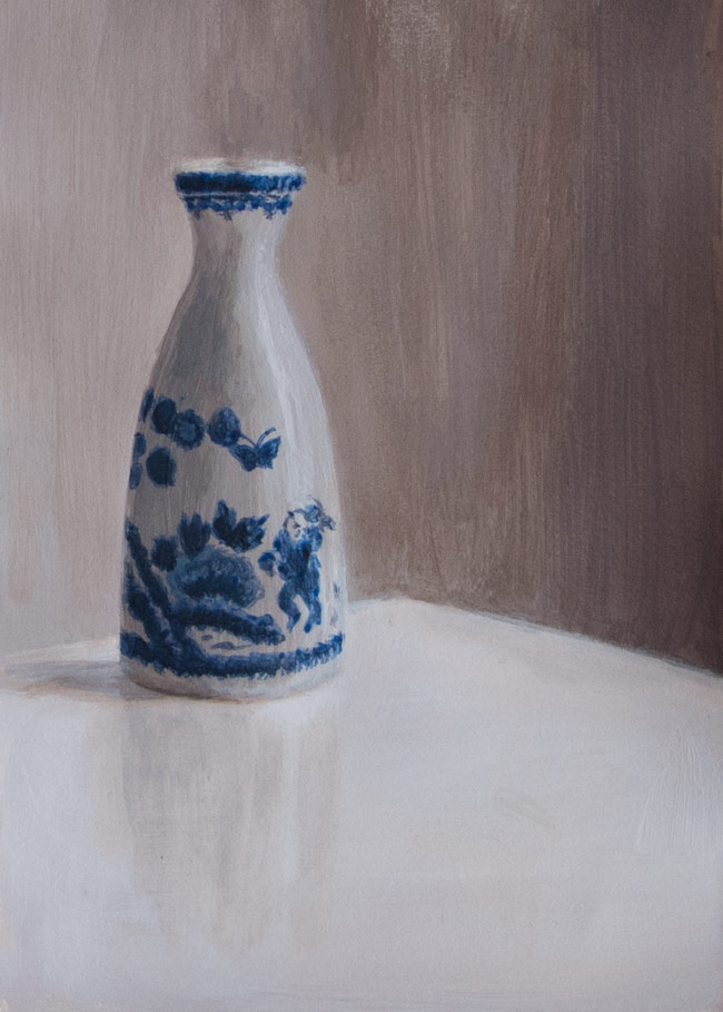
vase_8353

Another session with acrylics: a colour version of an image from the esteemed (but now unaffordable) publication Sun & Air, taken before the vase was broken in two when I knocked it off the windowsill with a Dyson attachment.

One problem I’ve found with acrylics is that it’s hard to blend smoothly. I would mix up colours for the shaded side of the vase and try and blend them in to the lighter side, but instead of a smooth blend I would end up with a large patch of shaded area. So I’d make a lighter mix and blend back the other way, and end up with too much highlight. There are so many layers of paint, it’s got more relief than the cover of an airport novel. I need to work faster, or experiment with mediums.

Or follow the Marker Carder method and not blend at all.

palette space

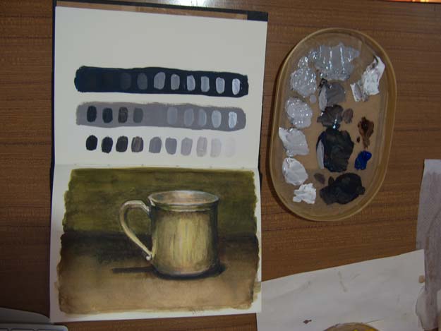
acrylic-grey-ramp-625

A first attempt to mix shades of grey with acrylic to show how the appearance of a colour depends on the background. The three lines of grey paint blobs were intended to have the same range of shades from black to white. See how the grey blobs on a dark background appear lighter than the same grey on a white or mid-grey background.

One thing I found when preparing colours is that it’s important to have lots of paint and lots of space. Even painting these simple blobs needed more paint than I had mixed up. I tried to mix a second batch half way through but found the new mix was slightly warmer (in terms of colour) than the first. It’s better to prepare the right amount to start with than add to it half way through.

When making these colour steps, it’s easier if you have lots of space on your palette. There wasn’t really enough room to work within my ice cream carton lid stay-wet palette (wet kitchen towel covered with greaseproof paper). It’s just about big enough for a small sketchbook painting, but I really should be following Will Kemp’s advice about laying out a palette, and using Mark Carder’s method for preparing accurate colour steps.


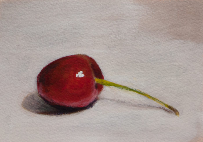
acrylic cherry

cherry_cropped8334

First attempt with acrylics, following an online tutorial at the Will Kemp art school. It’s a lot of fun and very forgiving in that mistakes can be painted over but glazing and blending are still possible. And it’s a lot more physical, scratching away with cheap hog brushes.

The paints I chose were Burnt Umber, Azo Yellow Medium, French Ultramarine, Phthalo Blue Green Shade, Permanent Rose, Titanium White. After using watercolours it felt odd to lighten colours by adding white rather than diluting with water. I found it harder to get a bright orangey red, but that could be because I’m not used to mixing. The paint dries with a slight matt plasticy sheen which can dull the colours if viewed from the wrong angle, but maybe one of the gloss mediums will fix that. Used a pad of cold pressed watercolour paper for this, but will try the thinner HP later. Apparently this stuff will paint on anything, and these walls need redecorating, ….hmmm.