
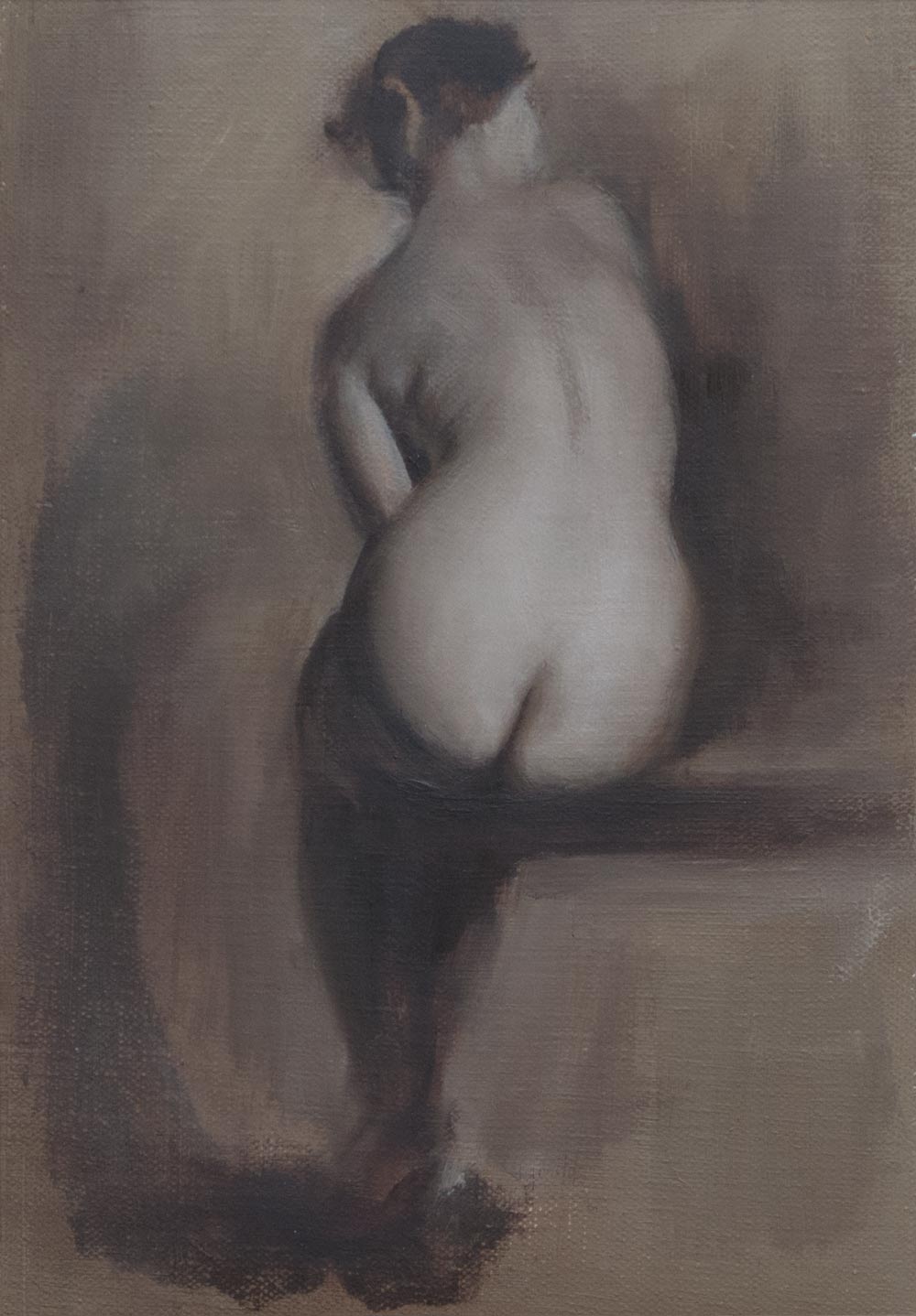
This should have been straightforward — I was drawing from a photo (from New Masters Academy) on to a prepared ground of leftover mud from a previous painting, smoothed on to a sheet of acrylic gessoed canvas. The surface was smooth enough that the raw umber underpainting could be lifted or modified with a rag. I went straight in with the brushes and no initial drawing, knowing I could move the paint around at will.
At first I fell in to my usual mistake of making the drawing progressively bigger as it expanded out. I hit the right edge of the canvas, erased that, then ran out of room at the top. Then began the real problem of constructing a believable figure. No matter how much I moved lines around, it just didn’t look convincing, and I couldn’t work out where the problem was.
Finally, after a few hours of chasing paint around, I gave up and literally went back to the drawing board. I had to be able to make a decent drawing if I was to have a hope of making a painting worth looking at.

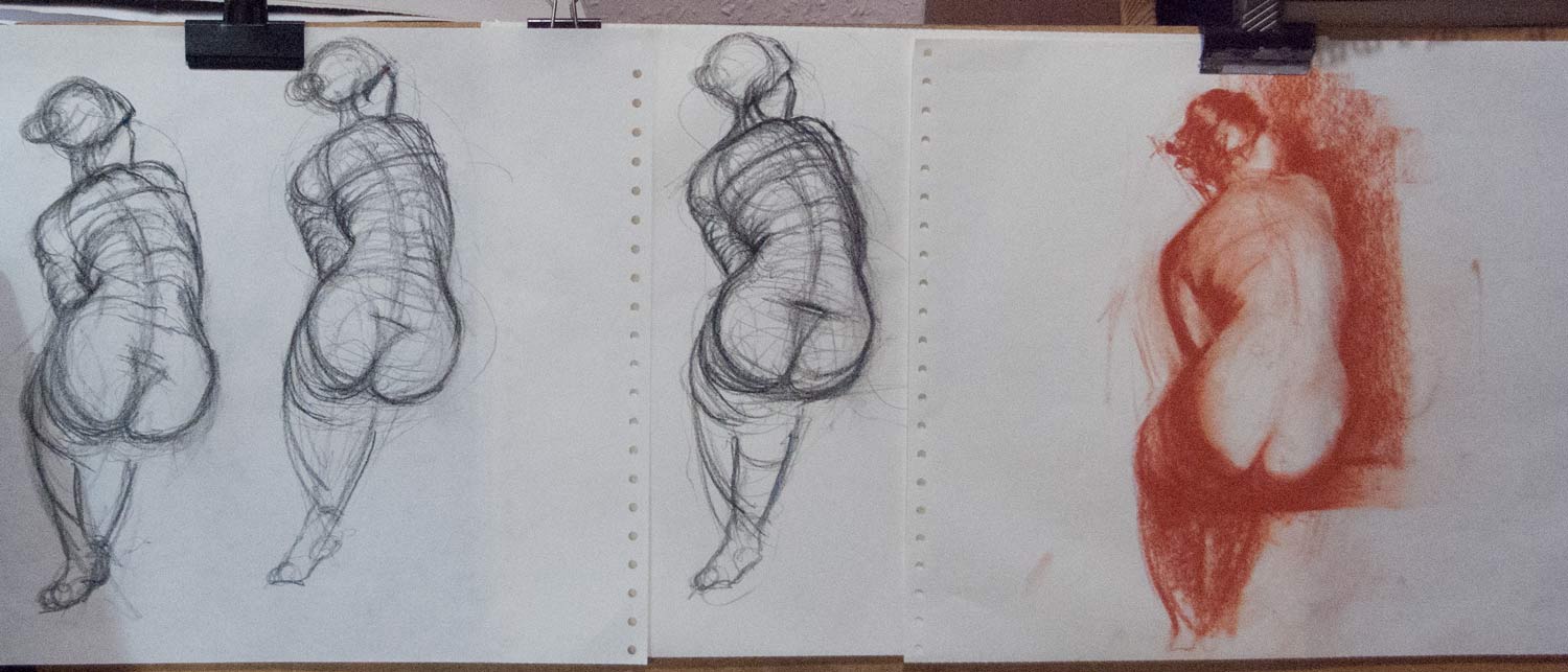
After multiple attempts with charcoal and crayon, I found I just couldn’t get this pose down on paper. It’s not a complicated pose. There is some foreshortening from the base of the spine up to the head, but nothing extreme. But I just couldn’t get a convincing pose by eye.
In frustration, I ended up tracing over the photo with my basic graphic tablet, just to get the feeling of what it would be like to draw the right lines. The results of this tracing, despite the scratchy, rapidly drawn contour lines, look way more convincing than my freehand drawing by eye.
This made me realise that getting an accurate, believable figure is essential. If the basic shapes are in place, you can get away with any kind of treatment of line or tone or paint — the figure will be convincing.
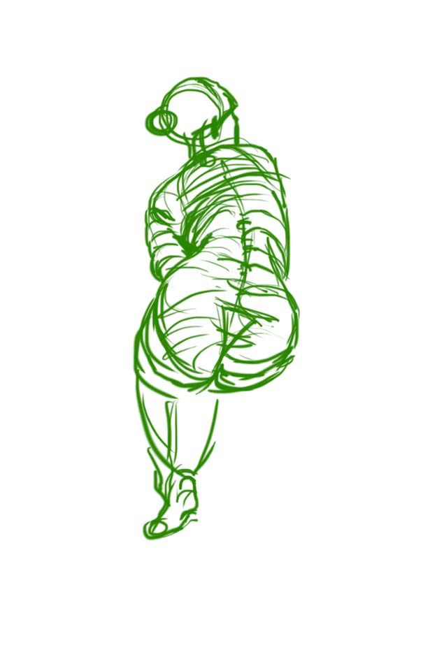
Back to the painting — I ended up taking photos of my painting revisions, then overlaying them on the original photo in Photoshop. By doing that I could work out that I needed to raise a curve here, lower a line there. I had given up being able to do this intuitively by eye. Instead, I was flying by instruments, relying on this feedback from a computer overlay.
I’m happy with some of the edge treatment — bringing things in to focus or losing them in a kind of abstraction was fun. But the figure still isn’t convincing to me. Something isn’t quite right, despite all this Photoshop intervention. I need another pair of eyes to tell me what’s wrong.
Ingres received ridicule and criticism for this painting La Grande Odalisque because of the unusual proportions. HIs contemporaries used to tease him by guessing how many extra vertebrae were needed for that spine to be possible. But Ingres was a superb draughtsman and knew what he was doing. If he needed a longer spine to create a more elegant figure, then that’s what he would paint. There’s a world of difference between deliberately distorting a figure for a particular effect and not being able to draw accurately.