
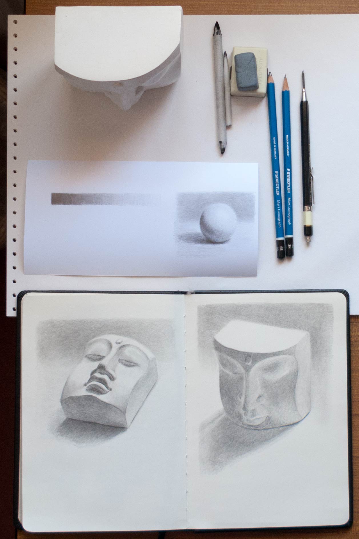
Juliette Aristides talks about the importance of rendering accurate values in Lessons in Classical Drawing, an excellent book full of practical advice and illustrated with exquisite graphite and charcoal drawings. Of course there are many elements which go towards creating a successful drawing, but if the values don’t work the chances are the whole picture will fall. A white plaster cast takes local colour out of the equation and armed only with a pencil you’re left with the challenge of rendering the whole thing in values alone.
Some of the advice in the book is direct and practical. For instance, if your initial lay-in tends to become a dense dark mass of lines she advises to switch to a harder lead. It sounds so simple and obvious, but already I’ve seen how using a 2H instead of a 2B prevents an incoherent bird’s nest of lines forming before the sketch has really begun.
There is also much more subtle advice which only made sense when I was trying to make what I thought would be a simple drawing of a plaster face, such as paying close attention to the halftones, which can often seem invisible.
I was once invited by a friend to pick chanterelle mushrooms in a forest in the Northwest. When we arrived, all I saw were trees and a carpet of leaves. Yet after some time, my eyes acclimated. As I learned where to look, sure enough, there were mushrooms. Although I had walked through those woods many times, I had never seen half of what was there.
Halftones are a critical element for creating the appearance of believable volume yet, like the chanterelle, they are hidden in plain sight. They are everywhere, yet it often helps to have a guide to see them….
From Lessons in Classical Drawing by Juliette Aristides
Excellent post Jim. The first picture is immediately stronger, with higher contrast across the face, but the second one has subtler shading (the reflected light from the table surface, the upper lids of the eyes etc.) and holds my attention longer… The half-tones slowly reveal the form. And barely a line in sight! Ed
Thanks, Ed. It’s surprising how much the appearance of the cast alters with changes of angle or lighting conditions. This must be true of all objects but it’s made clearer when all surfaces are white. I wonder if making all the surfaces mirrored (as in chrome) would be good practice.