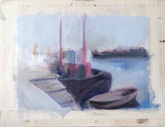
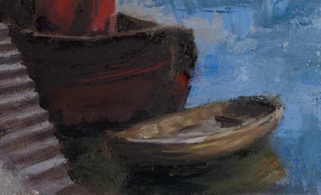
I took one of the value studies from the last post for this experiment. This painting in oils is a work in progress, based on a slide taken by my grandfather many decades ago. I’m experimenting with textures, colours and perspective.
Perspective has proven to be the biggest challenge. I thought I had a reasonable understanding of the basic theory — vanishing points, horizon lines, fields of view — but the practice of actually drawing objects in space threw up some problems.
Even though I was pretty much copying directly from a photo, I wasn’t aiming for a completely accurate copy. Instead, I wanted to be able to move things around a little or even invent things completely but still be able to make the objects and figures work together believably in the final composition.
Despite the charcoal value study, the first attempt was just a bad composition. Even though all the elements that I wanted to paint were included in the picture, there wasn’t enough space at the bottom and the composition looks cramped.

I pretty much erased this completely by scraping back and painting over.
Next, I had trouble in making the rowing boat sit flat on the water. It’s almost perpendicular to the harbour wall, but not quite, so it almost shares the same vanishing points as the harbour wall, the steps and the boat (which is moored parallel to the wall). Boxes in perspective are relatively simple, but this rowing boat has all sorts of curves and bulges which complicate things.

The most important angle to get right, I found, was the shadow shape at the rear of the boat. It has an acute angle going off to the left vanishing point, then a curve down, following the near side of the boat. This doesn’t look right in the picture above, and the overall size of the boat is wrong.

The boat is sitting better on the water now, though I think the reflection on the right needs some correction. Even though the brush strokes are fairly rough, I’m reminded of the Stapleton Kearns neck tattoo: “LOOSE HANDLING WILL NOT DISGUISE WEAK DRAWING!”
Next, came the figures on the left. Again, they’re based on the slide, but I wanted to be able to move them around and change them at will. The main problem is that the man on the left is too small compared to the woman and boy. Andrew Loomis has some useful illustrations in his book Successful Drawing (available in print, but I think there are some PDFs floating around the internet somewhere). He states the rule for scaling figures on the ground plane:
All figures of the same height, when standing on the same ground plane, will be crossed by the horizon at the same vertical point on the figure.
In other words, if you’re looking at a number of figures on the harbourside who are all of the same height but standing in different positions relative to the viewer, the horizon line will cut through all the figures at the same point. In this case, the horizon line cuts through the figures at roughly hip level. So if they are all the same height, the horizon line should pass through all the figures at hip level, no matter where they are standing.
In this painting, however, the figures aren’t the same height — the man should be taller than the woman and boy. So, I’ve drawn a very small man!
Here is the original with a perspective grid overlaid. (Click the image for a larger version.)
And here’s the figure on the left at a more believable size, corrected in Photoshop.
Ok, enough theory. Time to get the brushes out again…


