
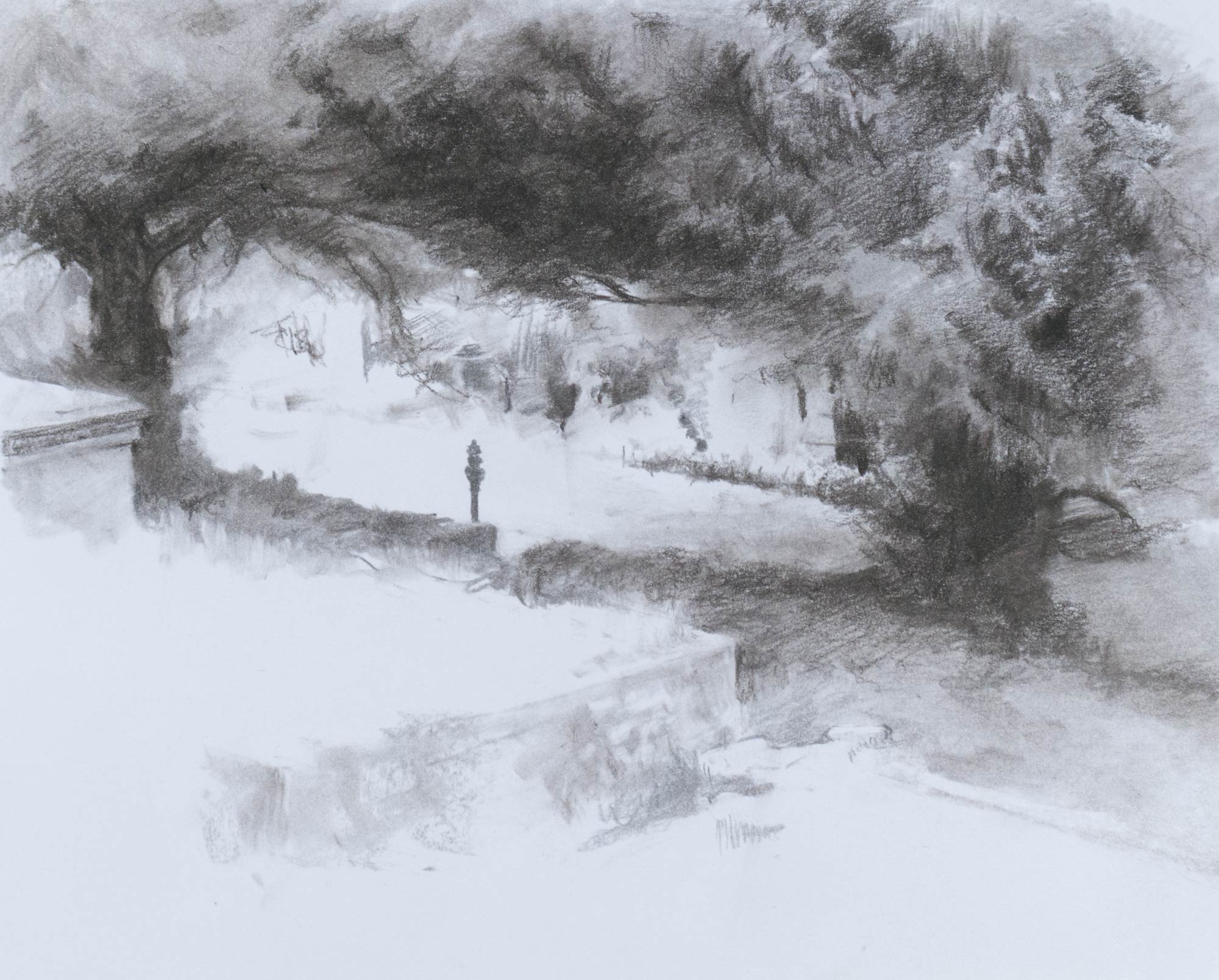
Experimenting with textures and effects using charcoal on Bristol board to show a view in Bath Abbey Cemetery, trying to capture the contrast between the areas bleached by sunlight and the gloom under the shade of the yew trees.
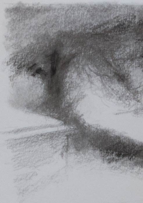
I wanted the shade under the trees to be deep black to get the maximum contrast with the paper white. I tried graphite on a slightly textured heavyweight cartridge paper but ended up with a grey shine on the darkest areas. The delicacy of graphite combined with the deep darks of charcoal would be ideal, but in areas of darker shading I found the soft graphite fills the grain of the paper and forms a plate-like barrier to the charcoal and the vine stick wouldn’t grab, as you can see in the trunk of the tree below.

I made another attempt on Bristol board (picture at top of the post). The smooth surface of Bristol isn’t usually the first choice for charcoal which needs some tooth to grab the grains, but it did take the charcoal, even if much of it turned to dust on the surface which occasionally had to be brushed or blown away. When blended with a paper stump the vine charcoal turned a light grey and almost has the appearance of an ink wash.
A kneaded eraser was useful for lightening areas and seemed to work more effectively than a hard pen eraser. However, I built up many of the leaf shapes and branch effects by adding extra shading to the negative spaces rather than picking out the lighter areas with an eraser. The stump would lighten the tone and flatten any texture, and then the dark background shapes could be drawn in to this grey midtone. This drawing in reverse allowed multiple layers of depth to be built up and was much more precise (and satisfying) than using an eraser.
The white of the Bristol paper appears cold, almost blue, compared to some papers, but in reality it’s probably closer to a neutral white and its coldness only appears in contrast to warmer surroundings, such as a matboard or the newsprint backing paper.
Other papers will have different handling with different results. Here are some sketches using graphite or charcoal (Mary in graphite) on a sheet of Fabriano Disegno drawing paper which has a texture laid in to the surface. The graphite and charcoal catch on the paper grain and sit on the top if lightly applied but blending with a soft brush or a stump can achieve a more even tone, as seen in the face and jacket of the figure on the right.

Zoom in or click the image to see the paper grain.