too much talking

It has been a few years since I posted here. I was talking a good game and writing all kinds of highfalutin stuff…. and then I would draw a figure with the arms too long and the head too large, and I realised I needed to stop talking and start drawing.

Not that I ever stopped drawing. In fact I’m probably drawing more now than I ever have. Or at least my focus on learning has become more deliberate and structured.

This is in part down to the New Masters Academy which is a subscription site with a range of skilled instructors who have pre-recorded courses and live feedback sessions. The Discord community there is very active. It’s a very inspiring place to be. Everyone is in the same boat of trying to learn this art thing. The same road blocks, the same frustrations keep coming up, which is in a way encouraging as it makes you realise that there are no shortcuts to building up a solid foundation of skills. And if you need advice or feedback there’s plenty of that available too.

A personal blog with posts and comments seems slightly old-fashioned now, even quaint. The world seems to have moved on from blog-rolls and tag-clouds on to platforms like Instagram or, what seems to be the new up-and-comer, Discord. Though James Gurney still puts out a post a day, and Stapleton Kearnes posted every day for over three years, though he’s gone quiet of late. (Perhaps he said everything he had to say. Or maybe he’s on Discord somewhere.)

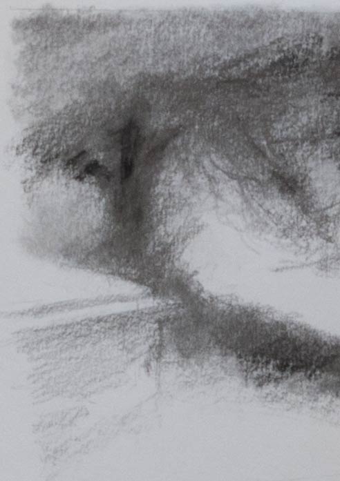
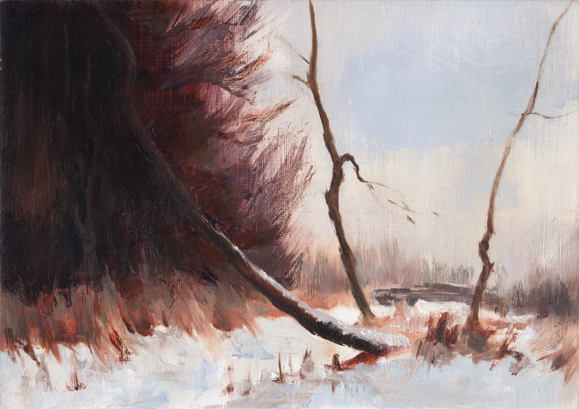
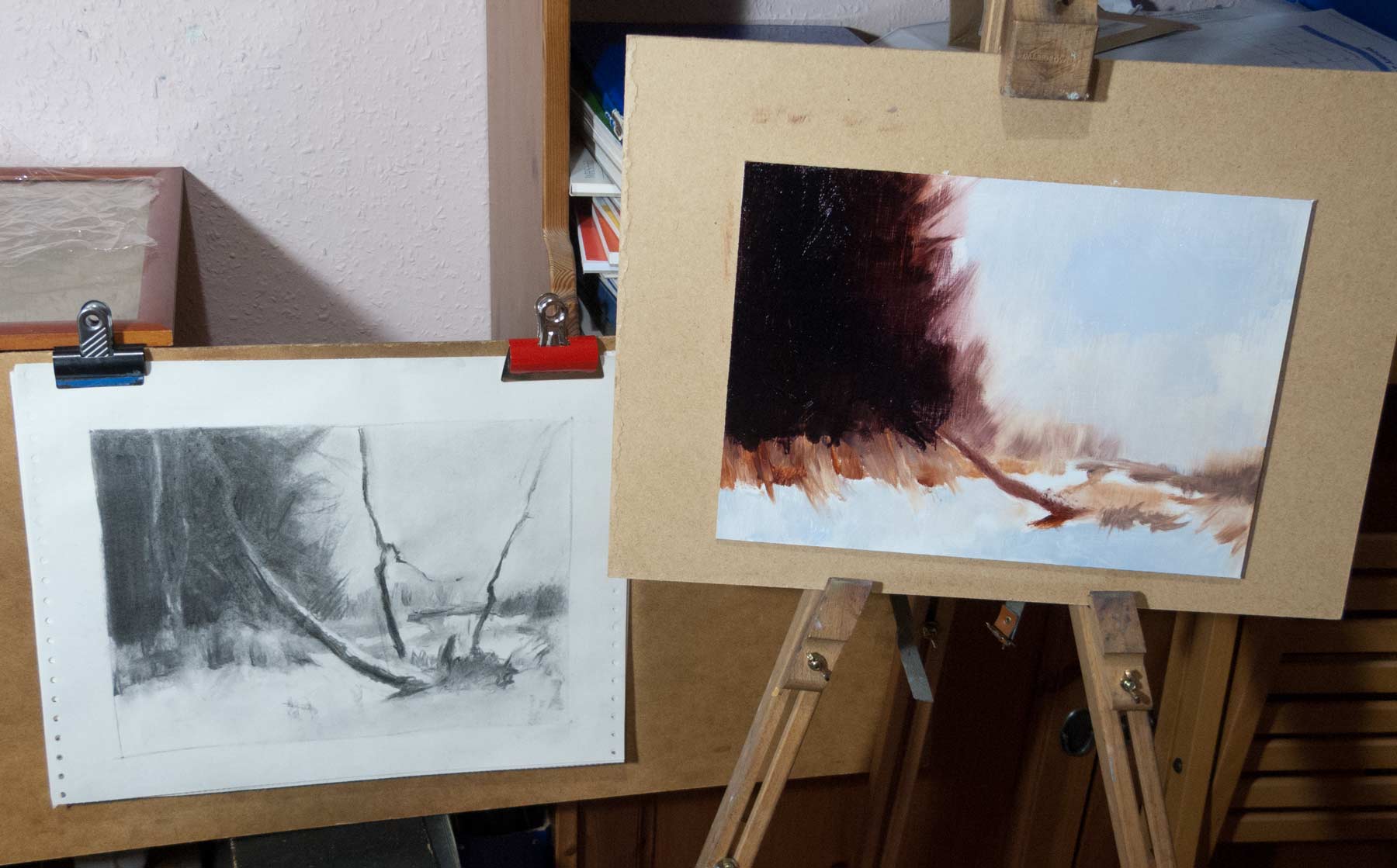
In some ways this website is a kind of sketchbook, building up over the years, a record of some of the many problems and frustrations or discoveries and insights found along the way. It’s by no means complete. Sometimes typing it all out helps to clarify a problem, or at least it puts my thoughts in order. Sometimes it’s good to talk.

street view

A copy of a Peter Hayward painting from the 1960s. The title from the pictures found online said ‘Fabulous New York City Street Scene. Signed lower left.‘ This was a copy in acrylics, a request for the living room wall.

Size was important. My usual small paintings would not satisfy my commissioner. Luckily I had a largish (50 x 70 cm) canvas with a wooden backing frame from a craft store, a birthday gift from some years back that had been abandoned in the back of a cupboard. The great thing about acrylics is they’ll paint on just about anything, no special surface preparation required.

As this was meant to be a straightforward copy (possibly part of my training as an art forger) I had no qualms about doing a copy of the basic outlines using a drawing grid and a pencil transfer to canvas. The proportion of my canvas was slightly different to the original, so I had to add some extra sky in Photoshop, which didn’t seem to affect the composition too much. Though in writing this post and finding the links to the original auction pictures, I found some extra pictures of the original painting in its frame that I had missed which show slightly more of the left and right edges of the painting. It’s a small difference, but it takes away the slightly awkward tangent of the round sign on the right next to the side of the frame.

Too late now. It’s done and on the wall.

Another potential problem with copying paintings is matching the colour. By strange coincidence, some months back my wife had returned from a charity shop with a large framed print that she couldn’t resist, also by Peter Hayward. The picture looked oddly familiar. Then I realised it was the same print that had been on the dining room wall in my grandparent’s house. It was one of the first pictures I remember looking at as a child. The trees looked weird. Why were they bending over like that? And why did the tree trunks disappear off the bottom of the frame? At the age of five I couldn’t understand the perspective. But I remembered the woman with the red coat. I thought it was somewhere in France. But it was another New York street scene, probably Greenwich Village. This picture, which was larger than the one I was painting, allowed me to compare the colours and study the thick impasto technique that he used. Of course, I’m relying on the colours in the print being accurate, but they matched the ones of other prints online.

After it was painted, I asked in the NMA Discord if anyone recognised whereabouts in New York it was. Someone came back straight away: It was the Jefferson Market clock tower. I could explore the surrounding streets with Google Street View and eventually found this view from West 10th Street.

The red brick, the fire escapes, the cornices on the buildings all looked right. The tower in the distance looked too small, but how much of that is down to the wide angle lens on the street view camera and how much is due to Peter Hayward taking artistic liberties? As Stapleton Kearnes said, you can’t observe good design into a painting, meaning you’ll probably have to change the scene in front of you to make a good composition.

The hotel on the left has gone. Further research revealed that the large building next to the clock tower was the Women’s House of Detention, or The House of D, demolished in the 1970s and replaced with a garden. See this article for a comparison of then and now.

The scene in those old photos feels quite different from Peter Hayward’s view. I’m glad I didn’t see those pictures before I started painting. The whole exercise was an attempt to reverse-engineer what he painted back to what he was seeing (or wanted to see), and to reproduce his technique to some degree. He seemed to be painting fast, with thick impasto, large areas of pallet-knife-flattened paint, edges moved over with another layer of thick paint. My copy didn’t have that speed and generous paint application. Perhaps you had to be on the street, capturing the light before it changed, getting the paint down quickly and efficiently, to get that distinctive look of a Peter Hayward painting.


Proko challenge – animorph

Yet another Proko challenge from July 2021:


Prompt

Do an illustration of any influencer morphing into an animal. Try to be clever! What animal would Logan Paul most likely turn into? Don’t take this too seriously, the submissions won’t necessarily be judged of technical skill and execution. More so humor, storytelling and creativity.

Medium: Any medium, traditional and digital, 2D and 3D is allowed


My entry was inspired by the Draftsmen podcast with Stan Prokopenko and Marshall Vandruff. There’s a chemistry between them, and occasionally Marshall will turn to camera to explain a point with a hawk-like gaze. That and his owlish wisdom meant he had to be a bird of prey.

I started by going back through old Proko videos featuring Marshall, looking for stills to sketch from, for facial expressions and that characteristic gaze. I did the sketches with polychromos pencil on rough paper which were later scanned, cleaned up and combined in Photoshop.

I also needed some reference for a hawk-like bird. The photos would have to show multiple angles including a head-on view. Also needed were close-ups of claws to grab Stan’s head.

The morph’s themselves relied on taking the starting image of Marshall and pushing the features gradually into the final hawk-head shape. It helped to find similarities between the two to serve as a link: the brow ridge; the slight turn of the mouth at the corners; the position of the iris as it gazes forward.

I lifted an old charcoal sketch of Stan from the archives and proceeded to do digital surgery on the top of his cranium. All that was left to do was add some rendering and lighting.

The final entry gets a very brief mention (around 15 minutes in) in the judging video with Ethan Pecker, though I think Stan’s more interested in his hair.

Proko challenge – movie poster

Another Proko challenge. This time:


Prompt

“Your favorite director JUST called! They want to make a movie about YOUR life, where YOU get the leading role (yourself!)! The director says you get to call the shots too, and decide the genre…oh and the studio is going to need YOU to do the movie poster too! What a demanding production!”

For this month’s challenge we want you to show us the movie poster of your life! This could be a poster about a sweet memory, or a poster that best represents your personality, or interests! Remember too, the director wants you to choose the genre as well! So maybe you feel like your life would be best suited for a fantasy film, or a western? Maybe it’s a romance comedy, or an animated film? Either way the director needs you to send that poster by the deadline because your movie can’t come out without it! Be sure to take a look at different movie posters! They can be really elaborate, or really graphic! But they HAVE to describe the genre and what the movie is like as best as possible! 😛 Have fun everyone.

Remember to leave some room for the text! Logo and title optional, unless you wanna also do the graphic designers job 😊 Let’s see those posters!

Format: Classic One Sheet – 27 x 41 inches or 68.6 x 104 cm

Medium: Any medium, traditional and digital, 2D and 3D is allowed


For my entry, I combined an oil painting sketch based on photos of me posing in front of a mirror with a hat (no, you don’t get to see that) which was then brought into Photoshop for extra painting, and then InDesign for the lettering. I was going for something with an Ealing comedy feel.

The result would probably make Leyendecker spin in his grave. Hey, at least I made the deadline. It’s never too late!

Here’s Karla Ortiz giving feedback (about 26 minutes in).

Proko challenge – cartoon anatomy

When Proko.com was beta-testing their new site they issued a Proko Challenge:

Get creative and imagine what the bones and muscles of cartoon characters look like.

This scene from Hergé’s Adventures of Tintin – Destination Moon came to mind when I saw this challenge. The Thom(p)son twins are spooked after seeing each other through an X-ray screen. Here’s Hergé’s original page:

Click the image for animation… Original image from Tintin.com

This was a real challenge. It was only once I’d started that I realised how hard it would be. I had to go back through the Proko videos and lesson notes for a crash course on bones and muscles and ended up going down the rabbit hole. The Skelly app was really useful for setting up the pose and taking some of the guesswork out of how a bone looks from an unusual angle.

I have an old graphics tablet but it’s a bit awkward and not easy for getting any kind of flow, especially for the initial sketch. So I started with pencil or fineliner pens on tracing paper, scanned in, then cleaned up and corrected (or redrawn completely) in digital.

I think my overlay of muscles on the skeleton is a bit suspect, but this kind of exercise is good for working out what’s going on in the figure, what all those bumps and dips represent. As Glenn Vilppu said in a recent livestream: A knowledge of anatomy helps you understand what you’re seeing, what to look for. If you can’t see it, you can’t draw it.


eye level

Deepest apologies to Sheridan Smith.

I was sketching along to one of Court Jones’ caricature lessons over on Proko.com using a reference photo which had good lighting and strong features — just what you need to practice caricature. It was only after I’d finished drawing that I noticed the eye positions. I’ve had this problem before, and I frequently use the ‘fresh eyes’ approach to take a break and see any inaccuracies in the drawing. But I definitely have an inability to see how the complete picture is working as a whole as I’m drawing all the smaller elements. Maybe there’s a term for this — ‘drawing blindness’, perhaps.

One solution to this is to build up the portrait systematically using a basic construction of the big shapes before going to the smaller forms within them, and then, finally, move on to the details. Don’t draw the small shapes until the big shapes are working.

It also helps to be aware of the many ways in which a portrait can go wrong. Sometimes it’s not a big mistake, like an eye in completely the wrong position, but an accumulation of smaller errors which might seem insignificant in themselves but which add up to a face which somehow just doesn’t look right.

Here are a few examples of the ways a portrait can miss the mark, taken from the pile of charcoal quicksketches on the endless computer paper.

The perspective lines for the eyes don’t match the rest of the features, making the far eye look too small.

Often the far eye in a portrait does appear smaller as it’s farther away, but the rest of the face needs to match, and any parallel construction lines need to share the same vanishing point. The difference in size in the features seen in three-quarter view will depend on how close you are to the subject — if you’re up close, there will be a more noticeable difference.

If the axis lines for the features and the centreline of the face don’t match, the face looks skewed. This can make an eye look too high, or a mouth slanted, or just give the sense that the features don’t quite hang together.

If the face is holding an expression which isn’t symmetrical (or the features themselves aren’t symmetrical) then axis lines can only provide a starting point. Is the mouth shifted to the side because of the expression (blue face) or because of inaccurate drawing (red face)?

Is Stan smiling with a sideways smile? Hard to tell when you can’t see both sides of the face. It’s often helpful to draw construction lines through the form even when you can’t see the hidden side, as though the head is made out of glass.

Stan Prokopenko has made a number of really useful videos on head construction. Here’s one which uses an intuitive approach to constructing the basic head structures.

An off-centre view combined with an asymmetrical expression can make centrelines hard to find. The corrected version in the animation above shows the more accurate centreline as taken from the reference photo. That said, the drawing has other elongations and distortions which confuse the final result and make the face appear slightly flattened.

There are so many factors which will influence the final appearance a portrait and so many ways to get there: Loomis methods, Reilly methods, Asaro heads, skull anatomy, caricature, tonal block-ins. (See Jeff Watts demonstrating some of the methods in this video.) I think there’s something valuable to be taken from all of them, and the aim is to have them all available as tools that can be used intuitively.


stumped and shaded

Experimenting with textures and effects using charcoal on Bristol board to show a view in Bath Abbey Cemetery, trying to capture the contrast between the areas bleached by sunlight and the gloom under the shade of the yew trees.

I wanted the shade under the trees to be deep black to get the maximum contrast with the paper white. I tried graphite on a slightly textured heavyweight cartridge paper but ended up with a grey shine on the darkest areas. The delicacy of graphite combined with the deep darks of charcoal would be ideal, but in areas of darker shading I found the soft graphite fills the grain of the paper and forms a plate-like barrier to the charcoal and the vine stick wouldn’t grab, as you can see in the trunk of the tree below.

I made another attempt on Bristol board (picture at top of the post). The smooth surface of Bristol isn’t usually the first choice for charcoal which needs some tooth to grab the grains, but it did take the charcoal, even if much of it turned to dust on the surface which occasionally had to be brushed or blown away. When blended with a paper stump the vine charcoal turned a light grey and almost has the appearance of an ink wash.

A kneaded eraser was useful for lightening areas and seemed to work more effectively than a hard pen eraser. However, I built up many of the leaf shapes and branch effects by adding extra shading to the negative spaces rather than picking out the lighter areas with an eraser. The stump would lighten the tone and flatten any texture, and then the dark background shapes could be drawn in to this grey midtone. This drawing in reverse allowed multiple layers of depth to be built up and was much more precise (and satisfying) than using an eraser.

The white of the Bristol paper appears cold, almost blue, compared to some papers, but in reality it’s probably closer to a neutral white and its coldness only appears in contrast to warmer surroundings, such as a matboard or the newsprint backing paper.

Other papers will have different handling with different results. Here are some sketches using graphite or charcoal (Mary in graphite) on a sheet of Fabriano Disegno drawing paper which has a texture laid in to the surface. The graphite and charcoal catch on the paper grain and sit on the top if lightly applied but blending with a soft brush or a stump can achieve a more even tone, as seen in the face and jacket of the figure on the right.

Zoom in or click the image to see the paper grain.


Seago copy

A copy in oils on panel of a painting by Edward Seago.

Seago was a prolific painter of landscapes. Stapleton Kearns has written extensively about his methods on his blog, which is well worth a read.

I started with a charcoal sketch to get the feel of the composition. I think the composition is instantly appealing, with those unusual tree angles and the light-dark balance. The eye is naturally drawn around the scene and off towards the distant trees and sky.

Seago’s style is very loose and painterly. He painted very quickly with brushy, textural strokes, and it was important to remember this when making this copy. It’s a style which can’t be reproduced by fussing around or tentative licking with the brush. This was especially true for the foreground snow where the textures of the grasses could only be achieved by a confident, definite stroke. A palette knife was useful for many of the effects.

I let the first pass of paint dry before drawing the trees over the top, though Seago probably did this wet-into-wet.

I might have oversaturated the colours in this copy. Seago’s colours are more muted and greyed down in the original painting, though two separate online references have different colour casts. Another painting of a similar scene [The reed bed — Winter] has different colours again.

These master copies really are useful for trying out different approaches to painting. The different styles force you in to new ways of seeing and translating. And while examining the surface of the painting can reveal valuable insights into the artist’s methods, so much more can be learned from ‘acting out’ a bravura brush stroke.


after Orazio

A not-too-slavish copy of Head of a Woman by Orazio Gentileschi. This copy is about a third the size of the original, and was painted with a limited palette of just ultramarine blue, transparent oxide red and titanium white. I first heard about transparent oxide red (PR101) from Terry Miura who uses it instead of umbers, and I think it’s becoming one of my favourite staple paints, not least because it mixes well with ultramarine to create a surprising range of flesh tones. The only downside is that it’s so tempting to leave the glowing orange when really I should be muting the colour down.

I haven’t done an overlay check of proportions with this one as that wasn’t really the exercise (though I did play around in Photoshop with a photo of the half-completed painting to identify an overly bulging eye). The challenge was to see if I could capture anything of that arresting and inquisitive gaze.


from life and imagination

This started out as an afternoon painting session in the garden. It was a sunny day, I wanted to paint in oils — and I didn’t want to rely on another photo. So I set up a small box easel and began to paint a self-seeded poppy growing out of a plastic pot. There was only one chance to do this as after a few hours the last of the petals fell off.

At the end of the session I wasn’t particularly impressed by what I’d done. So I experimented with thumbnail acrylic sketches and digital overlays to see if I could transform what I had into something more interesting.

The result (top picture) looks somewhat Victorian, and the short-lived suburban poppy has been hammed up with the drama of the fading light into a vanitas. (At least, that’s the story I’m telling myself.)