I decided to copy the watch a second time to try out some new water soluble oils and to see how they compare with acrylics, using a pad of acrylic paper with an extra layer of white acrylic gesso applied.
Because the paint isn’t dry in 2 minutes (like acrylic) there’s more time to blend and fuss, and it’s easier to make a smoother blend or to tease the paint in to an edge (shadow to left side of watch). I’m not used to the colours in this starter set and had trouble getting a dark grey for the background. I usually get dark neutral colours by mixing an earth colour with ultramarine. With this palette I get a purple by mixing the blue and red, but adding yellow creates brown as it lightens the whole mix. I’ve since ordered more paints to match as close as possible the colours I’m used to, based on my limited watercolour palette.
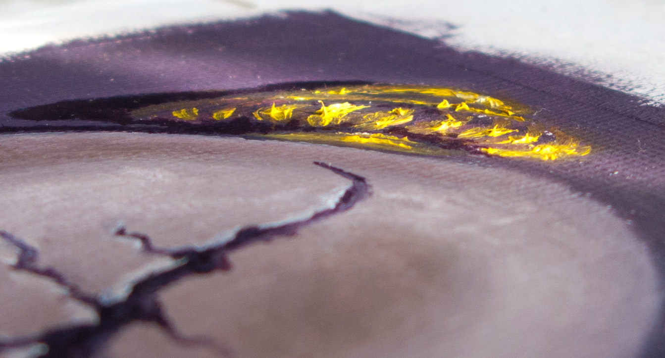
Another difference to the quick-drying acrylics was that highlights were unexpectedly difficult to apply as they would dig up darker paint from lower layers (a common beginner’s mistake, apparently). I ended up putting on the gold highlights in an impasto, like icing on a cake.
On the finer details the paint dragged a little. I’ve ordered some water soluble linseed oil and quick drying liquid to loosen it up. I’ve heard that walnut oil is good, but thought I’d stay with the water soluble range for now.
Touch dry within a couple of days (but probably not fully dry).
The linseed oil smell is quite pleasant, and being water soluble the brushes clean up with a bit of washing up liquid and water.
I’ve heard that some people hate water soluble oils and find their consistency unworkable. Others say that they behave like normal oils so long as water is only used for cleaning brushes and not as a solvent during painting. Instead use water soluble linseed oil or other mediums.