Monthly Archives: May 2018

pet portraits

A friend wondered if I could do a portrait of her dog. I wondered too, but it sounded like an interesting project. I didn’t realise that pet portraits were a thing until I went online and saw page after page of search results for pet portrait artists.

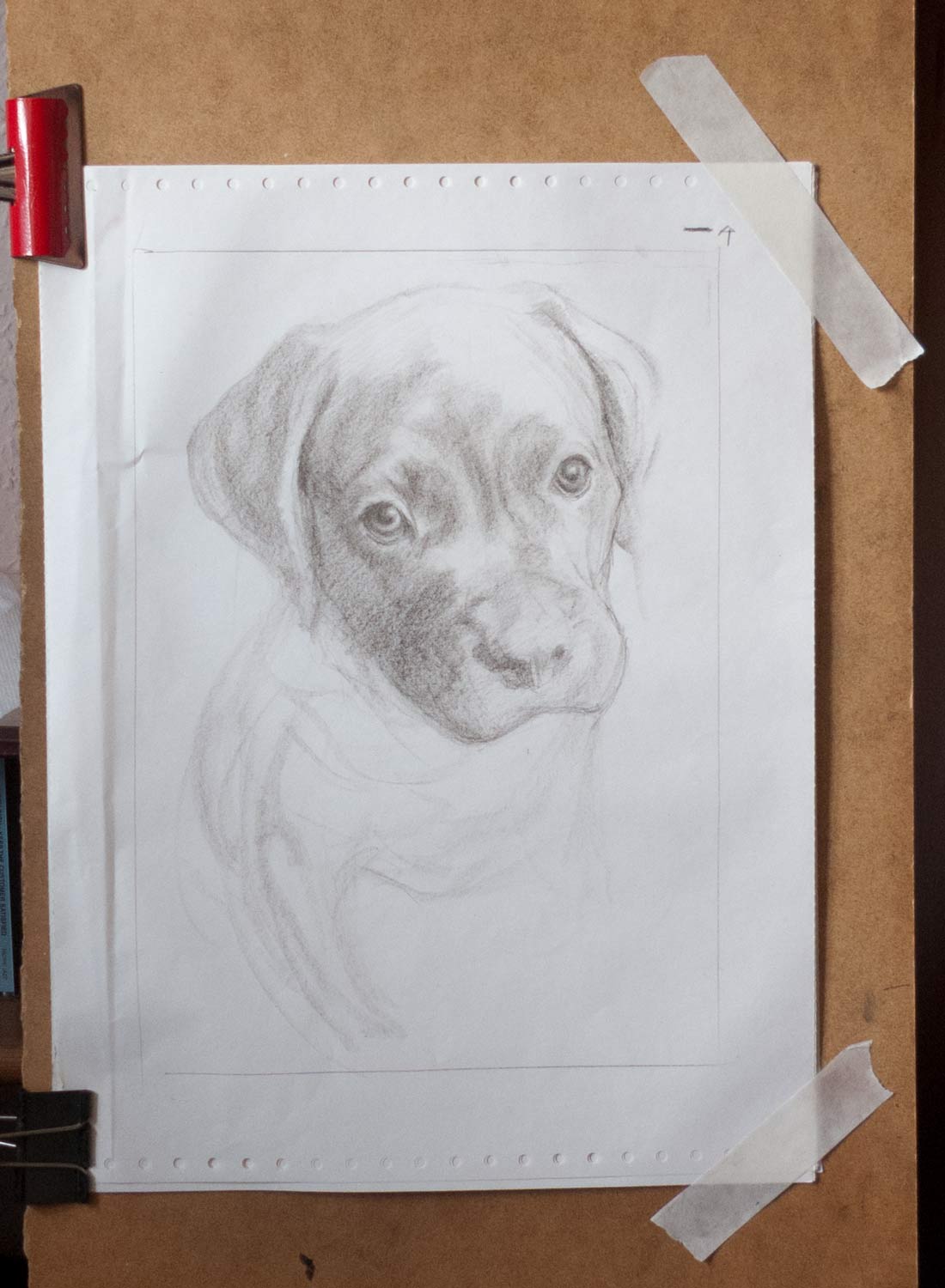
I’ve never met Cooper, a boxer mastiff cross. Everything was based on a collection of photos taken at different angles, including profile shots and various poses, that let me get some idea of the basic shape of his head.

Working in charcoal seemed the most flexible and natural method for me at the moment, but I really wanted to do an oil painting, just to see what I would come up with. I ended up doing two pieces, one in charcoal of Cooper as he is now (which didn’t quite work—I need to make another attempt), and this oil painting of him as a puppy.

For the puppy painting, I started with some warm-up charcoal and pencil drawings, then used a Polychromos pencil to do a more detailed sketch. I like the Polchromos pencils as they build up gently into darker tones, even though they don’t erase as easily as charcoal.

The pencil sketch was scanned and copied on to office paper and the back covered with old charcoal dust that I keep in a jar. The outlines and tones were transferred onto an A4 canvas mounted on aluminium composite by drawing over the sketch with a ballpoint pen.

The canvas ground was acrylic gesso covered with a layer of grey mud oil paint left over from a previous painting. Acrylic gesso can be very absorbant and suck the oil out of the upper layers, but this mud preparation acts as a barrier to the thirsty gesso and effectively creates an oil ground that is very pleasant to paint on.

I did about three passes on separate days to build up the painting, with a final pass to make some corrections to the background. I let the painting become touch dry before the next painting session.

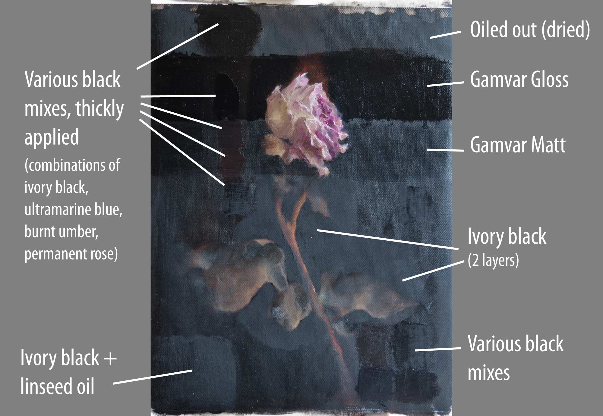
I used ivory black in this painting and it’s not a pigment that I’m used to. I bought a tube to mix with titanium white and burnt umber to make neutral greys for reducing the chroma of colour mixes (following Paul Foxton’s method), but it was tempting to use this black instead of my usual mix of ultramarine blue and burnt umber for some of the darkest areas. A problem I’ve found with ivory black is that it sinks in really noticeably. It looks like a deep, silky black when wet but dries a lighter matt, almost like gouache. I don’t know if the oil is sinking in to lower layers or if the pigment itself is soaking up all the oil.

I oiled out the painting at the beginning of each pass, but eventually that thin linseed oil layer also sinks in. I was betting everything on a final varnish using Gamvar Gloss to even things out, which it seems to have done.

He looks cute in this picture. He’s grown up to be the size of a small horse.


sinking in

To varnish or not to varnish. Some painters don’t like the glare and shine of gloss varnish, preferring a matt or satin finish, or not varnishing at all. There are matt varnishes which contain a small amount of wax to take away some of the glare, but for paintings with dark areas this can seem like the worst of all worlds: there is still a sheen of glare (though not as much as with gloss) but the deep tones become cloudy due to the wax. Maybe it works well with high-key paintings.

Varnish is there to protect the surface (it’s a removable, replaceable clear layer) but it also brings out the depth and vibrancy of the original wet paint. It also evens out any patchy, sunken-in areas, which is where I find it most useful. Some pigments sink in more than others (ivory black and burnt umber seem to soak up all the oil) and mediums added to the mix can alter the final gloss. Thick impasto can have a glossy sheen next to paint thinly applied with a brush.

It’s a minefield of confusion which I attempted to clear with systematic testing, but like many of these experiments I ended up throwing various combinations of paint and varnish on the canvas in the vague hope that something useful would come out of it.

Here’s a painting of a rose (this was originally going to be a post about painting a rose from life, with the various challenges that presented) with a background that contains large areas of ivory black. It looked deep and dark when wet, but as you can see from the photo, it sinks in really noticeably to a dull matt finish. So much of the oil is soaked up that the paint doesn’t even feel particularly well bound to the canvas, as you can see from the top-right edge where the paint was lifted during oiling out.

I was going to go in to detail about all the various combinations of paint and the effects of thickness of application, oiling out, layering, and so on. But you’re spared all that and here’s a picture instead.

Click for a larger image.

The conclusion I reached: just apply a layer of gloss varnish at the end and all the problems are solved. Except for one: whilst sunken-in areas regain their depth, any areas that are already very glossy become even more glossy, so there’s still some unevenness. The portrait at the top of this post had glossy areas where I’d used stand oil in the paint mix. Adjacent areas were relatively matt. The gloss varnish evened things out a little but not completely. I tried applying a number of coats but they all seemed to dry with the same result. In the end, in a spirit of experimention and desparation, I poured a pool of varnish over the non-glossy areas, hoping for an evenly-glossy final painting. It didn’t work, but I quite like the photo.

Things to try in future experiments: lightly abrading the very glossy areas to take down the sheen before applying the final varnish.

Here’s Mark Carder with a video on how to varnish a painting. However, if you’re using Gamvar (as I did) the application needs to be thinner. See here for Gamblin’s varnishing instructions.


dark yellowing

This was a bit of a shock. I’d never come across this before. This is an old oil sketch I made back in 2014 on postcard-sized gessoed acrylic paper. It was kept for a good part of those four years in a stack of other similar oil sketches.

I took it out recently to find yellow-brown splotches all over the painting, and the whole picture had a colour cast. At first, I thought oil from the back of another ungessoed sketch had soaked through the paper on to the surface of this one.

I wasn’t particularly concerned about this painting—it was just an experiment to try things out—but if I’m using a technique that is flawed then I need to correct it.

It’s easy to get a bit obsessed with archival methods for making a painting, and as someone once said, there are paintings that will last a hundred years that should never have been painted. But, I would like to make objects that will be around for at least a few decades without falling apart.

I looked online and discovered the phenomenon of dark yellowing. As the name suggests, the linseed oil in paintings kept in low light or dark conditions can go yellow and darken dramatically. The cure, thankfully, is simply to expose them to light again.

I put the cloud sketch on the windowsill for a couple of days and the yellowing disappeared. If only all oil painting problems were as easily fixed.

[I remember this picture being hard to photograph when I was writing the post four years ago—the colours would shift with every shot I took. Preparing these photos was even more difficult as they were taken a few days apart with different lighting conditions. The top photo doesn’t quite convey just how noticeable the yellow splotches and colour cast appeared. It really did look as though the painting had decayed and deteriorated.]