Monthly Archives: August 2018

overlays

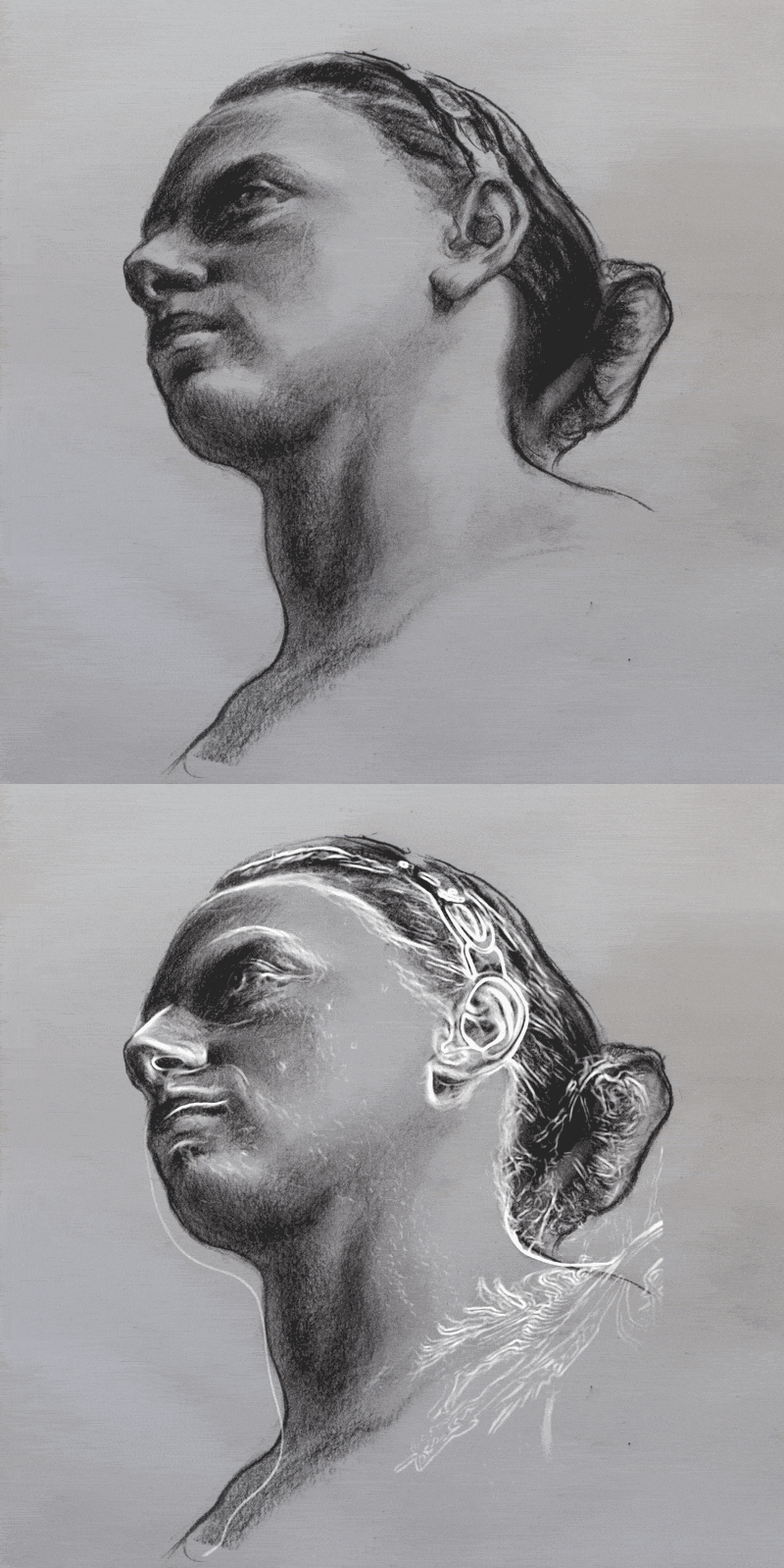
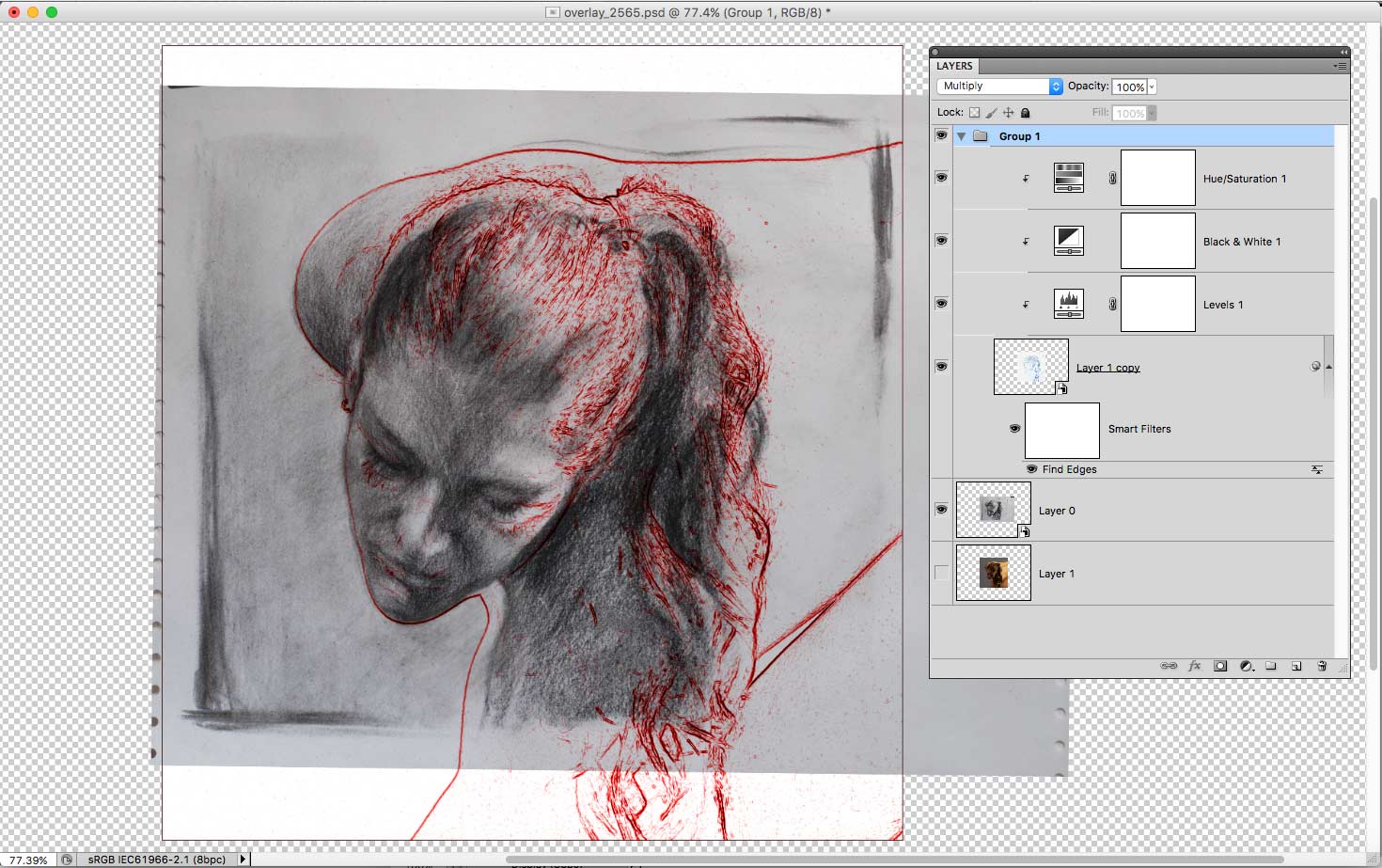
Apologies for making this post flash like the Blackpool illuminations, but I’m using a modern version of a technique used since olden times to check accuracy and proportions. Without a master draughtsman looking over my shoulder to tell me my ears are in the wrong place I’m reliant on overlaying my drawings on top of the original photo reference to see where I went wrong. Leonardo made practice drawings on glass plates to compare to the original, but I’m pretty sure he would have made use of today’s digital tools.

Usually, I take a photo of the sketch into Photoshop and simply add it as a semi-transparent layer above the original photo. Then it’s a matter of trying to align the sketch and the reference by rotating and scaling until (hopefully) the features line up. By quickly switching the layer on and off, you can compare the two.

The technique illustrated in the photos above is a little more complex as it uses a number of filters to find the edges (shown in red or white) of the features in the original photo. Usually, I don’t go to all that trouble when checking a sketch and instead use the transparent layer technique mentioned above.

By doing this regularly I have begun to identify some of my repeated mistakes: I make the backs of heads too small, brows are too high on the skull, everything is made too wide, chins tend to disappear, hands are too short.

Once these weaknesses have been identified they can be consciously corrected. I’ve found the quickest way to improve is to concentrate my practice on the things I find the hardest to draw.

[Models courtesy of New Masters Academy.]
 

hand study copy

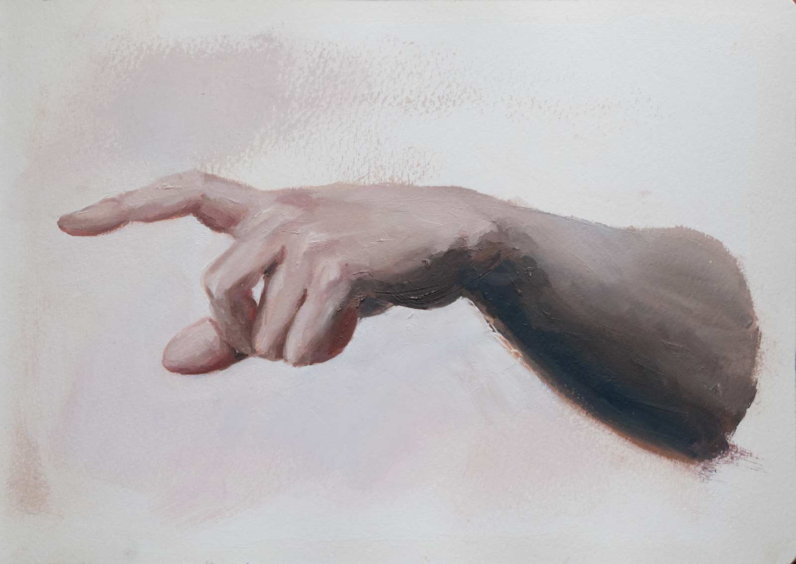
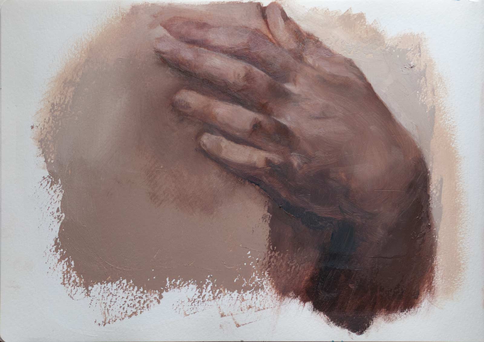
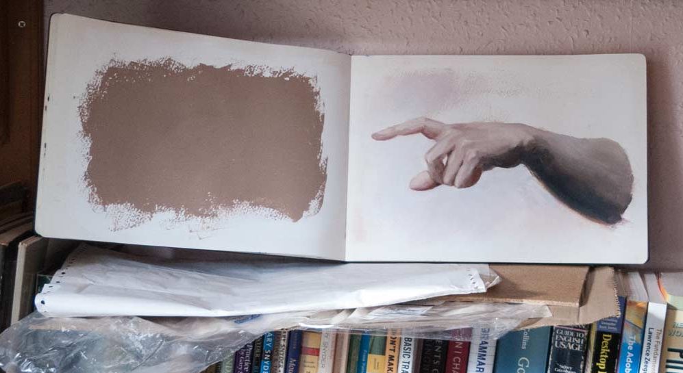
These are copies painted in oil in a sketchbook based on hand studies by Bouguereau. The thick sketchbook paper will take oil paint if first covered with a layer or two of acrylic gesso. Any leftover paint can be spread on top of this to create an oil ground for the next sketch, but it’s not necessary. This was another way to use the intimidating Moleskine, even though it seems a bit odd to put oil paint in a sketchbook.

As ever, the challenges were to match the values and hues while at the same time trying to model three-dimensional form, all by using buttery oil paint. The hues tended to be somewhere around orange—slightly more red or purple in some areas, more yellow in others—but all of of the hues were quite greyed-out or desaturated (low chroma). Bouguereau himself somehow managed to make flesh tones look natural and almost translucent (see this link for a discussion on this topic) yet his colours are not a dead grey.

On the dimly lit shelf, my version looked a lot more smooth and natural than when brought out into the light. Bright light shows how rough and sketchy the paint blending really is, as you can see if you zoom in on the photos above. Studio lighting is something I really need to sort out, as painting in the dark often fools me into thinking I’ve done a better job than I have.

I noticed that too, when painting the puppy portrait. The painting viewed in natural indoor light on an overcast day looks very different to the same painting in direct sunlight, as you’d expect, but it’s not just the colours that become more saturated, the edges become harder and more noticeable.

Click for larger image.

Anyway, it’s all good practice. To see some extraordinary oil paintings in sketchbooks, have a look at the sketcbook tour videos by Cesar Santos.