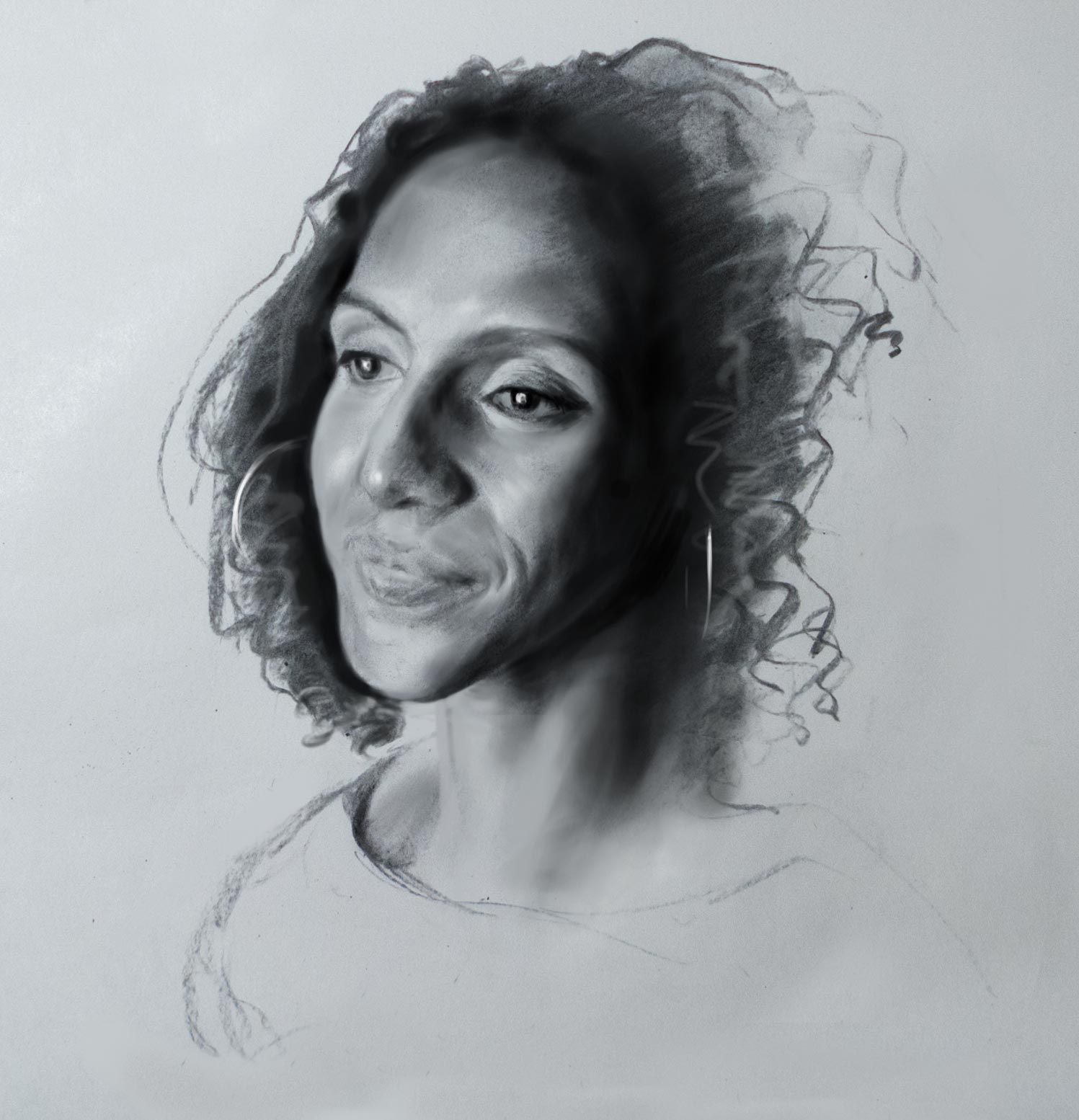
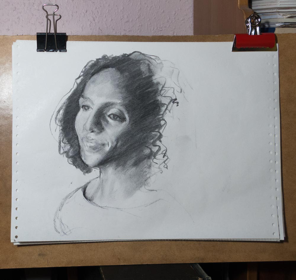
This one is a hybrid of charcoal on paper and digital painting. The reference photo was a portrait of Afua Hirsch taken by Richard Saker.
It started out as a quick generic head study using a stick of vine charcoal on cheap paper, with no real time being spent on measuring proportions or judging the relative positions of the features.
I continue to have major problems with basic proportion, making everything too wide or completely missing the scale and relationship of elements. I mean, look at the original charcoal sketch. As I was drawing it, I realised it wasn’t going to get a likeness, and I was aware the eye on the right was out of position a little, but maybe it would hold together with the other features to make a believable head.
It was only when I left the room and returned a few minutes later that the eye screamed out at me and showed its true position. How could I miss that? It’s half way down the face! This is up there with the repainting of Ecce Homo.
It’s so easy to work away on refining the details of something only to find the whole thing is in the wrong position. So I need to consciously walk away from a drawing, or use a mirror, or somehow get those essential fresh eyes.
As an experiment, I took it into Photoshop to move and rescale that eye, and then created a new blank layer to make further corrections and additions. I used an entry-level graphics tablet (Bamboo One) to do the refinement. I don’t have much knowledge of digital painting techniques, and everything was done with a default brush of varying softness and flow rate. The brush colour was sampled from the existing charcoal drawing. Some of the texture of the original charcoal remains but the default digital brushes have a tendency to make everything look too slick and airbrushed. There are no doubt techniques to avoid that plastic-wrapped appearance.
I still haven’t got a good likeness. A true likeness depends on a hundred and one subtle features to being just right. Somehow I’ve made her older and I can’t work out why. Have I made the face too wide? Is the forehead too short? I shortened the neck a little to more closely match the original reference. It’s still not her.
And again, I only have a digital file at the end of this. Will the endless opportunty for correction and revision that digital painting offers make me lazy? This process was fun, though. As Cynthia Sheppard shows us, there’s no one way to do this.

