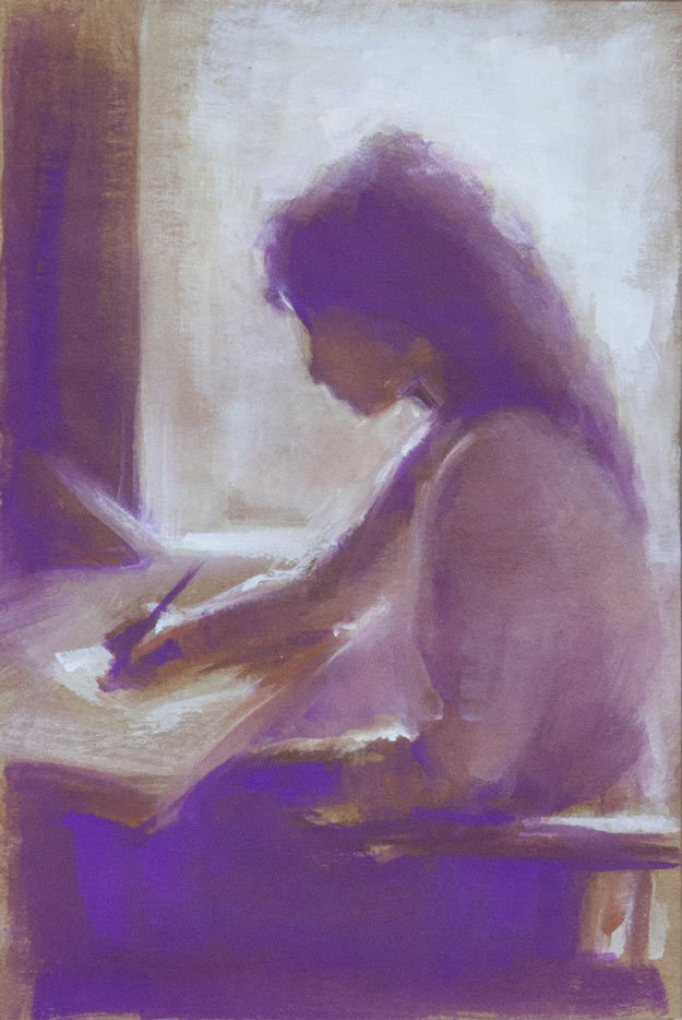
A gouache on Seawhite Kraft paper copy of a picture that I found somewhere on the internet. I forgot to note down the artist’s name when I saved it, something I do religiously now (usually) because it’s frustrating not to be able to find more of their work or to give credit in a blog post.
The Seawhite gouache (04 Mauve) looks almost fluorescent when lit by a daylight bulb. The other colours were burnt umber, burnt sienna (close to the tone as the Kraft paper background), and titanium white, painted with a 3/8 inch flat brush to keep it loose.
I recently discovered the work of Terry Miura who paints in a style I love: a mixture of loose painterly expressionistic brush strokes with areas of tightness and detail. I love the effect of moving from abstraction to realism within a painting. Oh, to be able to paint like him! His blog is a fascinating insight into his working methods and vision. Here’s a list of sticky notes he has taped to his easel to help him with composition:
-Unequal distribution of dark and light masses. Don’t make them 50 – 50.
-Have one dominant color. Additional color masses need to be clearly lesser in visual impact.
-Use a variety of edges on every shape. Lose an edge on every shape if you can.
-Paint the concept, not things.
-Have a hierarchy of interesting areas.
-Manipulate this hierarchy with value contrast, hue choices, saturation, edges, opacity, impasto, brush activity, and textures.
-Big passive area vs. small active area
-You don’t need two big passive areas.
-If the focal point is in light, simplify the shadow. If it’s in shadow, simplify the light.
-If the focal point is in light, lower the key. If it’s in shadow, raise the key.
-Connect shapes wherever you can. (Same thing as losing edges)
-Whenever you break a rule, make sure it looks intentional.
-Repetition and variation. Over do them. Then pull back.
-Less is more.
-Make Only One Statement!
On the top his easel, in big black letters, he has written the word MYSTERY.
Great picture and thanks for the mention – would sit well on our calendar or catalogue page – drop me a line of you would like it featured next time around –
thanks again
nick@seawhite.co.uk
Thanks, Nick. Feel free to use it, though as I said in the post it’s a copy of someone else’s painting. If anyone recognises it, please let me know.