Category Archives: gouache

portrait practice

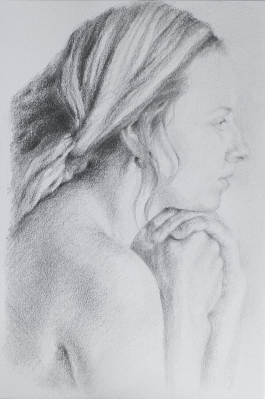
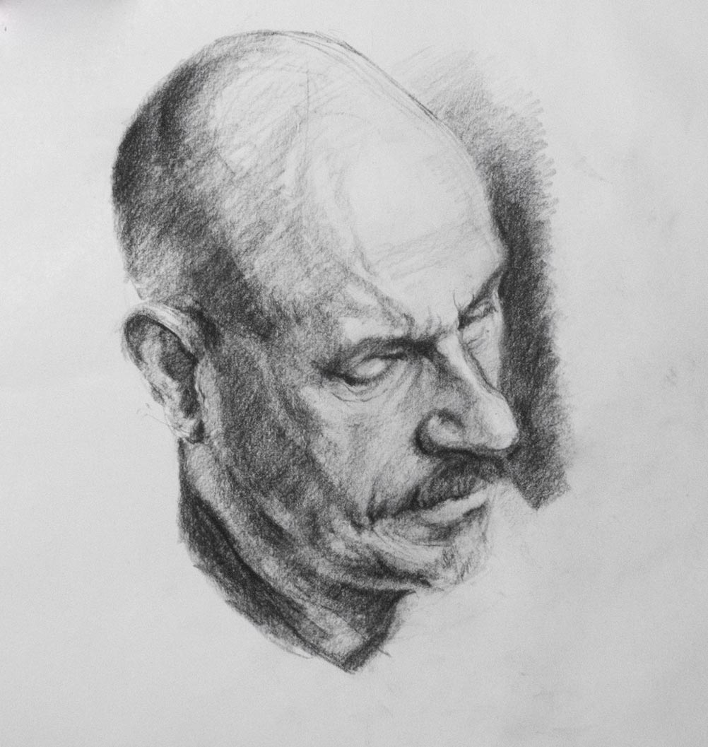
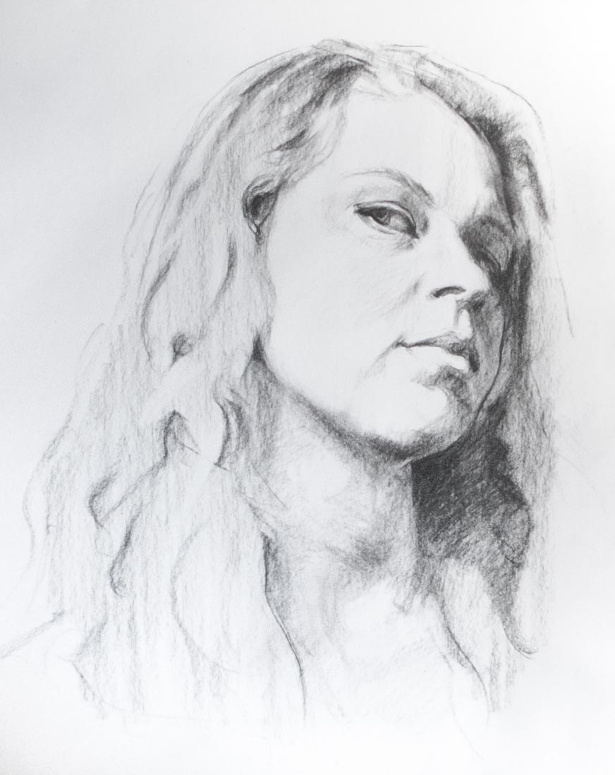
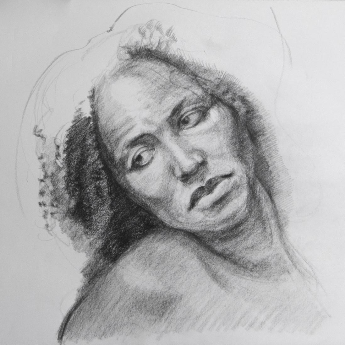
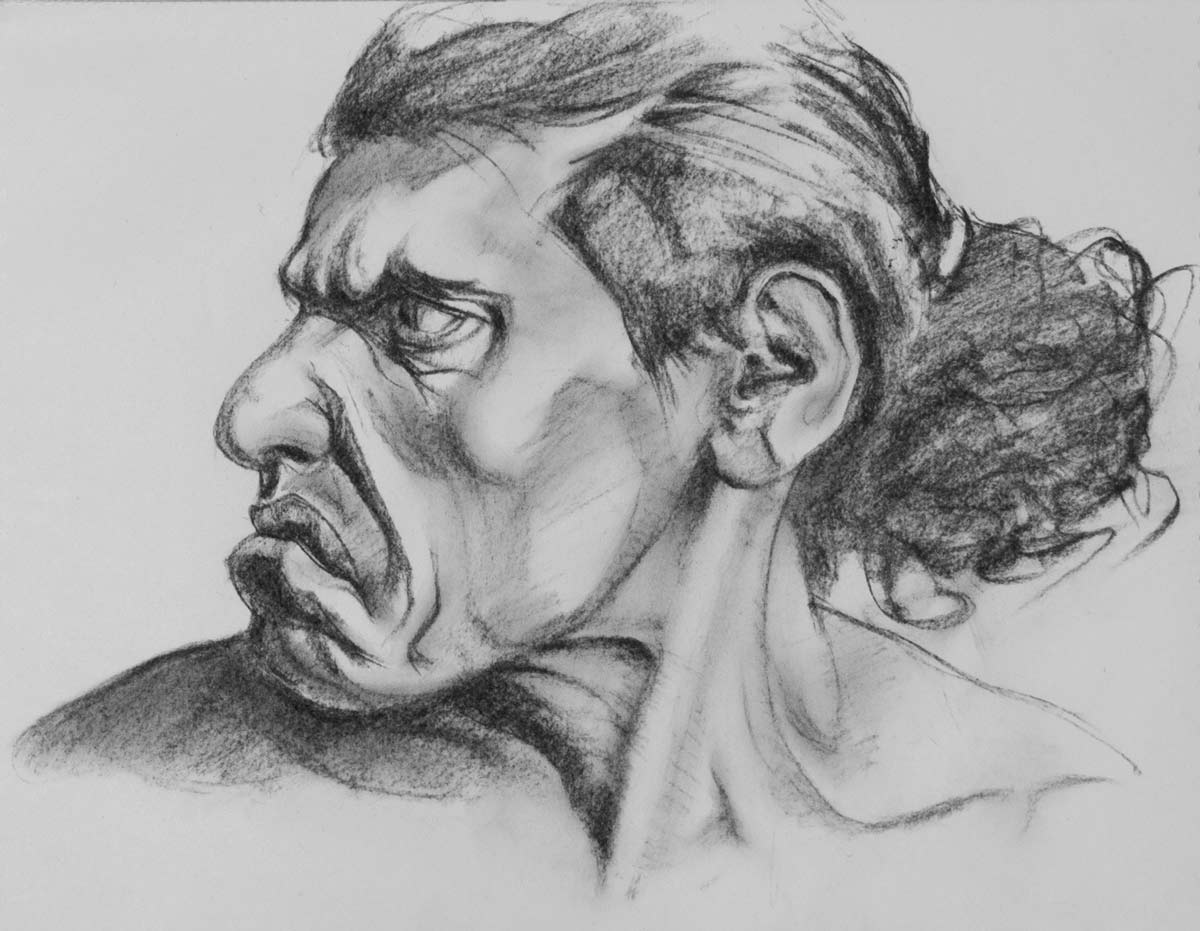
Sometimes it’s useful to copy a photo as if it’s a Bargue drawing, paying close attention to proportion and accuracy. I found that copying Bargue’s schematic drawings makes me more aware of how the contours of the features have distinct directions and angles in relation to one another, and it is useful to look out for these basic shapes when observing the model. For instance, the structures of the eye (including the eyeball) slope backwards when seen in profile, and the stair-step of the mouth has its own distinct pattern of slopes, bulges and overhangs.

At the other extreme is full-on caricature, which is sometimes necessary to get the life and gesture back in to a drawing after too much chasing after accuracy. Court Jones has an excellent series of videos on this subject over at Proko.com.

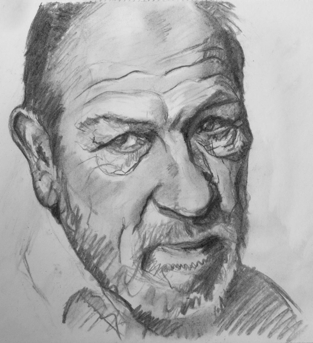
Another benefit of caricature is that it emphasises the three-dimensional structure of the features, so the final picture becomes a construction of cylinders, blocks and eggs. This is the opposite of flattening what you see into an abstract collection of two-dimensional shapes, like the pieces of a jigsaw. Both these ways of seeing have their advantages, and I find it useful to flip from one method to another as I build up a drawing.

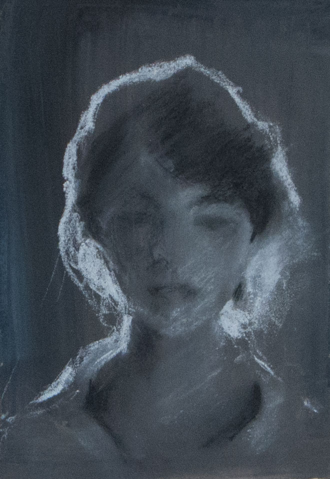
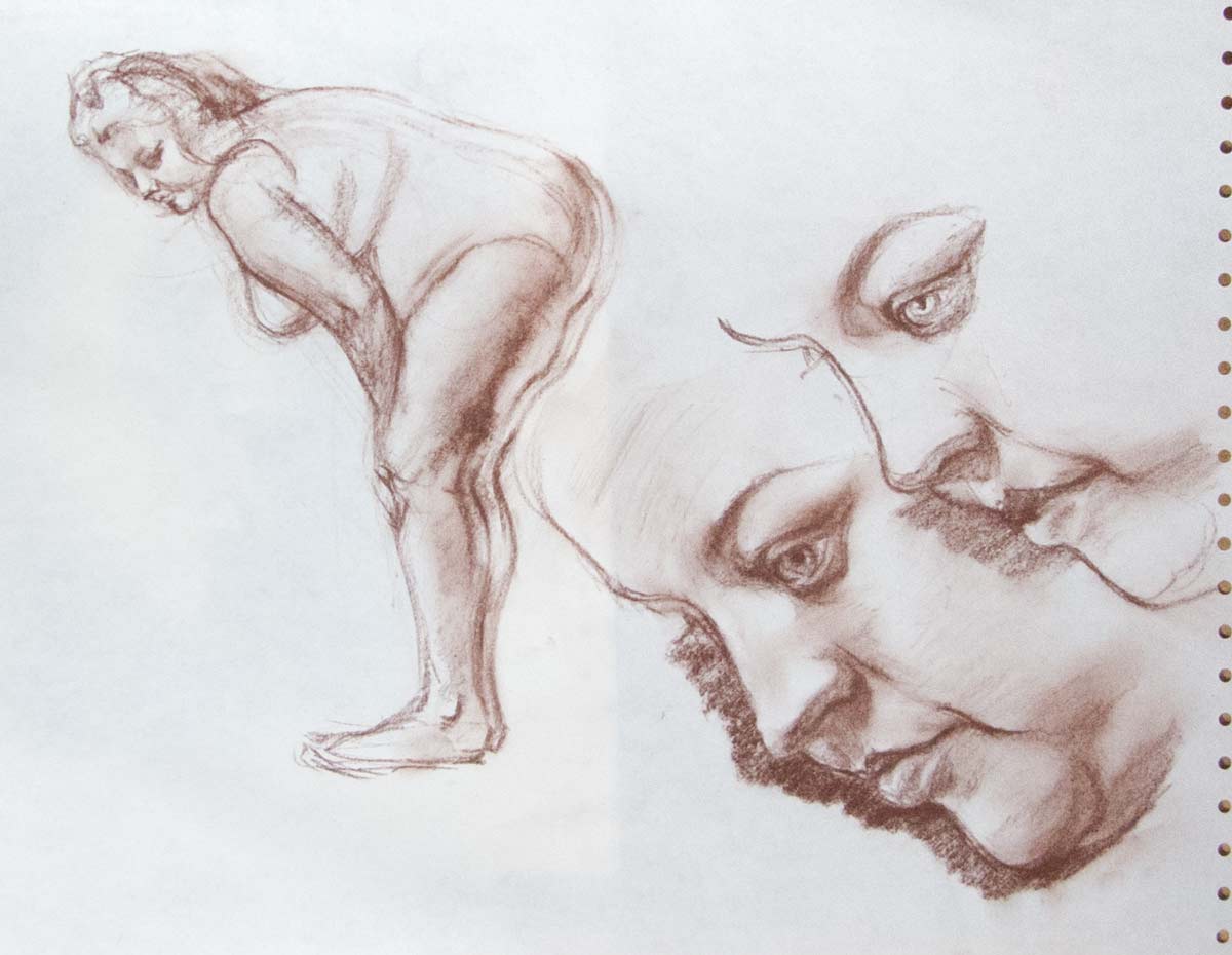
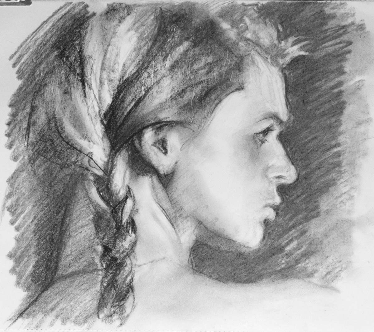
These pictures were made with charcoal or graphite except for the second one which was black and white Conté crayon on a background of gouache. Buried under that grey gouache background is a wiped-out attempt at a gouache portrait where I quickly found out how difficult it is to create smooth blends in that medium. It can be done but it requires some skill. James Gurney talks about it in this post, and has some general advice on using gouache here. Gouache is good for constructing forms from confident, distinct brush strokes. I find it much easier to build up forms with smooth blends and sharp edges using graphite or charcoal, especially when combined with a kneaded eraser.

Photo credits (including some very useful instructional videos):

On Air Video and Croquis Cafe Heads Up

Vincent Xeus

Bradwynn Jones Wake and Draw
Draw This

Alex John Beck

New Masters Academy


Hohenstein copy

Adolfo_Hohenstein_copy_0314

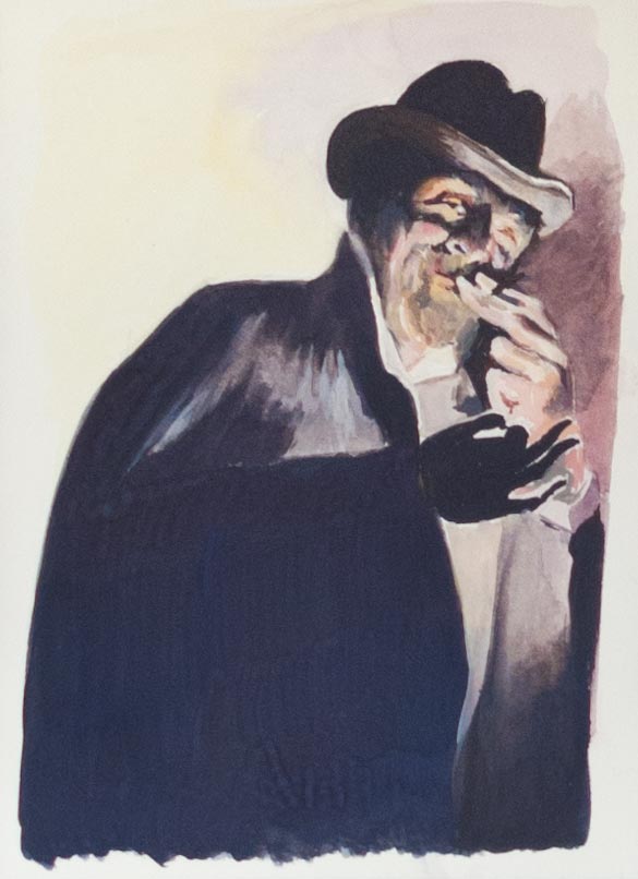
A gouache copy from a poster by Adolfo Hohenstein, inspired by watching Jeff Watts copy the work of master illustrators in his Friday Night Workshop.

In the link above, Jeff Watts gives a three hour demonstration of painting in gouache, full of useful advice. All his demonstrations are well worth watching as they let you look over his shoulder as he works in real time while he discusses his technique and art training in general. Particularly useful in this episode are his thoughts on how the consistency of the gouache paint affects its properties. Thinned down it can be used as a light wash or stain, useful during the initial underpainting. But to take advantage of the unique ability for gouache to reactivate even when fully dried it needs to be applied much thicker, so edges can be softened and colours blended.

It’s one thing to make a copy of these illustrations but quite another to come up with the striking graphic design in the first place. This rather sinister figure is enticing us to buy matches.

light and dark

lake_garda_9872

malcesine_9871

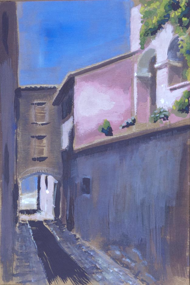
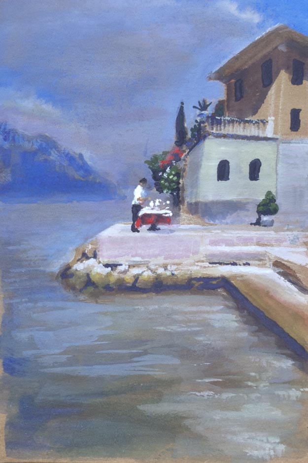
Following on from the previous post, I wanted to create a similar illusion of light areas made brighter by contrasting them with areas of dark, but this time using my own photos as reference – these are taken from a holiday in Malcesine on Lake Garda in Italy.

The picture by the lake seemed to be a bad choice for this experiment as the whole scene is flooded in bright sunlight. The lightest value is on the shirt of the figure in the centre, though the whole of the stone jetty needed to look strongly sunlit. The contrast is provided surprisingly by the distant haze of the receding lake and mountains which even in the bright sunlight appear as a relatively dark blue grey.

In the original photo, the eaves of the house on the right were very dark, almost black. One of the dangers in working from photos is that the shadow detail can often be lost, though in this case I thought that would work to my advantage as I wanted to create more contrast and avoid what James Gurney calls ‘middle value mumbling‘. After painting the eaves nearly black, I tried to add a highlight along the outside edge, but I overloaded the brush with paint and created an unnaturally thick white line. As I wiped it away with a finger, it blended with the dark under-eave colour. The result by happy accident looks much more realistic, with the eaves reflecting the bounced light from below. The house dimensions are way too small compared to the figure in the centre (which is slightly too large) – imagine the size of the figure looking out of the top floor window.

The second sketch was more successful in terms of contrast and perhaps composition but I’m not sure I’ve captured the light glancing across the uneven surface of the pink wall in the centre – it looks more like a wall of drying plaster. This is another hazard of trying to be too faithful to a photograph: what makes sense in a photo might not translate into paint.

glow in the dark

miura_philosophers_copy_9873

A quick gouache copy of Terry Miura’s oil painting The Philosophers.

I’m always struck by how the illusion of glowing, light-filled areas can be produced by surrounding those areas with dark. The strong sunlight transmitted through the red canopies can only appear that bright if the whole scene is painted in a low key. Ignoring the white highlights, the lightest values in the painting are the red canopies and the foreground in the sunlight, but they’re not that bright at all when you examine the paint used: a dull pink/brown for the foreground and a not very saturated lightish red for the umbrellas.

The gouache I mixed up for the background lightened dramatically as it dried, taking away from the illusion. This is perhaps partly due to the matt finish of gouache, but it’s something I need to keep in mind when mixing paints. And somehow I’ve managed to chop the philosophers’ legs off and put them on baby chairs – perhaps that’s what they’re discussing.

lost edges

mystery_writer_9760

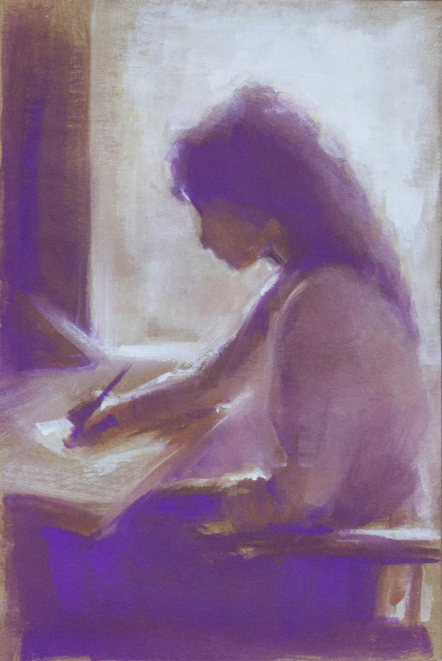
A gouache on Seawhite Kraft paper copy of a picture that I found somewhere on the internet. I forgot to note down the artist’s name when I saved it, something I do religiously now (usually) because it’s frustrating not to be able to find more of their work or to give credit in a blog post.

The Seawhite gouache (04 Mauve) looks almost fluorescent when lit by a daylight bulb. The other colours were burnt umber, burnt sienna (close to the tone as the Kraft paper background), and titanium white, painted with a 3/8 inch flat brush to keep it loose.

I recently discovered the work of Terry Miura who paints in a style I love: a mixture of loose painterly expressionistic brush strokes with areas of tightness and detail. I love the effect of moving from abstraction to realism within a painting. Oh, to be able to paint like him! His blog is a fascinating insight into his working methods and vision. Here’s a list of sticky notes he has taped to his easel to help him with composition:

-Unequal distribution of dark and light masses. Don’t make them 50 – 50.
-Have one dominant color. Additional color masses need to be clearly lesser in visual impact.
-Use a variety of edges on every shape. Lose an edge on every shape if you can.
-Paint the concept, not things.
-Have a hierarchy of interesting areas.
-Manipulate this hierarchy with value contrast, hue choices, saturation, edges, opacity, impasto, brush activity, and textures.
-Big passive area vs. small active area
-You don’t need two big passive areas.
-If the focal point is in light, simplify the shadow. If it’s in shadow, simplify the light.
-If the focal point is in light, lower the key. If it’s in shadow, raise the key.
-Connect shapes wherever you can. (Same thing as losing edges)
-Whenever you break a rule, make sure it looks intentional.
-Repetition and variation. Over do them. Then pull back.
-Less is more.
-Make Only One Statement!

On the top his easel, in big black letters, he has written the word MYSTERY.

exaggeration

bertrand_russell_9666

Bertrand Russell

richard_feynman_9662

Richard Feynman

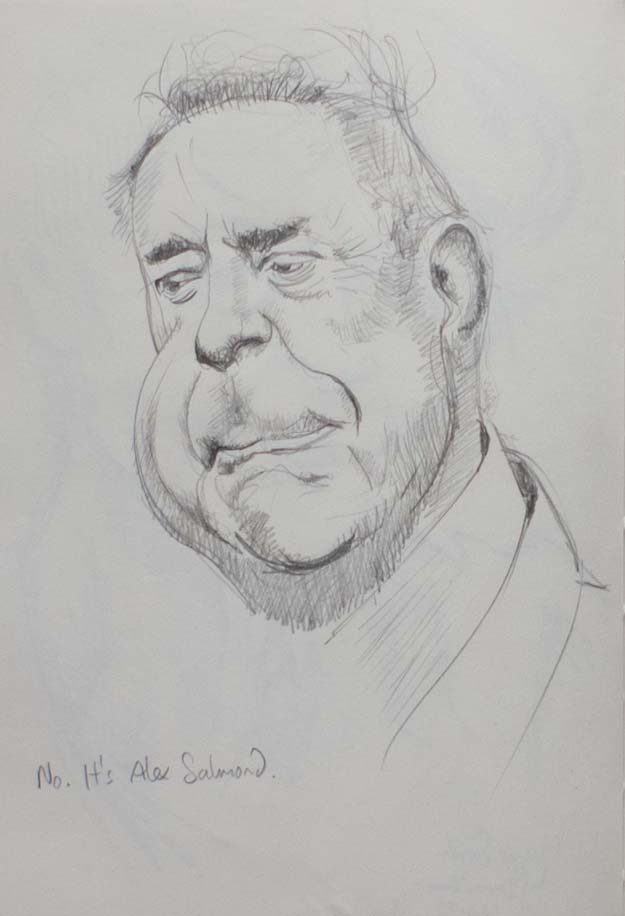
alex_salmond_9664

Alex Salmond

chimpanzee_9664

Pan troglodytes

maggie_smith_copy_9665

A copy of Derren Brown’s sketch of Maggie Smith

maggie_smith_9667

Maggie Smith

tom_jones_9661

Tom Jones

Drawing portraits has been described as making a picture of someone where the eyes aren’t quite right and the nose is in the wrong place. Well, if I’m going to get it wrong, why not really get it wrong and turn the face in to a caricature: find the features which make a person recognisable and exaggerate them.

I was inspired by seeing Derren Brown’s preliminary sketch of Maggie Smith, which I copied (above) as I found it very instructive in the way that he takes a feature, such as a cheekbone or a chin, and then sculpts and magnifies that form independently of what is really there.

I tried to do the same thing with a number of photos found on the web. Other than Alex Salmond’s enormous jowl and Bertrand Russell’s oversized collar, I found it surprisingly hard to exaggerate most features. As I was drawing, I thought I was overstating Richard Feynman’s distinctive high forehead and quizzical smiling frown, but I quickly slipped back into attempting an accurate copy. Perhaps this is a good way to draw a face: aim for an exaggeration then let the natural instinct to draw accurately tone down the caricature into a more lively portrait.

foxhole point

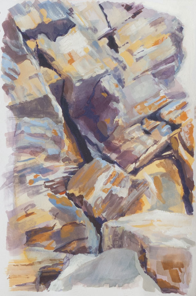
foxhole_point_625_9362

Foxhole Point at the far end of Millook Haven in Cornwall, painted in gouache from a photo.

The colours of the sandstones, shales and slates (I looked it up) in the spectacular geology of Millook Haven are a beautiful mix of purples oranges browns blues and greys. I did attempt some on-location sketches of the rocks, but I envisioned a translucent multilayered watercolour to do it justice. This isn’t it, but I had fun with the gouache.

Compared to acrylics there seems to be much more of a colour shift as the gouache dries. It’s most noticeable at the extremes: the rich deep dark colours of wet paint can dry with a slight matt sheen and lose some of their vibrancy, and whites tend to fade considerably unless applied thickly. The wetness and consistency of the paint together with how well the brush is loaded affect the covering power and final result.

imitation in gouache

wendell_berry_900_9350

I love James Gurney’s sketchbook portraits, often done rapidly with the subject in front of him. This was an attempt to imitate his style using gouache to paint from a paused videoI took heart from watching how he builds up detail from seemingly formless swirls of loosely applied colour using opaque gouache. He also uses casein, but I’m not sure if that’s available outside the US.

I found the gouache dries to a slightly lighter colour, and fresh layers can reactivate the paint below if they are too wet and worked for too long. As always, it’s hard to know when to stop: there’s always more detail to add or corrections to be made. Sometimes it’s useful to keep on painting, just to see what will happen. Other times it seems best to stop early and use later paintings for further experiments.

gouache heads

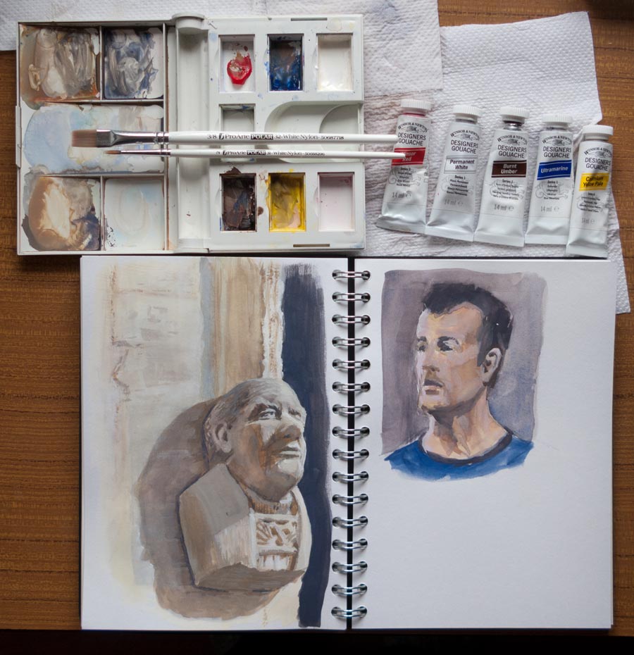
Gouache heads

I chickened out of starting the freshly bound book and carried on using a spiral bound Seawhite sketchbook which contains “all-media” paper, a sized cartridge paper which I’ve found can take a watercolour wash or several layers of fairly dry gouache. Too much pen work with a fine nib will roughen the surface enough for water to get in and break up the fibres.

These heads were inspired by seeing the court drawings of Jane Rosenberg and heads drawn by James Gurney. Both artists manage to divide the head up in to distinct planes which are painted with confident strokes. In trying to imitate that approach I find I fiddle and blend too much, especially when I mix up the wrong colour, with a result that some of the vitality of the figure is lost.

The stone head was snapped in a church doorway near Stoney Littleton, Somerset. The portrait on the right was drawn from a paused video of a David Malan lecture. Paused videos can be a great way to find a specific pose or expression for a quick sketch.

three leaves

leaf-1_625-8909

leaf-2-625_8909

leaf-3-625_8906

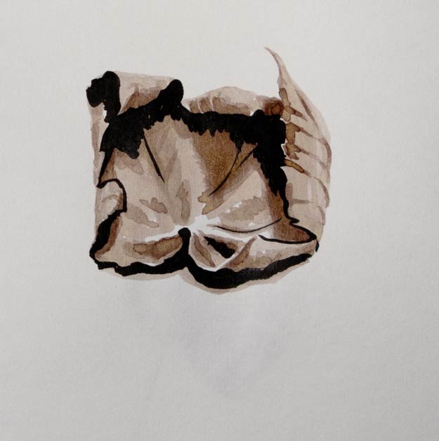
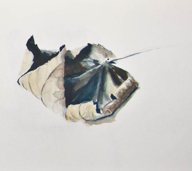
The perennial leaf returns, this time as two quick pen sketches and one in gouache. I wanted to see how different styles of drawing affected the process and the final result.

The first sketch was a simple fountain pen outline with dilute drawing ink for shading (Winsor & Newton Peat Brown in a waterbrush).

The second used a Pentel Brush Pen for part of the outline and also for the darkest shadows. Now the pen had two roles: outline and shading. Extra shading was applied with the dilute ink as before, but now the black ink of the brush pen presented a problem: do I describe an edge with a black line as I did with the fountain pen, or do I make the drawing more painterly by using black ink only for the shadows.

The final gouache painting was in some ways the easiest as none of these decisions about edges or shading had to be made. The paint was mixed to match the hues and values, and laid down in a copy of the shapes in front of me. In other words, no translation had to be made. There was no need to question whether to use a black ink line to draw an edge that was facing the light, for instance, which is where I became confused in the second ink brush sketch.

Drawing with ink seems to need a different ‘eye’, a different way of processing what I see, compared to a more literal approach when using paints. I find the simple ink line needs much more thought before it can be laid down.