Category Archives: ink

Gurney challenge

gurney-challenge-sketchtesting-1200px-60q

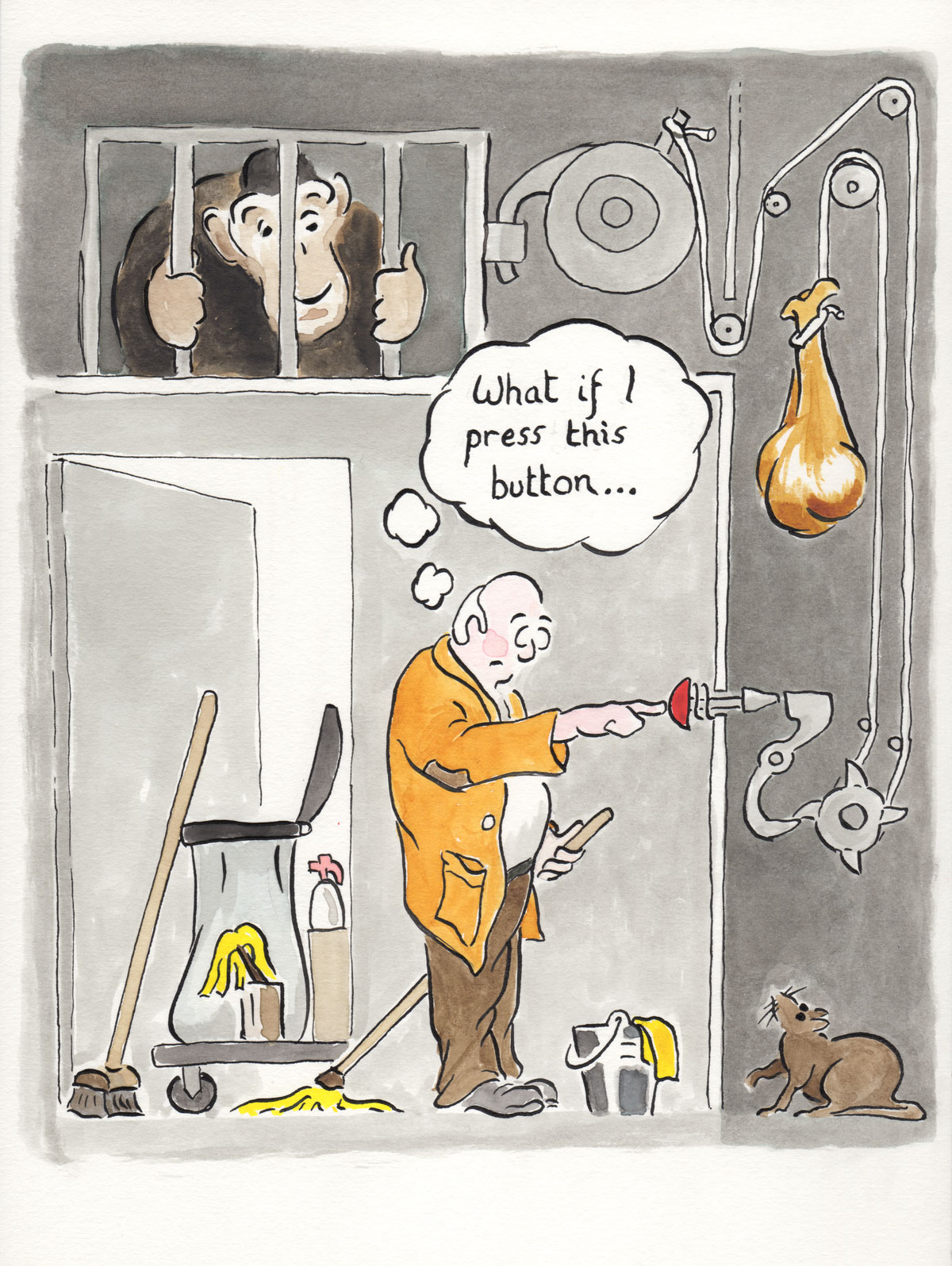
A cartoon made for James Gurney’s six word story challenge, using a dip pen and Indian ink, dilute Lexington Gray ink in a waterbrush and watercolour.

It began with lots of pencil doodles of individual items and general layout. The monkey started out as some kind of fish creature, the buckets and mops moved around, and I had to make many adjustments to the Heath Robinson machinery.

It was all really an excuse to get the dip pen out again. The variation in line weight and the blackness of the ink is very satisfying. The index nib ran over the sized heavyweight cartridge paper quite well, and the waterproof Indian ink allows watercolour and ink washes to go on later. The greys were built up with multiple layers of dilute Noodler’s Lexington Gray ink (hat-tip to Ed.)

There’s no undo button with this kind of drawing, something that I became very aware of the further it progressed.
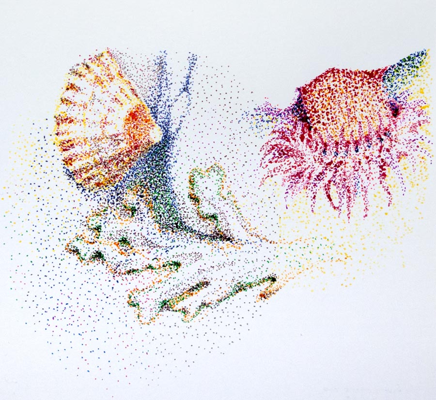
join the dots

seaworld-900_9695

Various critters snapped in a Cornish rockpool earlier this year, drawn with a dip pen and ink.

I used the ink straight from the bottle, so the nib (Gillot 404) had to be cleaned before each change of colour to keep the bottles pure, but I also cleaned the nib after prolonged use of one colour to avoid the build-up of dried shellac.

Previous sketches showed how even a light pencil lay-in would get trapped under the ink and could not be erased, so everything had to be drawn directly on the page, but the pointillist gradual build-up of dots prevents too many quick mistakes.

ink wash

diamine_dali_8967

diamine_fancy_dress_8965

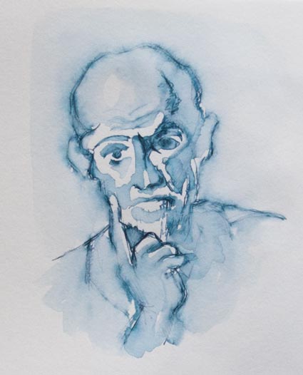
After spending some time filling pens with permanent, waterproof inks, I’ve ended up going for the opposite effect by dissolving Diamine Prussian Blue with a waterbrush. I love the blue-black colour of Prussian Blue, and the dissolved ink fades out the drawn line in a satisfying way to make an ink wash which becomes permanent once dried.

The top picture is a copy of a Dali study. The figures in fancy dress were drawn from a photo of my grandmother’s works party, taken around 1925. I’ve made them look a little sombre; they’re having much more fun in the photo.


three leaves

leaf-1_625-8909

leaf-2-625_8909

leaf-3-625_8906

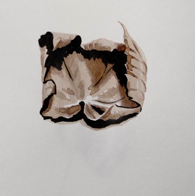
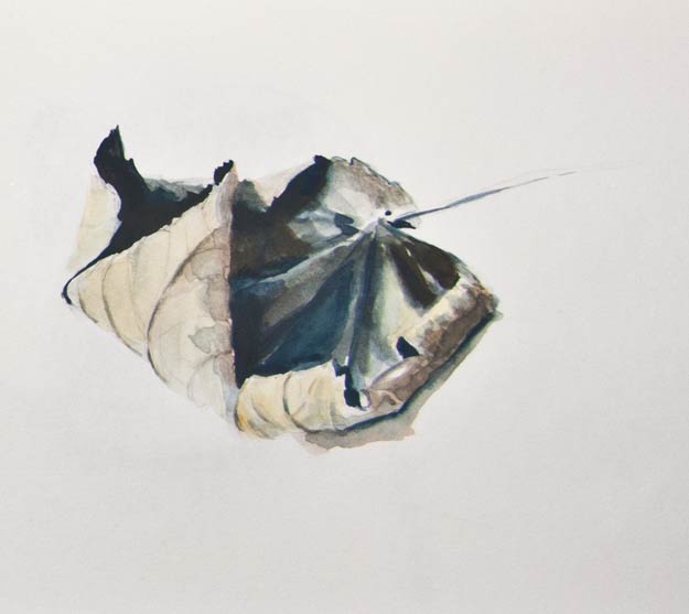
The perennial leaf returns, this time as two quick pen sketches and one in gouache. I wanted to see how different styles of drawing affected the process and the final result.

The first sketch was a simple fountain pen outline with dilute drawing ink for shading (Winsor & Newton Peat Brown in a waterbrush).

The second used a Pentel Brush Pen for part of the outline and also for the darkest shadows. Now the pen had two roles: outline and shading. Extra shading was applied with the dilute ink as before, but now the black ink of the brush pen presented a problem: do I describe an edge with a black line as I did with the fountain pen, or do I make the drawing more painterly by using black ink only for the shadows.

The final gouache painting was in some ways the easiest as none of these decisions about edges or shading had to be made. The paint was mixed to match the hues and values, and laid down in a copy of the shapes in front of me. In other words, no translation had to be made. There was no need to question whether to use a black ink line to draw an edge that was facing the light, for instance, which is where I became confused in the second ink brush sketch.

Drawing with ink seems to need a different ‘eye’, a different way of processing what I see, compared to a more literal approach when using paints. I find the simple ink line needs much more thought before it can be laid down.

Roots

roots-scan153

Lexington Gray ink in a Pilot 78G ‘F’ fountain pen, with a light watercolour wash, copied from a photo. After a while I started seeing double, trying to keeping track of which root was which.

This was drawn in a Daler Rowney Ebony A6 sketchbook which has 150gsm acid free cartridge paper. The fine ‘F’ nib on the fountain pen did start to break up the paper a little in the overworked darker areas, but this wasn’t really a problem. In fact the paper can take a light watercolour wash without bleeding through or buckling too much.

Insert bridge pun here

Victoria_Bridge_8559

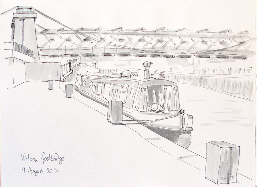
This was an attempt to speed up my from-life sketching. I’m not sure exactly how long it took as I lost track of time, but by the time I finished the sun was going down and my legs had gone numb, so more practice needed.

Dilute Lexington Gray ink in a waterbrush made the shading very satisfying to apply. Each application builds up the tone, making it quite versatile.

waterbrush and ink

alan-watts_8467

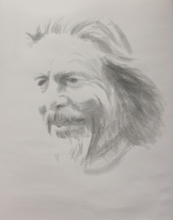
A sketch from a photo of Alan Watts using dilute Lexington Gray ink in a waterbrush, which enables shading to be quickly added as layers of ink are built up in to different tones.

This ink made by Noodler’s is usually only available in the US, but recently supplies have been available in the UK.

Distilled water is best for diluting the ink as it keeps an even flow through the waterbrush, though tap water is fine.

The great thing about Lexington Gray is that it’s suitable for fountain pens but is also permanent once it contacts the cellulose of the paper. This means a wash or watercolour can be added to ink drawings. This would usually only be possible if Indian ink was used. Indian ink contains shellac which sets hard and makes the ink waterproof on paper but can destroy a fountain pen if left to dry.

winged skulls

flying-skulls_8257

A work in progress, experimenting with techniques:

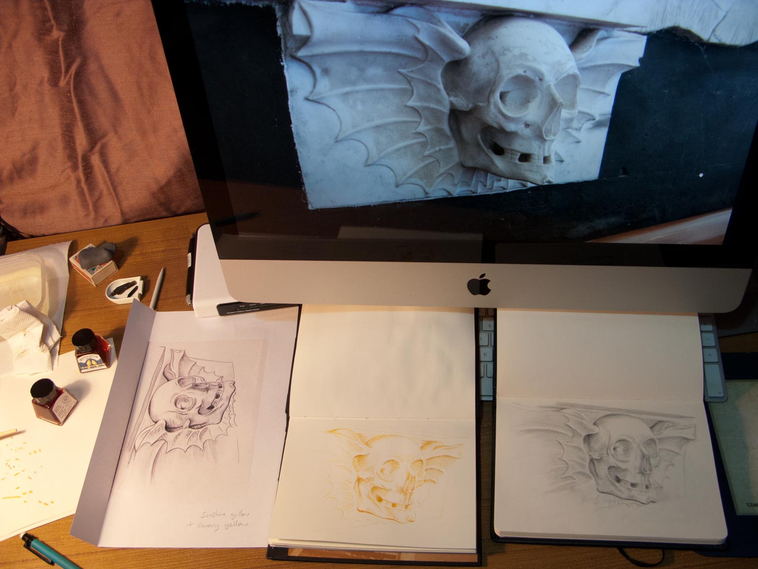
Flying skull death head snapped in the chapel behind Dyrham Park manor house, drawn with pencil (a nicely soft 0.7mm Pentel Ain Stein 2B, if you’re getting geeky), then scanned and printed (left), the back covered in 6B pencil then drawn over with a ballpoint pen to trace the outline onto another page (middle). The traced outline was then shaded with a dip pen with a mix of Winsor & Newton canary yellow and sunshine yellow. Took this pic as the next stage was to attempt some stippling with a darker ink, which would probably turn it to mush.

In some ways the cartoony one on the left probably looks the best of the three, even though that was just used for transfer. Ho hum.

The composition lacks some punch. More contrast needed, perhaps.

stippleskullington-scan194

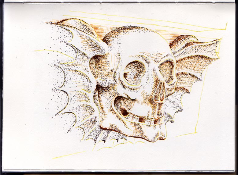
Mr Skullington has now been stippled. There’s a strange effect where the stipple seems to follow the lines of the underlying yellow/orange crosshatch even though I was doing it randomly. Maybe it’s something to do with the dried ink being slightly raised and attracting the newly-laid ink.

Still not enough oomph, somehow.  I was hoping it would be more Leonardo’s notebook.

José Guadalupe Poseda

Poseda-scan168-625

Whenever I use a dip pen and a bottle of ink I’m waiting for the moment when the bottle tips or the nib explodes. It keeps you on your toes.

This was drawn on cartridge paper using Indian ink, which bled through and glued together the next few pages.


dip pen leaf

dip-pen-leaf_8180

A sketch of an old leaf kept on my windowsill as a convenient and recurring subject, this time using an index nib dipped in Dr Ph. Martin’s Bombay Black Indian ink. The paper is Bristol board which doesn’t bleed with heavy applications of ink and provides a hard, even surface over which the nib can glide smoothly.

I found the nib in Meticulous Ink (Walcot Street, Bath), and bought it as much for its wonderful design as for drawing. A reservoir of ink is kept in the palm of the hand. It turned out that it is surprisingly smooth to draw with, compared to some the smaller, scratchy Gillott nibs.

index-nib_8181