Category Archives: oil

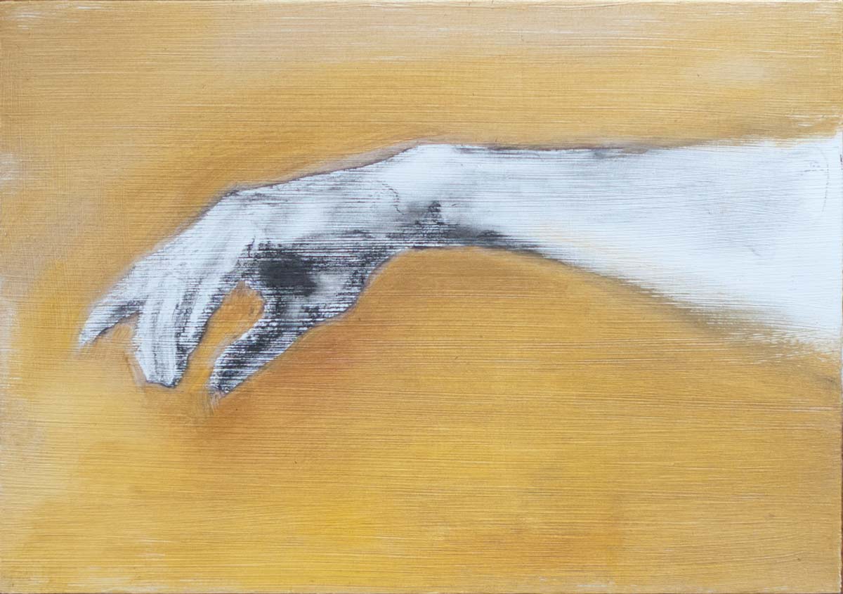
oil on charcoal

More experiments with aluminium composite panels, this time on the smaller A5 size. I wanted to see how a vine charcoal pencil would behave on the acrylic gesso surface. Sometimes it’s useful to draw using the precision of a sharp point. And sometimes it’s easier to draw with a pencil grip rather than holding a brush that can only be moved over the surface in certain ways. The question is how to transform that drawing in to a layer of oil paint.

Many people draw directly on canvas then use a spray fixative. Cesar Santos uses this method but has warned against using too much fixative as it creates a weak paint layer.

I found the charcoal draws quite well (albeit with a line tone effect due to the brush strokes in the gesso) and can be lifted off with a kneaded eraser. The paint can be applied directly over the charcoal, but to avoid the whole thing turning into a grey mess it’s necessary to work on only one area of tone at a time and to make sure those values are matched before moving on to the next area.

It’s a bit laborious to do it this way (without the fixative) so I’ll probably stick to using a transfer drawing for any precision areas or to get the overall composition placed correctly. After that, I’ll use a block-in with a brush directly on the canvas, or a wipe-out method for a more tonal drawing. But drawing in charcoal is so much fun, and this alone will make for a more dynamic picture.


live memory

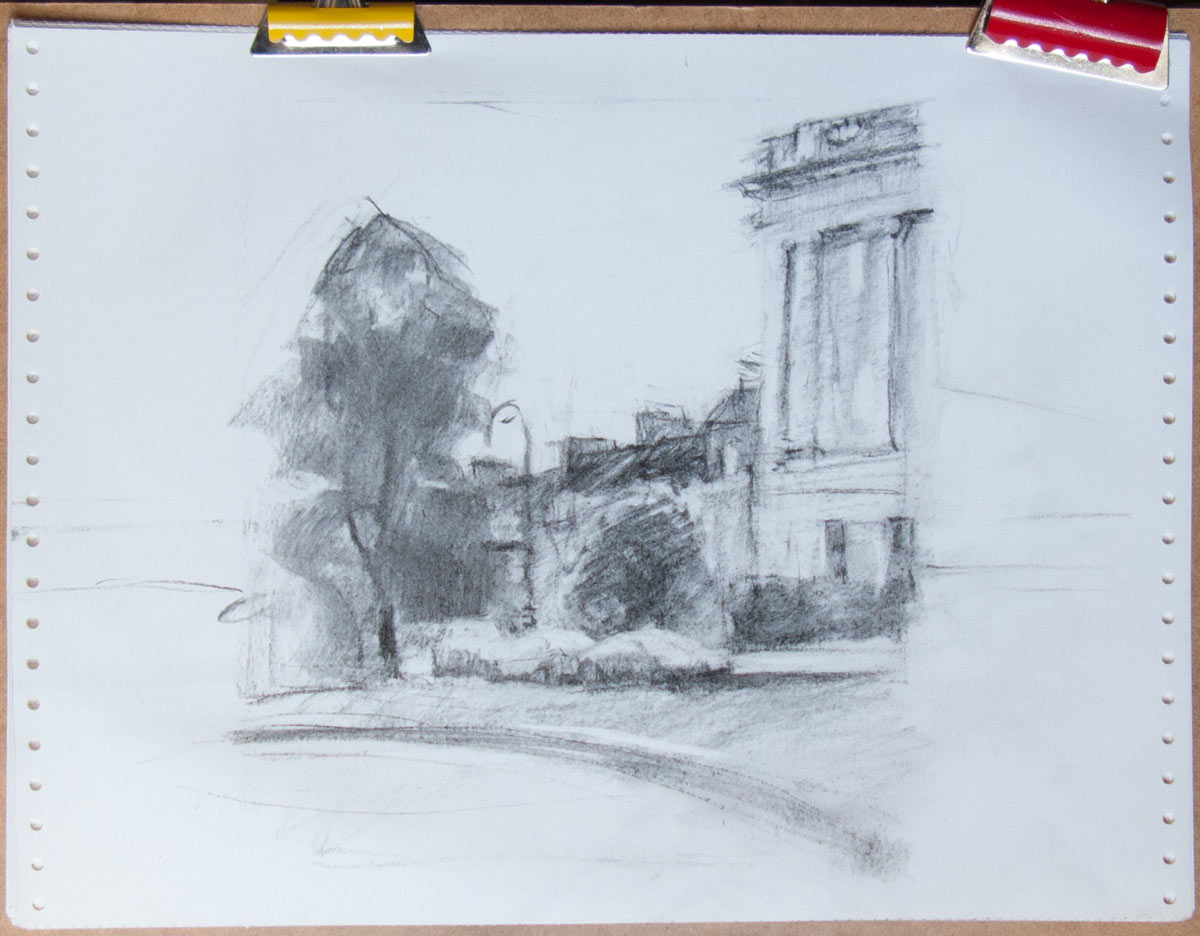
The end of the Royal Crescent in Bath, painted in oils on the new aluminium composite panels.

This began as a pencil sketch made on location but was painted at home on the easel. I revisited the scene a couple more times at the same time of day to make further pencil sketches of details and light effects. The late autumn mid-afternoon light created some interesting edge lighting on the trees and columns.

Various sketch references and an acrylic colour study. The vine charcoal sketch below was useful for overall composition. The original pencil drawings and other notes are in the spiral-bound sketchbook. The aluminium composite panel was attached to the easel with tape and Blu Tack.


I took a reference photo which was useful for correcting proportions and details, but many of the important light effects in the scene were lost. The strange thing was that they were there in the photo, but somehow they had been flattened out and weren’t noticeable.

In the continuing debate about painting from life against painting from photo reference, I found this approach of doing both worked quite well. The most important thing I found was that drawing anything for any length of time has the effect of imprinting the scene on memory — not so much the overall composition, I still needed the sketch and photo for that, but the sense of depth, the subtle lighting effects and the overall atmosphere of the scene. For instance, there was a shift in the warmth of the stone between the crescent in the foreground and the buildings behind. And the road in the middle-ground has a steep camber which somehow added to the depth of the scene.

As I was making the first pencil sketch, leaning on the cast iron railings in front of the crescent, the late afternoon sun came out from behind the clouds and flooded the scene with golden light. The edges of the trees and buildings lit up, and everything else was plunged in to deep, warm shadow. It was a completely different scene and it only lasted a few seconds. It would have made for a more dramatic picture, and it certainly made me aware of how ‘light’ and ‘dark’ in our visual perception are relative to their surroundings.

All these memories played in my mind as I was painting, and it certainly made the process of painting much more interesting. Whether I can capture these perceptions using oil paint is another matter, but I certainly won’t be able to paint what I didn’t see in the first place.


in search of the perfect panel

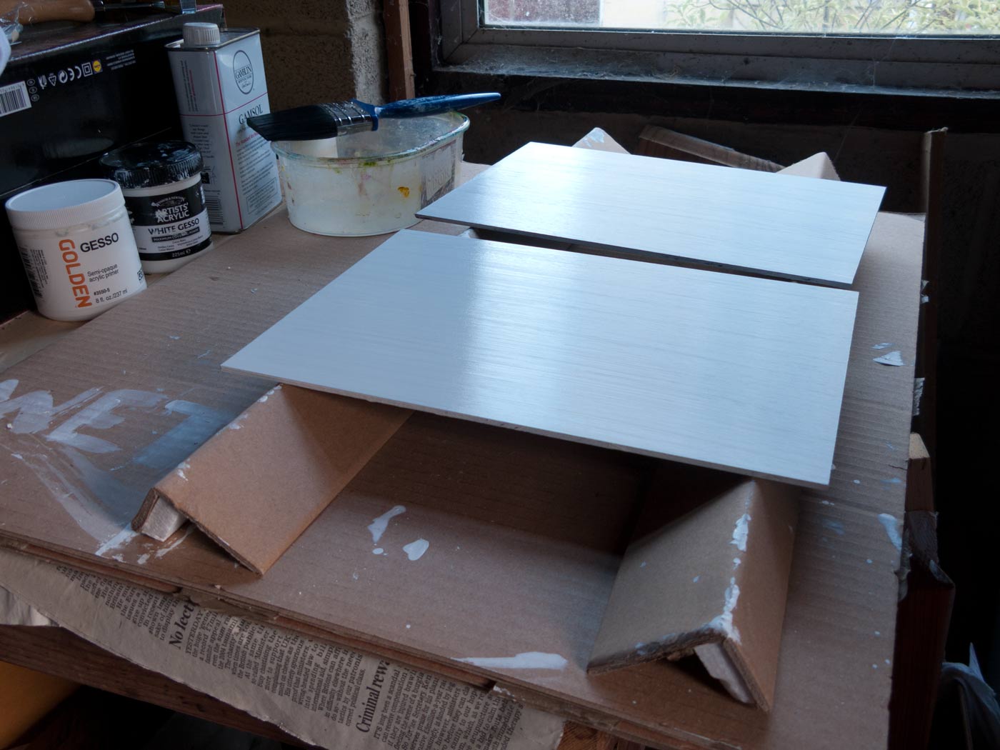
First layer of acrylic gesso on A4 aluminium composite panels.

I had been meaning to experiment with using aluminium composite as a support for some time as it has many useful properties:

  • It doesn’t warp much, even at fairly large sizes (up to at least a metre).
  • Takes up much less space than stretched canvas.
  • Doesn’t rot, split, degrade or otherwise fall apart (so I’m told).
  • Provides a solid surface (which I prefer) compared to the bounciness of stretched canvas.

A friend who works in a sign shop gave me an offcut to experiment with. This is 3mm aluminium composite (a sandwich of two thin sheets of aluminium with a polyethylene or polyurethane core). Some kind of polycarbonate surface is baked on at the factory and can come in a range of colours. It’s this surface rather than the aluminium itself which the painting ground will adhere to. Painting on bare aluminium can apparently lead to adhesion problems due to aluminium forming a thin (and crumbly) layer of oxide on its surface.

Preparation

I basically followed the instructions given by Kate Stone in her very useful post More Apocalypse-Surviving Panels which gives all the details about how to prepare these panels. I suggest you go there if you need step-by-step instructions. I went with the ‘acrylic dispersion ground’ option as I’m used to painting on acrylic ground and it seems to be the simplest method.

So the trick is to lightly abrade the coloured surface enough for a layer of acrylic gesso to form a mechanical bond. I used a medium grit sandpaper to create an even scuffing of the surface, enough to take the shine off the surface but not enough to wear through to the bare aluminium. I did try using a small electric sander but found it created hot-spots of bare aluminium, so doing it by hand is the way to go.

After sanding the surface and smoothing down any sharp edges, clean the surface with rubbing alcohol (I used a bit of Gamsol) to remove the dust and grease. Then build up thin layers of acrylic gesso using a house-painting brush. Four layers seems to give complete coverage (see the right-hand section of the test panel in the photo). Allow each layer to dry before applying the next and alternate the direction of the brush strokes for each layer. Many thin layers will be mechanically stronger than fewer thicker ones. Add a little water to the final layer for a super-smooth surface if desired, but I prefer a surface with a little more tooth provided by the ridges from the application brush.
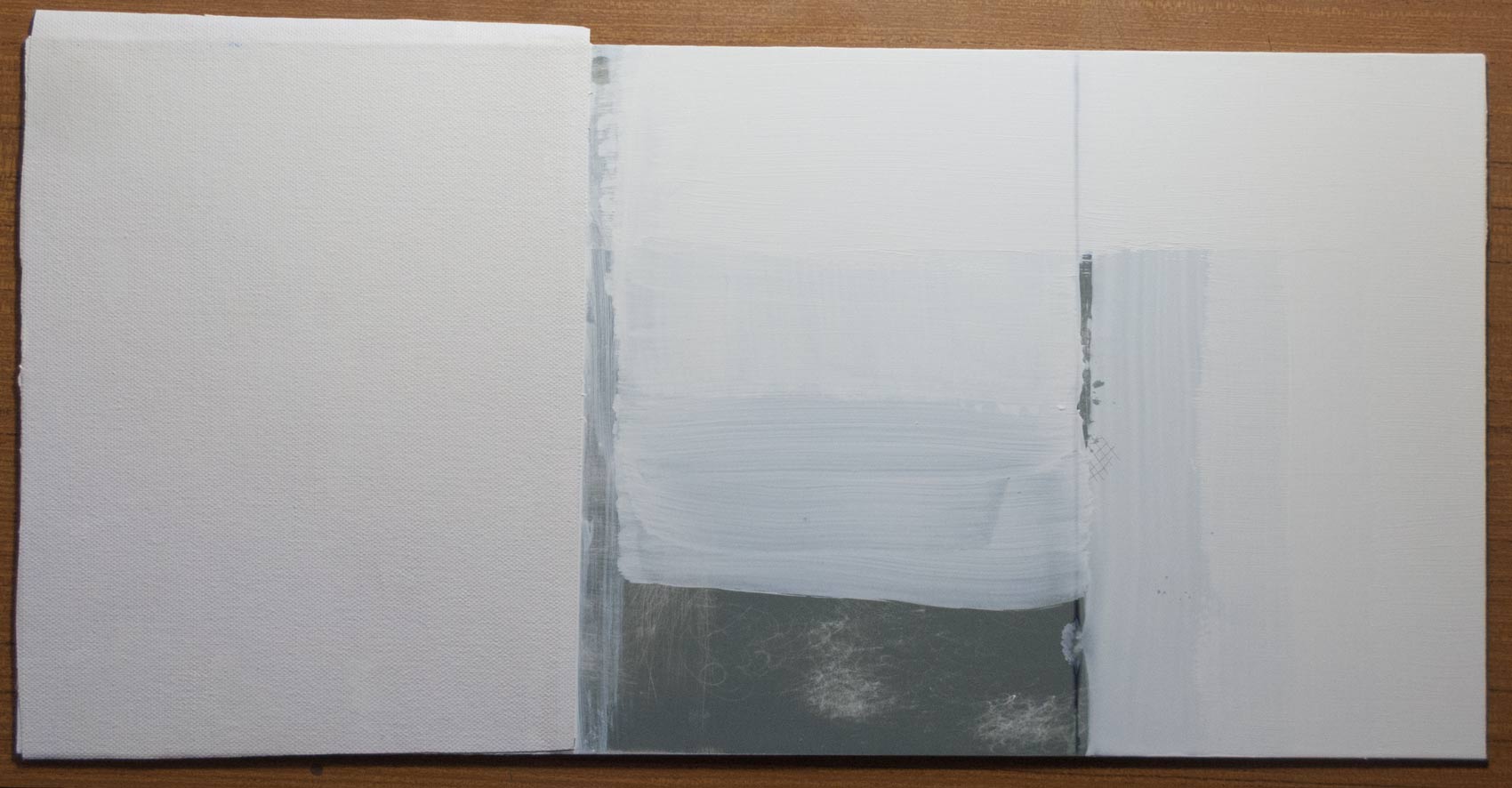
Testing on an offcut of aluminium composite. Left: Canvas sheet attached with acrylic gesso; Middle: gesso over a base of GAC100; Right: four layers of acrylic gesso.

I also experimented with attaching a sheet of loose canvas to the panel using either PVA glue or GAC100 (a type of acrylic used for extending acrylic paint and for sealing surfaces). I didn’t find either was a particularly good adhesive in my limited experiments.

Compared to the other two, the best adhesive by far was, once again, acrylic gesso. I sanded and cleaned the panel surface as before, and added one thin layer of acrylic gesso which I allowed to dry. The second layer of gesso was a bit thicker as some of it would need to soak in to the weave of the canvas. After smoothing out the canvas with a brayer to remove any wrinkles or air bubbles, I put a layer of plastic wrap from some old packaging on top, then weighed the whole thing down with a flat board and anything heavy I could find.

There is one problem at this stage, which is that the wet acrylic gesso is effectively sandwiched in an airtight layer between the non-porous panel and the plastic protective sheet on top, making it slow to dry. I conducted these tests in a damp midwinter, so dryer, warmer conditions might help. Once or twice I would remove the weights and plastic for half an hour to let the surface breathe before weighing down again.

It seemed to work well. The canvas surface was very even. As a test I peeled back the canvas from the panel and, although it wasn’t welded on, it required a fair amount of pull to remove it, and it peeled back evenly with no bubbles or weak points, suggesting a good bond.
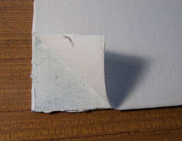
Canvas sheet adhesion test.
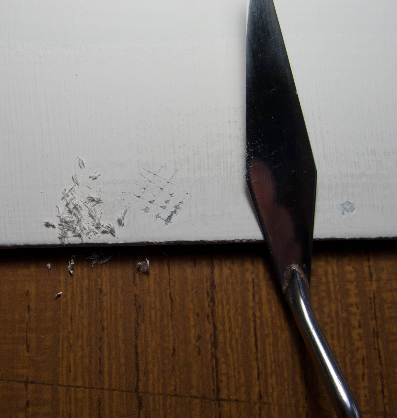
Panel abuse with screwdriver and palette knife.

I then attacked the plain gesso surface with a screwdriver. I gouged in a crosshatch of lines a few millimetres apart then stuck on some adhesive tape as firmly as possible before ripping it off. Next, I scraped away at the surface with some force using the edge of a metal palette knife. The results of all this abuse can be seen in the photo. The gouged squares did lose some of the paint from the corners where I repeated scraped at them, but this was limited to the corners where the screwdriver had already broken the surface right down to the aluminium. The whole square didn’t come away and nothing suggested that this was a weak or flaky surface.

So based on my limited testing, either a plain acrylic gesso surface or canvas glued to the panel with acrylic gesso will provide a solid ground for oil painting.

Suppliers

Aluminium composite comes under many trade names (one of the original manufacturers sells it as Dibond). Many brands are cheaper Chinese imports and I’ve heard they can vary in the thickness of the aluminium layers and in the material used in the central core. It’s not always clear exactly which brand you’re buying, and some suppliers advertise as Dibond but say they may substitute for an equivalent brand. For our purposes, we just need a panel that won’t warp or dent too easily.

Some people buy large panels and cut them to size using a table saw, or even cut the panel with a craft knife and some determination. (See Amanda Teicher’s video on cutting panels by hand, which contains useful advice on preparing Dibond in general).

I shopped online for a supplier who would cut panels to any size. The single-sided panels are much cheaper (the reverse side is bare aluminium) but only come in white; a coloured surface would make it easier to ensure an even coverage of gesso. After including delivery costs and VAT, it worked out at roughly £1.70 for an A4 panel and £3.40 for A3. By comparison, the cheapest uncradled gessoboard found online costs around £5 for a 20 x 30 cm panel (roughly equivalent to A4 size) and around £9 for 30 x 40 cm (roughly A3). Of course, there’s still the time and effort needed to prepare the aluminium panels and the cost of a tub of acrylic gesso, but it’s certainly affordable.
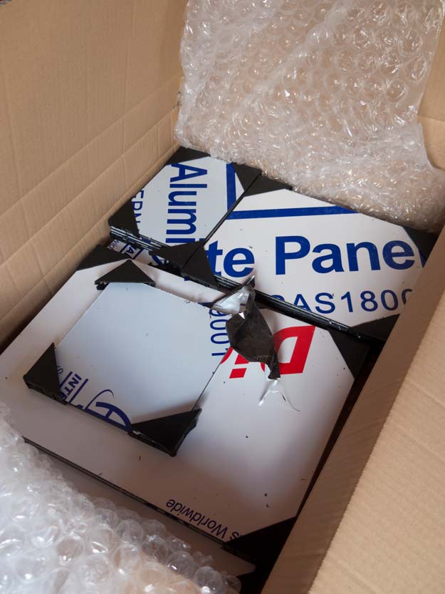
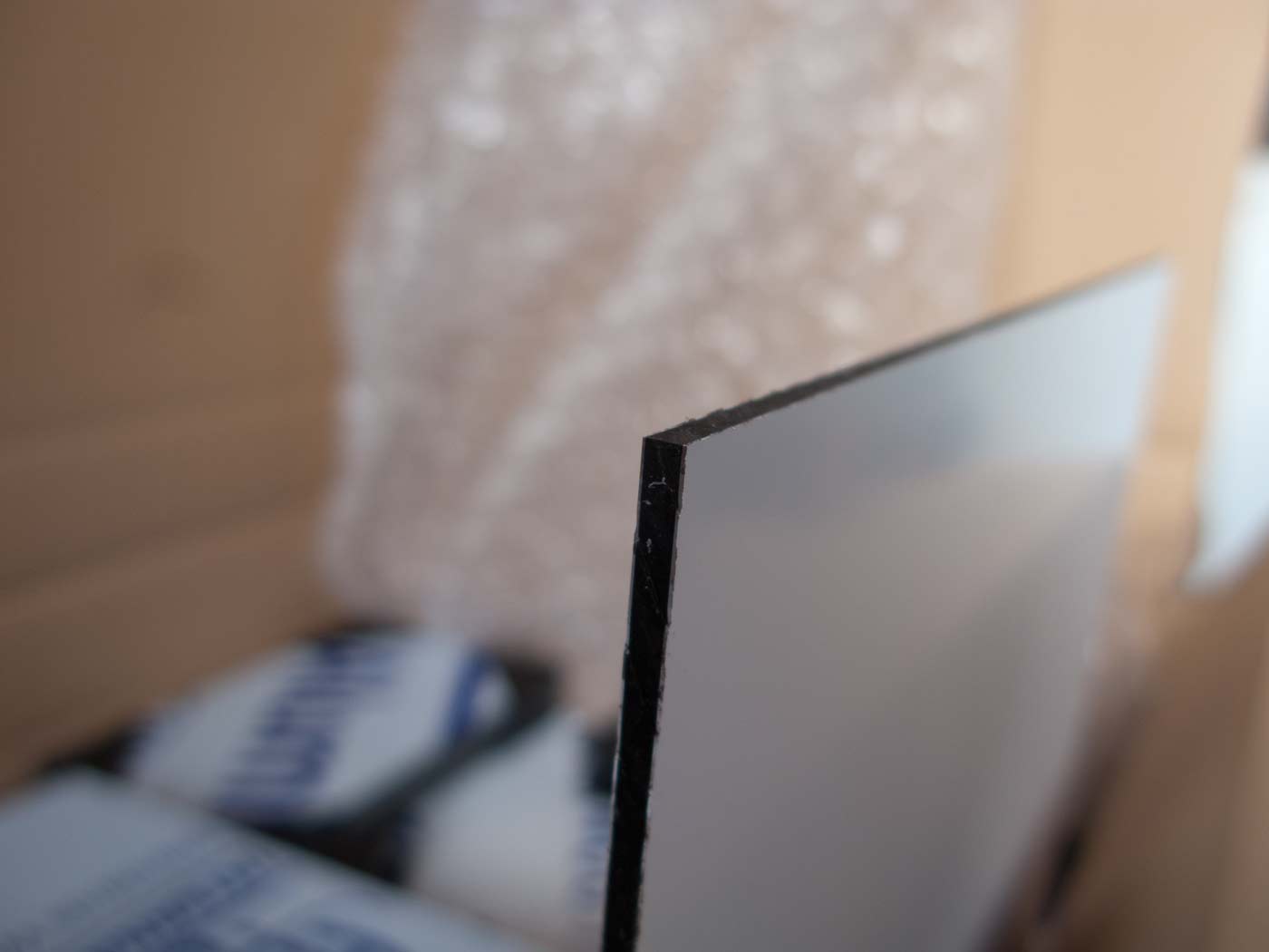
On delivery, I found that the aluminium sheets in the composite sandwich were slightly thinner than the sample I had been working with. It felt slightly less rigid but was still almost free of any warp at A2 size (420 x 594 mm), and being non-porous there is less concern about the effects of primers or water-based grounds causing warping. So no need for sealing, or priming both sides, or bracing, which might be necessary for wood-based supports.

And there’s something to be said for preparing your own panels. Before you’ve even laid down the first brush stroke, you’ve invested some time, effort and care into creating this surface.
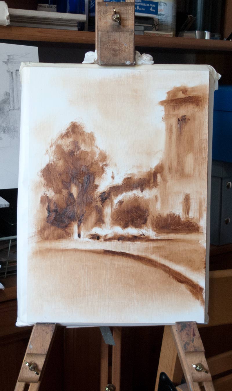
But what’s it like to paint on? It’s too early to say at the moment, but first impressions are good. I created this wipe-out underpainting using only burnt umber oil paint straight from the tube with no solvents. The paint could be easily faded back with kitchen paper, and the slightly toothy surface took the paint evenly from the brush.

To be continued…
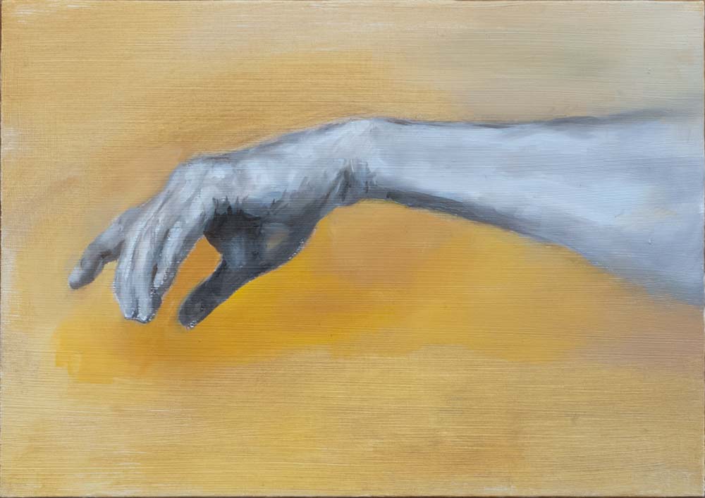
 

off the grid

I wanted to practice laying down oil paint in smooth, even blends, like in those classic pictures of old with their ceramic finish and no visible brush strokes. Bouguereau could do it, so why couldn’t I?

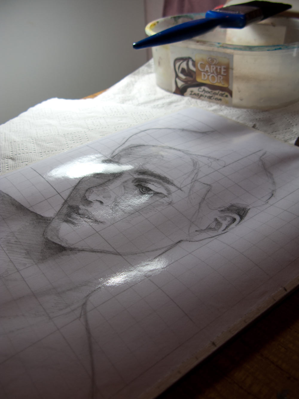
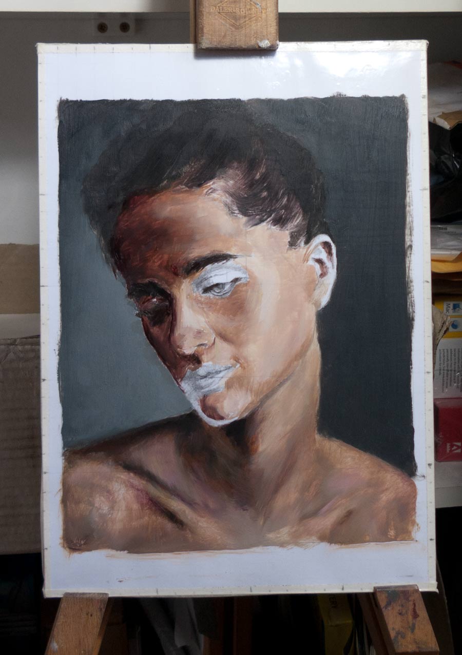
To practice this, I decided to do a straightforward copy in oils of a photo by Jérôme Bonnet of Loulou Robert. I liked the lighting and the classical pose. In the rush to get painting, I botched the initial lay-in, and after a number of failed attempts I decided to bypass the whole drawing phase and copy the photo directly using a grid. The grid was drawn on Bristol illustration board and a matching grid was overlaid on the on-screen photo reference. The tight grid ensured that the freehand pencil drawing would never stray too far. It was a shortcut to get to the fun part of the painting. I would worry about becoming a decent draughtsman some other time.

I’d read that James Gurney covers his initial drawings on illustration board with a layer of acrylic medium to seal the drawing and provide a base for oil paint. So I painted over the illustration board with a thin layer of acrylic gloss glazing medium (which was all I had to hand). The thin 220 gsm illustration board warped as it absorbed the water from the acrylic medium, despite being taped down. It did flatten back down later, and the result was effectively a plastic-laminated pencil drawing.

As I found out later, acrylic matt medium would have provided more tooth. The gloss surface is very slick and doesn’t grab the first oil paint layer; the brush tends to smear the paint around rather than being drawn evenly from the bristles by the tooth of the surface.

And this experiment brought to an end to any thoughts as to whether drawing a grid is ‘cheating’ or not. The pencil drawing quickly disappears below the first thin layers of paint, the guidelines are gone and you come face to face with the limits of your own ability to draw. I found that hairlines would go up, jawlines would go down, eyebrows would shift around. They were small inaccuracies, but they mounted up, until the face was no longer a recognisable likeness (or in this case, even recognisably female).

Successive layers of paint were easier to paint on than first slick acrylic layer. I used some Galkyd Slow Dry medium to smooth out the blends, but probably overused it as sometimes the paint would bead-up. The hoped-for ceramic finish began to look more like the surface of the moon after the repeated attempts to model forms and match colours.

I ended up printing out the reference photo and trying to copy it sight size. I was aiming for a close match to the original, both in layout and in colour. Of course, this meant that the best this painting would ever be is a replica of a printed photo.

Although this is necessary practice that highlights the many difficulties in handling oil paint, I’ve got to the stage where it feels like I’m trying to patch up a bad job, and I’m not sure the goal of replicating a print-out is worth aiming for. The foundations are wrong, and any improvements to the painting are mainly due to fixing mistakes rather than building up a picture with a process of progression and refinement. So, the picture remains half-finished on the shelf. I’ll take it out from time to time to experiment further or to try something new. But for the moment, I need to rip it up and start again.


all at sea

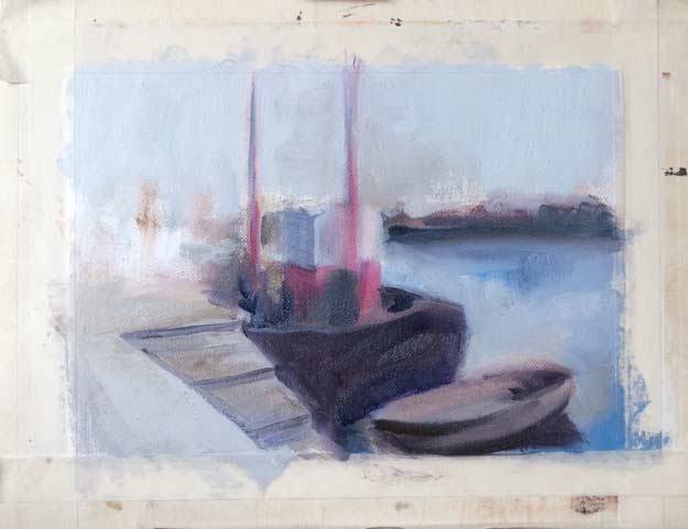
I took one of the value studies from the last post for this experiment. This painting in oils is a work in progress, based on a slide taken by my grandfather many decades ago. I’m experimenting with textures, colours and perspective.

Perspective has proven to be the biggest challenge. I thought I had a reasonable understanding of the basic theory — vanishing points, horizon lines, fields of view — but the practice of actually drawing objects in space threw up some problems.

Even though I was pretty much copying directly from a photo, I wasn’t aiming for a completely accurate copy. Instead, I wanted to be able to move things around a little or even invent things completely but still be able to make the objects and figures work together believably in the final composition.

Despite the charcoal value study, the first attempt was just a bad composition. Even though all the elements that I wanted to paint were included in the picture, there wasn’t enough space at the bottom and the composition looks cramped.

I pretty much erased this completely by scraping back and painting over.

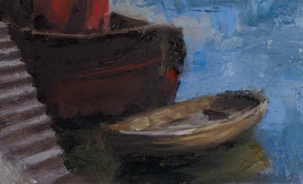
Next, I had trouble in making the rowing boat sit flat on the water. It’s almost perpendicular to the harbour wall, but not quite, so it almost shares the same vanishing points as the harbour wall, the steps and the boat (which is moored parallel to the wall). Boxes in perspective are relatively simple, but this rowing boat has all sorts of curves and bulges which complicate things.

The most important angle to get right, I found, was the shadow shape at the rear of the boat. It has an acute angle going off to the left vanishing point, then a curve down, following the near side of the boat. This doesn’t look right in the picture above, and the overall size of the boat is wrong.

The boat is sitting better on the water now, though I think the reflection on the right needs some correction. Even though the brush strokes are fairly rough, I’m reminded of the Stapleton Kearns neck tattoo: “LOOSE HANDLING WILL NOT DISGUISE WEAK DRAWING!

Next, came the figures on the left. Again, they’re based on the slide, but I wanted to be able to move them around and change them at will. The main problem is that the man on the left is too small compared to the woman and boy. Andrew Loomis has some useful illustrations in his book Successful Drawing (available in print, but I think there are some PDFs floating around the internet somewhere). He states the rule for scaling figures on the ground plane:

All figures of the same height, when standing on the same ground plane, will be crossed by the horizon at the same vertical point on the figure.

In other words, if you’re looking at a number of figures on the harbourside who are all of the same height but standing in different positions relative to the viewer, the horizon line will cut through all the figures at the same point. In this case, the horizon line cuts through the figures at roughly hip level. So if they are all the same height, the horizon line should pass through all the figures at hip level, no matter where they are standing.

In this painting, however, the figures aren’t the same height — the man should be taller than the woman and boy. So, I’ve drawn a very small man!

Here is the original with a perspective grid overlaid. (Click the image for a larger version.)

And here’s the figure on the left at a more believable size, corrected in Photoshop.

Ok, enough theory. Time to get the brushes out again…


mind the gap

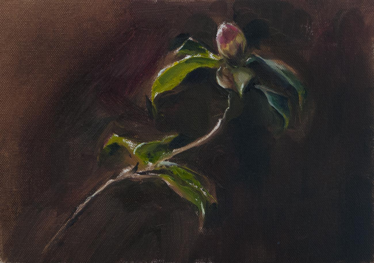
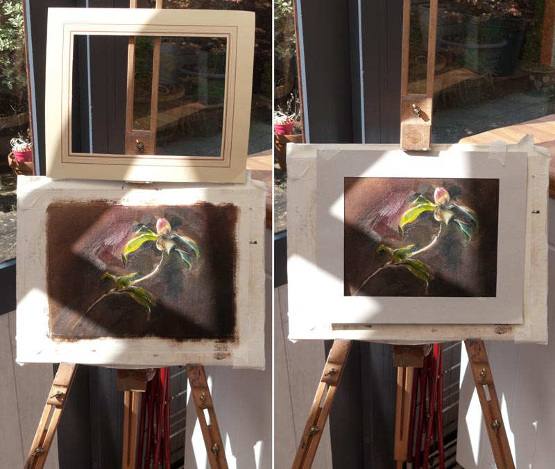
This camellia was painted fairly quickly from life in oils. I thought the direct sunlight glowing through the leaf would only last for half an hour or so at most, but in the end it lasted for a few hours and the subject didn’t change dramatically as the sun moved across the sky. I didn’t really have a plan for what to do if it did disappear apart from following the rule ‘Don’t chase the light.’

These A4 canvas sheets are temporarily fixed on a board using masking tape, and often the edge of the tape gets lost as I paint the dark background. This gives the impression (as I’m painting) that the edge of the picture is farther out than it really is, and this can lead to problems of the composition appearing too cramped when I finally peel off the tape.

One way around this would be to retape the edges to make the boundaries clear again. But perhaps the best solution is to decide in advance how a picture like this would eventually be displayed, taking in to consideration the size of mat board or overlap of a frame, and then work back from there to find the working area. A temporary mat board cut to size and placed over the work in progress can help with this.

flying by instruments

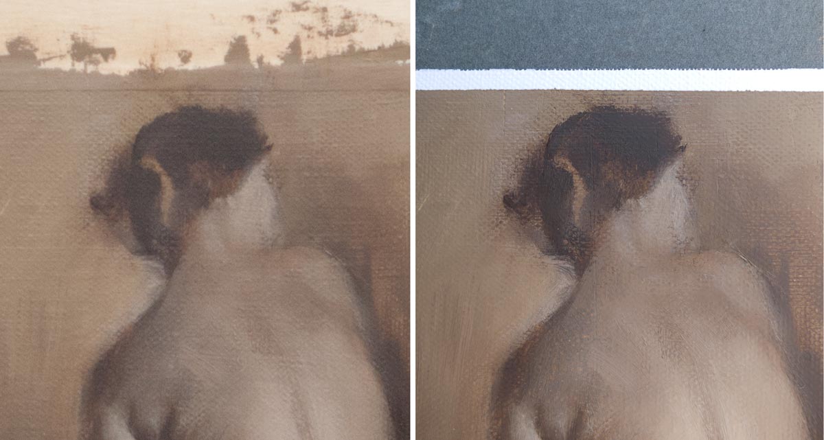
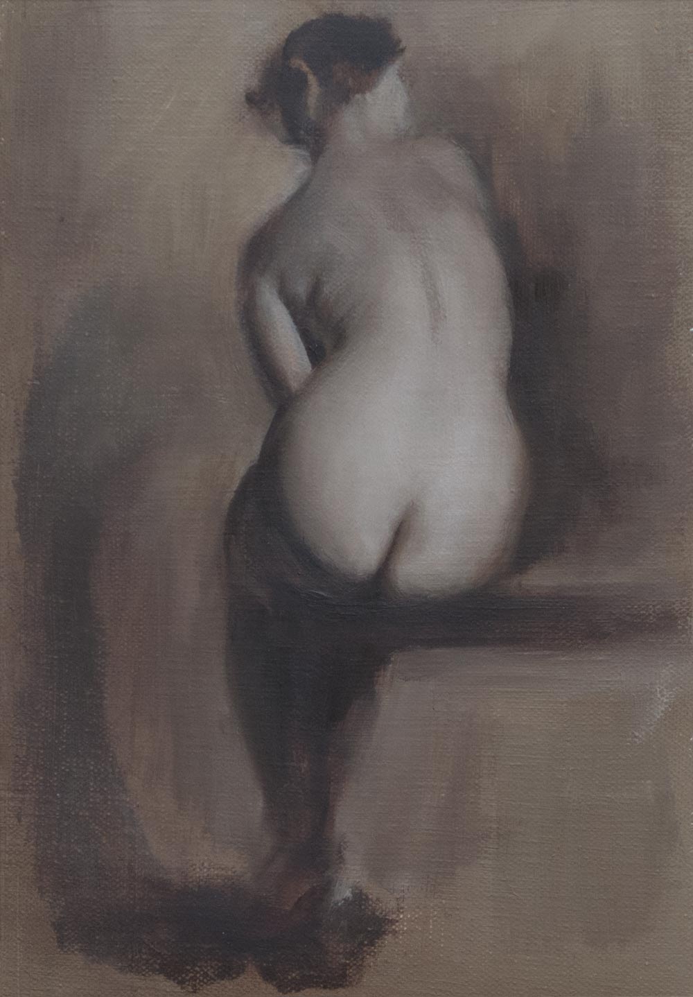
This should have been straightforward — I was drawing from a photo (from New Masters Academy) on to a prepared ground of leftover mud from a previous painting, smoothed on to a sheet of acrylic gessoed canvas. The surface was smooth enough that the raw umber underpainting could be lifted or modified with a rag. I went straight in with the brushes and no initial drawing, knowing I could move the paint around at will.

At first I fell in to my usual mistake of making the drawing progressively bigger as it expanded out. I hit the right edge of the canvas, erased that, then ran out of room at the top. Then began the real problem of constructing a believable figure. No matter how much I moved lines around, it just didn’t look convincing, and I couldn’t work out where the problem was.

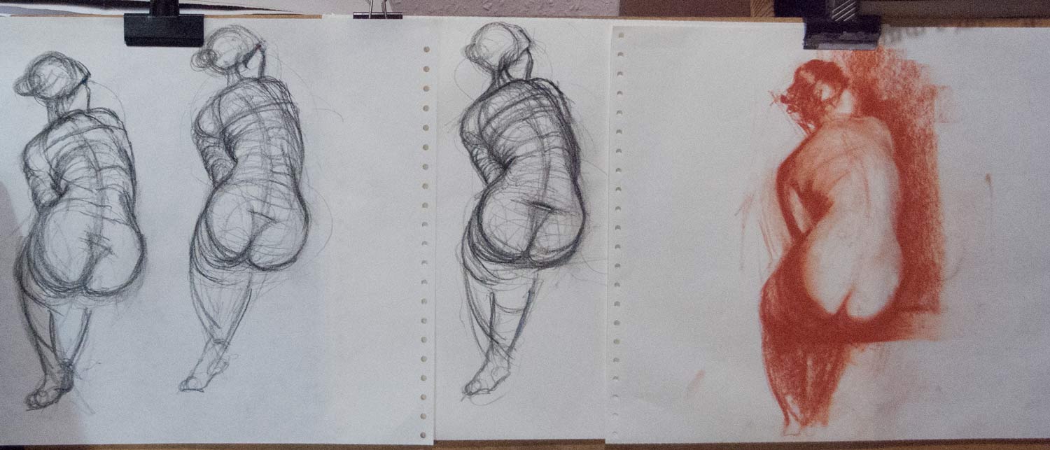
Finally, after a few hours of chasing paint around, I gave up and literally went back to the drawing board. I had to be able to make a decent drawing if I was to have a hope of making a painting worth looking at.

After multiple attempts with charcoal and crayon, I found I just couldn’t get this pose down on paper. It’s not a complicated pose. There is some foreshortening from the base of the spine up to the head, but nothing extreme. But I just couldn’t get a convincing pose by eye.

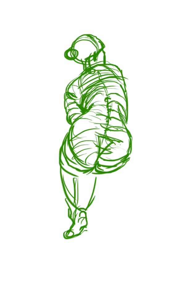
In frustration, I ended up tracing over the photo with my basic graphic tablet, just to get the feeling of what it would be like to draw the right lines. The results of this tracing, despite the scratchy, rapidly drawn contour lines, look way more convincing than my freehand drawing by eye.

This made me realise that getting an accurate, believable figure is essential. If the basic shapes are in place, you can get away with any kind of treatment of line or tone or paint — the figure will be convincing.

Back to the painting — I ended up taking photos of my painting revisions, then overlaying them on the original photo in Photoshop. By doing that I could work out that I needed to raise a curve here, lower a line there. I had given up being able to do this intuitively by eye. Instead, I was flying by instruments, relying on this feedback from a computer overlay.

I’m happy with some of the edge treatment — bringing things in to focus or losing them in a kind of abstraction was fun. But the figure still isn’t convincing to me. Something isn’t quite right, despite all this Photoshop intervention. I need another pair of eyes to tell me what’s wrong.

Ingres received ridicule and criticism for this painting La Grande Odalisque because of the unusual proportions. HIs contemporaries used to tease him by guessing how many extra vertebrae were needed for that spine to be possible. But Ingres was a superb draughtsman and knew what he was doing. If he needed a longer spine to create a more elegant figure, then that’s what he would paint. There’s a world of difference between deliberately distorting a figure for a particular effect and not being able to draw accurately.

one session

jug-tomatoes-625_0932b

jug-tomatoes-setup-625_0933

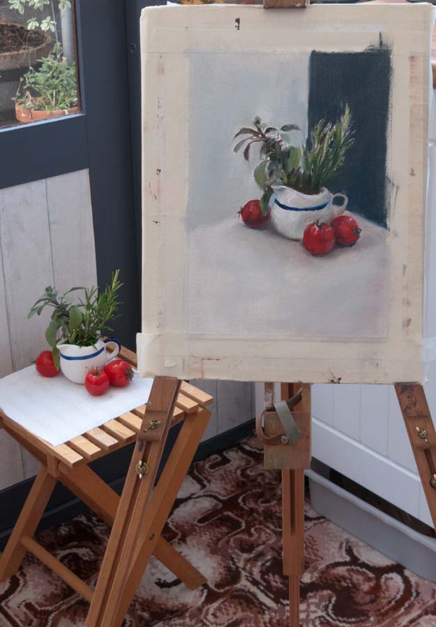
This one was deliberately completed in one session in an attempt to make me focus on the important elements of building up a painting. It’s so easy for me to get locked in to one particular area which grabs my attention rather than concentrating on developing the entire painting systematically. So the goal of finishing the painting in one go wasn’t so much to speed up the process but rather to get rid of woolly thinking and to have a plan, at least with regard to the mechanics of painting: laying-in, mixing colours, building up the lights and darks.

A large synthetic filbert was useful for creating the sage leaf shapes, and I used the end of the brush handle to scrape out some of the rosemary leaves. I’m sure there’s a whole range of these Bob Ross techniques that I’ve yet to learn.

The crop of the picture makes a big difference to the final effect. Left as I painted it on the A4 canvas, the subject seems lost and flat, but is improved by a tighter, more square crop.

And to continue the efficiency drive, the laborious clean up of brushes after oil painting can be avoided by dipping the brushes in safflower oil with a few drops of clove oil added. Wipe off any excess paint before dipping, then either leave them on a brush holder or put them in a plastic bag. The slow-drying oils keep the bristles supple and in good condition for days if not weeks. At the next painting session, just remove the excess oil with a rag and continue painting. Full instructions for using brush dip and brush care in general can be found here.

training tiles

forte-tiles-copy-900-img_1079

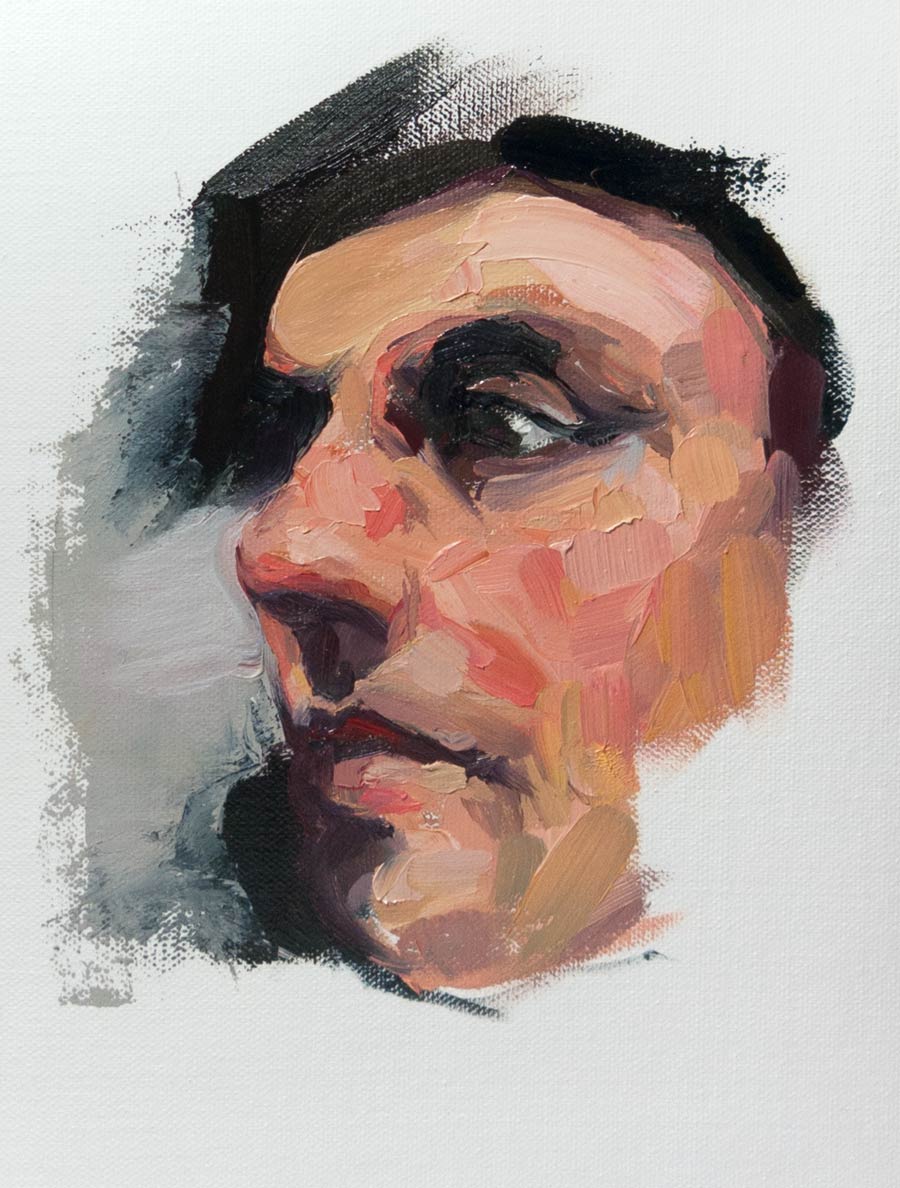
This is a copy in oils of a painting by Felicia Forte which impressed me with the way the image was built up of flat tiles of colour. Copying this style was an exercise in making deliberate strokes with plenty of paint (it was surprising how much paint was needed to make a solid tile) and was a good antidote to my tendency to apply paint thinly and then dab and fuss.

Instead, it ensures I make a decision, mix a colour, load the brush, apply the paint with one stroke. Then leave it. Assess what needs to be done, then repeat for the next stroke.

I think this would apply to any style of painting. The most valuable lesson for me was to not make a mark until I’d made a decision about the very next stroke, which sounds obvious, but it’s so easy to just dive in and hope for the best.

pyrrole red, cadmium yellow

Spring-after_Juliette_Aristides-1500-v2-0817

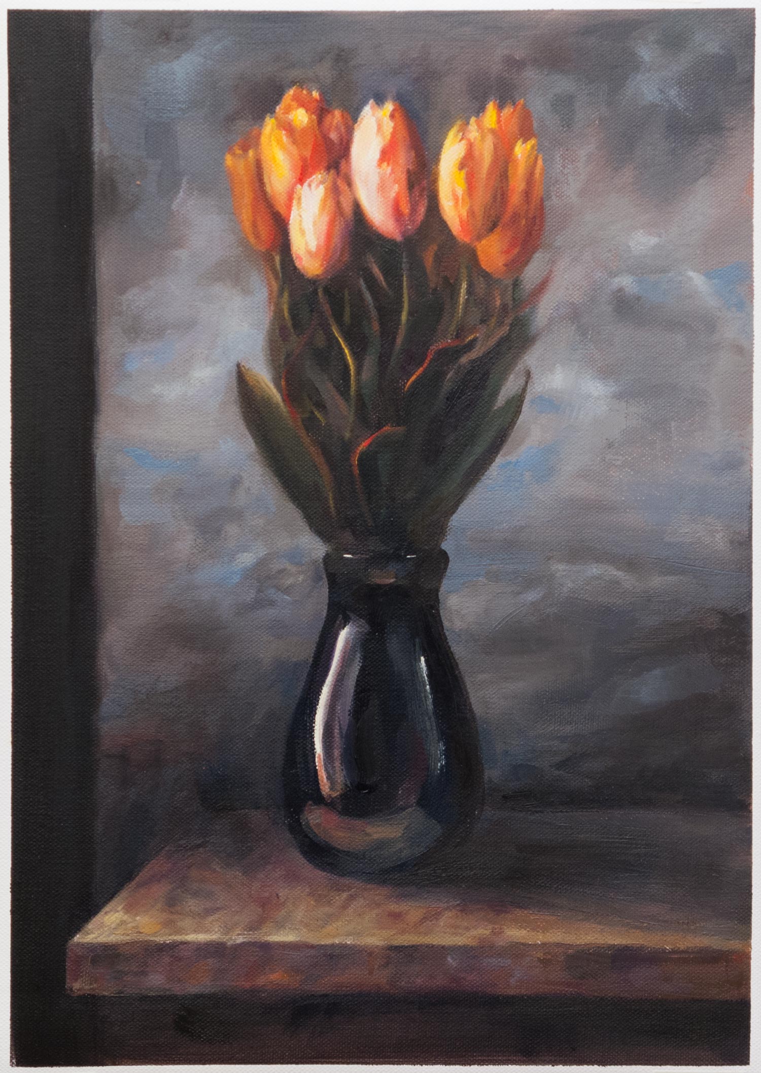
A copy in oils of Spring by Juliette Aristides. I love the way she makes vibrant colour stand out in a mostly neutral painting.

I copied this painting from the back cover of her book Classical Painting Atelier. In writing this post, I looked for an online version to link to and was surprised to find the original has a different crop (I didn’t realise that was a patterned column on the left) and lacks the red cast of the printed version which turned the original vibrant greens towards olive. It also has darker clouds in the background, making the flowers stand out even more, though this could be partly due to the glowing pixels of the screen. Paintings are notoriously hard to photograph, and I wonder if the true original looks different again.

So besides the overly-large blooms and the colour shift, one of the main differences that I can see between my copy and the book version is the handling of the edges. The original achieves a softness in both the background and the receding blooms which adds to the pop of the central flowers. The original is roughly twice the size of my A3 copy so paint handling at that scale might be slightly different, but I need to get more control over that final finish. Much of the beauty of a painting depends on the handling of edges: it’s not enough to just put down roughly the right colour in roughly the right place.

I was trying out two new tubes of paint which I hadn’t used before: cadmium yellow and pyrrole red. Up until now my palette used permanent rose (PV19) and imidazalone yellow (PY180), both of which are transparent and the yellow in particular gets lost in a mix, even though it’s a bright mid yellow on a white background. Cadmium yellow seemed to be the yellow on everyone’s palette and I couldn’t work out why it was so popular considering it’s often two or three times the price of other yellows. Now, after seeing how powerful it is when mixed with other colours and how sparingly it needs to be added, I see the value of having an opaque yellow. This might be a new way of creating a colour palette: as well as warm or cool versions of each primary, I could try transparent and opaque paints. Paint handling in mixes seems to be as much of a factor as the colour itself.

The pyrrole red (Winsor Red, PR255 and PR254) is much closer to orange than the permanent rose and also holds up well in a mix. In the past, I’ve sometimes found it hard to hit a bright mid red, so this is a useful addition.

I still prefer a limited palette, but it’s useful to see how shifting around to different pigments can change the way I think about mixing colour.