
Following on from the previous post, I wanted to create a similar illusion of light areas made brighter by contrasting them with areas of dark, but this time using my own photos as reference – these are taken from a holiday in Malcesine on Lake Garda in Italy.
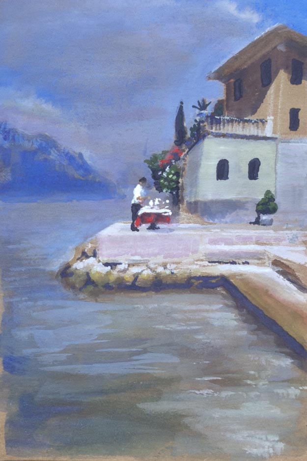
The picture by the lake seemed to be a bad choice for this experiment as the whole scene is flooded in bright sunlight. The lightest value is on the shirt of the figure in the centre, though the whole of the stone jetty needed to look strongly sunlit. The contrast is provided surprisingly by the distant haze of the receding lake and mountains which even in the bright sunlight appear as a relatively dark blue grey.
In the original photo, the eaves of the house on the right were very dark, almost black. One of the dangers in working from photos is that the shadow detail can often be lost, though in this case I thought that would work to my advantage as I wanted to create more contrast and avoid what James Gurney calls ‘middle value mumbling‘. After painting the eaves nearly black, I tried to add a highlight along the outside edge, but I overloaded the brush with paint and created an unnaturally thick white line. As I wiped it away with a finger, it blended with the dark under-eave colour. The result by happy accident looks much more realistic, with the eaves reflecting the bounced light from below. The house dimensions are way too small compared to the figure in the centre (which is slightly too large) – imagine the size of the figure looking out of the top floor window.
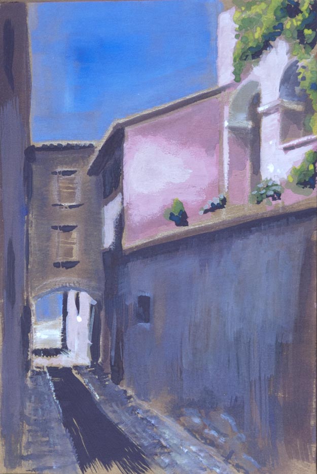
The second sketch was more successful in terms of contrast and perhaps composition but I’m not sure I’ve captured the light glancing across the uneven surface of the pink wall in the centre – it looks more like a wall of drying plaster. This is another hazard of trying to be too faithful to a photograph: what makes sense in a photo might not translate into paint.