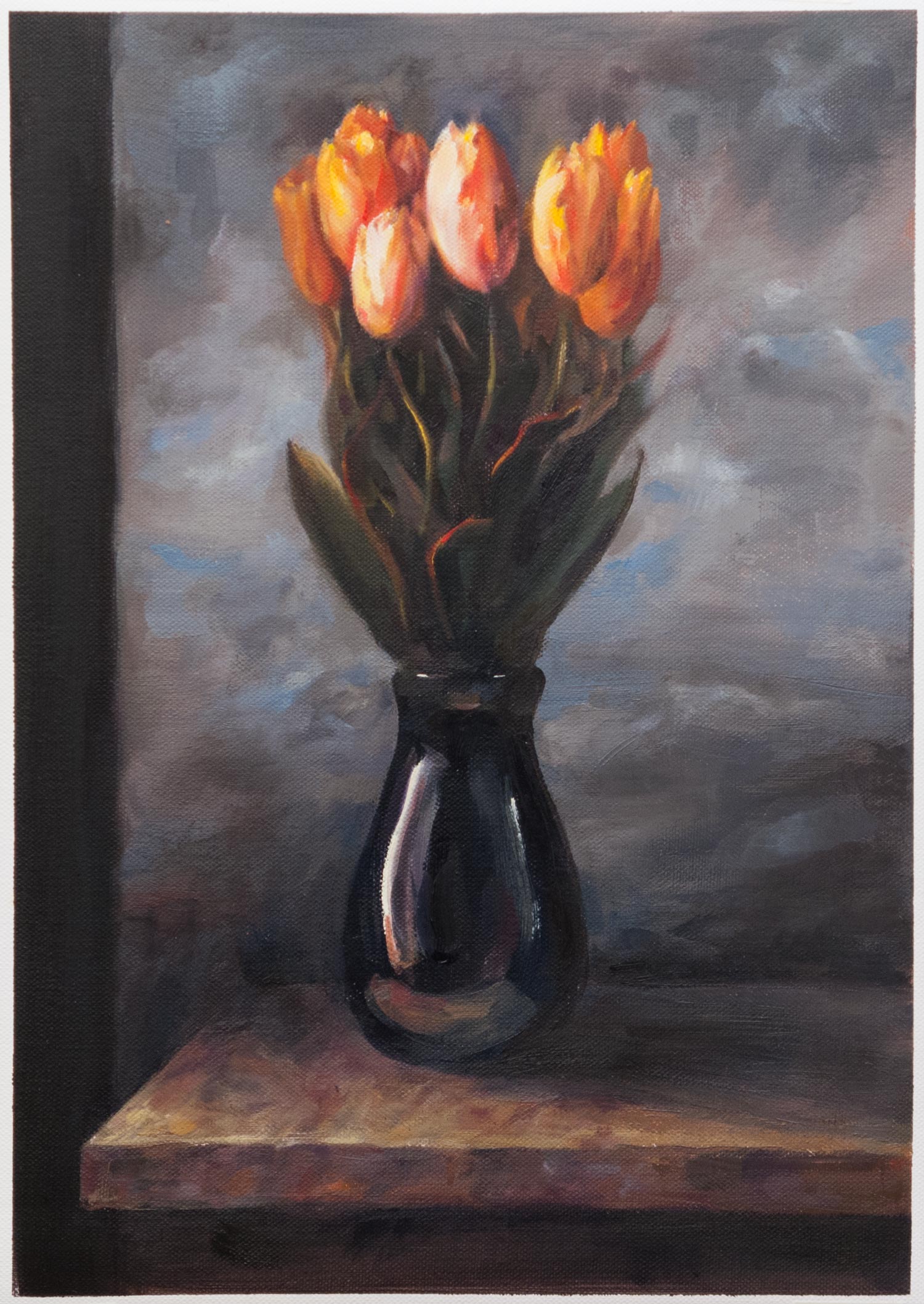
A copy in oils of Spring by Juliette Aristides. I love the way she makes vibrant colour stand out in a mostly neutral painting.
I copied this painting from the back cover of her book Classical Painting Atelier. In writing this post, I looked for an online version to link to and was surprised to find the original has a different crop (I didn’t realise that was a patterned column on the left) and lacks the red cast of the printed version which turned the original vibrant greens towards olive. It also has darker clouds in the background, making the flowers stand out even more, though this could be partly due to the glowing pixels of the screen. Paintings are notoriously hard to photograph, and I wonder if the true original looks different again.
So besides the overly-large blooms and the colour shift, one of the main differences that I can see between my copy and the book version is the handling of the edges. The original achieves a softness in both the background and the receding blooms which adds to the pop of the central flowers. The original is roughly twice the size of my A3 copy so paint handling at that scale might be slightly different, but I need to get more control over that final finish. Much of the beauty of a painting depends on the handling of edges: it’s not enough to just put down roughly the right colour in roughly the right place.
I was trying out two new tubes of paint which I hadn’t used before: cadmium yellow and pyrrole red. Up until now my palette used permanent rose (PV19) and imidazalone yellow (PY180), both of which are transparent and the yellow in particular gets lost in a mix, even though it’s a bright mid yellow on a white background. Cadmium yellow seemed to be the yellow on everyone’s palette and I couldn’t work out why it was so popular considering it’s often two or three times the price of other yellows. Now, after seeing how powerful it is when mixed with other colours and how sparingly it needs to be added, I see the value of having an opaque yellow. This might be a new way of creating a colour palette: as well as warm or cool versions of each primary, I could try transparent and opaque paints. Paint handling in mixes seems to be as much of a factor as the colour itself.
The pyrrole red (Winsor Red, PR255 and PR254) is much closer to orange than the permanent rose and also holds up well in a mix. In the past, I’ve sometimes found it hard to hit a bright mid red, so this is a useful addition.
I still prefer a limited palette, but it’s useful to see how shifting around to different pigments can change the way I think about mixing colour.
