overlays

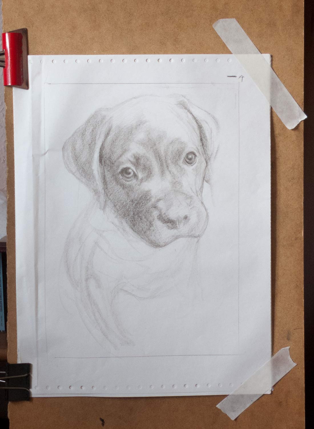
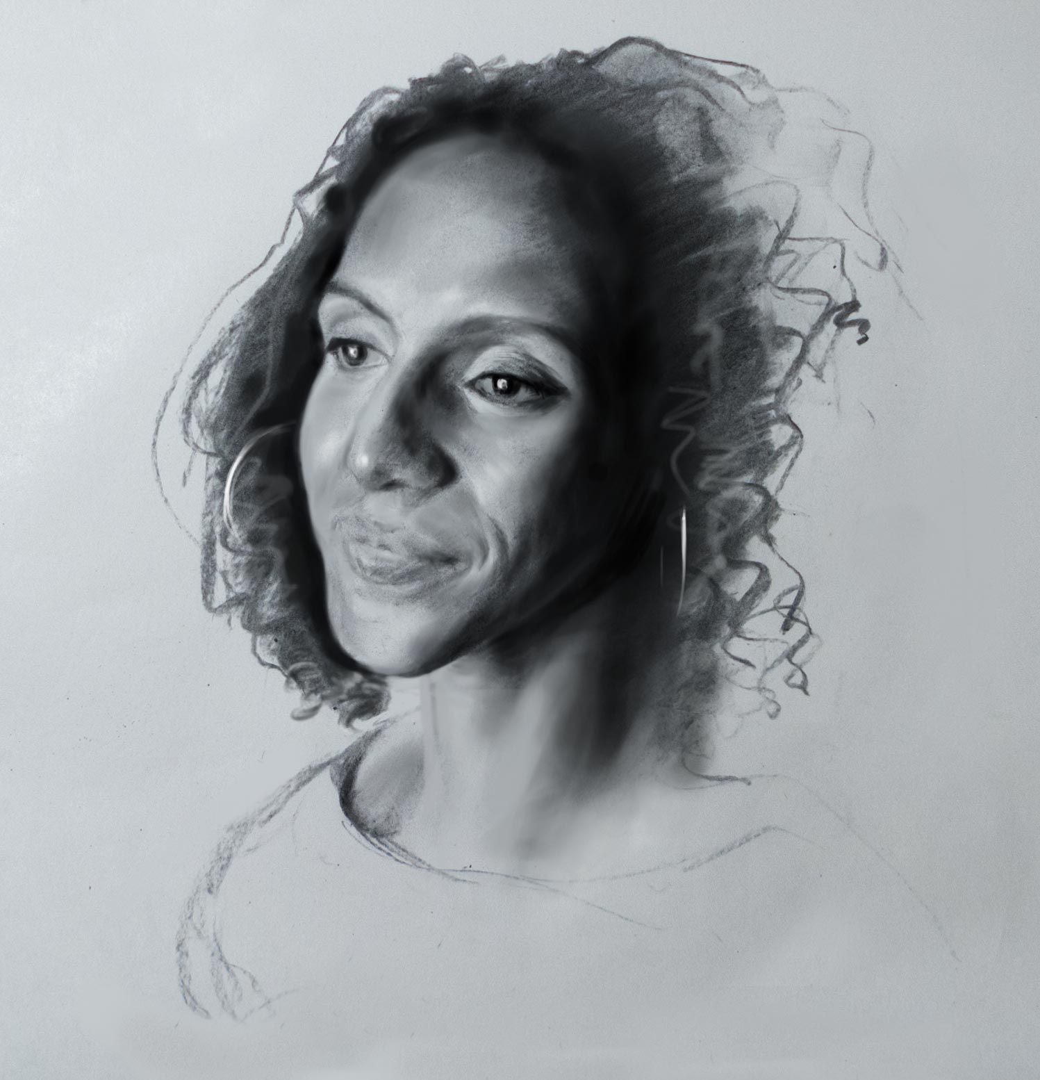
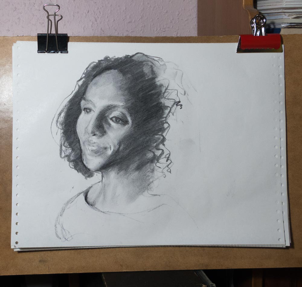
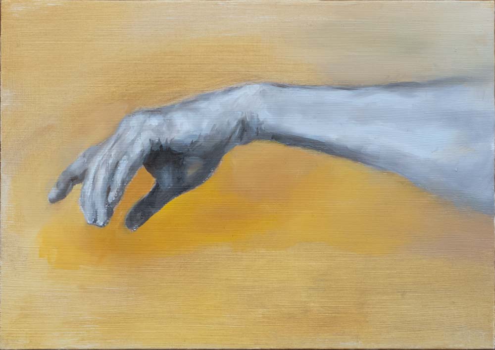
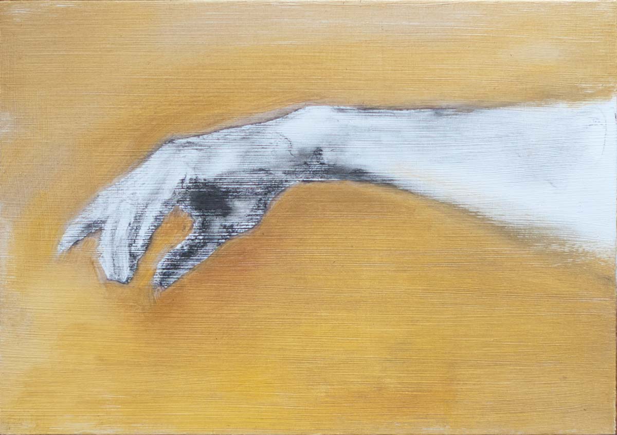
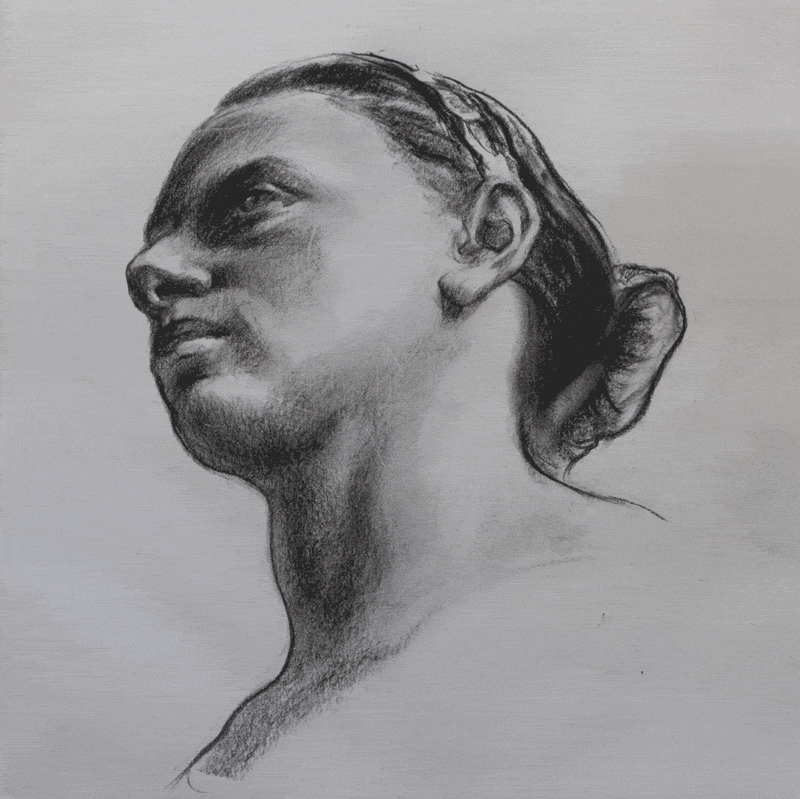
Apologies for making this post flash like the Blackpool illuminations, but I’m using a modern version of a technique used since olden times to check accuracy and proportions. Without a master draughtsman looking over my shoulder to tell me my ears are in the wrong place I’m reliant on overlaying my drawings on top of the original photo reference to see where I went wrong. Leonardo made practice drawings on glass plates to compare to the original, but I’m pretty sure he would have made use of today’s digital tools.

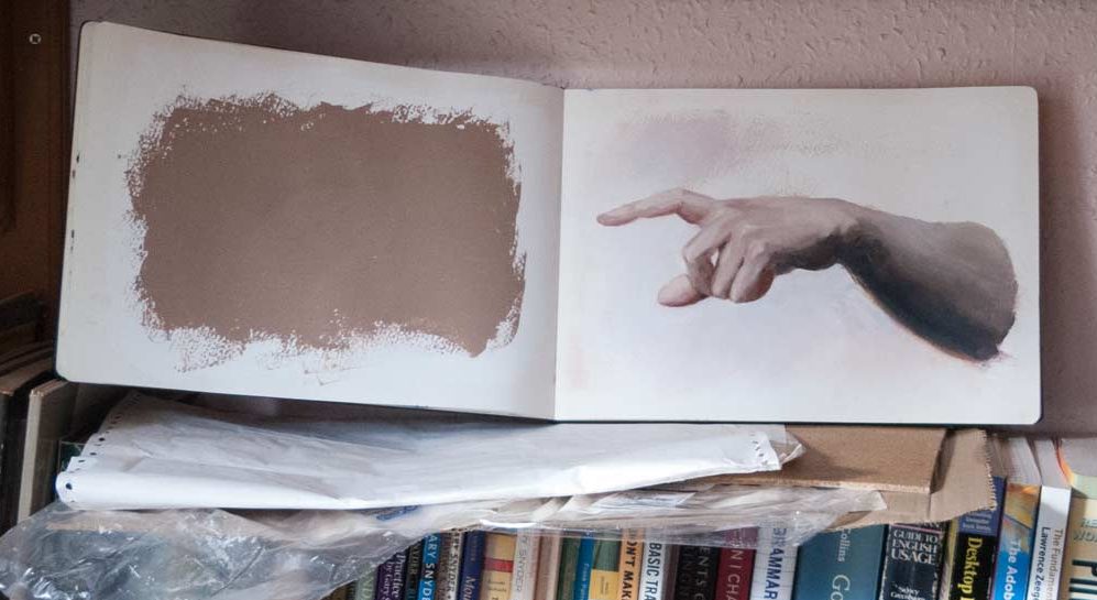
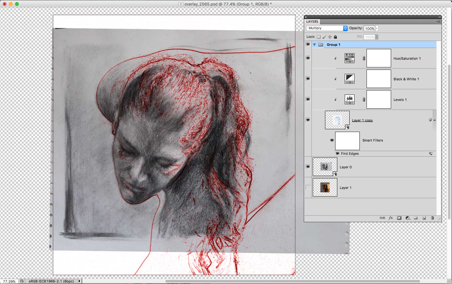
Usually, I take a photo of the sketch into Photoshop and simply add it as a semi-transparent layer above the original photo. Then it’s a matter of trying to align the sketch and the reference by rotating and scaling until (hopefully) the features line up. By quickly switching the layer on and off, you can compare the two.

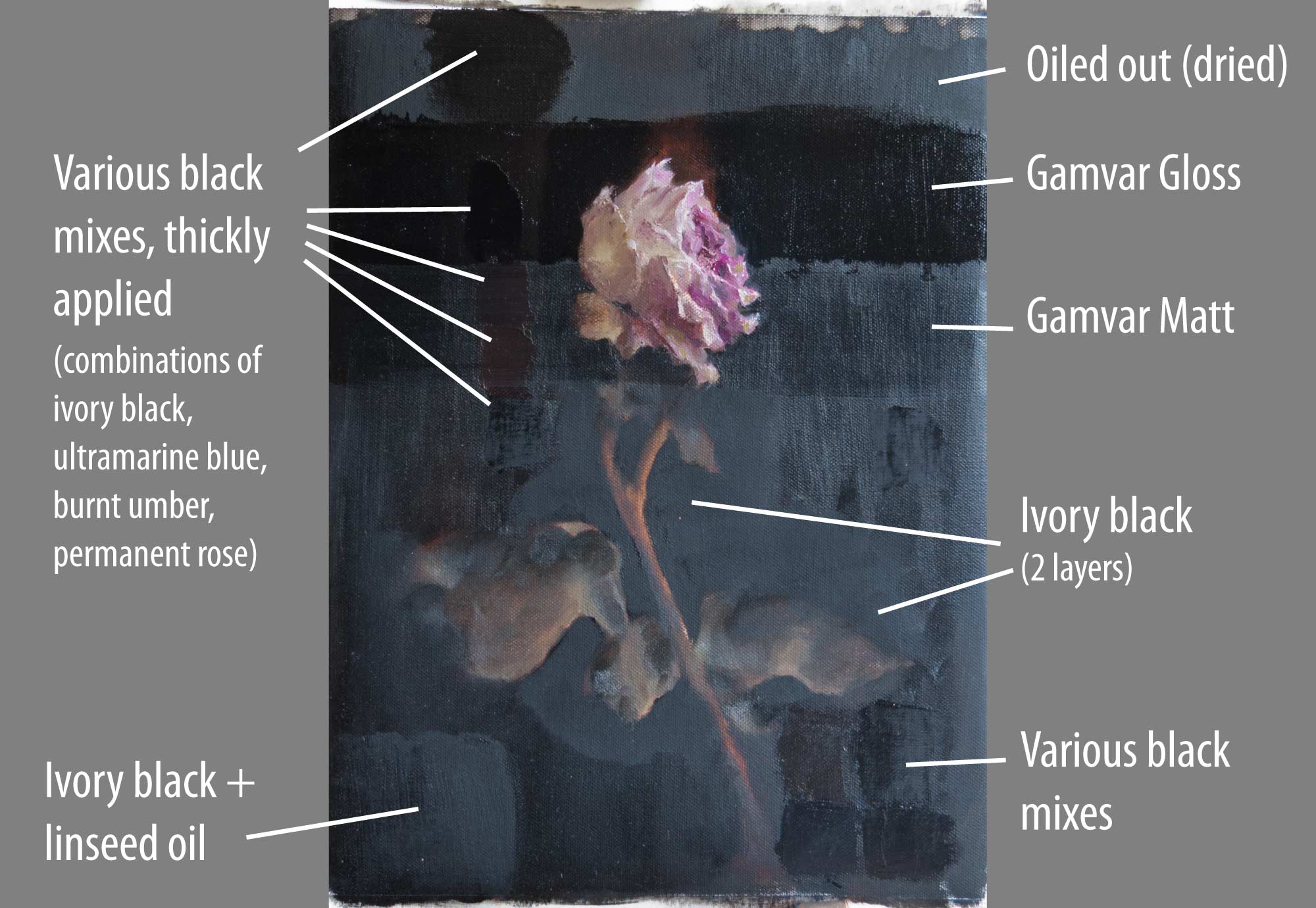
The technique illustrated in the photos above is a little more complex as it uses a number of filters to find the edges (shown in red or white) of the features in the original photo. Usually, I don’t go to all that trouble when checking a sketch and instead use the transparent layer technique mentioned above.

By doing this regularly I have begun to identify some of my repeated mistakes: I make the backs of heads too small, brows are too high on the skull, everything is made too wide, chins tend to disappear, hands are too short.

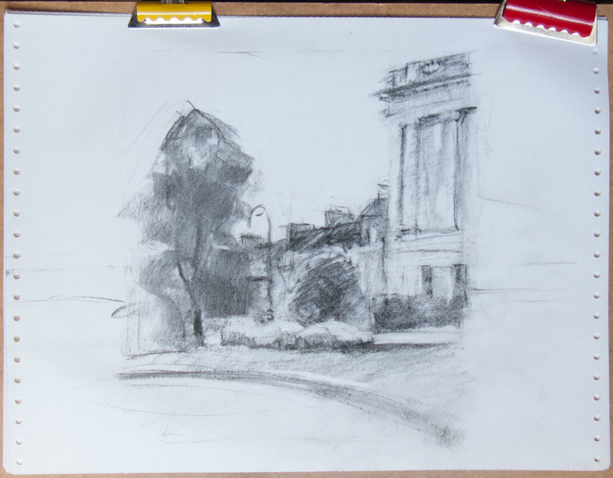
Once these weaknesses have been identified they can be consciously corrected. I’ve found the quickest way to improve is to concentrate my practice on the things I find the hardest to draw.

[Models courtesy of New Masters Academy.]


hand study copy

These are copies painted in oil in a sketchbook based on hand studies by Bouguereau. The thick sketchbook paper will take oil paint if first covered with a layer or two of acrylic gesso. Any leftover paint can be spread on top of this to create an oil ground for the next sketch, but it’s not necessary. This was another way to use the intimidating Moleskine, even though it seems a bit odd to put oil paint in a sketchbook.

As ever, the challenges were to match the values and hues while at the same time trying to model three-dimensional form, all by using buttery oil paint. The hues tended to be somewhere around orange—slightly more red or purple in some areas, more yellow in others—but all of of the hues were quite greyed-out or desaturated (low chroma). Bouguereau himself somehow managed to make flesh tones look natural and almost translucent (see this link for a discussion on this topic) yet his colours are not a dead grey.

On the dimly lit shelf, my version looked a lot more smooth and natural than when brought out into the light. Bright light shows how rough and sketchy the paint blending really is, as you can see if you zoom in on the photos above. Studio lighting is something I really need to sort out, as painting in the dark often fools me into thinking I’ve done a better job than I have.

I noticed that too, when painting the puppy portrait. The painting viewed in natural indoor light on an overcast day looks very different to the same painting in direct sunlight, as you’d expect, but it’s not just the colours that become more saturated, the edges become harder and more noticeable.

Click for larger image.

Anyway, it’s all good practice. To see some extraordinary oil paintings in sketchbooks, have a look at the sketcbook tour videos by Cesar Santos.


space saver

A typical mid-session mess.

For various reasons, I usually paint in the second smallest room in the house. My ‘studio’ working surfaces are a few book shelves (covered, predictably, with books) and a small table which is home to a computer, modem, keyboard, mouse mat, graphics tablet and a cup of tea. In short, space is short.

Out of necessity I’ve found various ways to cram the messy paraphanaelia of oil painting into as little space as possible. There’s enough space on the table for a glass picture frame (my palette) which when not in use can be balanced precariously on a section of my CD collection (the bad ones).

I’ve found that using glass as a palette is the easiest way to mix paint and the easiest to clean. I turned the lining cardboard to the front to create a neutral midtone. At the end of the session any extra paint is gathered up with a palette knife and transferred to the bespoke paint stick which was cut to fit in the frame. Large amounts of unsullied tube paint can be kept in separate blobs, but everything else is mixed up into a pile of mud. The stick is then wrapped in junk-mail clingfilm.

After the bulk of the extra paint has been saved, a few sheets of kitchen towel and a small blob of hand soap will complete the clean-up, no solvents necessary. In fact, I rarely use solvents for any part of the painting process, so even in this small room there is only the faint smell of linseed oil.

I don’t bother cleaning the brushes. Instead I get the worst of the paint out on a kitchen towel then dip the end of the brush in a mixture of safflower oil and a dozen drops of clove oil. This combination is very slow drying and will keep the brushes supple and in good condition for at least a couple of weeks before needing another dip. At the next painting session, just wipe off the excess brush dip and carry on painting.

In this small space, the easel is put up wherever it will fit. The lighting… well, that’s a problem I haven’t really solved yet. I want to get a consistent soft-box setup so I can draw the curtains on the sun beaming uncontrollably through the west-facing window. But that will be the subject of another post…


pet portraits

A friend wondered if I could do a portrait of her dog. I wondered too, but it sounded like an interesting project. I didn’t realise that pet portraits were a thing until I went online and saw page after page of search results for pet portrait artists.

I’ve never met Cooper, a boxer mastiff cross. Everything was based on a collection of photos taken at different angles, including profile shots and various poses, that let me get some idea of the basic shape of his head.

Working in charcoal seemed the most flexible and natural method for me at the moment, but I really wanted to do an oil painting, just to see what I would come up with. I ended up doing two pieces, one in charcoal of Cooper as he is now (which didn’t quite work—I need to make another attempt), and this oil painting of him as a puppy.

For the puppy painting, I started with some warm-up charcoal and pencil drawings, then used a Polychromos pencil to do a more detailed sketch. I like the Polchromos pencils as they build up gently into darker tones, even though they don’t erase as easily as charcoal.

The pencil sketch was scanned and copied on to office paper and the back covered with old charcoal dust that I keep in a jar. The outlines and tones were transferred onto an A4 canvas mounted on aluminium composite by drawing over the sketch with a ballpoint pen.

The canvas ground was acrylic gesso covered with a layer of grey mud oil paint left over from a previous painting. Acrylic gesso can be very absorbant and suck the oil out of the upper layers, but this mud preparation acts as a barrier to the thirsty gesso and effectively creates an oil ground that is very pleasant to paint on.

I did about three passes on separate days to build up the painting, with a final pass to make some corrections to the background. I let the painting become touch dry before the next painting session.

I used ivory black in this painting and it’s not a pigment that I’m used to. I bought a tube to mix with titanium white and burnt umber to make neutral greys for reducing the chroma of colour mixes (following Paul Foxton’s method), but it was tempting to use this black instead of my usual mix of ultramarine blue and burnt umber for some of the darkest areas. A problem I’ve found with ivory black is that it sinks in really noticeably. It looks like a deep, silky black when wet but dries a lighter matt, almost like gouache. I don’t know if the oil is sinking in to lower layers or if the pigment itself is soaking up all the oil.

I oiled out the painting at the beginning of each pass, but eventually that thin linseed oil layer also sinks in. I was betting everything on a final varnish using Gamvar Gloss to even things out, which it seems to have done.

He looks cute in this picture. He’s grown up to be the size of a small horse.


sinking in

To varnish or not to varnish. Some painters don’t like the glare and shine of gloss varnish, preferring a matt or satin finish, or not varnishing at all. There are matt varnishes which contain a small amount of wax to take away some of the glare, but for paintings with dark areas this can seem like the worst of all worlds: there is still a sheen of glare (though not as much as with gloss) but the deep tones become cloudy due to the wax. Maybe it works well with high-key paintings.

Varnish is there to protect the surface (it’s a removable, replaceable clear layer) but it also brings out the depth and vibrancy of the original wet paint. It also evens out any patchy, sunken-in areas, which is where I find it most useful. Some pigments sink in more than others (ivory black and burnt umber seem to soak up all the oil) and mediums added to the mix can alter the final gloss. Thick impasto can have a glossy sheen next to paint thinly applied with a brush.

It’s a minefield of confusion which I attempted to clear with systematic testing, but like many of these experiments I ended up throwing various combinations of paint and varnish on the canvas in the vague hope that something useful would come out of it.

Here’s a painting of a rose (this was originally going to be a post about painting a rose from life, with the various challenges that presented) with a background that contains large areas of ivory black. It looked deep and dark when wet, but as you can see from the photo, it sinks in really noticeably to a dull matt finish. So much of the oil is soaked up that the paint doesn’t even feel particularly well bound to the canvas, as you can see from the top-right edge where the paint was lifted during oiling out.

I was going to go in to detail about all the various combinations of paint and the effects of thickness of application, oiling out, layering, and so on. But you’re spared all that and here’s a picture instead.

Click for a larger image.

The conclusion I reached: just apply a layer of gloss varnish at the end and all the problems are solved. Except for one: whilst sunken-in areas regain their depth, any areas that are already very glossy become even more glossy, so there’s still some unevenness. The portrait at the top of this post had glossy areas where I’d used stand oil in the paint mix. Adjacent areas were relatively matt. The gloss varnish evened things out a little but not completely. I tried applying a number of coats but they all seemed to dry with the same result. In the end, in a spirit of experimention and desparation, I poured a pool of varnish over the non-glossy areas, hoping for an evenly-glossy final painting. It didn’t work, but I quite like the photo.

Things to try in future experiments: lightly abrading the very glossy areas to take down the sheen before applying the final varnish.

Here’s Mark Carder with a video on how to varnish a painting. However, if you’re using Gamvar (as I did) the application needs to be thinner. See here for Gamblin’s varnishing instructions.


dark yellowing

This was a bit of a shock. I’d never come across this before. This is an old oil sketch I made back in 2014 on postcard-sized gessoed acrylic paper. It was kept for a good part of those four years in a stack of other similar oil sketches.

I took it out recently to find yellow-brown splotches all over the painting, and the whole picture had a colour cast. At first, I thought oil from the back of another ungessoed sketch had soaked through the paper on to the surface of this one.

I wasn’t particularly concerned about this painting—it was just an experiment to try things out—but if I’m using a technique that is flawed then I need to correct it.

It’s easy to get a bit obsessed with archival methods for making a painting, and as someone once said, there are paintings that will last a hundred years that should never have been painted. But, I would like to make objects that will be around for at least a few decades without falling apart.

I looked online and discovered the phenomenon of dark yellowing. As the name suggests, the linseed oil in paintings kept in low light or dark conditions can go yellow and darken dramatically. The cure, thankfully, is simply to expose them to light again.

I put the cloud sketch on the windowsill for a couple of days and the yellowing disappeared. If only all oil painting problems were as easily fixed.

[I remember this picture being hard to photograph when I was writing the post four years ago—the colours would shift with every shot I took. Preparing these photos was even more difficult as they were taken a few days apart with different lighting conditions. The top photo doesn’t quite convey just how noticeable the yellow splotches and colour cast appeared. It really did look as though the painting had decayed and deteriorated.]


fresh eyes

This one is a hybrid of charcoal on paper and digital painting. The reference photo was a portrait of Afua Hirsch taken by Richard Saker.

It started out as a quick generic head study using a stick of vine charcoal on cheap paper, with no real time being spent on measuring proportions or judging the relative positions of the features.

I continue to have major problems with basic proportion, making everything too wide or completely missing the scale and relationship of elements. I mean, look at the original charcoal sketch. As I was drawing it, I realised it wasn’t going to get a likeness, and I was aware the eye on the right was out of position a little, but maybe it would hold together with the other features to make a believable head.

It was only when I left the room and returned a few minutes later that the eye screamed out at me and showed its true position. How could I miss that? It’s half way down the face! This is up there with the repainting of Ecce Homo.

It’s so easy to work away on refining the details of something only to find the whole thing is in the wrong position. So I need to consciously walk away from a drawing, or use a mirror, or somehow get those essential fresh eyes.

As an experiment, I took it into Photoshop to move and rescale that eye, and then created a new blank layer to make further corrections and additions. I used an entry-level graphics tablet (Bamboo One) to do the refinement. I don’t have much knowledge of digital painting techniques, and everything was done with a default brush of varying softness and flow rate. The brush colour was sampled from the existing charcoal drawing. Some of the texture of the original charcoal remains but the default digital brushes have a tendency to make everything look too slick and airbrushed. There are no doubt techniques to avoid that plastic-wrapped appearance.

I still haven’t got a good likeness. A true likeness depends on a hundred and one subtle features to being just right. Somehow I’ve made her older and I can’t work out why. Have I made the face too wide? Is the forehead too short? I shortened the neck a little to more closely match the original reference. It’s still not her.

And again, I only have a digital file at the end of this. Will the endless opportunty for correction and revision that digital painting offers make me lazy? This process was fun, though. As Cynthia Sheppard shows us, there’s no one way to do this.


after Félix Thiollier

A copy of a photograph taken over a century ago by Félix Thiollier, possibly of his daughter, Emma. As far as I can tell from the translation of the French Wikipedia page, he developed his own prints and sometimes altered them using acid, or by drawing over them with ink or gouache.

This was a chance to just experiment with creating light effects using loose brush strokes and rough scraping with a palette knife. The cheap canvas surface was good resistance for the sharp corner of the knife and at times it felt like I was channelling Timothy Spall.

The original photograph has an unreal beauty and it’s hard to know how to add to it with paint. In being documentary, photography sometimes has the trump card over painting in that this moment actually happened. There’s a power to that which no amount of paint handling can recreate.


oil on charcoal

More experiments with aluminium composite panels, this time on the smaller A5 size. I wanted to see how a vine charcoal pencil would behave on the acrylic gesso surface. Sometimes it’s useful to draw using the precision of a sharp point. And sometimes it’s easier to draw with a pencil grip rather than holding a brush that can only be moved over the surface in certain ways. The question is how to transform that drawing in to a layer of oil paint.

Many people draw directly on canvas then use a spray fixative. Cesar Santos uses this method but has warned against using too much fixative as it creates a weak paint layer.

I found the charcoal draws quite well (albeit with a line tone effect due to the brush strokes in the gesso) and can be lifted off with a kneaded eraser. The paint can be applied directly over the charcoal, but to avoid the whole thing turning into a grey mess it’s necessary to work on only one area of tone at a time and to make sure those values are matched before moving on to the next area.

It’s a bit laborious to do it this way (without the fixative) so I’ll probably stick to using a transfer drawing for any precision areas or to get the overall composition placed correctly. After that, I’ll use a block-in with a brush directly on the canvas, or a wipe-out method for a more tonal drawing. But drawing in charcoal is so much fun, and this alone will make for a more dynamic picture.


live memory

The end of the Royal Crescent in Bath, painted in oils on the new aluminium composite panels.

This began as a pencil sketch made on location but was painted at home on the easel. I revisited the scene a couple more times at the same time of day to make further pencil sketches of details and light effects. The late autumn mid-afternoon light created some interesting edge lighting on the trees and columns.

Various sketch references and an acrylic colour study. The vine charcoal sketch below was useful for overall composition. The original pencil drawings and other notes are in the spiral-bound sketchbook. The aluminium composite panel was attached to the easel with tape and Blu Tack.


I took a reference photo which was useful for correcting proportions and details, but many of the important light effects in the scene were lost. The strange thing was that they were there in the photo, but somehow they had been flattened out and weren’t noticeable.

In the continuing debate about painting from life against painting from photo reference, I found this approach of doing both worked quite well. The most important thing I found was that drawing anything for any length of time has the effect of imprinting the scene on memory — not so much the overall composition, I still needed the sketch and photo for that, but the sense of depth, the subtle lighting effects and the overall atmosphere of the scene. For instance, there was a shift in the warmth of the stone between the crescent in the foreground and the buildings behind. And the road in the middle-ground has a steep camber which somehow added to the depth of the scene.

As I was making the first pencil sketch, leaning on the cast iron railings in front of the crescent, the late afternoon sun came out from behind the clouds and flooded the scene with golden light. The edges of the trees and buildings lit up, and everything else was plunged in to deep, warm shadow. It was a completely different scene and it only lasted a few seconds. It would have made for a more dramatic picture, and it certainly made me aware of how ‘light’ and ‘dark’ in our visual perception are relative to their surroundings.

All these memories played in my mind as I was painting, and it certainly made the process of painting much more interesting. Whether I can capture these perceptions using oil paint is another matter, but I certainly won’t be able to paint what I didn’t see in the first place.