preparation

cactus-stones-1200_0804

cactus-stones-prep-800_0803

I wanted to work entirely from life for this one. A watercolour pencil with a water brush was useful for the thumbnails. I did use a photo to roughly check the colours and layout in the gouache sketch but I couldn’t quite get the perspective I wanted, and working from a photo seemed somehow artificial and dead after the sketches done in front of the subject. So I went back to draw from life a more accurate pencil layout for transfer to canvas.

I like this method of repeated drawing — thumbnails, studies, sketches — before attempting the main painting. Each time around, the problems could be worked out, so by the time I began the final painting many of the features of the composition felt familiar through all these revisitations.

Mixing colours from life is more accurate but also more satisfying, despite the technical difficulties of changing light conditions. And a true sense of depth makes it easier to play with hard, soft and lost edges to make things recede or to snap them into attention.

This week the room was redecorated, so I painted those walls a final time with a larger brush.

break it, fix it

portrait-day2_0774

A self portrait is a strangely narcissistic affair, spending all that time looking at your own head, but the benefits are undeniable: the model is always available, and you’re drawing from life, not a flat image with all the problems already worked out.

I took the often-heard advice to start with large brushes — a size larger than seems necessary — and then keep using these large sizes as long as possible. Also, I was mindful of not being too worried about destroying part of the painting that had gone well if that’s what was needed to repair or progress another part. This was a revelation to me, that oil paint can be reworked and corrected as long as you have the will or the patience. As Terry Miura said: if you found it once, you can find it again. I kept this as a mantra during the times when it all dissolved to mush. That said, I’ve left it in a state of half finished roughness, knowing that if I built up one area I’d have to revisit the others. And the near-monochrome brown is a bit much. When to stop?

I also need to work out a way to light the canvas as I’m painting. Working with no medium, the raking light on the brush strokes throws off the values, especially on the left side of the face.

lost in translation

pink_azalea_copy-1067_0759

A copy in oils of Pink Azalea—Chinese Vase by William Merritt Chase, trying out a new pad of A4 gessoed canvas.

I was attempting to copy three things from the original painting: the colours and texture of the glazed porcelain, the impression of the flower shapes and the play of light on the whole scene.

Some things I found:
Adding titanium white makes colours much cooler and can result in a chalky appearance. I had to glaze over with a warmer mixture to reverse this effect.

It’s very easy to overuse white. In the original painting, the flowers appear bright and show their three-dimensional form only by making the receding ones look much duller. Much of the success of the original comes from this subtle handling of the value and chroma. There’s still not enough variation and control in this copy.

It’s hard to make a loose impression of a petal shape based on someone else’s loose impression. I had to reverse-engineer the loosely brushed shapes made in the original painting in order to guess the form of the original flowers, and then redo it while attempting a similar handling.

I was working without an underdrawing, and at one point had to place some tracing paper over the half-finished painting in order to work out the correct perspective for the bottle. I did use the mirror test for the symmetry of the vase, but in bumping the background around at the end I’ve knocked it out of shape again.

So, lots of room for improvement, but a worthwhile exercise as every time I copy a master work I learn something of value.

textures

drumlin-800_0677

Painted in oils from a photo (thanks Aunt Joan!) of a snow-covered drumlin.

The soft make-up brush had another outing for the blending of the snow colours, but many of the textures were the result of trial and error with a palette knife—either smearing or scraping away the layers of paint.

Decisions had to be made about how much detail to describe, or whether to give just an impression. It’s always tempting to add more detail, especially as I’m one of those people who like to get up close to a painting in a gallery and have a good peer at the brushstrokes. Mark Carder talks about resisting this temptation to add more detail, and instead suggests we ‘paint ugly‘.

stand oil

portrait-720_0647

wipeout-1200_0640

paper-palette-1200_0642

More blending experiments, this time using stand oil as a medium. The portrait is based on a photo by Randall Hobbet.

Stand oil has the consistency of honey, but can be thinned with a little odourless mineral spirits. (I used Gamsol.) Besides helping to make smooth, fluid transitions, the stand oil levels out any brush strokes, making it easier to judge the colours. (See Mark Carder’s demonstration of the advantages of levelling paint.) It dries with a glossy finish which can make these paper sketches look patchy. A layer of varnish would even this out.

I made the underpainting with thinned-down burnt umber, then used the wipe-out method to remove areas of tone with a rag. This quickly builds up the basic light-dark structure of the painting without any initial drawing.

It was also a chance to try out a tear-off paper palette, which is basically a pad of white greaseproof paper. Clipping the medium holder on one end and putting a loop of masking tape underneath the other end helped to stop the palette sliding around on the table top. (It does have a thumbhole, but I’m waiting for my beret and smock to arrive before I try that.) A piece of cling film taken from junk mail wrapping kept the main blobs of paint workable for a couple of days.

As for the portrait itself, I was trying to make the finish as tight as I could make it, just to see how it would look. I had trouble with the perspective on the mouth and chin—I’ve got a tendency to draw this area out of proportion, with the jaw jutting out rather than curving back in. It’s one of those recurrent drawing errors which I need to be aware of, like my tendency when drawing figures to draw everything progressively larger as I work down from the head, resulting in pyramid people with large feet and small heads. This is where a second pair of eyes is helpful, to point out my blind spots.

blobs in space

blobs-800_0644

This doodle in oils started out as an experiment in blending thin layers of paint with a soft make-up brush. It worked quite well as a way of getting a smooth transition without brush strokes across the spheres, and the light and dark areas could be gradually pushed around. It helps to tap the end of the brush in the starting colour and then blend only one way. If you try and blend back the other way, it pollutes the opposite colour and you have to start again.

After that, the eye and ear were very loosely based on a photo reference, but the lighting and perspective had to be invented. The trouble with inventing objects is that there’s no quick way of checking if you’ve got it right. James Gurney often uses maquettes or makes a model of his imaginary scenes, and this can help solve the major lighting problems and perhaps make you aware of things you’ve missed. But I think he uses these models only as a starting point, and completes the artwork by relying on his knowledge of lighting on forms gained from many drawings from life—which is what I need to do.

Gurney challenge

gurney-challenge-sketchtesting-1200px-60q

A cartoon made for James Gurney’s six word story challenge, using a dip pen and Indian ink, dilute Lexington Gray ink in a waterbrush and watercolour.

It began with lots of pencil doodles of individual items and general layout. The monkey started out as some kind of fish creature, the buckets and mops moved around, and I had to make many adjustments to the Heath Robinson machinery.

It was all really an excuse to get the dip pen out again. The variation in line weight and the blackness of the ink is very satisfying. The index nib ran over the sized heavyweight cartridge paper quite well, and the waterproof Indian ink allows watercolour and ink washes to go on later. The greys were built up with multiple layers of dilute Noodler’s Lexington Gray ink (hat-tip to Ed.)

There’s no undo button with this kind of drawing, something that I became very aware of the further it progressed.

bare arms

arm-study-1000_0592arm-transfer_0581

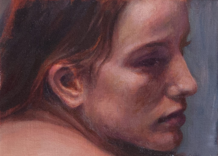
An oil painting of a pencil copy of a drawing found in Risunok: Osnovy uchebnogo akademicheskogo risunka (Figure: Basic educational academic drawing) — a book full of beautiful drawings but with Russian text. I can’t read the words, but at least I can learn something from copying the drawings.

I’m trying to develop the ability to see things in terms of their three-dimensional form, as an object in space, as recommended by Robert Beverley Hale in Drawing Lessons from the Great Masters. He suggests visualising forms in terms of very simple mass:

…the block, the cylinder, the sphere; occasionally the cone; as well as simple combinations and modifications of these forms, principally the egg.

When we wish to create the illusion of reality on the surface of a piece of paper or canvas, nothing is more helpful than the ability to visualise in terms of simple mass. Troublesome problems connected with general shape, proportion, direction, planes, detail, light and shade, and line can all be solved by thinking in terms of simple geometrical masses.

In this painting, many liberties were taken with the lighting, which was developed and invented from the original line drawing. For instance, the light catching the muscle in the top left coming from the shoulder blade is lit too strongly, but I liked it as a centre of interest. I took a picture of the half-finished painting into Photoshop to experiment with the background glow and highlights, and then used that mock-up as a guide for finishing the painting. And the anatomy has no doubt become distorted through the multiple copies (final year students of Medicine & Surgery take note). I recommend Proko.com as a great site to learn how to visualise and draw anatomy.

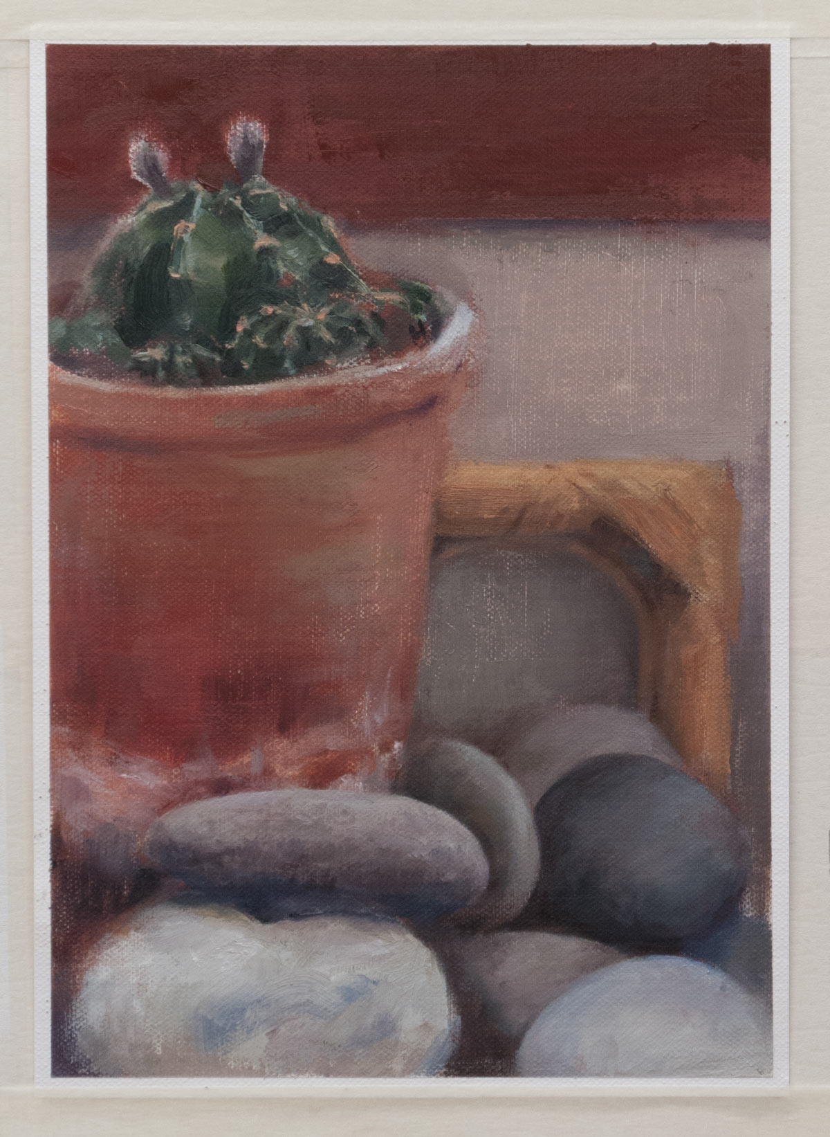
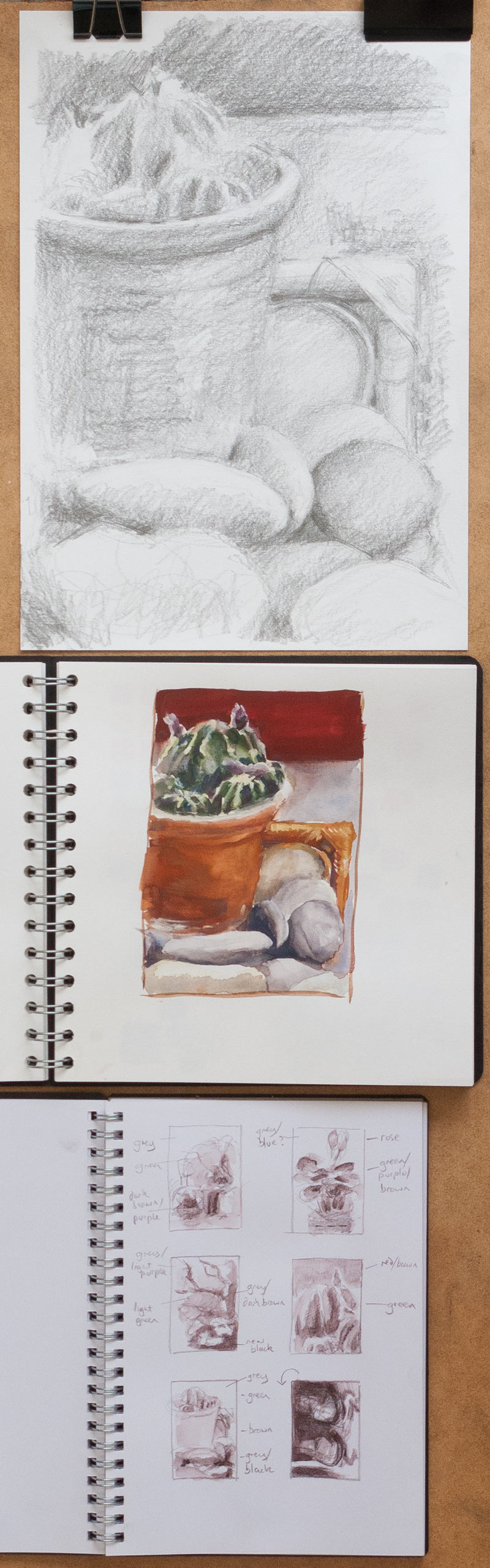
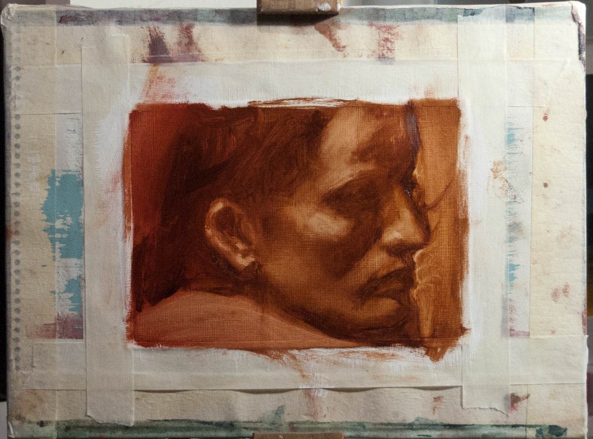
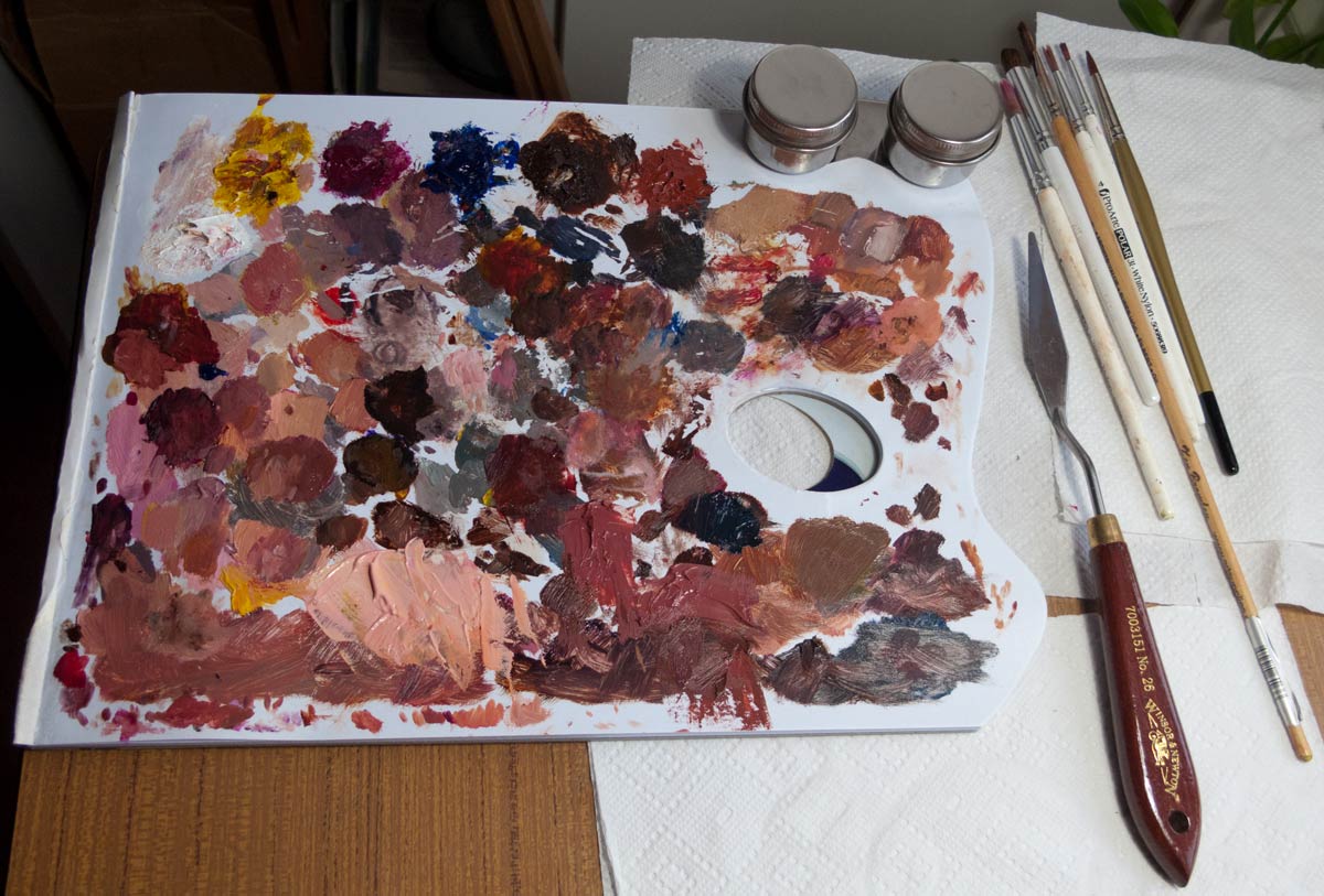
This was also an exercise in developing a method of creating a final painting. I quite like this process of starting with a pencil drawing then transferring it to the canvas, or in this case the usual gessoed paper. A scan of the original pencil copy was enlarged to the final size and printed out on normal office paper. The back of the printout was rubbed with charcoal then taped in place and the outline traced with a red ballpoint pen (red ink makes it easier to see which parts have been traced). I found it helpful to trace not only the outlines but also areas of shade. With the charcoal transfer in place I could quickly build up a tonal underpainting. After that, the experiments could begin with building up layers of paint, blending (or deliberately not blending) the tiles of adjacent colour, making many mistakes, and trying to correct them.

layers and glazing

jugs_and_apple_0396

Another painting in oils, going up in size to A4 acrylic paper covered with an extra layer of acrylic gesso. The still life was set up on a shelf in a cupboard, illuminated with a desk lamp.

A terra rosa underpainting was covered in a grey ‘dead’ layer (grisaille) and allowed to dry in preparation for glazing, which was the main point of this experiment — seeing layers of transparent glaze build up into forms, shadows and colour looked so satisfying when watching others do it, I wanted to try it myself.

But I had some problems. Thinned down with Galkyd Slow Dry medium and spread with a soft brush or rag, the diluted paint seemed to collect in the grain of the surface. So instead of a smooth layer of colour, it gave the underlying paint a dirty appearance. Maybe the previous layer wasn’t completely dry, or perhaps the surface needs to be smoother. Anyway, I ended up adding the final layers in opaque paint, which was quite satisfying as the work had already been done with the previous layers and I could follow the tones of the rough glaze below. I could probably have created much the same effect by painting the final colours directly over the underpainting — I’ll have to do some more glazing experiments.

I didn’t capture the subtle difference between the slightly grey-green jug and the warmer-toned porcelain of the vase (in the end I was just glad to get the shading roughly right). The red of the apple could have been more striking if everything else had a cooler tone. And the vase doesn’t pass the mirror test. But that’s the whole point of these studies: to test out materials and to get to know the pitfalls.

eggs first

egg-800_0373

The world is full of eggs and egg-shaped things, so I need to know how to paint them. It turned out to be quite difficult. Once I got over the apparent simplicity of an egg, I realised that they are full of shifts in hue, value changes, and variations in colour saturation. To add to the confusion, all these shifting variables change according to what’s around them. For instance, the high chroma oranginess of the egg only appeared when the background darkened and turned towards a blue-green-grey.

My aim was not to create a good composition or even an attractive picture, but to paint what I saw as accurately as possible. I used the Holbein Duo Aqua oils with a little of Gamblin’s Galkyd Slow Dry medium as an experiment in smoothing out the brush strokes. Sometimes the light rakes against the tiny ridges made by brush strokes in paint straight out of the tube causing patches of glare, which can make it hard to judge the colour. The medium evens out the surface and also makes the paint thinner and easier to blend. (Oil paint mediums are a rabbit hole of conflicting advice, I found out.)

The set-up was the egg placed on a slightly faded cloth-bound book with the light coming mainly from a desk lamp fitted with a daylight bulb placed a few inches away. I surrounded the back and sides with some black-covered sketchbooks to lower the reflected light and increase the contrast between the light and shadow.

There appeared to be a halo of washed out colour around the highlight, followed by increased saturation moving through the halftones into the shadows, but some areas of the darker halftones also seemed to have low chroma. It really was a case of careful observation then trial and error. Sometimes I would hold the mixed paint on my brush next to the part of the scene I was painting to see how they compared. Mark Carder has invented a colour checker for doing just this but it requires close attention to the lighting to use it accurately, so somehow I need to develop an intuitive way to get to the right mix of paint. This will probably involve painting lots of eggs.