apple to imp

imps_0350

Don’t ask…

apples_and_books_0348

About to be binned

This started out as an experiment with oil mediums. I wanted to see how adding extra linseed oil to the paint would affect its handling properties. I was hoping for a smooth, fluid application but the linseed oil is too stiff and viscous on its own and would need to be thinned down.

In my haste to experiment with mediums I neglected the painting itself, distorting the perspective and missing all the colours. It was meant to be a still life of two apples on some books. I was about to abandon the whole experiment and prepare a new sheet of acrylic gessoed paper when a friend saw a face in one of the apples and suggested I develop this and make my own Hieronymus Bosch.

The results are hardly Bosch, but it was an interesting exercise in inventing forms and deciding how they might be lit.

Hohenstein copy

Adolfo_Hohenstein_copy_0314

A gouache copy from a poster by Adolfo Hohenstein, inspired by watching Jeff Watts copy the work of master illustrators in his Friday Night Workshop.

In the link above, Jeff Watts gives a three hour demonstration of painting in gouache, full of useful advice. All his demonstrations are well worth watching as they let you look over his shoulder as he works in real time while he discusses his technique and art training in general. Particularly useful in this episode are his thoughts on how the consistency of the gouache paint affects its properties. Thinned down it can be used as a light wash or stain, useful during the initial underpainting. But to take advantage of the unique ability for gouache to reactivate even when fully dried it needs to be applied much thicker, so edges can be softened and colours blended.

It’s one thing to make a copy of these illustrations but quite another to come up with the striking graphic design in the first place. This rather sinister figure is enticing us to buy matches.

spontaneity

figure-520_0299

Oil on paper, model courtesy of New Masters Academy.

I was pleased with this one, not because I think it’s a good painting (the anatomy is questionable, and the finish is more like a rough underpainting) but because it was done quickly and spontaneously while using up leftover paint from the previous oil sketch. The revelation for me was that the paint could be overlaid, built up, corrected and modified without too many of the problems I’ve encountered before, such as underlying paint being dug up and polluting a newly applied colour. I applied the paint fairly thinly and kept two brushes on the go at the same time, one for dark paint, one for light. If a major correction needed to be done, such as moving a light edge further out into the dark background, I loaded slightly more paint on the brush and just went over the top. Old paint could be wiped or scraped back if necessary, but generally it seemed that the workability of the paint was due to the confidence of ploughing forward and not getting too fussy.

It was meant to be a monochrome sketch, the leftover colours being mixed into a mud, but the permanent rose and burnt umber created a kind of flesh tone and I added a bit of blue to the shadows.

I’m posting this as a reminder to myself to do more quick oil sketches and to be bolder with the paint. To see someone who really knows how to play with oils and revise and modify a painting, have a look at this short video by Duane Keiser.

shapewelding

Rode_farm-550-0300

Painted in oils on paper, based on a photo of a farm near Rode, Somerset.

I was attracted to the various abstract shapes in this view: the vertical blocks of the building in light and shade, the horizontal stripes of the sky, trees and distant field, and the diagonals of the shadows. In his book Imaginative Realism James Gurney talks about a technique he calls shapewelding to link adjacent areas of similar value or colour to make a stronger composition. Even though I played around with the colours in the main shadow on the left, the values are similar enough to merge with the wall and form a single shape.

I also tweaked some of the details for better effect, such as darkening the right edge of the distant trees to provide more contrast with the white wall, and making sure there was something light behind the left gatepost so it wasn’t lost against the background.

basic values

graphite-value-studies_0091

Juliette Aristides talks about the importance of rendering accurate values in Lessons in Classical Drawing, an excellent book full of practical advice and illustrated with exquisite graphite and charcoal drawings. Of course there are many elements which go towards creating a successful drawing, but if the values don’t work the chances are the whole picture will fall. A white plaster cast takes local colour out of the equation and armed only with a pencil you’re left with the challenge of rendering the whole thing in values alone.

Some of the advice in the book is direct and practical. For instance, if your initial lay-in tends to become a dense dark mass of lines she advises to switch to a harder lead. It sounds so simple and obvious, but already I’ve seen how using a 2H instead of a 2B prevents an incoherent bird’s nest of lines forming before the sketch has really begun.

There is also much more subtle advice which only made sense when I was trying to make what I thought would be a simple drawing of a plaster face, such as paying close attention to the halftones, which can often seem invisible.

I was once invited by a friend to pick chanterelle mushrooms in a forest in the Northwest. When we arrived, all I saw were trees and a carpet of leaves. Yet after some time, my eyes acclimated. As I learned where to look, sure enough, there were mushrooms. Although I had walked through those woods many times, I had never seen half of what was there.

Halftones are a critical element for creating the appearance of believable volume yet, like the chanterelle, they are hidden in plain sight. They are everywhere, yet it often helps to have a guide to see them….

From Lessons in Classical Drawing by Juliette Aristides

skull shading

skull_9909-3

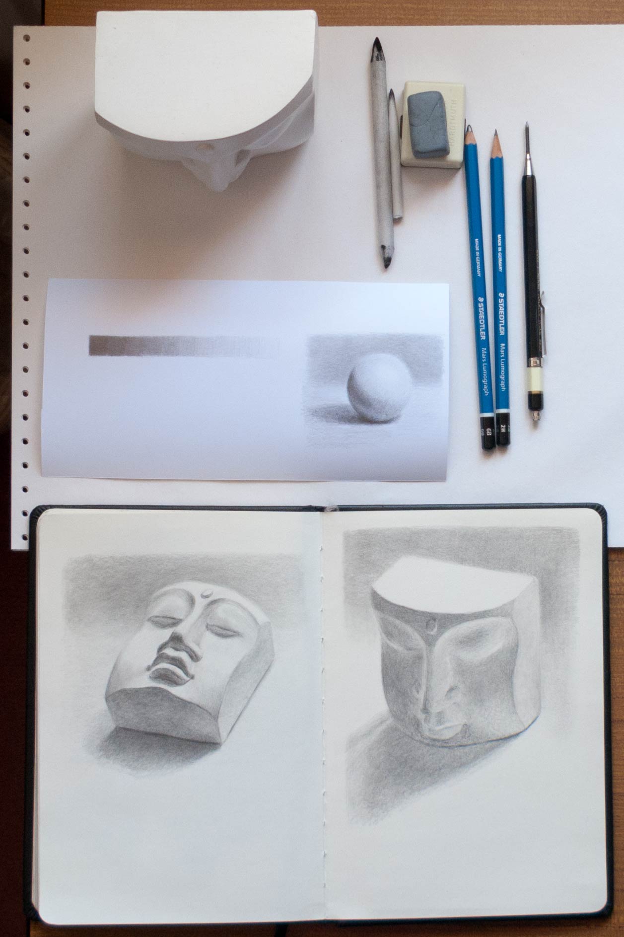
Trying out a clutch pencil and new graphite leads on Bristol board.

The advantage of using a clutch pencil is that there’s no need to whittle down a normal woodcase pencil to expose a long lead for shading on the flat side. It also stays a consistent weight and size in the hand as the lead wears down. I also like that it’s possible to get a more expressive line by using the side of the lead as well as the tip. The Staedtler range of leads seemed to get the thumbs-up in various online forums so I tried some of their Mars carbon 2B 2mm leads in a Koh-I-Noor lead holder (I prefer the weight and feel of the Koh-I-Noor compared to the Staedtler lead holders). Cult Pens had a special offer on a set of 6 Staedtler Mars Lumograph pencils ranging from 6B to 2H, so they had to be added to the basket.

The Staedtler leads are buttery smooth, especially on the toothless Bristol board. The smooth board surface also means that any graphite can be easily taken back to white with a kneaded eraser. I had to tape down the Bristol board (which is more like thin card) as it was bought as a large sheet and had been stored rolled up in a tube. In the future I think I’ll opt for pads instead of loose sheets.

Drawn from a photo found on the internet, taken by Anastasia at the State Darwin Museum in Moscow, the perspective shows off the wide looping zygomatic process (the thin bone connecting the cheek bone to the side of the skull). As the skull is a museum exhibit I couldn’t tell if this bone structure was unusual or just natural individual variation.

I didn’t use a grid this time, but I found it helpful to lightly shade in the main dark shapes right at the beginning of the lay-in to check the general proportions rather than use outlines alone. With the shading, establishing the darkest darks early on made it easier to assess how light to make the other tones. I couldn’t decide on the background: Leaving it white would hide the shape of the top of the skull. I took a mock-up into Photoshop to play around with various background options and decided that a bit of tone around the right edge would emphasise the skull shape and cheekbone. After adding this light shading I tried to blend it into a smooth tone using a paper stump but just made a smudgy mess (I’m not sure why), and in the end used a hard 2H lead to lightly scumble the graphite around.

This is an example of the limitations of working from a photo. It would have been so useful to have examined the skull as a three dimensional object rather than try and work out the structure from patches of light and dark – the back of the jaw bone was especially hard to decipher. I’ll keep my eye out for a junk shop skull.

whose statue?

widcome_cemetery_statue_9880

widcome_cemetery_statue_lay-in_9877

A statue over the grave of Constance Christian Hardyman (died 1892, age 25) in Smallcombe Cemetery in Bath, at least those are the details on the headstone. A search on the internet reveals that “Constance [Trueman] died in Bath in April 1892 after the birth of the couple’s first child, Constance Christian“, but that doesn’t match up with the headstone. As with many of the crumbling, lichen-covered headstones in that cemetery, who knows who lies below.

This was intended to be a figure study but I wanted to get it fairly accurate, so for the lay-in I drew a grid matching one over the photo. A rough watercolour wash was used to get the main dark shapes (using Ed’s homemade watercolour set, made from a converted mint tin with the half pans attached with magnetic tape).

After that it was trial and error with many layers of acrylic paint. The colour choices were based on the mid-winter frost-covered scene with its purples, russets, blue greys and whites.

I couldn’t settle on the background. I wanted it to be roughly true to the original scene rather than just showing a generic graveyard, but it looks rather contrived and gimmicky despite toning it down with white mixed with glazing medium. I think I should do more straightforward studies before getting too painterly like this, and develop skills in colour mixing, values and composition.

light and dark

lake_garda_9872

malcesine_9871

Following on from the previous post, I wanted to create a similar illusion of light areas made brighter by contrasting them with areas of dark, but this time using my own photos as reference – these are taken from a holiday in Malcesine on Lake Garda in Italy.

The picture by the lake seemed to be a bad choice for this experiment as the whole scene is flooded in bright sunlight. The lightest value is on the shirt of the figure in the centre, though the whole of the stone jetty needed to look strongly sunlit. The contrast is provided surprisingly by the distant haze of the receding lake and mountains which even in the bright sunlight appear as a relatively dark blue grey.

In the original photo, the eaves of the house on the right were very dark, almost black. One of the dangers in working from photos is that the shadow detail can often be lost, though in this case I thought that would work to my advantage as I wanted to create more contrast and avoid what James Gurney calls ‘middle value mumbling‘. After painting the eaves nearly black, I tried to add a highlight along the outside edge, but I overloaded the brush with paint and created an unnaturally thick white line. As I wiped it away with a finger, it blended with the dark under-eave colour. The result by happy accident looks much more realistic, with the eaves reflecting the bounced light from below. The house dimensions are way too small compared to the figure in the centre (which is slightly too large) – imagine the size of the figure looking out of the top floor window.

The second sketch was more successful in terms of contrast and perhaps composition but I’m not sure I’ve captured the light glancing across the uneven surface of the pink wall in the centre – it looks more like a wall of drying plaster. This is another hazard of trying to be too faithful to a photograph: what makes sense in a photo might not translate into paint.

glow in the dark

miura_philosophers_copy_9873

A quick gouache copy of Terry Miura’s oil painting The Philosophers.

I’m always struck by how the illusion of glowing, light-filled areas can be produced by surrounding those areas with dark. The strong sunlight transmitted through the red canopies can only appear that bright if the whole scene is painted in a low key. Ignoring the white highlights, the lightest values in the painting are the red canopies and the foreground in the sunlight, but they’re not that bright at all when you examine the paint used: a dull pink/brown for the foreground and a not very saturated lightish red for the umbrellas.

The gouache I mixed up for the background lightened dramatically as it dried, taking away from the illusion. This is perhaps partly due to the matt finish of gouache, but it’s something I need to keep in mind when mixing paints. And somehow I’ve managed to chop the philosophers’ legs off and put them on baby chairs – perhaps that’s what they’re discussing.

lost edges

mystery_writer_9760

A gouache on Seawhite Kraft paper copy of a picture that I found somewhere on the internet. I forgot to note down the artist’s name when I saved it, something I do religiously now (usually) because it’s frustrating not to be able to find more of their work or to give credit in a blog post.

The Seawhite gouache (04 Mauve) looks almost fluorescent when lit by a daylight bulb. The other colours were burnt umber, burnt sienna (close to the tone as the Kraft paper background), and titanium white, painted with a 3/8 inch flat brush to keep it loose.

I recently discovered the work of Terry Miura who paints in a style I love: a mixture of loose painterly expressionistic brush strokes with areas of tightness and detail. I love the effect of moving from abstraction to realism within a painting. Oh, to be able to paint like him! His blog is a fascinating insight into his working methods and vision. Here’s a list of sticky notes he has taped to his easel to help him with composition:

-Unequal distribution of dark and light masses. Don’t make them 50 – 50.
-Have one dominant color. Additional color masses need to be clearly lesser in visual impact.
-Use a variety of edges on every shape. Lose an edge on every shape if you can.
-Paint the concept, not things.
-Have a hierarchy of interesting areas.
-Manipulate this hierarchy with value contrast, hue choices, saturation, edges, opacity, impasto, brush activity, and textures.
-Big passive area vs. small active area
-You don’t need two big passive areas.
-If the focal point is in light, simplify the shadow. If it’s in shadow, simplify the light.
-If the focal point is in light, lower the key. If it’s in shadow, raise the key.
-Connect shapes wherever you can. (Same thing as losing edges)
-Whenever you break a rule, make sure it looks intentional.
-Repetition and variation. Over do them. Then pull back.
-Less is more.
-Make Only One Statement!

On the top his easel, in big black letters, he has written the word MYSTERY.