clouds

clouds-800_9706b

Some isolated clouds out to sea, viewed from a Cornish cliff top.

I’d like to say I made this postcard sized oil sketch on the spot as a pochade, but it was based on a series of photos. A quick underpainting of acrylics was overlaid with layers of oil.

The titanium white is the slowest drying of all the oils in this palette and only goes tacky after a few days. This can lead to problems if extra glazing is attempted too soon. I’ve heard that the slower drying walnut oil is sometimes used for whites instead of linseed oil as it is less yellowing, but I don’t know if this is the case with these Holbein Duo Aqua oils.

The finished painting was hard to photograph accurately. Subtle changes in the ambient light makes the colours and contrast look markedly different.

join the dots

seaworld-900_9695

Various critters snapped in a Cornish rockpool earlier this year, drawn with a dip pen and ink.

I used the ink straight from the bottle, so the nib (Gillot 404) had to be cleaned before each change of colour to keep the bottles pure, but I also cleaned the nib after prolonged use of one colour to avoid the build-up of dried shellac.

Previous sketches showed how even a light pencil lay-in would get trapped under the ink and could not be erased, so everything had to be drawn directly on the page, but the pointillist gradual build-up of dots prevents too many quick mistakes.

brown paper

bowl_9681

plant_pot_9683

Trying out a Seawhite Kraft sketchbook, which has 40 pages of 175gsm brown ‘Kraft’ card suitable for wet and dry media according to the blurb.

The card is slightly rough but doesn’t have much texture. Despite the spiral binding the pages have a slight warp and don’t lie completely flat even when new, but I find this encourages more experimentation and quick sketches as I’m not daunted by a perfect blank page.

The main reason for trying this sketchbook was to experiment with a toned background. With the midtones already there, the paint mostly adds highlights and shadows. These sketches in acrylic were to practice mixing the right range of values in the various areas of reflected light and cast shadows.

acrylic blending

fred_cuming_owl_copy_9676

A rough sketch copy of a painting by Fred Cuming to experiment with blending colours using acrylic paint.

Instead of using glazing mediums for the background, I used only water. By mixing the colours on the palette with a wet brush, the paint was already fairly thin when I applied it. After covering an area with wet paint, I would straight away clean the brush and re-wet it, then go back over the area to further dilute and stretch the glaze.

When it’s that dilute, the acrylic paint behaves more like gouache in that it doesn’t bind fully to the paper (at least if the paper is still a little wet), so it can be lifted and faded by scrubbing with a wet brush.  I was using cheap hog hair brushes which allow for all sorts of rough treatment without having to worry about damaging the bristles.

The colours I’ve mixed are a little too garish. The original painting, which I copied from a scan of a greetings card, has a much more subtle palette.

exaggeration

bertrand_russell_9666

Bertrand Russell

richard_feynman_9662

Richard Feynman

alex_salmond_9664

Alex Salmond

chimpanzee_9664

Pan troglodytes

maggie_smith_copy_9665

A copy of Derren Brown’s sketch of Maggie Smith

maggie_smith_9667

Maggie Smith

tom_jones_9661

Tom Jones

Drawing portraits has been described as making a picture of someone where the eyes aren’t quite right and the nose is in the wrong place. Well, if I’m going to get it wrong, why not really get it wrong and turn the face in to a caricature: find the features which make a person recognisable and exaggerate them.

I was inspired by seeing Derren Brown’s preliminary sketch of Maggie Smith, which I copied (above) as I found it very instructive in the way that he takes a feature, such as a cheekbone or a chin, and then sculpts and magnifies that form independently of what is really there.

I tried to do the same thing with a number of photos found on the web. Other than Alex Salmond’s enormous jowl and Bertrand Russell’s oversized collar, I found it surprisingly hard to exaggerate most features. As I was drawing, I thought I was overstating Richard Feynman’s distinctive high forehead and quizzical smiling frown, but I quickly slipped back into attempting an accurate copy. Perhaps this is a good way to draw a face: aim for an exaggeration then let the natural instinct to draw accurately tone down the caricature into a more lively portrait.

white jug copy

white_jug_copy_9583

An attempt to copy a painting by Larine Chung, found on Will Kemp’s page about choosing a basic colour palette. I was impressed by the effect created by just three colours (ultramarine blue, burnt sienna and titanium white) in Larine Chung’s original. I used ultramarine blue, burnt umber, a little azo yellow and titanium white in the Duo Aqua oils.

The handle was the hardest, with the whole three-dimensional appearance being easily thrown off with just a little paint in the wrong place – I still don’t think I got the light quite right, and the alignment of the spout and the handle seems wrong. And I haven’t captured that beautiful luminous glow of the porcelain in the original.

I used a small fan brush to do some of the blending, and found how easy it is to pollute the darks with lighter paint. See Mark Carder’s video on just this problem.

bookshelves

bookshelves_9572

More experiments with oils, getting to know their properties and how they behave. I wanted to get away from using an on-screen photo as a reference, but painting the bookshelves in the corner of the room presented the problem of continually changing light. Not only did the illumination in the corner of the room change during the few hours spent painting but the painting itself was in turn lit by overcast clouds, direct sunlight and sunlight through a drawn curtain – not ideal, but it underlined the importance of consistent lighting when attempting to get any sort of accurate colour.

I started with a perspective sketch and spent some time with a pencil held at arm’s length to get the proportions right. The various mistakes (such as the angle of the top of the books on the lower shelf) were going to be corrected the next day, but the paint had already become tacky and unworkable. Maybe the way round that is to let it dry even more before correcting, or use a slow drying medium so the paint stays workable for days.

I’d bought some low-tack masking tape to hold down the acrylic paper, hoping that would cure the problem of the paper ripping on removal. If anything, this was worse than the masking tape bought from the DIY shop. Perhaps I need to rethink the whole painting on paper technique.

head of Venus

venus_statue_9559

The head of the Venus Callipyge outside the Pantheon in Stourhead, Wiltshire, painted in acrylics from a photo (most photos I take now are composed with a painting in mind).  The ever-forgiving acrylics allow for repeated alterations. Blending of a sort was possible with glazing medium and working quickly with wet paint, but tones could also be built up by a kind of scumbling as the paint dried. There was a surprising amount of colour in the grey stone.

speed

gurneycopy-900_9510

This is a copy of a painting by James Gurney which he made while waiting for his breakfast to arrive. He painted the man at the bar in about 10 minutes with the rest of the scene completed later.

It took me over an hour to do this pencil copy, sat on a sofa in the evening with the TV on in the background, enough time for half a dozen Gurney paintings. But I think I need to stop being so concerned about speed as I think that comes naturally with regular practice and knowledge of materials.

I do find myself falling back to pencil much of the time as it’s the only medium where I can quickly render large areas of tone together with areas of precision. If only it didn’t look like pencil! For a painting I still need (for now) a table, a couple of tubs of water with access to a tap for refills, kitchen roll, space for the paper, brushes and materials, and lots of time.

thumbnails

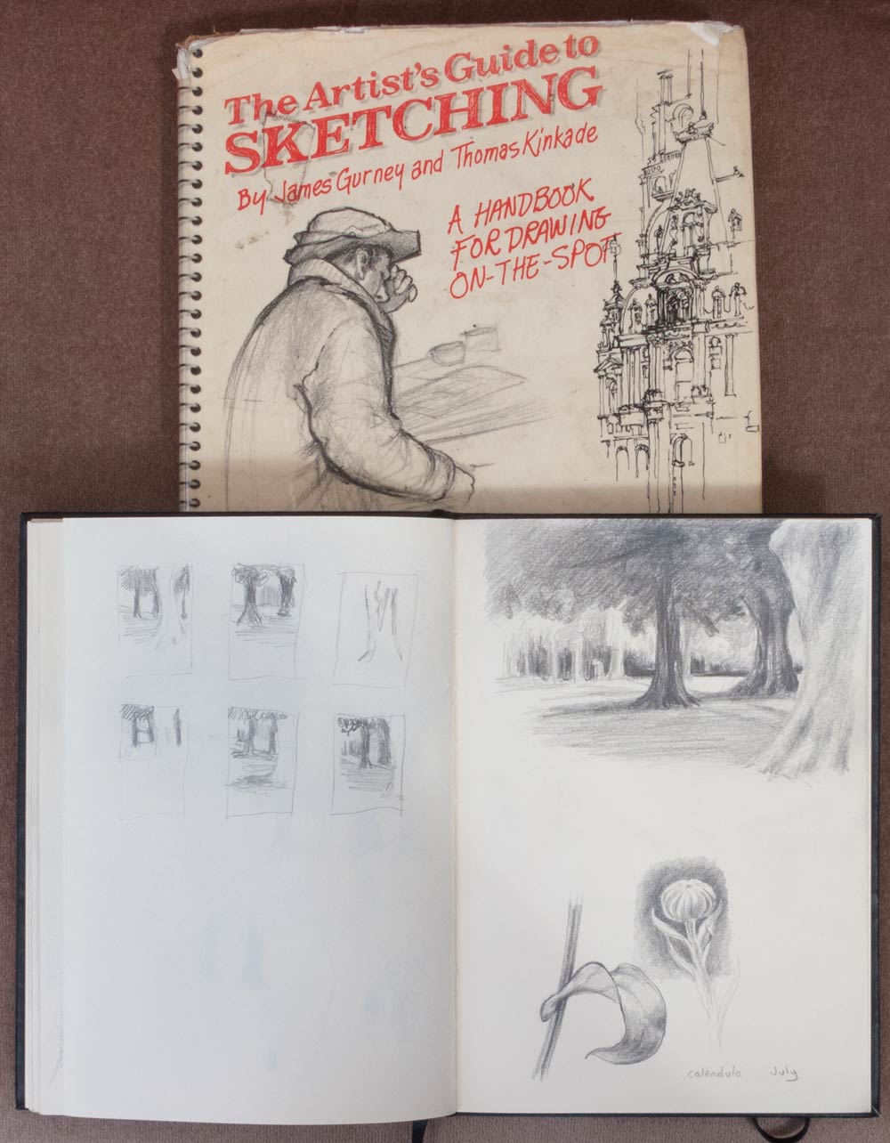
After reading Color and Light by James Gurney, I’ve been trying to track down a copy of The Artist’s Guide to Sketching, an earlier book he co-wrote with Thomas Kinkade. Unfortunately it is out of print and the second-hand prices have gone crazy. Then I remembered we still have public libraries in this country and reserved a copy for a humble pound.

One of the tips he gives is to spend some time drawing small thumbnail sketches of the scene instead of beginning the drawing right away. This gives the chance to try out different compositions and experiment with areas of focus. But for me the most useful result of making these thumbnails is that it creates enough time to look at the subject before committing to a drawing. Once I’ve decided on a subject, the urge to start sketching right away is near irresistible, with the result that the composition often suffers. Just looking at the scene without drawing anything I find very hard, so scribbling thumbnails satisfies the need to be making marks immediately. By creating a number of empty rectangles you’re forced to reassess the scene a number of times, giving the eye a chance to discover the important features while giving the impatient hand something to do.

In the sketch above, I was drawn to the shapes between the three trees in the foreground, but only after the time spent drawing thumbnails did I realise that the empty sunlit space in the middle distance to the left, with the path leading off through the avenue of trees, is what attracted me to the tree shapes to begin with.