Category Archives: oil

spontaneity

figure-520_0299

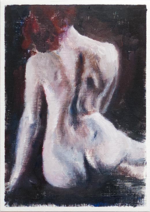
Oil on paper, model courtesy of New Masters Academy.

I was pleased with this one, not because I think it’s a good painting (the anatomy is questionable, and the finish is more like a rough underpainting) but because it was done quickly and spontaneously while using up leftover paint from the previous oil sketch. The revelation for me was that the paint could be overlaid, built up, corrected and modified without too many of the problems I’ve encountered before, such as underlying paint being dug up and polluting a newly applied colour. I applied the paint fairly thinly and kept two brushes on the go at the same time, one for dark paint, one for light. If a major correction needed to be done, such as moving a light edge further out into the dark background, I loaded slightly more paint on the brush and just went over the top. Old paint could be wiped or scraped back if necessary, but generally it seemed that the workability of the paint was due to the confidence of ploughing forward and not getting too fussy.

It was meant to be a monochrome sketch, the leftover colours being mixed into a mud, but the permanent rose and burnt umber created a kind of flesh tone and I added a bit of blue to the shadows.

I’m posting this as a reminder to myself to do more quick oil sketches and to be bolder with the paint. To see someone who really knows how to play with oils and revise and modify a painting, have a look at this short video by Duane Keiser.
shapewelding

Rode_farm-550-0300

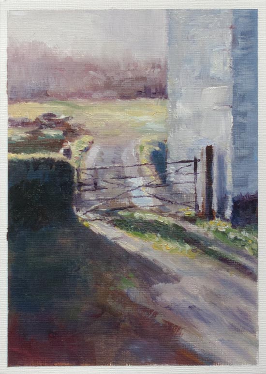
Painted in oils on paper, based on a photo of a farm near Rode, Somerset.

I was attracted to the various abstract shapes in this view: the vertical blocks of the building in light and shade, the horizontal stripes of the sky, trees and distant field, and the diagonals of the shadows. In his book Imaginative Realism James Gurney talks about a technique he calls shapewelding to link adjacent areas of similar value or colour to make a stronger composition. Even though I played around with the colours in the main shadow on the left, the values are similar enough to merge with the wall and form a single shape.

I also tweaked some of the details for better effect, such as darkening the right edge of the distant trees to provide more contrast with the white wall, and making sure there was something light behind the left gatepost so it wasn’t lost against the background.

clouds

clouds-800_9706b

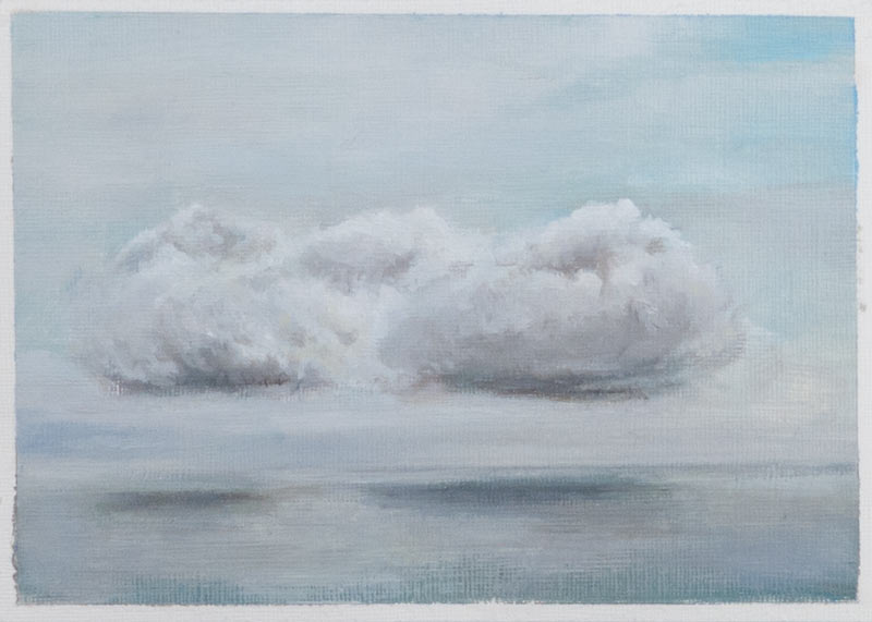
Some isolated clouds out to sea, viewed from a Cornish cliff top.

I’d like to say I made this postcard sized oil sketch on the spot as a pochade, but it was based on a series of photos. A quick underpainting of acrylics was overlaid with layers of oil.

The titanium white is the slowest drying of all the oils in this palette and only goes tacky after a few days. This can lead to problems if extra glazing is attempted too soon. I’ve heard that the slower drying walnut oil is sometimes used for whites instead of linseed oil as it is less yellowing, but I don’t know if this is the case with these Holbein Duo Aqua oils.

The finished painting was hard to photograph accurately. Subtle changes in the ambient light makes the colours and contrast look markedly different.

white jug copy

white_jug_copy_9583

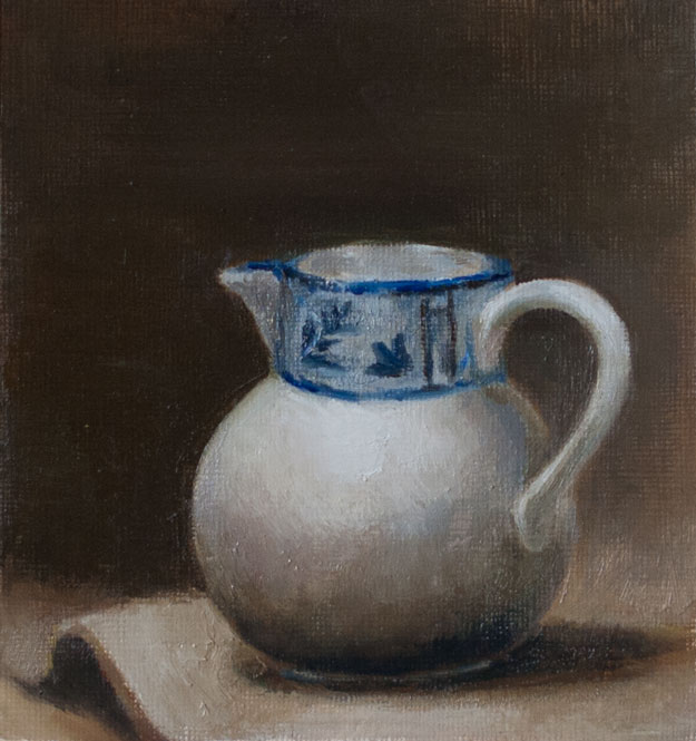
An attempt to copy a painting by Larine Chung, found on Will Kemp’s page about choosing a basic colour palette. I was impressed by the effect created by just three colours (ultramarine blue, burnt sienna and titanium white) in Larine Chung’s original. I used ultramarine blue, burnt umber, a little azo yellow and titanium white in the Duo Aqua oils.

The handle was the hardest, with the whole three-dimensional appearance being easily thrown off with just a little paint in the wrong place – I still don’t think I got the light quite right, and the alignment of the spout and the handle seems wrong. And I haven’t captured that beautiful luminous glow of the porcelain in the original.

I used a small fan brush to do some of the blending, and found how easy it is to pollute the darks with lighter paint. See Mark Carder’s video on just this problem.

bookshelves

bookshelves_9572

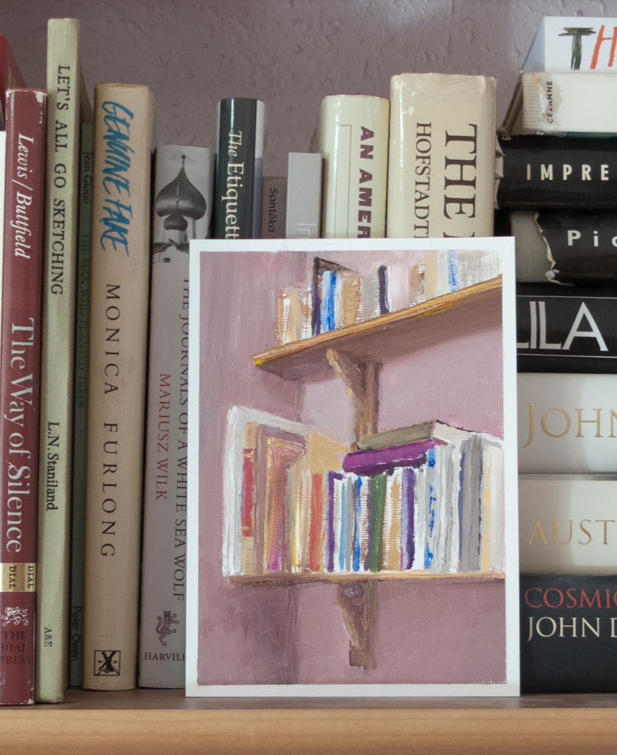
More experiments with oils, getting to know their properties and how they behave. I wanted to get away from using an on-screen photo as a reference, but painting the bookshelves in the corner of the room presented the problem of continually changing light. Not only did the illumination in the corner of the room change during the few hours spent painting but the painting itself was in turn lit by overcast clouds, direct sunlight and sunlight through a drawn curtain – not ideal, but it underlined the importance of consistent lighting when attempting to get any sort of accurate colour.

I started with a perspective sketch and spent some time with a pencil held at arm’s length to get the proportions right. The various mistakes (such as the angle of the top of the books on the lower shelf) were going to be corrected the next day, but the paint had already become tacky and unworkable. Maybe the way round that is to let it dry even more before correcting, or use a slow drying medium so the paint stays workable for days.

I’d bought some low-tack masking tape to hold down the acrylic paper, hoping that would cure the problem of the paper ripping on removal. If anything, this was worse than the masking tape bought from the DIY shop. Perhaps I need to rethink the whole painting on paper technique.

black and phthalo blue

flowervase_747_9049

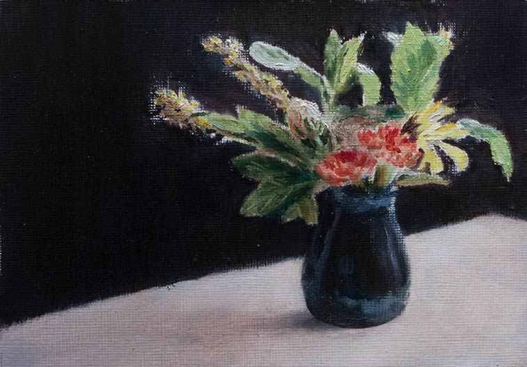
Copied from a photo and from life using oils on paper, this painting took a beating as I tried to get it in to shape.

The first problem was finding the right mix of paints to match the intense, saturated mid-green colour of the transmitted light passing through the mint leaves (yes, they’re mint leaves). I had ultramarine blue and azo yellow but really needed something like phthalo blue to get that high chroma acid green which could be adjusted with yellow and titanium white.

I ended up buying a tube of Winsor Blue which had the colour labelled as PB15:3. Only later did I realise that I’d bought Winsor Blue Red Shade when I really needed Green Shade (PB15). Also, the tube was regular oil paint, not the water-miscible oil I was using. I was hoping (after reading online forums) that I could clean up the brushes with just soap and water, after all it is just oil. It does clean up but needs a lot more working in to the bristles of a lot more detergent than is needed for the Holbein Duo Aqua oils, and phthalo blue being an intense staining colour doesn’t help.

Anyway, all that palaver resulted in the rather insipid green on the right-hand leaves.

The backdrop was a black shirt hung up behind the vase which was sitting on some white kitchen roll. (I thought a white surface would be an improvement on the imitation wood formica table top — am I ruining the mood?)

I managed to mix up the background black a little too well, and the first draft looked dead and flat. Closer inspection of the flowers showed they had more depth and variety of values than I had initially painted, so I decided to try glazing on some darker values to create more contrast.

Instead of burnt umber I used a mix of more translucent paints for the glaze, hoping I could build up tones while letting the colours beneath shine through. In my haste the glaze mixed in with the titanium white of the table top which I hadn’t allowed to dry. The resultant murky mess was nothing like the subtle glazes found in the paintings of the old masters, instead it looked as if I’d spilt something.

I used more kitchen towel to scrub off the ‘glaze’ and tried a few more times, with similar results.

Eventually I got to that point where I knew the painting was lost. So I patched up the table top and shadows as best I could and drew a line under the whole exercise. The murky grey brown lighting doesn’t complement the inaccurate greens. The lighting is flat, the arrangement of flowers too literal (what’s going on above the carnations?). Composition, colour, value, lighting — there’s a lot to learn. At least now I know some of the ways not to do it.

Rose hips

rosehips_8825

Painted with water soluble oils on paper from a photo taken in the garden. A top tip from Anna Mason’s site is to put a sheet of white card behind the subject when taking the photo. This enables you to assess the composition straight away, and there is no need to do any complicated masking in Photoshop.

The paper is from a 7×5 inch canvas-textured 300gsm acrylic pad (Galeria by Winsor & Newton). I added and extra layer of acrylic gesso with a wide flat house painting brush to further protect the paper from the oils. The texture gives a satisfying resistance to the brush.

Space is a problem where I paint, so by mounting the paper on a board it can be easily propped up on a bookshelf out of the way in between sessions or when waiting for the oils to dry. In this case, the paper was attached to a hardback Tintin book (Explorers on the Moon, since you ask) using masking tape. The masking tape can sometimes rip the surface when removed if pulled off too quickly. I don’t know if this is because I’m using masking tape bought from a DIY shop (is there a low-tack version?) or because the applications of gesso and paint somehow bind the tape to the paper.

The layers of paint on these small sketches are quite thin. In summer it took a few days to be touch dry. I don’t know how long it takes to be fully dry (or should I say ‘cured’), but as I’m not going to be varnishing these, it doesn’t really matter. I’ve read that its best to mount unvarnished paintings behind glass to protect them from dust. Most of my pictures up to now have been drawn in sketch books, but now I need to read up the best way to store these individual paintings.


Fire hazard

sim_simulation_8759

Sometimes you’ve got to give in to that urge to get the paints out and mix them all together, just for the joy of it. Compared to acrylics, the water-soluble oils make the blending process very satisfying.

The face was copied from the Katie Sims painting Featherweight, which impressed me greatly when I saw it at a local gallery. I think the face she painted was inspired by another painting in the gallery’s permanent collection.

Once more, with feeling

daliwatch-oil_8412

I decided to copy the watch a second time to try out some new water soluble oils and to see how they compare with acrylics, using a pad of acrylic paper with an extra layer of white acrylic gesso applied.

Because the paint isn’t dry in 2 minutes (like acrylic) there’s more time to blend and fuss, and it’s easier to make a smoother blend or to tease the paint in to an edge (shadow to left side of watch). I’m not used to the colours in this starter set and had trouble getting a dark grey for the background. I usually get dark neutral colours by mixing an earth colour with ultramarine. With this palette I get a purple by mixing the blue and red, but adding yellow creates brown as it lightens the whole mix. I’ve since ordered more paints to match as close as possible the colours I’m used to, based on my limited watercolour palette.

highlightedhighlights_8411

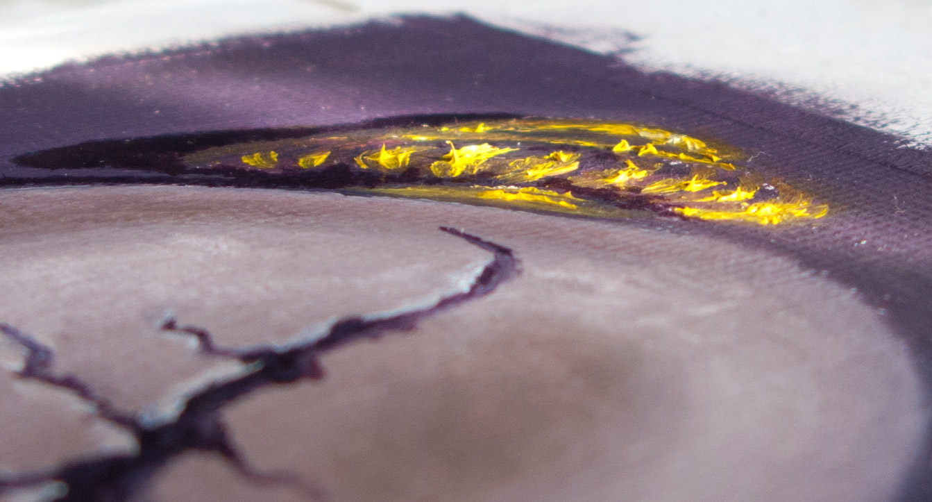
Another difference to the quick-drying acrylics was that highlights were unexpectedly difficult to apply as they would dig up darker paint from lower layers (a common beginner’s mistake, apparently). I ended up putting on the gold highlights in an impasto, like icing on a cake.

On the finer details the paint dragged a little. I’ve ordered some water soluble linseed oil and quick drying liquid to loosen it up. I’ve heard that walnut oil is good, but thought I’d stay with the water soluble range for now.

Touch dry within a couple of days (but probably not fully dry).

The linseed oil smell is quite pleasant, and being water soluble the brushes clean up with a bit of washing up liquid and water.

I’ve heard that some people hate water soluble oils and find their consistency unworkable. Others say that they behave like normal oils so long as water is only used for cleaning brushes and not as a solvent during painting. Instead use water soluble linseed oil or other mediums.