Category Archives: pencil/graphite/charcoal

fixed lines

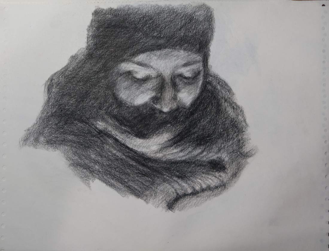
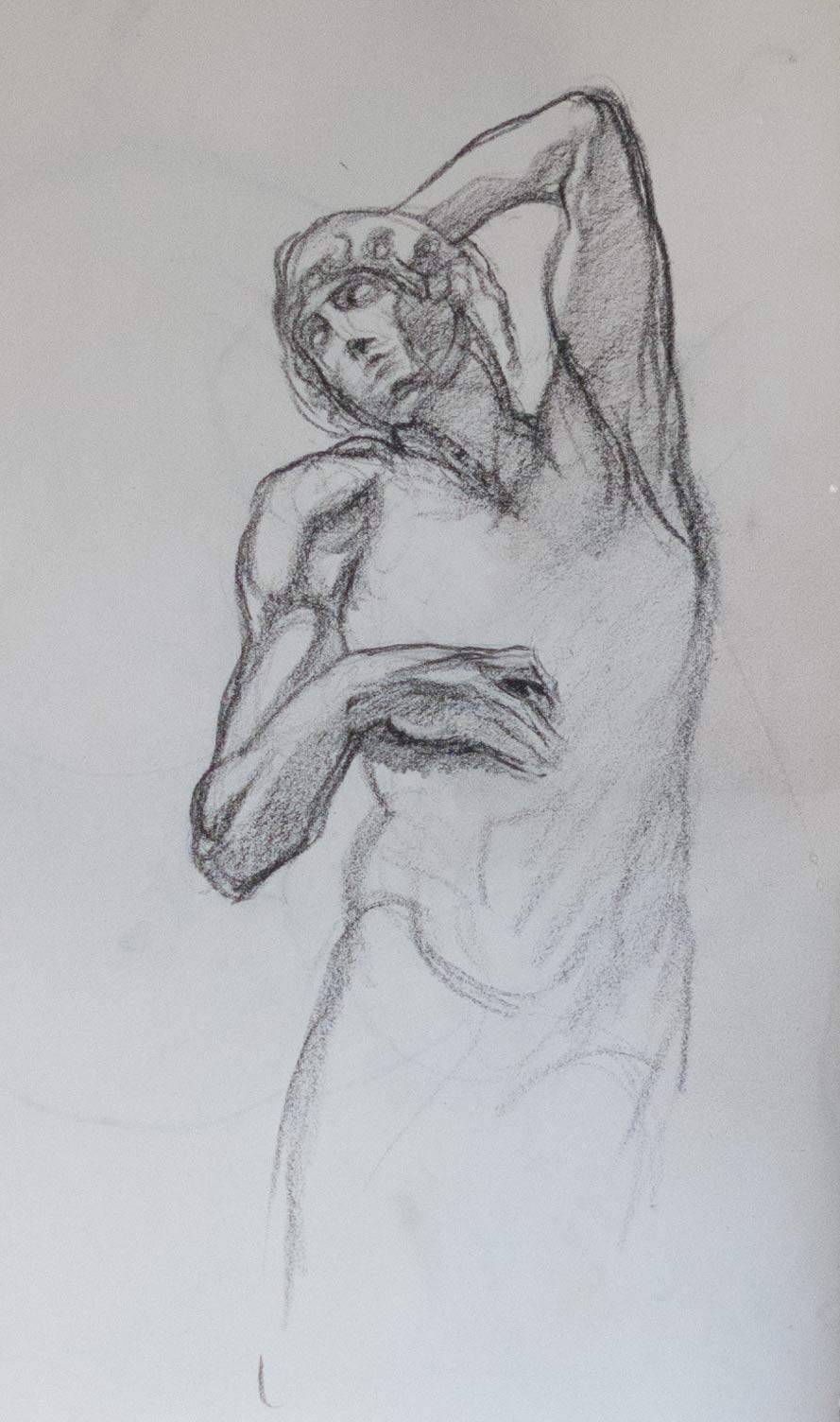
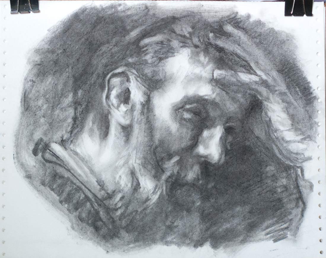
A vine charcoal copy of a drawing by Ernest Laurent of Georges Seurat. (I thought it was a drawing by Seurat of Laurent until I realised I was reading the caption incorrectly, though Seurat has made some beautiful tonal drawings.)

I copied this from a full page reproduction in Juliette Aristides book Classical Drawing Atelier at almost sight size. Even so, this is a different face from the one in the book. The forehead is higher and the gaze more stern. The features in the original are more round and gentle. The tiniest change made to the shape of an eye with the tip of a sharpened stick of charcoal could transform the face dramatically.

Laurent gives the illusion of a rough sketch with his quickly drawn lines around the edges of the picture. The face in the centre, however, has a precision and diffuse softness which was hard to reproduce. For some of the background areas of the drawing I tried blending the charcoal into the laid charcoal paper with a screwed-up piece of kitchen paper, but this creates an even smudgy grey rather than the clean halftones of Laurent’s original. Laurent’s mid greys seem to be a clean black dot on an untouched paper background, much like the halftone dots of a newspaper photograph.

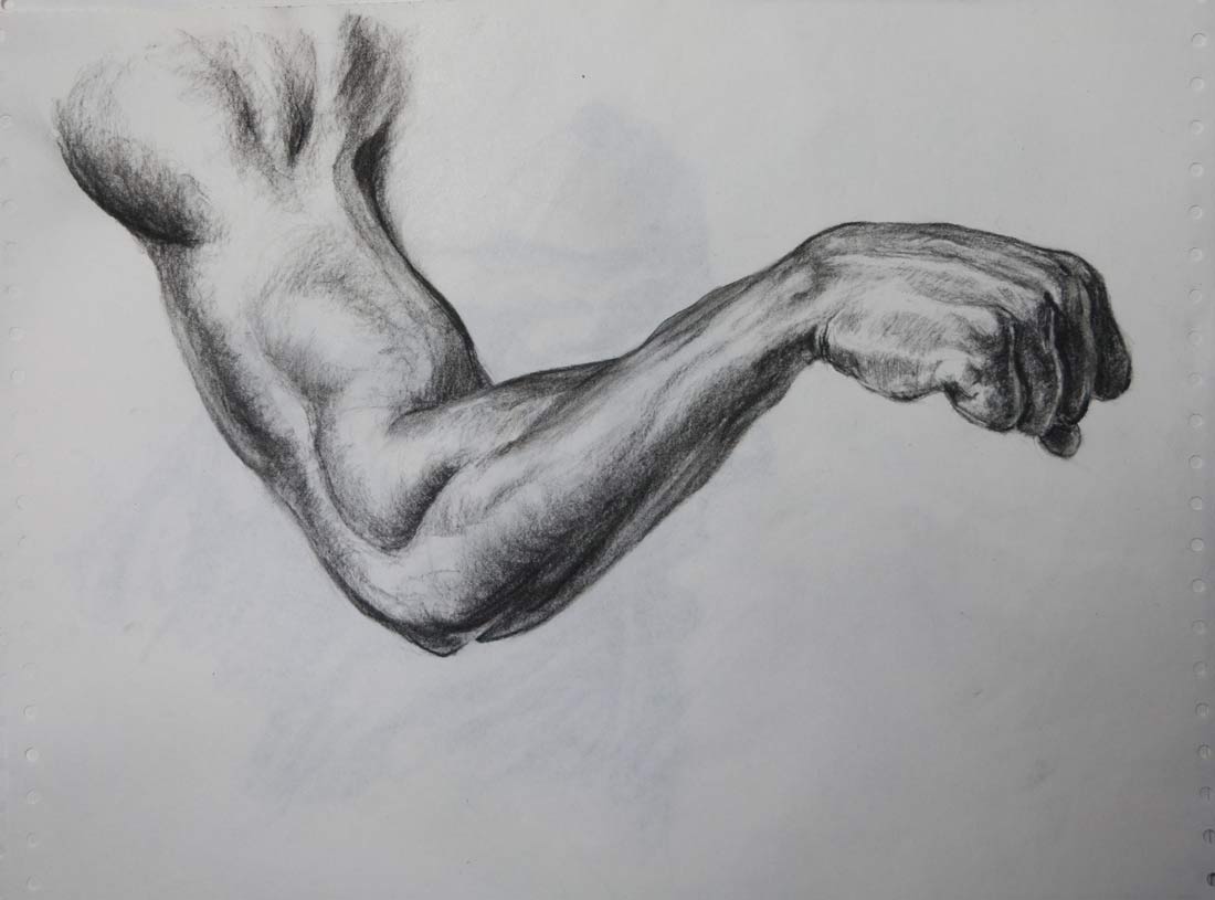
As I’ve mentioned before, vine charcoal is lovely to draw with, being very maleable and erasable, but the finished drawing is so ridiculously susceptible to damage that I think even the process of putting a drawing behind glass in a frame would risk some smudging.

One solution would be to use a spray fixative. Up until now, I’ve had two reservations about this: that the fixative would darken or shift any delicate tone changes in the drawing, and that individual drops of spray would create a coarse, blotchy mess on a smooth areas.

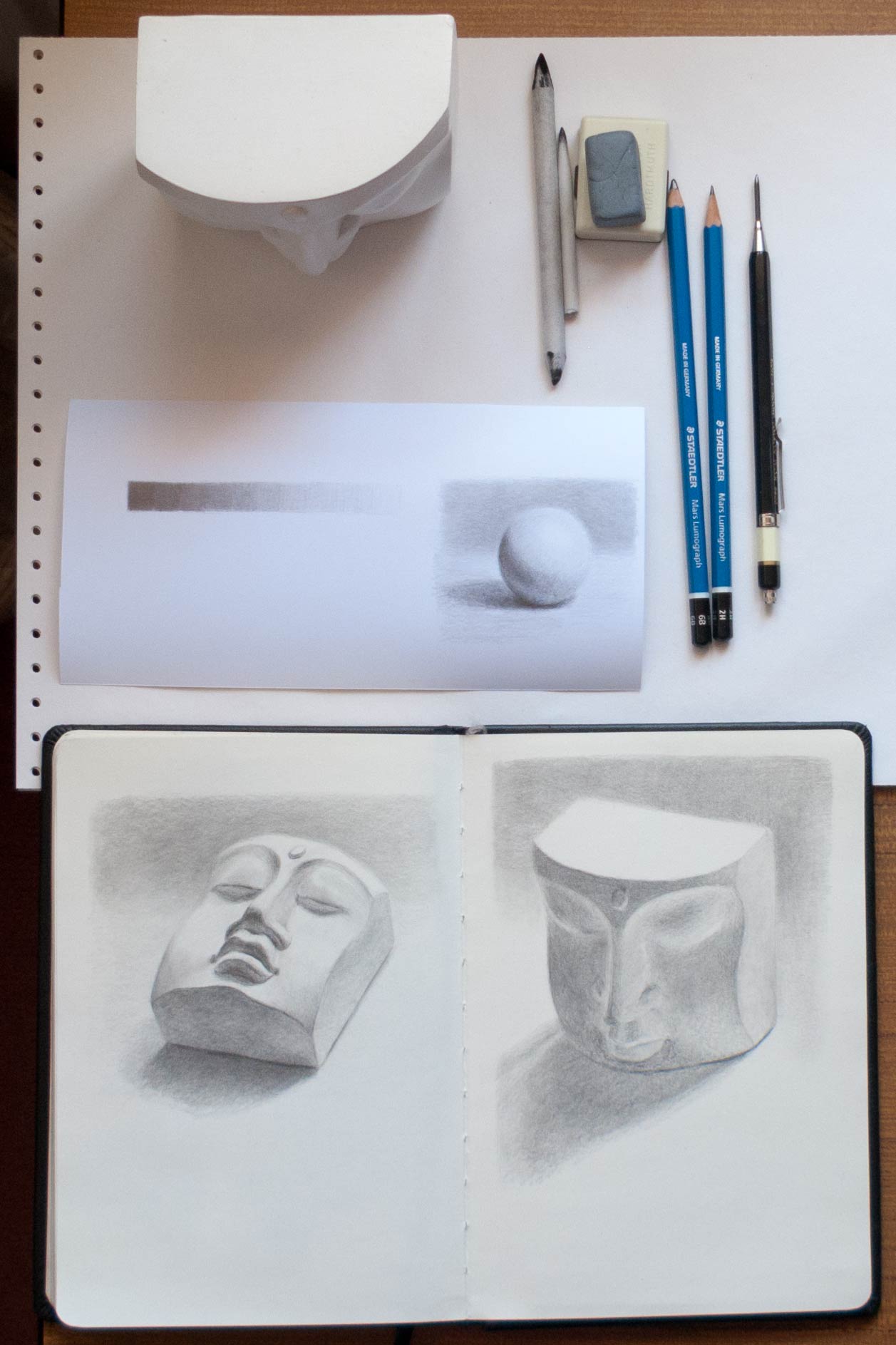
To test this, I drew tone gradients on charcoal paper (Strathmore laid toned charcoal paper), then covered the left half with a sheet of paper before spraying with fixative from an art shop (Winsor & Newton Artists’ Fixative). Here it is before spraying:

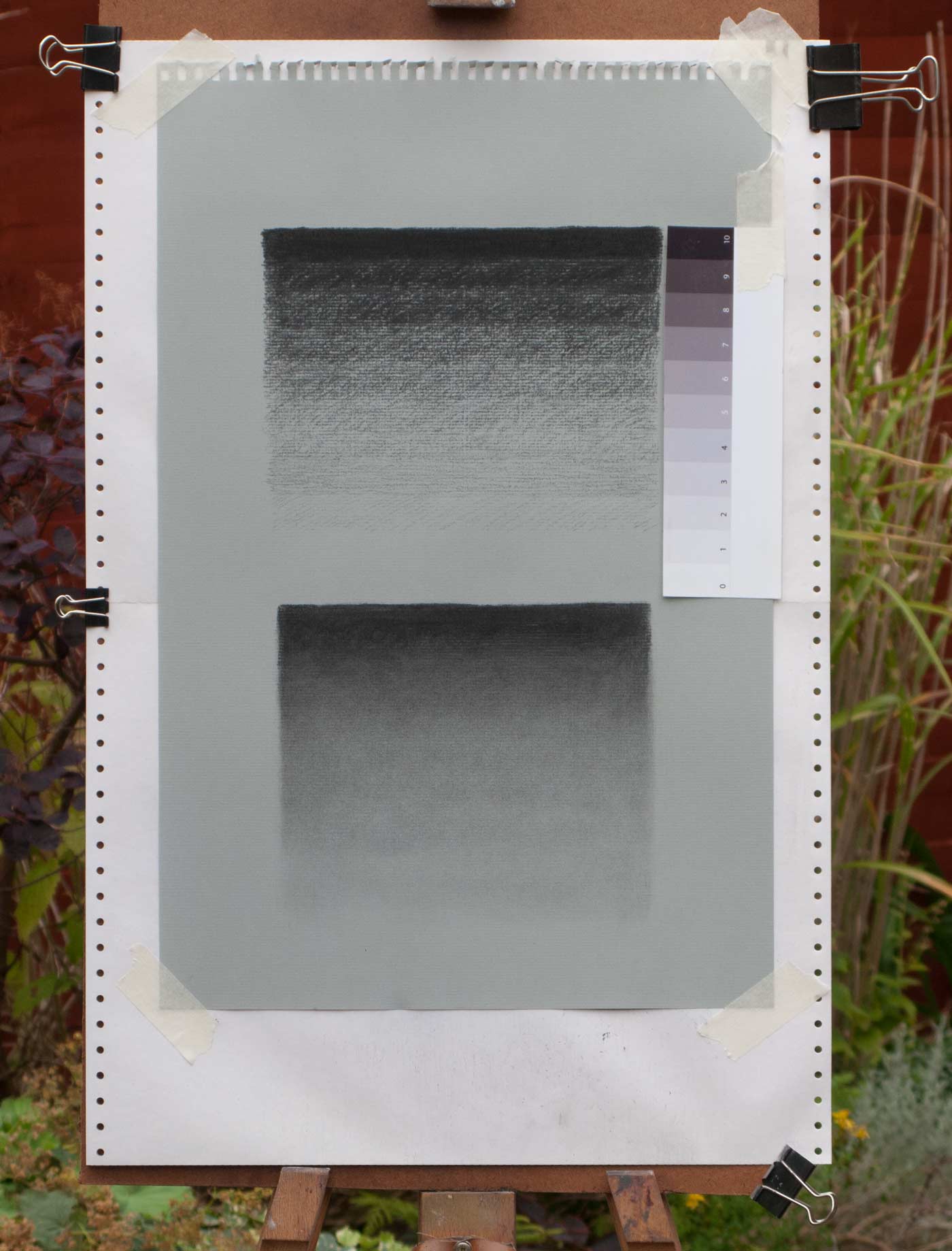
I copied the printed tone strip on the right as accurately as I could, though the toned paper meant I couldn’t go lighter than about a step 3 or 4. I drew the tones indoors in relatively dim light. When I took it outside, the printed tone strip seemed much brighter at the light end. (The effects of consistent lighting are something I need to experiment with in detail.)

The top block of tone strips were drawn by varying the pressure of the charcoal or by crosshatching. In the lower block, the charcoal was blended using a stub of kitchen paper.

You can see a slight darkening effect on the right half, especially at the bottom due to uneven spraying. You can also see my smudge tests to see if the fixative was working after each round of spraying. How you would do this on a finished drawing, I don’t know. Perhaps just give it many coats and accept the slight darkening.

Even though it was darkened, the blended charcoal tones didn’t seem to be blotchy or grainy.

After these tests, I found that:

  • The drawing did darken a little, with a slightly yellowish cast, and perhaps this was more noticeable in the lighter areas.
  • The darker areas needed as many as 8 or 9 coats to really hold down the thickly applied vine charcoal. Lighter areas were fixed with just two or three.
  • The spray was very even and did not cause any noticeable blotching or splattering in the smooth tones.
  • Getting an even coat on the paper was another matter: the slightest breeze would blow the precious spray to land anywhere except on top of the drawing.

So, when I create my vine charcoal masterpiece, I’ll be able to use fixative without being too concerned about drastically changing its appearance. (Concern about my bank balance is another matter — this stuff ain’t cheap.)


too many photos

“Draw from life.” It’s advice I hear all the time, from the web, from books, from friends.

There is something different about seeing a real three-dimensional thing in front of you. Compared to a photograph, there is so much more information to draw from. In many ways, this makes it easier to pull out what you need for the picture. In other ways, you have more work to do: What do you do with that bright highlight when all you’ve got to represent it is the dull white of the paper you’re drawing on?

Playing here with some grey wash watercolour pencils, softened with a waterbrush and a touch of fountain pen black ink.


value studies

Inspired by a post by Terry Miura and the striking composition of Ed’s recent sketches, these are quick value studies of various photos. Value studies are a useful way to see if a picture will hold together as a composition before committing to a larger painting. Terry Miura’s post explains the process and thinking and is well worth a read.

I used vine charcoal on cheap printer paper for these studies. It smudges very easily which can be an advantage as you can lighten or even erase an area just by touching it. Large areas of tone can be laid down by quickly scribbling over an area then smoothing it over with a finger. Very often this process will erase or blur something you want to keep, so the darkest darks will need to be reapplied. Once you get used to this smudging-then-reapplying dance, it’s a very quick and satisfying way to draw thumbnail sketches.

Don’t wear white.

surface tension

I’m always impressed how different materials make for different types of drawing. With a large mop brush in your hand, you’re not going to make a delicate mark. A sharp pencil on silky, hard paper tends to lead to delicate lines and more detail, with smooth tones from teasing the graphite around.

This is perhaps why I haven’t been attracted to making digital artwork, despite its many advantages. A plastic stylus on a graphics tablet lacks the tactile joy of feeling the paint crush under the bristles or of a dip pen gliding over plate illustration board.

I keep this small concertina sketchbook in my bag for sketching when out and about. It’s a Moleskine, but only cost £1 in a charity shop. It has one long continuous sheet of folded paper, ideal for panoramas, and it has the advantage that the facing pages fold flat. The paper is more like thin card and feels wonderfully smooth under a pencil. My favourite weapon of choice is a clutch pencil with a 2B lead, but a thick, buttery Croquis 6B retractable pencil allows for more expressive lines and can take the graphite as dark as it will go.

The image immediately above can be scrolled left to right. It’s a cheat really as the pages aren’t in the correct order and I’ve rotated the horizontal ones, but you get the idea.

endless paper

Sketchbooks are great, I love them. They keep all your masterpieces, all your mistakes, all your experiments, all together in one place — a record of that time in a self-contained book. For better or worse, that is what you saw, and how well you could draw, at that time.

But sometimes you just want to experiment and not worry how this new page will compare to all those previous pages. When you manage to make two or three decent drawings, the next one has to be at least as good. That’s a pressure that can stop you from starting the next drawing. A pressure that can stop you from drawing altogether.

There are ways of getting around this expectation (in your own head) that you have to live up to the quality of the last drawing. One is to fill a page full of scrawls of pen testing — squiggles of run-out ink or freshly sharpened pencil. This spoils the page. The bar has been lowered. You no longer have to live up to that golden run of fine artwork. You are free to experiment and, possibly, fall flat on your face with a lemon of a drawing.

Sometimes you don’t even want to lower the bar. Sometimes you just need to scrawl, scratch and belly-flop your way through a whole bunch of drawings that will never be seen. This is valuable. It is important to practise, to get it wrong, again and again. The results will be a mess, arms will be drawn too long, heads will look like deflated footballs, hands will be stunted stubs, but it doesn’t matter. You have to make mistakes, takes risks, try things out, and do it all away from the public gaze. If every piece is for show then there’s a tendency to play safe and only use methods you’ve used before.

There are parallels to sports training or mastering a musical instrument — endless repetition, making the awkward and difficult rewire into muscle memory. And most importantly (otherwise you’ll never do it), you have to love the process of training.

Some time back I found a box of printer paper in the back of the garage. It was that perforated printer paper with holes in the side — one long, box-deep piece of seemingly endless paper. It was smooth on one side and rough on the reverse, much like shop-bought artist’s newsprint.

Lately, it has replaced the sketchbook. That’s not quite true: I still have a number of sketchbooks on the go — one stuffed in a rucksack for those moments of sketching on a park bench or waiting in a car park. Another, with thicker paper, has paint thrown at it. Yet another contains watercolours or gouache or ink. This computer paper isn’t a replacement, it’s a place to experiment.

Of course, the ones shown here are a selected batch — many of the sheets are filled with unremarkable 1 minute gesture drawings. quick sketches, warm-ups, or overworked dark-grey multi-lined smudges — a necessary graveyard of lemons. They all end up being stuffed into a corner of a cupboard, so I take a snapshot of some of the ones that have something interesting about them, or sometimes I’ll take a photo just to record the way I draw at the moment. Hopefully, I’ll be able to look back in years to come and see an improvement.

When this box runs out, I’ll go online and order a ridiculous amount of cheap paper, probably not intended for artists but sold to wrap ornaments for a house move or to wrap fish & chips.

Someone once said, to become good at drawing you need to encircle the world with newsprint. I haven’t encircled the world, but I’m approaching the Ilfracombe & Barnstaple section.

black and white

leaf-charcoal_1055

Charcoal and white Conté pencil on Strathmore toned charcoal paper, roughly 15 x 10 inches.

The process for this drawing was a little different in that I started with an image in my head and then went in search of the subject, rather than starting with the reference then deciding to draw. I still need to draw from something I can see — I can invent forms and lighting from my imagination to some degree, but all the detailed forms and textures of the subject and the many unexpected quirks of the scene just don’t appear clearly in my mind’s eye. In fact I find it hard to visualise anything with any clarity in my imagination — it’s more like a fleeting collection of fragments. I can get a mood, an appearance, but not a solid image which I can transfer.

So I went out with my camera, hunting for withered leaves. The photo this is based on was full of strong russets and oranges, but I took it in to Photoshop to make it easier to see it in black and white. I used vine charcoal, charcoal pencil, charcoal dust rubbed with paper and white Conté pencil. It was tempting to use sanguine and bistre Conté crayons as their colours were similar to the original leaf, but I decided that monochrome would be less distracting. Even the white pencil clashed with the other tones and I had to fade it back with a kneaded eraser. Just as with paints, I find it useful to think of white as being on the blue side of the colour wheel, and to be aware that sometimes it can cool and deaden, as well as lighten, the warmer tones.

vine charcoal

figure-226_0827

Trying out vine charcoal and a PITT soft charcoal pencil on Strathmore toned paper, model courtesy of On Air Video.

Vine charcoal is so soft it will darken to pure black and as there are no waxy binders it will erase back to plain paper with a kneaded eraser making it unexpectedly versatile to play with. It can be also be lifted with a soft dry brush or a chamois leather. I haven’t tried the chamois yet though I’ve heard it’s good for the wipe out technique on a ground of charcoal dust. Charcoal paper has a tooth which holds on to the grains; smooth papers run the risk of the line disappearing into a cloud of black dust though there are beautiful and delicate drawings made on hot pressed paper.

The toned paper makes a satisfying mid tone, though the lightest light can only be the light grey of the paper (white chalk or pencil will be future experiments), so all the values are compressed into a small range and the success of the drawing is going to depend on whether I’ve pitched those halftones right. Some license can be taken with reflected light, but getting the values right is key, (along with anatomy, proportion, composition, gesture… ) — it’s like being addicted to spinning plates.

bare arms

arm-study-1000_0592arm-transfer_0581

An oil painting of a pencil copy of a drawing found in Risunok: Osnovy uchebnogo akademicheskogo risunka (Figure: Basic educational academic drawing) — a book full of beautiful drawings but with Russian text. I can’t read the words, but at least I can learn something from copying the drawings.

I’m trying to develop the ability to see things in terms of their three-dimensional form, as an object in space, as recommended by Robert Beverley Hale in Drawing Lessons from the Great Masters. He suggests visualising forms in terms of very simple mass:

…the block, the cylinder, the sphere; occasionally the cone; as well as simple combinations and modifications of these forms, principally the egg.

When we wish to create the illusion of reality on the surface of a piece of paper or canvas, nothing is more helpful than the ability to visualise in terms of simple mass. Troublesome problems connected with general shape, proportion, direction, planes, detail, light and shade, and line can all be solved by thinking in terms of simple geometrical masses.

In this painting, many liberties were taken with the lighting, which was developed and invented from the original line drawing. For instance, the light catching the muscle in the top left coming from the shoulder blade is lit too strongly, but I liked it as a centre of interest. I took a picture of the half-finished painting into Photoshop to experiment with the background glow and highlights, and then used that mock-up as a guide for finishing the painting. And the anatomy has no doubt become distorted through the multiple copies (final year students of Medicine & Surgery take note). I recommend Proko.com as a great site to learn how to visualise and draw anatomy.

This was also an exercise in developing a method of creating a final painting. I quite like this process of starting with a pencil drawing then transferring it to the canvas, or in this case the usual gessoed paper. A scan of the original pencil copy was enlarged to the final size and printed out on normal office paper. The back of the printout was rubbed with charcoal then taped in place and the outline traced with a red ballpoint pen (red ink makes it easier to see which parts have been traced). I found it helpful to trace not only the outlines but also areas of shade. With the charcoal transfer in place I could quickly build up a tonal underpainting. After that, the experiments could begin with building up layers of paint, blending (or deliberately not blending) the tiles of adjacent colour, making many mistakes, and trying to correct them.

basic values

graphite-value-studies_0091

Juliette Aristides talks about the importance of rendering accurate values in Lessons in Classical Drawing, an excellent book full of practical advice and illustrated with exquisite graphite and charcoal drawings. Of course there are many elements which go towards creating a successful drawing, but if the values don’t work the chances are the whole picture will fall. A white plaster cast takes local colour out of the equation and armed only with a pencil you’re left with the challenge of rendering the whole thing in values alone.

Some of the advice in the book is direct and practical. For instance, if your initial lay-in tends to become a dense dark mass of lines she advises to switch to a harder lead. It sounds so simple and obvious, but already I’ve seen how using a 2H instead of a 2B prevents an incoherent bird’s nest of lines forming before the sketch has really begun.

There is also much more subtle advice which only made sense when I was trying to make what I thought would be a simple drawing of a plaster face, such as paying close attention to the halftones, which can often seem invisible.

I was once invited by a friend to pick chanterelle mushrooms in a forest in the Northwest. When we arrived, all I saw were trees and a carpet of leaves. Yet after some time, my eyes acclimated. As I learned where to look, sure enough, there were mushrooms. Although I had walked through those woods many times, I had never seen half of what was there.

Halftones are a critical element for creating the appearance of believable volume yet, like the chanterelle, they are hidden in plain sight. They are everywhere, yet it often helps to have a guide to see them….

From Lessons in Classical Drawing by Juliette Aristides

skull shading

skull_9909-3

Trying out a clutch pencil and new graphite leads on Bristol board.

The advantage of using a clutch pencil is that there’s no need to whittle down a normal woodcase pencil to expose a long lead for shading on the flat side. It also stays a consistent weight and size in the hand as the lead wears down. I also like that it’s possible to get a more expressive line by using the side of the lead as well as the tip. The Staedtler range of leads seemed to get the thumbs-up in various online forums so I tried some of their Mars carbon 2B 2mm leads in a Koh-I-Noor lead holder (I prefer the weight and feel of the Koh-I-Noor compared to the Staedtler lead holders). Cult Pens had a special offer on a set of 6 Staedtler Mars Lumograph pencils ranging from 6B to 2H, so they had to be added to the basket.

The Staedtler leads are buttery smooth, especially on the toothless Bristol board. The smooth board surface also means that any graphite can be easily taken back to white with a kneaded eraser. I had to tape down the Bristol board (which is more like thin card) as it was bought as a large sheet and had been stored rolled up in a tube. In the future I think I’ll opt for pads instead of loose sheets.

Drawn from a photo found on the internet, taken by Anastasia at the State Darwin Museum in Moscow, the perspective shows off the wide looping zygomatic process (the thin bone connecting the cheek bone to the side of the skull). As the skull is a museum exhibit I couldn’t tell if this bone structure was unusual or just natural individual variation.

I didn’t use a grid this time, but I found it helpful to lightly shade in the main dark shapes right at the beginning of the lay-in to check the general proportions rather than use outlines alone. With the shading, establishing the darkest darks early on made it easier to assess how light to make the other tones. I couldn’t decide on the background: Leaving it white would hide the shape of the top of the skull. I took a mock-up into Photoshop to play around with various background options and decided that a bit of tone around the right edge would emphasise the skull shape and cheekbone. After adding this light shading I tried to blend it into a smooth tone using a paper stump but just made a smudgy mess (I’m not sure why), and in the end used a hard 2H lead to lightly scumble the graphite around.

This is an example of the limitations of working from a photo. It would have been so useful to have examined the skull as a three dimensional object rather than try and work out the structure from patches of light and dark – the back of the jaw bone was especially hard to decipher. I’ll keep my eye out for a junk shop skull.