Bertrand Russell

Richard Feynman
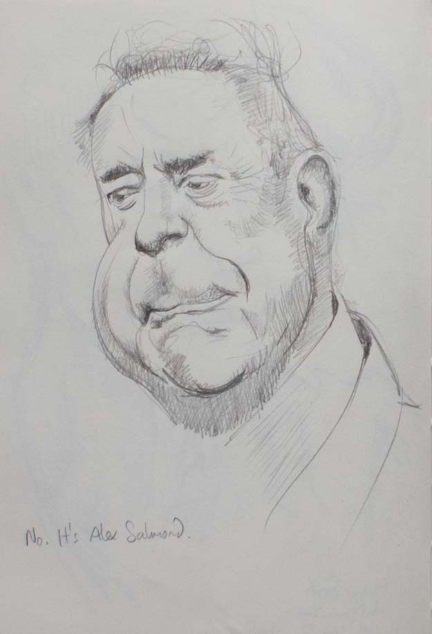
Alex Salmond

Pan troglodytes

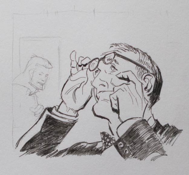
A copy of Derren Brown’s sketch of Maggie Smith

Maggie Smith

Tom Jones
Drawing portraits has been described as making a picture of someone where the eyes aren’t quite right and the nose is in the wrong place. Well, if I’m going to get it wrong, why not really get it wrong and turn the face in to a caricature: find the features which make a person recognisable and exaggerate them.
I was inspired by seeing Derren Brown’s preliminary sketch of Maggie Smith, which I copied (above) as I found it very instructive in the way that he takes a feature, such as a cheekbone or a chin, and then sculpts and magnifies that form independently of what is really there.
I tried to do the same thing with a number of photos found on the web. Other than Alex Salmond’s enormous jowl and Bertrand Russell’s oversized collar, I found it surprisingly hard to exaggerate most features. As I was drawing, I thought I was overstating Richard Feynman’s distinctive high forehead and quizzical smiling frown, but I quickly slipped back into attempting an accurate copy. Perhaps this is a good way to draw a face: aim for an exaggeration then let the natural instinct to draw accurately tone down the caricature into a more lively portrait.