haystacks

wrestling-scan183

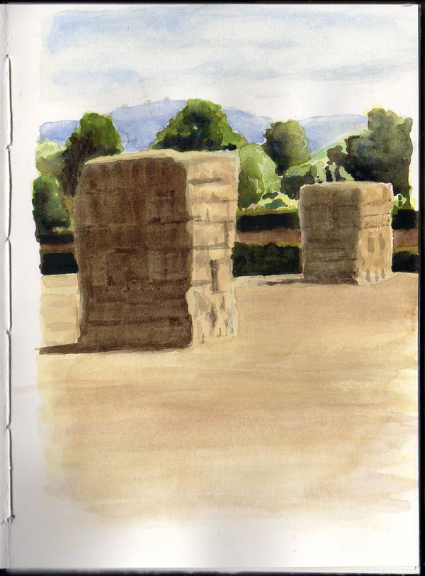
Painted from a photo in watercolour, the colours in this haystack scene look a bit cool for a late afternoon in autumn, but that’s the trouble with working from a photo where all sorts of in-camera corrections have already been done.

Or maybe the light was that cool and neutral. Perhaps the reality we’re trying to paint needs a tweak to be believable, or perhaps we need to wait for the scene to change before we decide to paint.


master copy

sketches-scan1881 sketches-scan1871 sketches-scan1861

Copying pictures from an old copy of The Picture History of Painting that contains a number of rather heavily printed mono reproductions, which make practice pencil sketches that much easier as the image is already broken down into values.

It’s worth doing these copies just to feel something of the flow and graceful line that the masters managed to put on the canvas.

tree shade

tree-scan169

Experimenting with areas of light, using some heavy (300gsm) Bockingford watercolour paper. It needed to be that heavy because I worked it to death, with some areas turning to mud. After all that abuse, the paint still lifted from the paper (shadow side of the trunk).

The main object was to experiment with the relative brightness of different areas: to make something look light, make the areas around it darker. Leaves on the foreground tree were blotched with a bristle brush.

sizing saints

saint-scan170

Practising proportions with a pencil sketch of a stone figure, from a photo of Murcia Cathedral roof snapped some years back.

Getting the mid-point (advised in Dodson’s Keys to Drawing) is very useful. From the top of the head to bottom of the plinth it turns out to be just to the right of the knee, which was surprising. Must do more of that as proportions are a major weak point. Still managed to make the cherub’s shield look like a melted ice cream tortoise.

I read somewhere that these rooftop statues were often made deliberately too tall, so that when viewed from below they would appear correctly proportioned.

José Guadalupe Poseda

Poseda-scan168-625

Whenever I use a dip pen and a bottle of ink I’m waiting for the moment when the bottle tips or the nib explodes. It keeps you on your toes.

This was drawn on cartridge paper using Indian ink, which bled through and glued together the next few pages.


apples

apples_scan166

Watercolour, from a photo.

This was the first time I used a normal watercolour brush instead of a water brush. By letting the paint dry before applying another glaze, shades and colours can be built up. It takes a while as you have to let each application dry completely before applying the next. A hairdryer could speed things up, but that ruins the mood.

Hergé

haddock-bottle-scan165

Hergé’s clean line technique is deceptively simple. He managed to get so much expression in the hands, face and posture with just a few well chosen lines.

The colours in this copy are uneven, showing my poor watercolour wash technique, not helped by using a water brush which continually adds water to the mix. I think the original team at the Hergé studios used gouache, which makes it easier to apply flat blocks of colour.

dip pen leaf

dip-pen-leaf_8180

A sketch of an old leaf kept on my windowsill as a convenient and recurring subject, this time using an index nib dipped in Dr Ph. Martin’s Bombay Black Indian ink. The paper is Bristol board which doesn’t bleed with heavy applications of ink and provides a hard, even surface over which the nib can glide smoothly.

I found the nib in Meticulous Ink (Walcot Street, Bath), and bought it as much for its wonderful design as for drawing. A reservoir of ink is kept in the palm of the hand. It turned out that it is surprisingly smooth to draw with, compared to some the smaller, scratchy Gillott nibs.

index-nib_8181

ojime

netsuke-scan149

I think this figure is known as an ojime, a gift from a friend. Drawn using a Pilot 78G ‘F’ fountain pen with Lexington Gray ink and a watercolour wash. The ‘F’ nib is one of the finest, and when turned upside down gets finer still; useful for drawing the scratches in the resin cast.

1 shade of Bombay Black

edm-11-scan148-1400

This week I have been mostly using dip nibs and Dr. Ph. Martin’s Bombay Black Indian Ink (which, fear not, won’t go near the fountain pen). Much scratchy noodling fun to be had, though best to wear old clothes and have a couple of buckets of hot soapy water to hand. A Winsor & Newton palette box works nicely as a nib holder and temporary ink well, as well as providing somewhere to put down the nib and holder whilst drawing.

I bought a random selection of drawing nibs from a local art shop. One of the sketching nibs (Gillott 404) was unpredictable in how much ink it releases but you can push it in any direction, and I can’t get one of the extra fine ones to flow (Gillott 290) but apparently the 291 is similar, and was used for EDM11: some stepped-on polaroids found in a field.