Category Archives: pencil/graphite/charcoal

eye level

Deepest apologies to Sheridan Smith.

I was sketching along to one of Court Jones’ caricature lessons over on Proko.com using a reference photo which had good lighting and strong features — just what you need to practice caricature. It was only after I’d finished drawing that I noticed the eye positions. I’ve had this problem before, and I frequently use the ‘fresh eyes’ approach to take a break and see any inaccuracies in the drawing. But I definitely have an inability to see how the complete picture is working as a whole as I’m drawing all the smaller elements. Maybe there’s a term for this — ‘drawing blindness’, perhaps.

One solution to this is to build up the portrait systematically using a basic construction of the big shapes before going to the smaller forms within them, and then, finally, move on to the details. Don’t draw the small shapes until the big shapes are working.

It also helps to be aware of the many ways in which a portrait can go wrong. Sometimes it’s not a big mistake, like an eye in completely the wrong position, but an accumulation of smaller errors which might seem insignificant in themselves but which add up to a face which somehow just doesn’t look right.

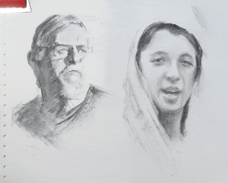
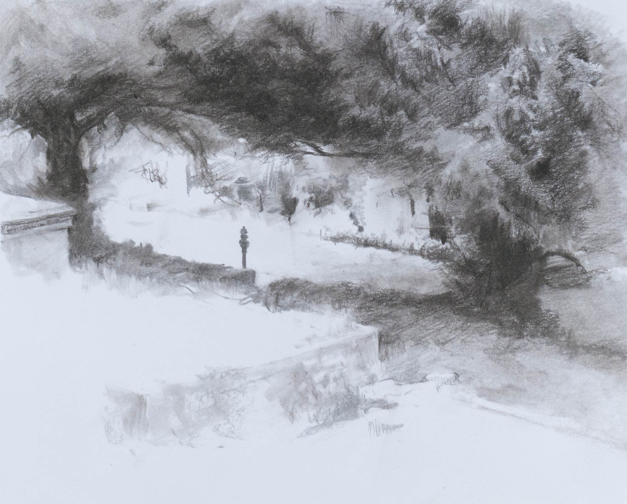
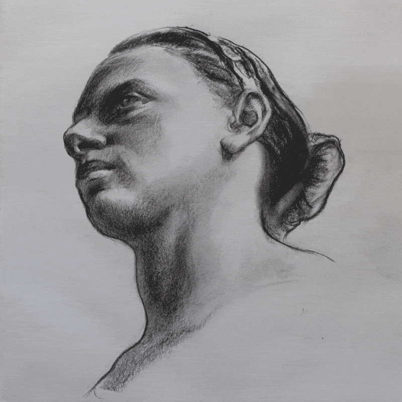
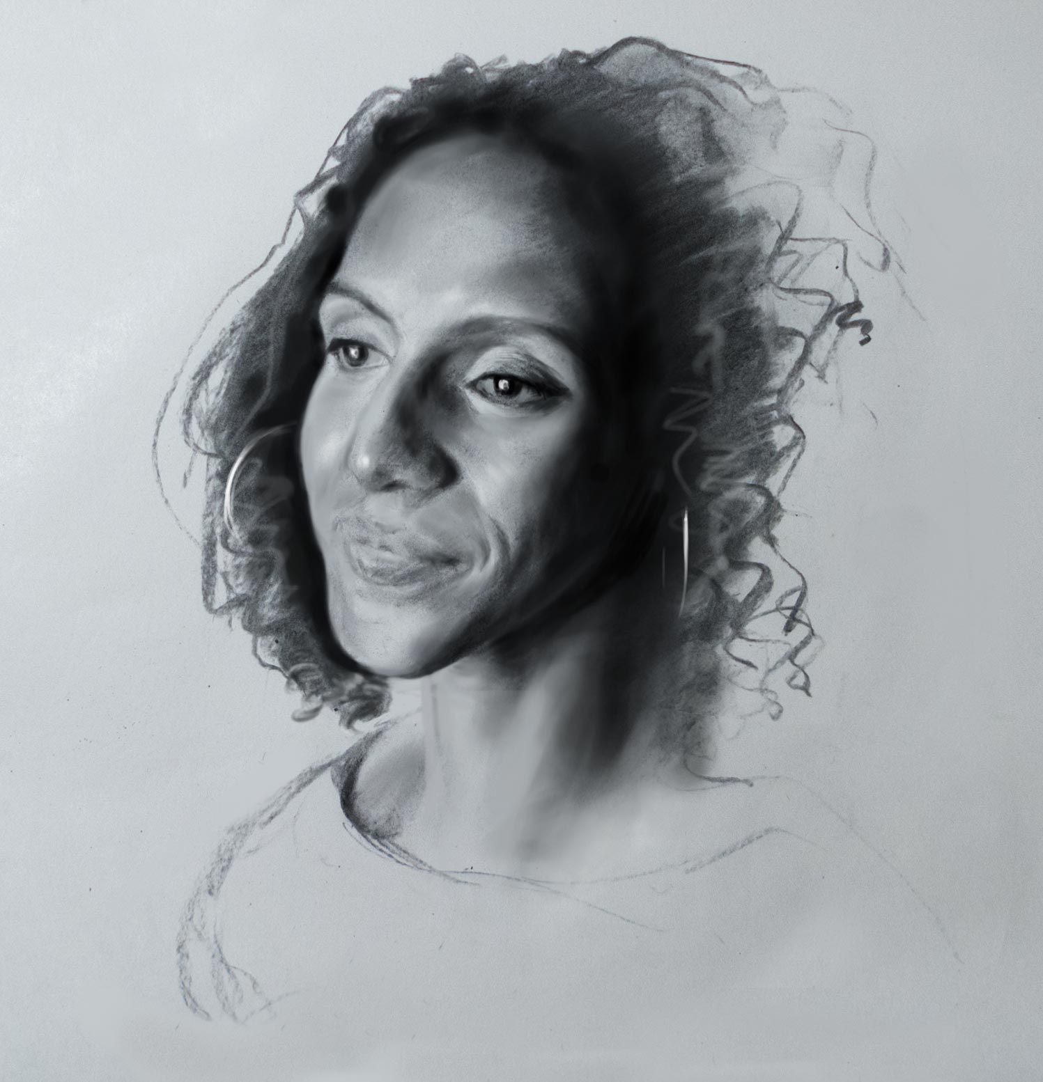
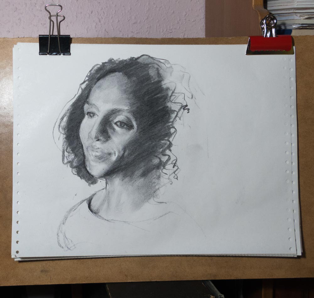
Here are a few examples of the ways a portrait can miss the mark, taken from the pile of charcoal quicksketches on the endless computer paper.

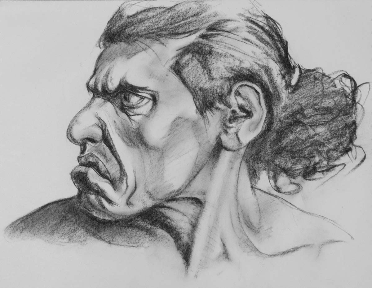
The perspective lines for the eyes don’t match the rest of the features, making the far eye look too small.

Often the far eye in a portrait does appear smaller as it’s farther away, but the rest of the face needs to match, and any parallel construction lines need to share the same vanishing point. The difference in size in the features seen in three-quarter view will depend on how close you are to the subject — if you’re up close, there will be a more noticeable difference.

If the axis lines for the features and the centreline of the face don’t match, the face looks skewed. This can make an eye look too high, or a mouth slanted, or just give the sense that the features don’t quite hang together.

If the face is holding an expression which isn’t symmetrical (or the features themselves aren’t symmetrical) then axis lines can only provide a starting point. Is the mouth shifted to the side because of the expression (blue face) or because of inaccurate drawing (red face)?

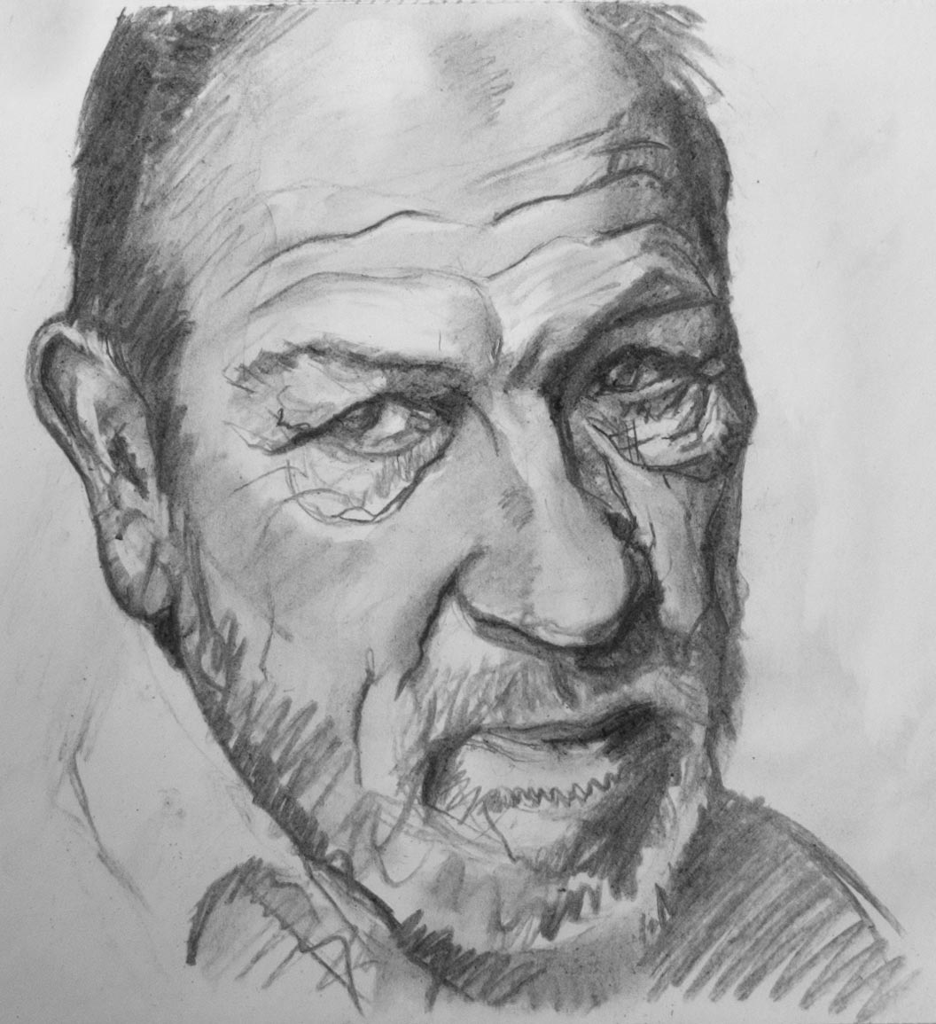
Is Stan smiling with a sideways smile? Hard to tell when you can’t see both sides of the face. It’s often helpful to draw construction lines through the form even when you can’t see the hidden side, as though the head is made out of glass.

Stan Prokopenko has made a number of really useful videos on head construction. Here’s one which uses an intuitive approach to constructing the basic head structures.

An off-centre view combined with an asymmetrical expression can make centrelines hard to find. The corrected version in the animation above shows the more accurate centreline as taken from the reference photo. That said, the drawing has other elongations and distortions which confuse the final result and make the face appear slightly flattened.

There are so many factors which will influence the final appearance a portrait and so many ways to get there: Loomis methods, Reilly methods, Asaro heads, skull anatomy, caricature, tonal block-ins. (See Jeff Watts demonstrating some of the methods in this video.) I think there’s something valuable to be taken from all of them, and the aim is to have them all available as tools that can be used intuitively.


stumped and shaded

Experimenting with textures and effects using charcoal on Bristol board to show a view in Bath Abbey Cemetery, trying to capture the contrast between the areas bleached by sunlight and the gloom under the shade of the yew trees.

I wanted the shade under the trees to be deep black to get the maximum contrast with the paper white. I tried graphite on a slightly textured heavyweight cartridge paper but ended up with a grey shine on the darkest areas. The delicacy of graphite combined with the deep darks of charcoal would be ideal, but in areas of darker shading I found the soft graphite fills the grain of the paper and forms a plate-like barrier to the charcoal and the vine stick wouldn’t grab, as you can see in the trunk of the tree below.

I made another attempt on Bristol board (picture at top of the post). The smooth surface of Bristol isn’t usually the first choice for charcoal which needs some tooth to grab the grains, but it did take the charcoal, even if much of it turned to dust on the surface which occasionally had to be brushed or blown away. When blended with a paper stump the vine charcoal turned a light grey and almost has the appearance of an ink wash.

A kneaded eraser was useful for lightening areas and seemed to work more effectively than a hard pen eraser. However, I built up many of the leaf shapes and branch effects by adding extra shading to the negative spaces rather than picking out the lighter areas with an eraser. The stump would lighten the tone and flatten any texture, and then the dark background shapes could be drawn in to this grey midtone. This drawing in reverse allowed multiple layers of depth to be built up and was much more precise (and satisfying) than using an eraser.

The white of the Bristol paper appears cold, almost blue, compared to some papers, but in reality it’s probably closer to a neutral white and its coldness only appears in contrast to warmer surroundings, such as a matboard or the newsprint backing paper.

Other papers will have different handling with different results. Here are some sketches using graphite or charcoal (Mary in graphite) on a sheet of Fabriano Disegno drawing paper which has a texture laid in to the surface. The graphite and charcoal catch on the paper grain and sit on the top if lightly applied but blending with a soft brush or a stump can achieve a more even tone, as seen in the face and jacket of the figure on the right.

Zoom in or click the image to see the paper grain.


overlays

Apologies for making this post flash like the Blackpool illuminations, but I’m using a modern version of a technique used since olden times to check accuracy and proportions. Without a master draughtsman looking over my shoulder to tell me my ears are in the wrong place I’m reliant on overlaying my drawings on top of the original photo reference to see where I went wrong. Leonardo made practice drawings on glass plates to compare to the original, but I’m pretty sure he would have made use of today’s digital tools.

Usually, I take a photo of the sketch into Photoshop and simply add it as a semi-transparent layer above the original photo. Then it’s a matter of trying to align the sketch and the reference by rotating and scaling until (hopefully) the features line up. By quickly switching the layer on and off, you can compare the two.

The technique illustrated in the photos above is a little more complex as it uses a number of filters to find the edges (shown in red or white) of the features in the original photo. Usually, I don’t go to all that trouble when checking a sketch and instead use the transparent layer technique mentioned above.

By doing this regularly I have begun to identify some of my repeated mistakes: I make the backs of heads too small, brows are too high on the skull, everything is made too wide, chins tend to disappear, hands are too short.

Once these weaknesses have been identified they can be consciously corrected. I’ve found the quickest way to improve is to concentrate my practice on the things I find the hardest to draw.

[Models courtesy of New Masters Academy.]


pet portraits

A friend wondered if I could do a portrait of her dog. I wondered too, but it sounded like an interesting project. I didn’t realise that pet portraits were a thing until I went online and saw page after page of search results for pet portrait artists.

I’ve never met Cooper, a boxer mastiff cross. Everything was based on a collection of photos taken at different angles, including profile shots and various poses, that let me get some idea of the basic shape of his head.

Working in charcoal seemed the most flexible and natural method for me at the moment, but I really wanted to do an oil painting, just to see what I would come up with. I ended up doing two pieces, one in charcoal of Cooper as he is now (which didn’t quite work—I need to make another attempt), and this oil painting of him as a puppy.

For the puppy painting, I started with some warm-up charcoal and pencil drawings, then used a Polychromos pencil to do a more detailed sketch. I like the Polchromos pencils as they build up gently into darker tones, even though they don’t erase as easily as charcoal.

The pencil sketch was scanned and copied on to office paper and the back covered with old charcoal dust that I keep in a jar. The outlines and tones were transferred onto an A4 canvas mounted on aluminium composite by drawing over the sketch with a ballpoint pen.

The canvas ground was acrylic gesso covered with a layer of grey mud oil paint left over from a previous painting. Acrylic gesso can be very absorbant and suck the oil out of the upper layers, but this mud preparation acts as a barrier to the thirsty gesso and effectively creates an oil ground that is very pleasant to paint on.

I did about three passes on separate days to build up the painting, with a final pass to make some corrections to the background. I let the painting become touch dry before the next painting session.

I used ivory black in this painting and it’s not a pigment that I’m used to. I bought a tube to mix with titanium white and burnt umber to make neutral greys for reducing the chroma of colour mixes (following Paul Foxton’s method), but it was tempting to use this black instead of my usual mix of ultramarine blue and burnt umber for some of the darkest areas. A problem I’ve found with ivory black is that it sinks in really noticeably. It looks like a deep, silky black when wet but dries a lighter matt, almost like gouache. I don’t know if the oil is sinking in to lower layers or if the pigment itself is soaking up all the oil.

I oiled out the painting at the beginning of each pass, but eventually that thin linseed oil layer also sinks in. I was betting everything on a final varnish using Gamvar Gloss to even things out, which it seems to have done.

He looks cute in this picture. He’s grown up to be the size of a small horse.


fresh eyes

This one is a hybrid of charcoal on paper and digital painting. The reference photo was a portrait of Afua Hirsch taken by Richard Saker.

It started out as a quick generic head study using a stick of vine charcoal on cheap paper, with no real time being spent on measuring proportions or judging the relative positions of the features.

I continue to have major problems with basic proportion, making everything too wide or completely missing the scale and relationship of elements. I mean, look at the original charcoal sketch. As I was drawing it, I realised it wasn’t going to get a likeness, and I was aware the eye on the right was out of position a little, but maybe it would hold together with the other features to make a believable head.

It was only when I left the room and returned a few minutes later that the eye screamed out at me and showed its true position. How could I miss that? It’s half way down the face! This is up there with the repainting of Ecce Homo.

It’s so easy to work away on refining the details of something only to find the whole thing is in the wrong position. So I need to consciously walk away from a drawing, or use a mirror, or somehow get those essential fresh eyes.

As an experiment, I took it into Photoshop to move and rescale that eye, and then created a new blank layer to make further corrections and additions. I used an entry-level graphics tablet (Bamboo One) to do the refinement. I don’t have much knowledge of digital painting techniques, and everything was done with a default brush of varying softness and flow rate. The brush colour was sampled from the existing charcoal drawing. Some of the texture of the original charcoal remains but the default digital brushes have a tendency to make everything look too slick and airbrushed. There are no doubt techniques to avoid that plastic-wrapped appearance.

I still haven’t got a good likeness. A true likeness depends on a hundred and one subtle features to being just right. Somehow I’ve made her older and I can’t work out why. Have I made the face too wide? Is the forehead too short? I shortened the neck a little to more closely match the original reference. It’s still not her.

And again, I only have a digital file at the end of this. Will the endless opportunty for correction and revision that digital painting offers make me lazy? This process was fun, though. As Cynthia Sheppard shows us, there’s no one way to do this.


oil on charcoal

More experiments with aluminium composite panels, this time on the smaller A5 size. I wanted to see how a vine charcoal pencil would behave on the acrylic gesso surface. Sometimes it’s useful to draw using the precision of a sharp point. And sometimes it’s easier to draw with a pencil grip rather than holding a brush that can only be moved over the surface in certain ways. The question is how to transform that drawing in to a layer of oil paint.

Many people draw directly on canvas then use a spray fixative. Cesar Santos uses this method but has warned against using too much fixative as it creates a weak paint layer.

I found the charcoal draws quite well (albeit with a line tone effect due to the brush strokes in the gesso) and can be lifted off with a kneaded eraser. The paint can be applied directly over the charcoal, but to avoid the whole thing turning into a grey mess it’s necessary to work on only one area of tone at a time and to make sure those values are matched before moving on to the next area.

It’s a bit laborious to do it this way (without the fixative) so I’ll probably stick to using a transfer drawing for any precision areas or to get the overall composition placed correctly. After that, I’ll use a block-in with a brush directly on the canvas, or a wipe-out method for a more tonal drawing. But drawing in charcoal is so much fun, and this alone will make for a more dynamic picture.


live memory

The end of the Royal Crescent in Bath, painted in oils on the new aluminium composite panels.

This began as a pencil sketch made on location but was painted at home on the easel. I revisited the scene a couple more times at the same time of day to make further pencil sketches of details and light effects. The late autumn mid-afternoon light created some interesting edge lighting on the trees and columns.

Various sketch references and an acrylic colour study. The vine charcoal sketch below was useful for overall composition. The original pencil drawings and other notes are in the spiral-bound sketchbook. The aluminium composite panel was attached to the easel with tape and Blu Tack.


I took a reference photo which was useful for correcting proportions and details, but many of the important light effects in the scene were lost. The strange thing was that they were there in the photo, but somehow they had been flattened out and weren’t noticeable.

In the continuing debate about painting from life against painting from photo reference, I found this approach of doing both worked quite well. The most important thing I found was that drawing anything for any length of time has the effect of imprinting the scene on memory — not so much the overall composition, I still needed the sketch and photo for that, but the sense of depth, the subtle lighting effects and the overall atmosphere of the scene. For instance, there was a shift in the warmth of the stone between the crescent in the foreground and the buildings behind. And the road in the middle-ground has a steep camber which somehow added to the depth of the scene.

As I was making the first pencil sketch, leaning on the cast iron railings in front of the crescent, the late afternoon sun came out from behind the clouds and flooded the scene with golden light. The edges of the trees and buildings lit up, and everything else was plunged in to deep, warm shadow. It was a completely different scene and it only lasted a few seconds. It would have made for a more dramatic picture, and it certainly made me aware of how ‘light’ and ‘dark’ in our visual perception are relative to their surroundings.

All these memories played in my mind as I was painting, and it certainly made the process of painting much more interesting. Whether I can capture these perceptions using oil paint is another matter, but I certainly won’t be able to paint what I didn’t see in the first place.


portrait practice

Sometimes it’s useful to copy a photo as if it’s a Bargue drawing, paying close attention to proportion and accuracy. I found that copying Bargue’s schematic drawings makes me more aware of how the contours of the features have distinct directions and angles in relation to one another, and it is useful to look out for these basic shapes when observing the model. For instance, the structures of the eye (including the eyeball) slope backwards when seen in profile, and the stair-step of the mouth has its own distinct pattern of slopes, bulges and overhangs.

At the other extreme is full-on caricature, which is sometimes necessary to get the life and gesture back in to a drawing after too much chasing after accuracy. Court Jones has an excellent series of videos on this subject over at Proko.com.

Another benefit of caricature is that it emphasises the three-dimensional structure of the features, so the final picture becomes a construction of cylinders, blocks and eggs. This is the opposite of flattening what you see into an abstract collection of two-dimensional shapes, like the pieces of a jigsaw. Both these ways of seeing have their advantages, and I find it useful to flip from one method to another as I build up a drawing.

These pictures were made with charcoal or graphite except for the second one which was black and white Conté crayon on a background of gouache. Buried under that grey gouache background is a wiped-out attempt at a gouache portrait where I quickly found out how difficult it is to create smooth blends in that medium. It can be done but it requires some skill. James Gurney talks about it in this post, and has some general advice on using gouache here. Gouache is good for constructing forms from confident, distinct brush strokes. I find it much easier to build up forms with smooth blends and sharp edges using graphite or charcoal, especially when combined with a kneaded eraser.

Photo credits (including some very useful instructional videos):

On Air Video and Croquis Cafe Heads Up

Vincent Xeus

Bradwynn Jones Wake and Draw

Draw This

Alex John Beck

New Masters Academy


flat or round

When I’m drawing, I find I frequently change the way I interpret what I am seeing in order to get it down on paper. Sometimes, the scene is an abstract arrangement of flat shapes, and the drawing is an attempt to copy that collection of unidentified blobs and curves as accurately as possible. At other times, I see the object as a construction of primitive shapes, where an arm becomes a foreshortened cylinder or a torso becomes a rounded block.

The Betty Edwards classic Drawing on the Right Side of the Brain has a central message to draw what you see rather than what you know, and ignore the generic image of a cup, a tree, a face that we have stored in our minds and replace it with the collection of light and dark forms right there in front of you.

Of course, the labelling ‘left brain’ can have its uses, for instance to recognise that the eye is probably more important to get exactly right in a portrait rather than accurately drawing every last lock of hair. But once the important area has been identified, the ‘right brain’ can take over so that it is no longer ‘an eye’ but a collection of interlocking forms and shapes.

By contrast, using the construction method to draw takes what we see and transforms it in the virtual reality of our minds into a simple shape, and then we draw that shape.

One method isn’t necessarily better than another; they’re all useful tools to get an image down on a flat surface, and I find it useful to switch from one method to the other. So, as I draw, an abstract blob can turn in to ‘an arm curving around an elbow in to the forearm’, which in turn turns into a construction of cylinders, pyramids and elongated spheres leading in to the square block of the wrist. And as I draw that, the shadow shapes take over again.

[Photo credits for the three photos copied above: Martin Munkácsi, Neil Libbert, Pierre Parente via aucharbon.]


after Steichen

This charcoal sketch was inspired by watching an episode of Jennifer Marie’s Atelier Diary in which she talks about the book Camera Work by Alfred Stieglitz. Camera Work was a quarterly photographic journal which ran in the early 20th century, full of high quality photogravures. As she says in the video, some of the photographs in Camera Work look like charcoal drawings. So a quick image search lead to a photo taken by Edward Steichen and published in Camera Work in 1903, which had the tones and textures of a drawing rather than a photograph.

This drawing, based on the Steichen photo, was done fairly quickly with vine charcoal on the cheap printer paper I use for most of these charcoal or carbon pencil sketches. I wondered what it would look like with more of the tone and colouring of the original. So I took a photo of the sketch into Photoshop and added an orange/yellow gradient map which could be faded and selectively masked to create a more three-dimensional form. I also made some adjustments to the original sketch to alter the contour of the muscles attaching to the right shoulder blade.

The resulting picture only exists as a digital file. And that’s the lesson I learnt from this: to start as you mean to go on — a sketch will always be a sketch. To make a finished piece, it’s best to begin with the right materials and build it up with a proven method.