waterbrush and ink

alan-watts_8467

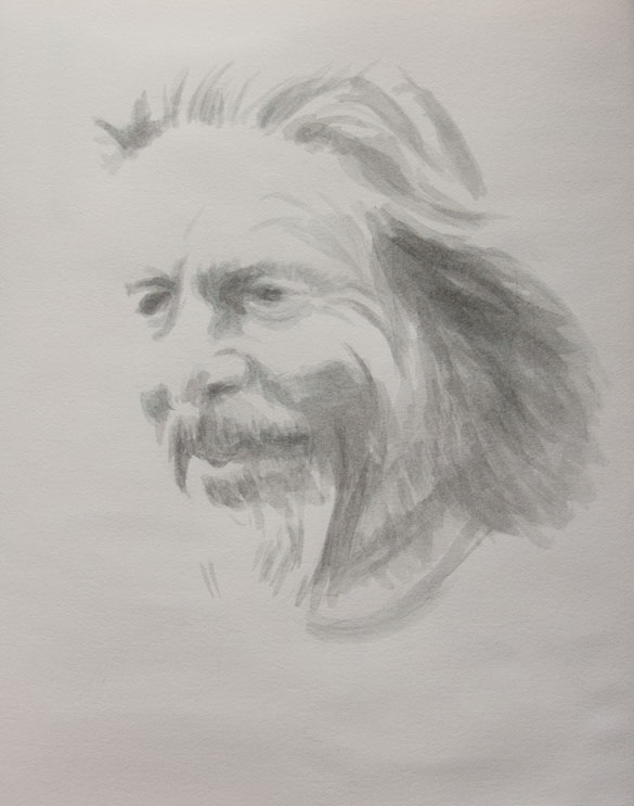
A sketch from a photo of Alan Watts using dilute Lexington Gray ink in a waterbrush, which enables shading to be quickly added as layers of ink are built up in to different tones.

This ink made by Noodler’s is usually only available in the US, but recently supplies have been available in the UK.

Distilled water is best for diluting the ink as it keeps an even flow through the waterbrush, though tap water is fine.

The great thing about Lexington Gray is that it’s suitable for fountain pens but is also permanent once it contacts the cellulose of the paper. This means a wash or watercolour can be added to ink drawings. This would usually only be possible if Indian ink was used. Indian ink contains shellac which sets hard and makes the ink waterproof on paper but can destroy a fountain pen if left to dry.

Once more, with feeling

daliwatch-oil_8412

I decided to copy the watch a second time to try out some new water soluble oils and to see how they compare with acrylics, using a pad of acrylic paper with an extra layer of white acrylic gesso applied.

Because the paint isn’t dry in 2 minutes (like acrylic) there’s more time to blend and fuss, and it’s easier to make a smoother blend or to tease the paint in to an edge (shadow to left side of watch). I’m not used to the colours in this starter set and had trouble getting a dark grey for the background. I usually get dark neutral colours by mixing an earth colour with ultramarine. With this palette I get a purple by mixing the blue and red, but adding yellow creates brown as it lightens the whole mix. I’ve since ordered more paints to match as close as possible the colours I’m used to, based on my limited watercolour palette.
highlightedhighlights_8411

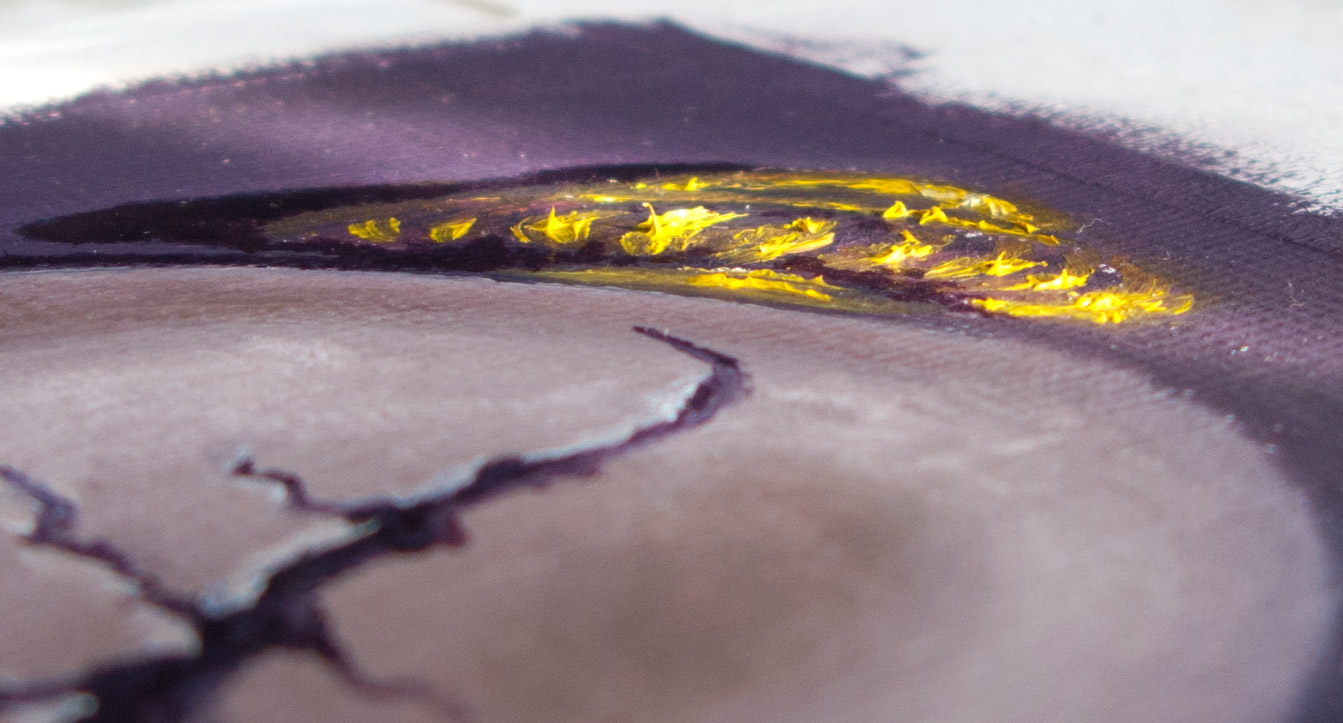
Another difference to the quick-drying acrylics was that highlights were unexpectedly difficult to apply as they would dig up darker paint from lower layers (a common beginner’s mistake, apparently). I ended up putting on the gold highlights in an impasto, like icing on a cake.

On the finer details the paint dragged a little. I’ve ordered some water soluble linseed oil and quick drying liquid to loosen it up. I’ve heard that walnut oil is good, but thought I’d stay with the water soluble range for now.

Touch dry within a couple of days (but probably not fully dry).

The linseed oil smell is quite pleasant, and being water soluble the brushes clean up with a bit of washing up liquid and water.

I’ve heard that some people hate water soluble oils and find their consistency unworkable. Others say that they behave like normal oils so long as water is only used for cleaning brushes and not as a solvent during painting. Instead use water soluble linseed oil or other mediums.
EDM 8 revisited

daliwatch_8400

More acrylic shenanigans, copying Dali’s Melancholy, 1945 from an old poster which is big enough to see the brush strokes. Minus the ants. I never did like Dali’s ants, plus I haven’t got a brush fine enough for the legs. UniPins? But that would feel odd.

flophouse priest

old-man-and-priest_8398

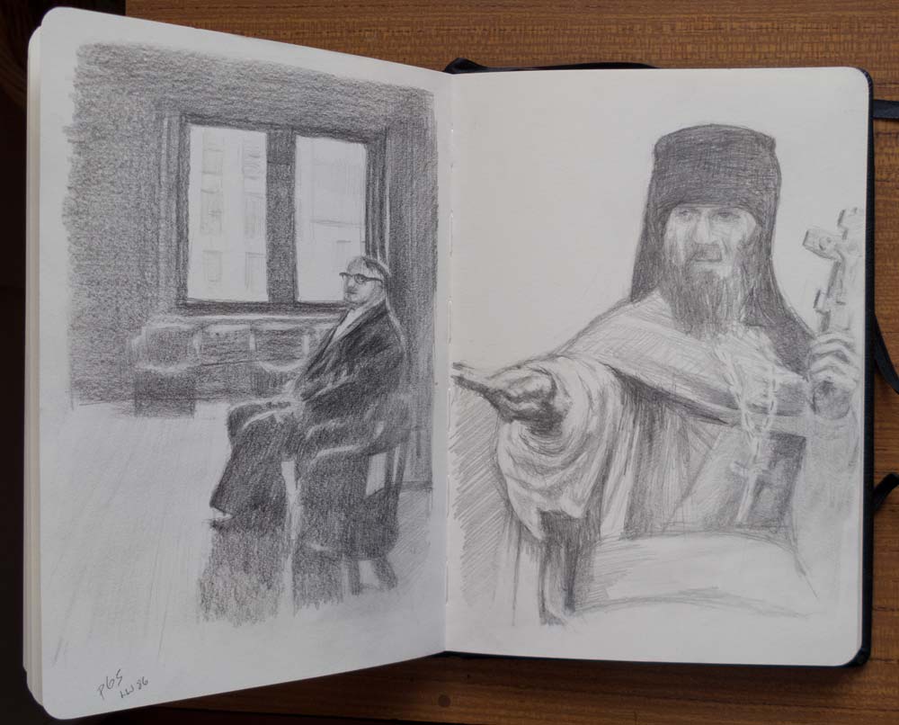
Many of these pencil sketches are drawn while sitting on a sofa with the sketchbook on my lap, not the ideal drawing position and the lighting is poor, but if I get too precious about when and where I draw then I would do very little. The mantra I hear repeated by art instructors is to draw as much as possible – theory and knowledge are fine, but we only really learn while drawing.

For the flophouse sketch I used a lead holder fitted with a soft, fat lead (Pilot Croquis 6B 4mm) to shade large areas, with my trusty mechanical pencil (Ain Stein 2B 0.7mm) used for the details. A kneaded eraser was used to pick out the highlights, such as the light reflected from the top of the chairs and the folds in the suit, and to define the chain from the shading of the priest’s robes.

The sketch on the left is from the series Bowery Flophouse by photographer John F. Conn, printed in LensWork 86; the other is an Orthodox priest on the Solovetski Islands, from The Journals of a White Sea Wolf by Mariusz Wilk.

The freedom of limitations

stalker_8358

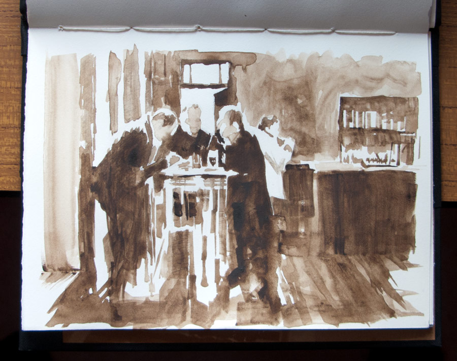
This was painted from the opening scenes of Andrei Tarkovsky’s film Stalker, paused onscreen and painted with a flat half-inch brush with raw umber watercolour. I made an initial sketch in pencil to get the main proportions. It was a good job I did, because after drawing the basic outlines of the top corner of the room I drew the figures way too big, out of proportion to the rest of the scene. Maybe this is a Betty Edwards left brain problem: I think the figures have more importance so draw them larger than the background. I had to make a conscious effort to draw small heads! But once I did, something clicked and they looked correct relative to the frame of the door.

Using one brush and one colour was surprisingly liberating, leaving me free to concentrate on shapes of light and dark.

before the fall

vase_8353

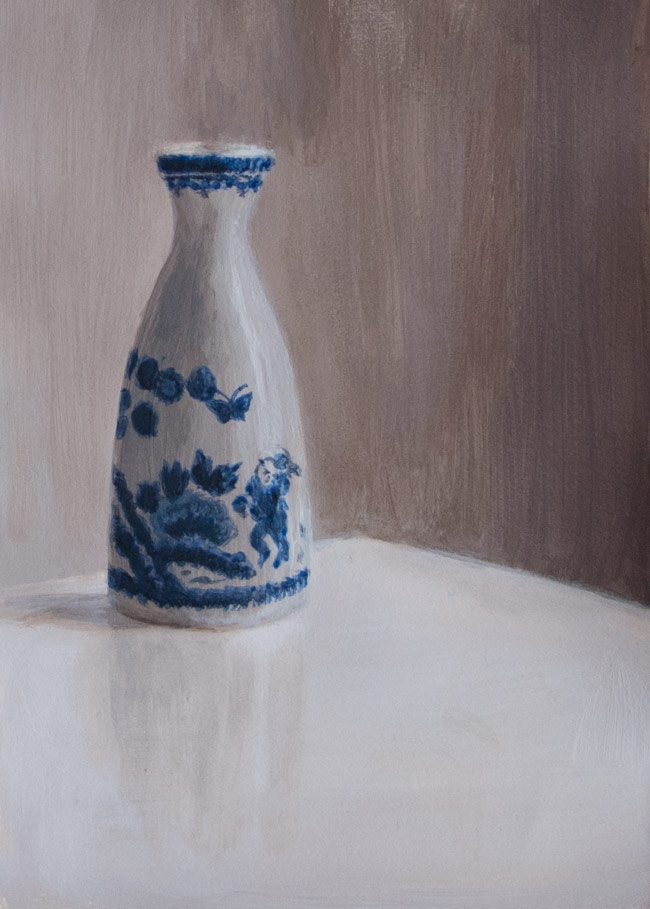
Another session with acrylics: a colour version of an image from the esteemed (but now unaffordable) publication Sun & Air, taken before the vase was broken in two when I knocked it off the windowsill with a Dyson attachment.

One problem I’ve found with acrylics is that it’s hard to blend smoothly. I would mix up colours for the shaded side of the vase and try and blend them in to the lighter side, but instead of a smooth blend I would end up with a large patch of shaded area. So I’d make a lighter mix and blend back the other way, and end up with too much highlight. There are so many layers of paint, it’s got more relief than the cover of an airport novel. I need to work faster, or experiment with mediums.

Or follow the Marker Carder method and not blend at all.

palette space

acrylic-grey-ramp-625

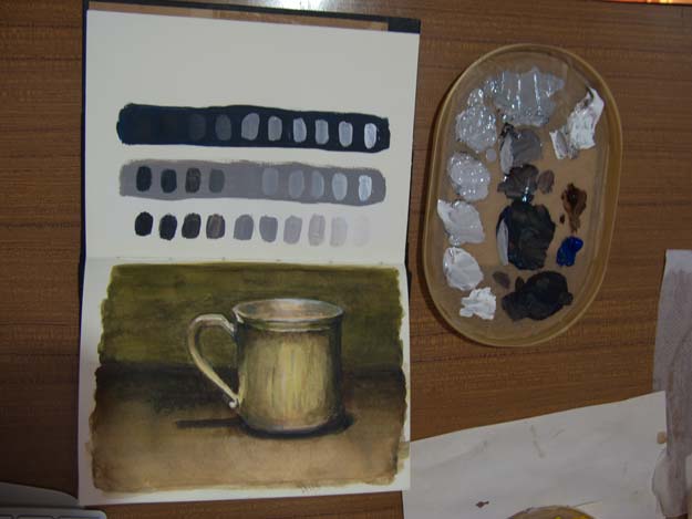
A first attempt to mix shades of grey with acrylic to show how the appearance of a colour depends on the background. The three lines of grey paint blobs were intended to have the same range of shades from black to white. See how the grey blobs on a dark background appear lighter than the same grey on a white or mid-grey background.

One thing I found when preparing colours is that it’s important to have lots of paint and lots of space. Even painting these simple blobs needed more paint than I had mixed up. I tried to mix a second batch half way through but found the new mix was slightly warmer (in terms of colour) than the first. It’s better to prepare the right amount to start with than add to it half way through.

When making these colour steps, it’s easier if you have lots of space on your palette. There wasn’t really enough room to work within my ice cream carton lid stay-wet palette (wet kitchen towel covered with greaseproof paper). It’s just about big enough for a small sketchbook painting, but I really should be following Will Kemp’s advice about laying out a palette, and using Mark Carder’s method for preparing accurate colour steps.


acrylic cherry

cherry_cropped8334

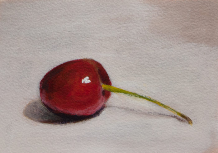
First attempt with acrylics, following an online tutorial at the Will Kemp art school. It’s a lot of fun and very forgiving in that mistakes can be painted over but glazing and blending are still possible. And it’s a lot more physical, scratching away with cheap hog brushes.

The paints I chose were Burnt Umber, Azo Yellow Medium, French Ultramarine, Phthalo Blue Green Shade, Permanent Rose, Titanium White. After using watercolours it felt odd to lighten colours by adding white rather than diluting with water. I found it harder to get a bright orangey red, but that could be because I’m not used to mixing. The paint dries with a slight matt plasticy sheen which can dull the colours if viewed from the wrong angle, but maybe one of the gloss mediums will fix that. Used a pad of cold pressed watercolour paper for this, but will try the thinner HP later. Apparently this stuff will paint on anything, and these walls need redecorating, ….hmmm.

accurate weirs

weir-ponchosketch

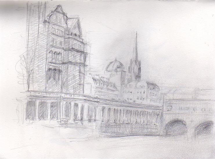
Sketching Pulteney weir in Bath, using pencil rather than going straight in with pen as I wanted to try and make the main proportions as accurate as I could. The lines weren’t ‘restated’, they were rubbed out many times, obliterated and begun again. Something wasn’t quite right about it (besides being wonky and covered in smudges): the spire and dome didn’t look right, the buildings on the left looked too short…

bridgesketchoverlay

Took a pic of the scene, and with the aid of Photoshop overlaid the sketch to check proportions: The pavement railings, pillars beneath and bridge arches seem to be ok, and strangely enough the spire is about right, even though I thought that was way out. The dome, however, has turned into St Paul’s Cathedral, and there’s too much space between the dome and buildings on the left.

It took so long to do this that there was no time to add any watercolour washes.


winged skulls

flying-skulls_8257

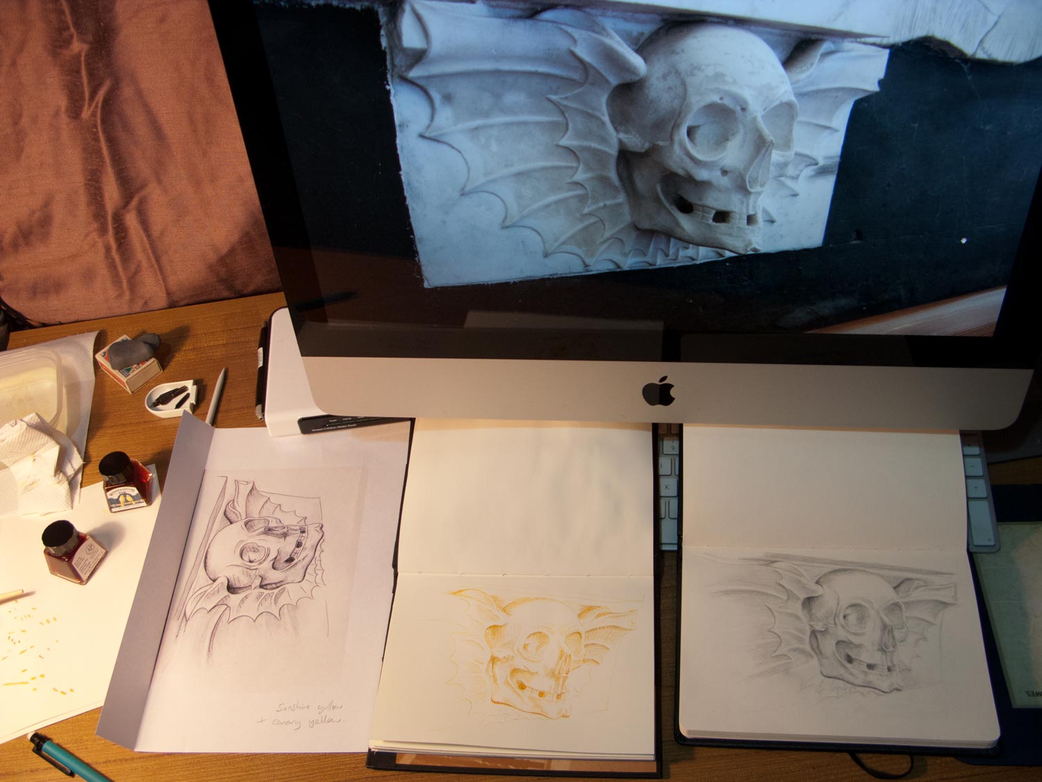
A work in progress, experimenting with techniques:

Flying skull death head snapped in the chapel behind Dyrham Park manor house, drawn with pencil (a nicely soft 0.7mm Pentel Ain Stein 2B, if you’re getting geeky), then scanned and printed (left), the back covered in 6B pencil then drawn over with a ballpoint pen to trace the outline onto another page (middle). The traced outline was then shaded with a dip pen with a mix of Winsor & Newton canary yellow and sunshine yellow. Took this pic as the next stage was to attempt some stippling with a darker ink, which would probably turn it to mush.

In some ways the cartoony one on the left probably looks the best of the three, even though that was just used for transfer. Ho hum.

The composition lacks some punch. More contrast needed, perhaps.

stippleskullington-scan194

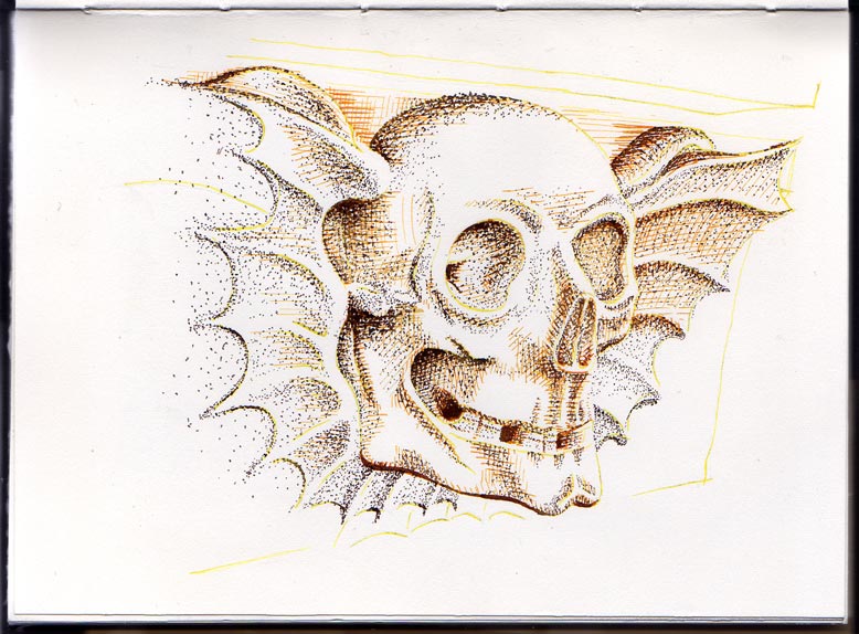
Mr Skullington has now been stippled. There’s a strange effect where the stipple seems to follow the lines of the underlying yellow/orange crosshatch even though I was doing it randomly. Maybe it’s something to do with the dried ink being slightly raised and attracting the newly-laid ink.

Still not enough oomph, somehow.  I was hoping it would be more Leonardo’s notebook.