mind the gap

This camellia was painted fairly quickly from life in oils. I thought the direct sunlight glowing through the leaf would only last for half an hour or so at most, but in the end it lasted for a few hours and the subject didn’t change dramatically as the sun moved across the sky. I didn’t really have a plan for what to do if it did disappear apart from following the rule ‘Don’t chase the light.’

These A4 canvas sheets are temporarily fixed on a board using masking tape, and often the edge of the tape gets lost as I paint the dark background. This gives the impression (as I’m painting) that the edge of the picture is farther out than it really is, and this can lead to problems of the composition appearing too cramped when I finally peel off the tape.

One way around this would be to retape the edges to make the boundaries clear again. But perhaps the best solution is to decide in advance how a picture like this would eventually be displayed, taking in to consideration the size of mat board or overlap of a frame, and then work back from there to find the working area. A temporary mat board cut to size and placed over the work in progress can help with this.

surface tension

I’m always impressed how different materials make for different types of drawing. With a large mop brush in your hand, you’re not going to make a delicate mark. A sharp pencil on silky, hard paper tends to lead to delicate lines and more detail, with smooth tones from teasing the graphite around.

This is perhaps why I haven’t been attracted to making digital artwork, despite its many advantages. A plastic stylus on a graphics tablet lacks the tactile joy of feeling the paint crush under the bristles or of a dip pen gliding over plate illustration board.

I keep this small concertina sketchbook in my bag for sketching when out and about. It’s a Moleskine, but only cost £1 in a charity shop. It has one long continuous sheet of folded paper, ideal for panoramas, and it has the advantage that the facing pages fold flat. The paper is more like thin card and feels wonderfully smooth under a pencil. My favourite weapon of choice is a clutch pencil with a 2B lead, but a thick, buttery Croquis 6B retractable pencil allows for more expressive lines and can take the graphite as dark as it will go.

The image immediately above can be scrolled left to right. It’s a cheat really as the pages aren’t in the correct order and I’ve rotated the horizontal ones, but you get the idea.

endless paper

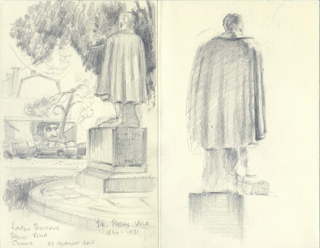
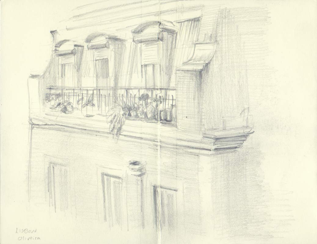
Sketchbooks are great, I love them. They keep all your masterpieces, all your mistakes, all your experiments, all together in one place — a record of that time in a self-contained book. For better or worse, that is what you saw, and how well you could draw, at that time.

But sometimes you just want to experiment and not worry how this new page will compare to all those previous pages. When you manage to make two or three decent drawings, the next one has to be at least as good. That’s a pressure that can stop you from starting the next drawing. A pressure that can stop you from drawing altogether.

There are ways of getting around this expectation (in your own head) that you have to live up to the quality of the last drawing. One is to fill a page full of scrawls of pen testing — squiggles of run-out ink or freshly sharpened pencil. This spoils the page. The bar has been lowered. You no longer have to live up to that golden run of fine artwork. You are free to experiment and, possibly, fall flat on your face with a lemon of a drawing.

Sometimes you don’t even want to lower the bar. Sometimes you just need to scrawl, scratch and belly-flop your way through a whole bunch of drawings that will never be seen. This is valuable. It is important to practise, to get it wrong, again and again. The results will be a mess, arms will be drawn too long, heads will look like deflated footballs, hands will be stunted stubs, but it doesn’t matter. You have to make mistakes, takes risks, try things out, and do it all away from the public gaze. If every piece is for show then there’s a tendency to play safe and only use methods you’ve used before.

There are parallels to sports training or mastering a musical instrument — endless repetition, making the awkward and difficult rewire into muscle memory. And most importantly (otherwise you’ll never do it), you have to love the process of training.

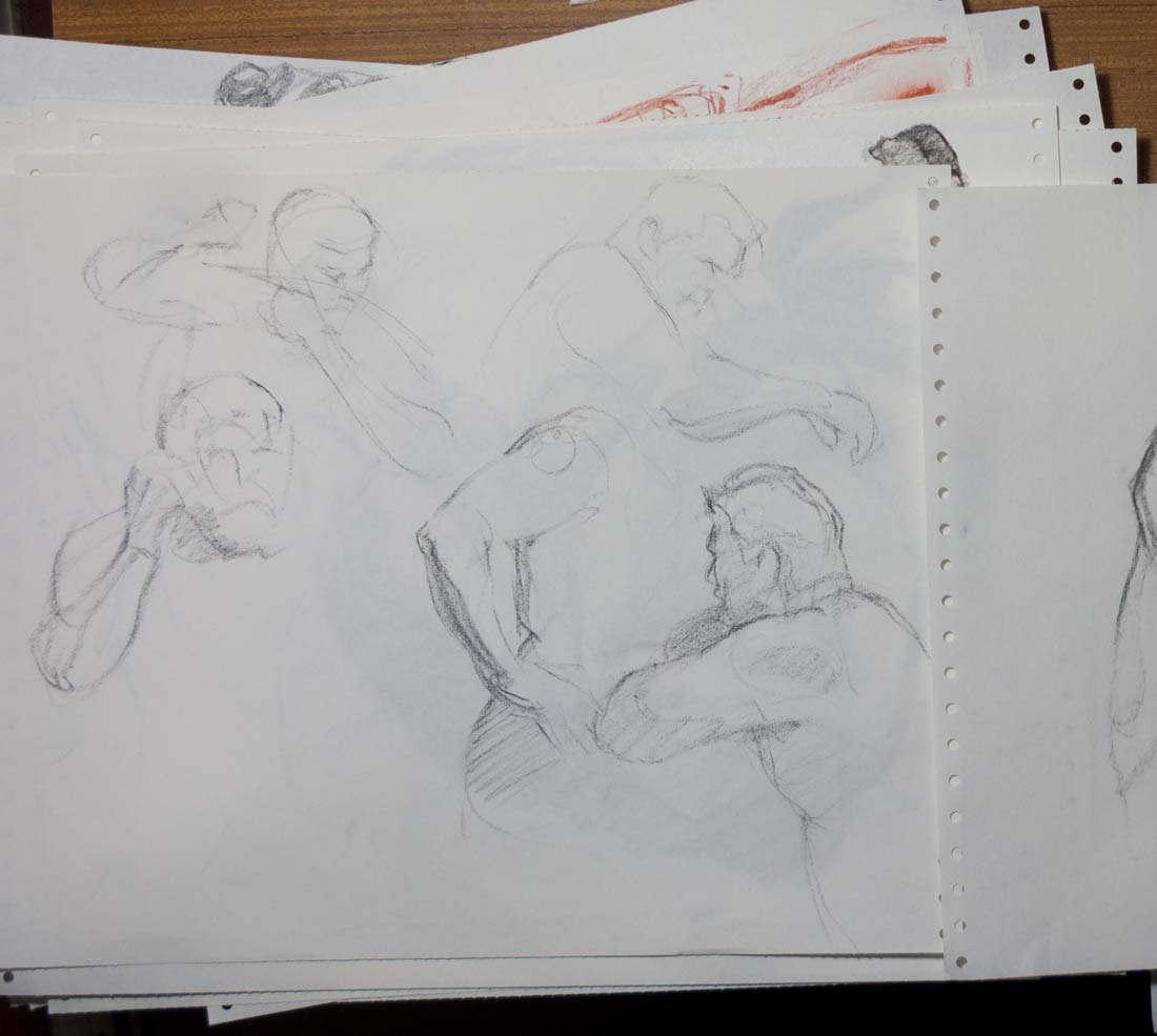
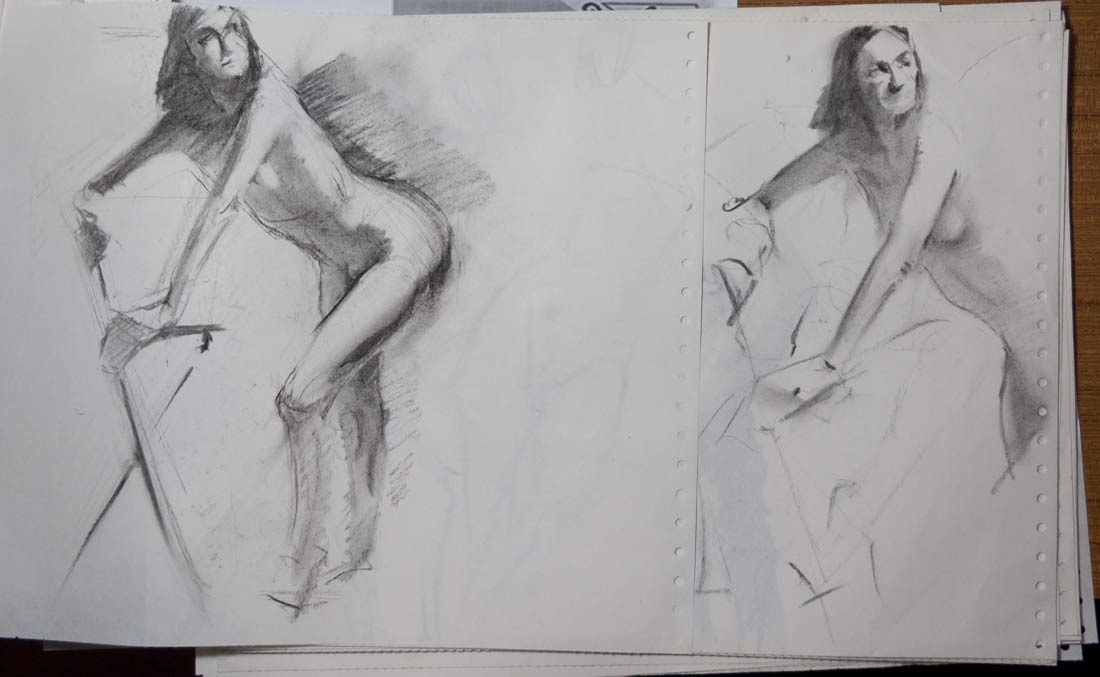
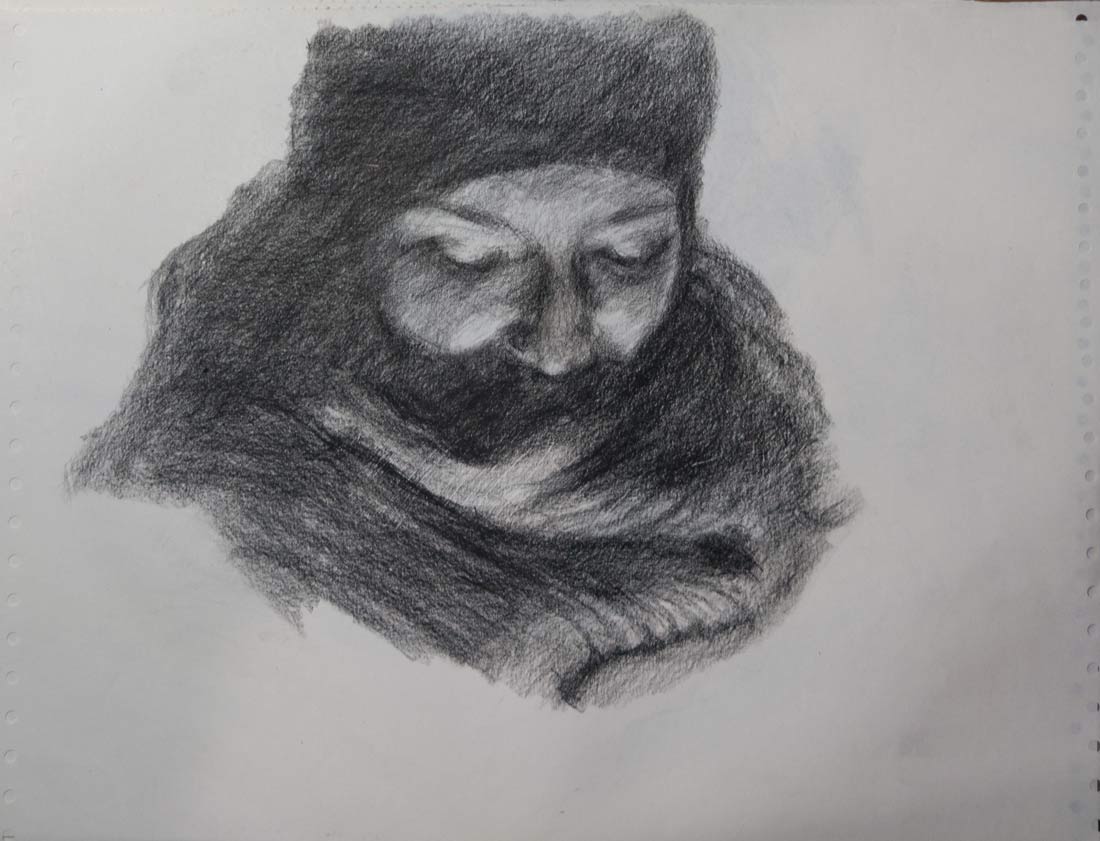
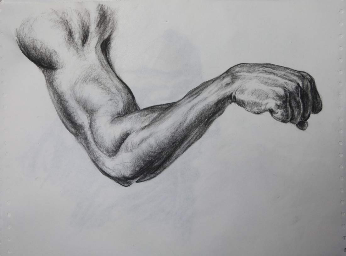
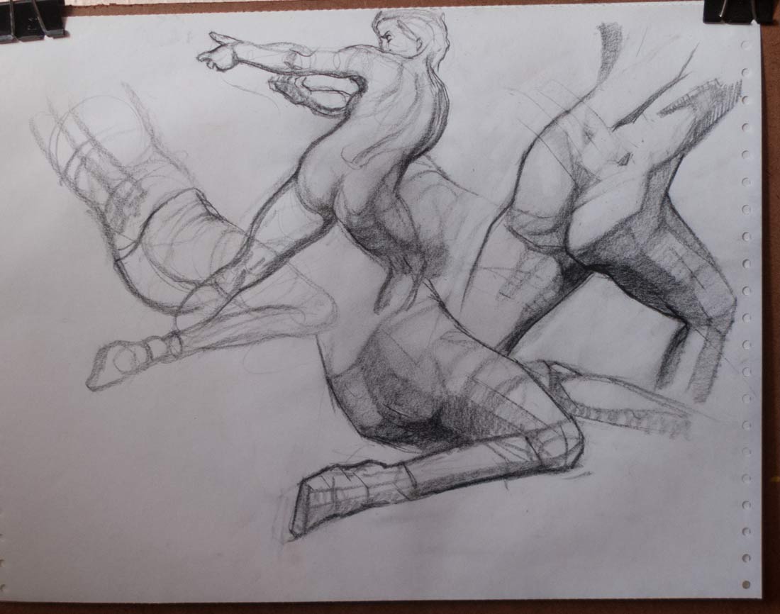
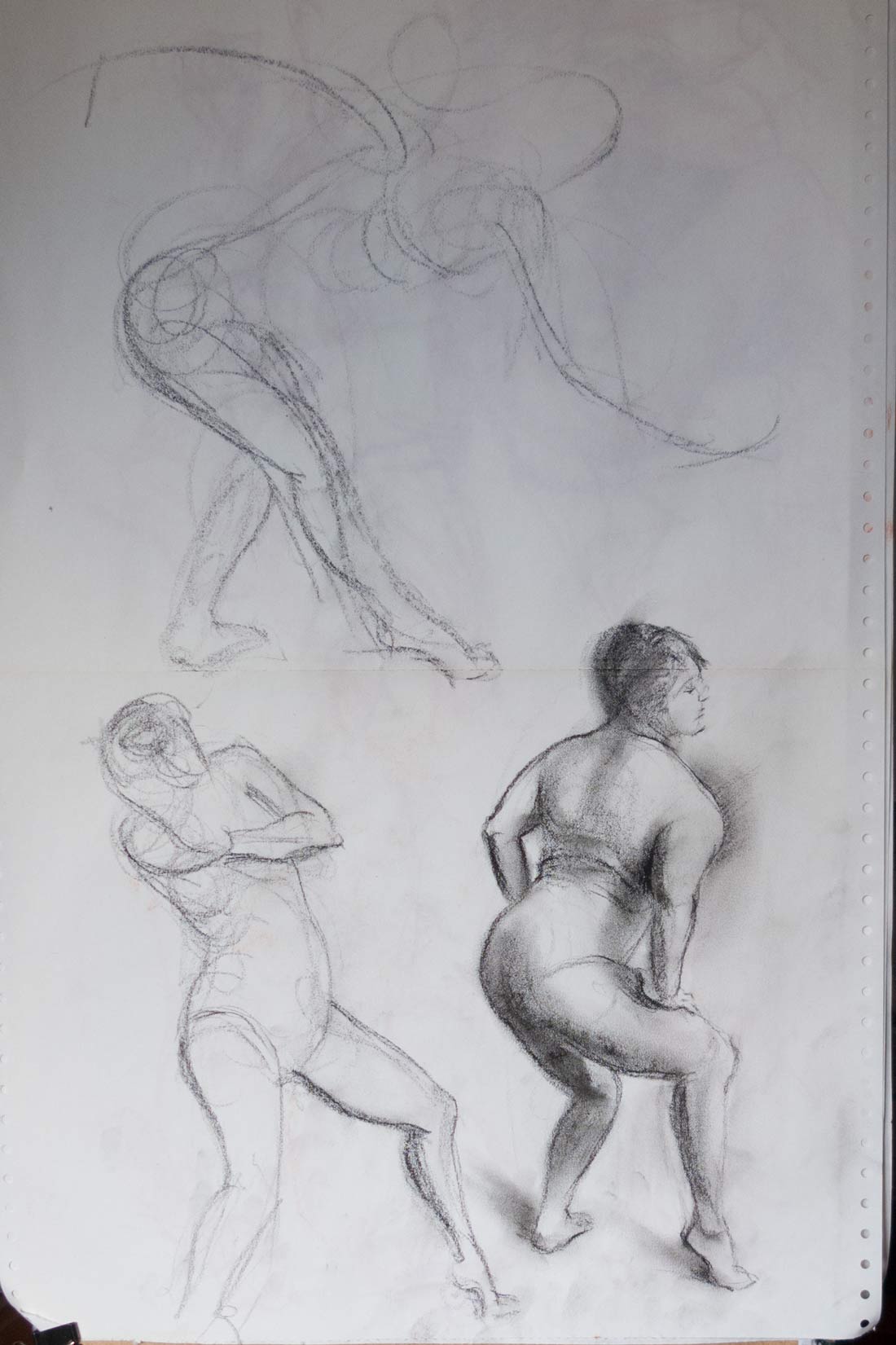
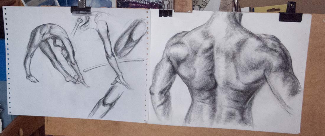
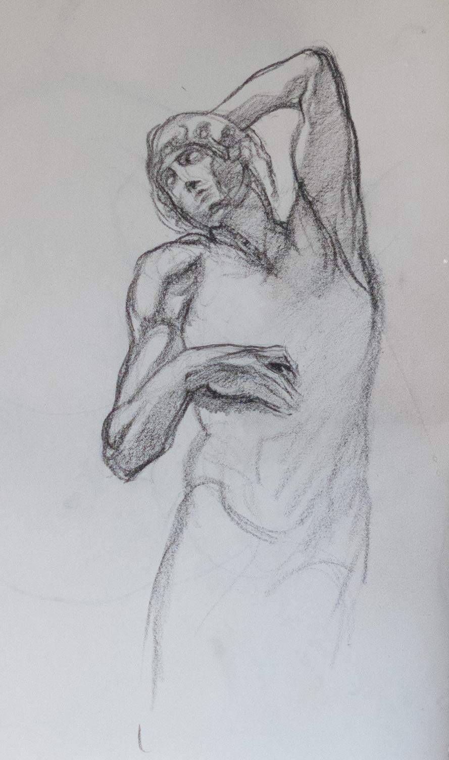
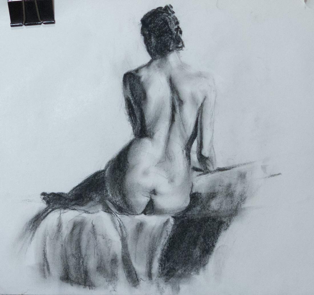
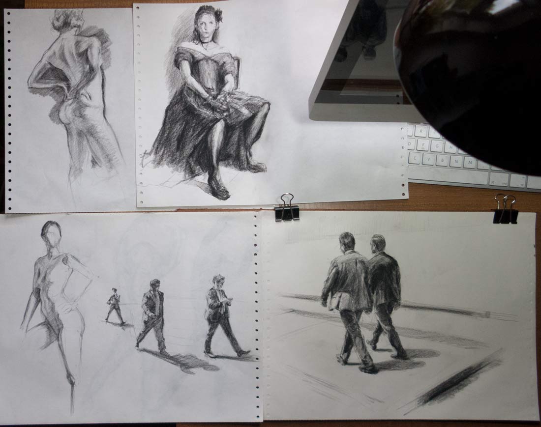
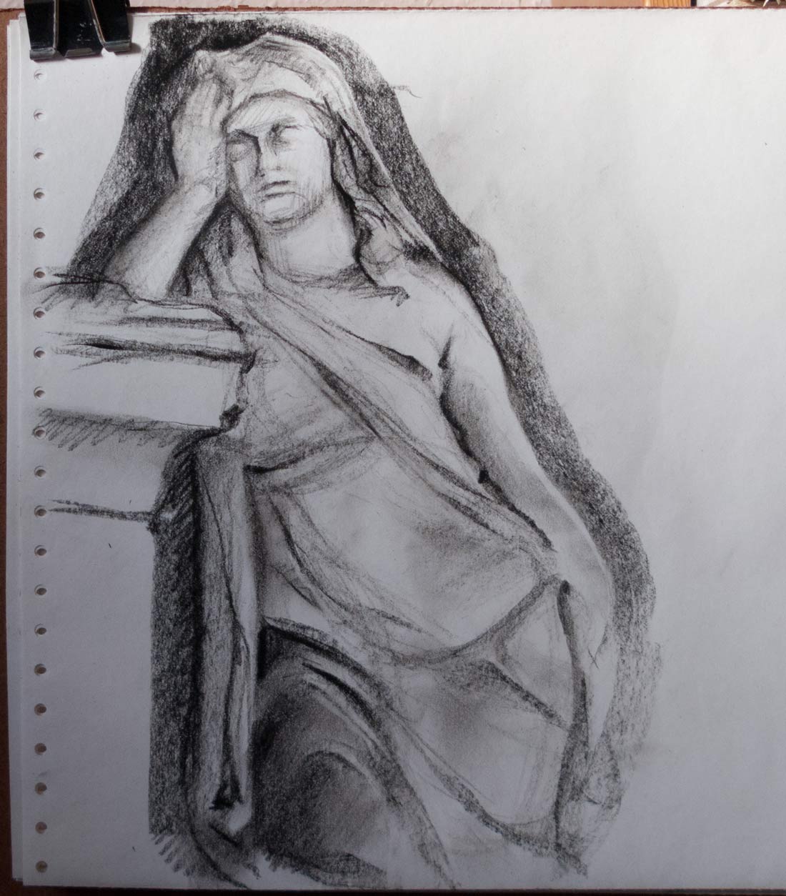
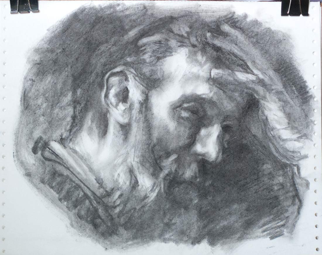
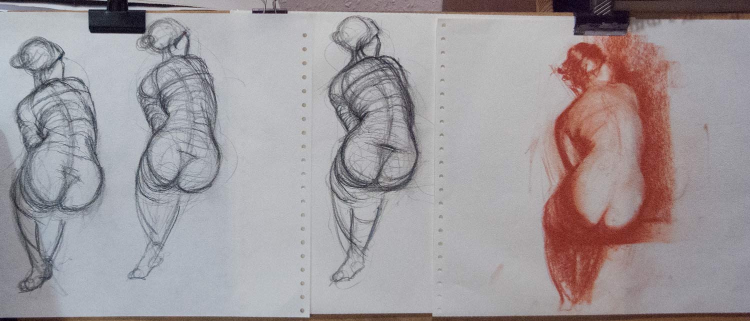
Some time back I found a box of printer paper in the back of the garage. It was that perforated printer paper with holes in the side — one long, box-deep piece of seemingly endless paper. It was smooth on one side and rough on the reverse, much like shop-bought artist’s newsprint.

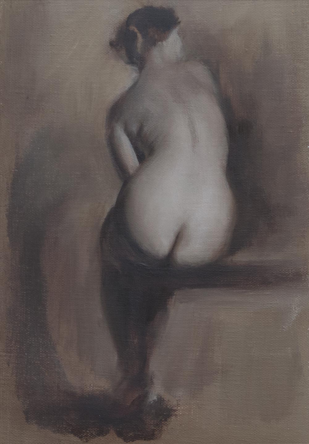
Lately, it has replaced the sketchbook. That’s not quite true: I still have a number of sketchbooks on the go — one stuffed in a rucksack for those moments of sketching on a park bench or waiting in a car park. Another, with thicker paper, has paint thrown at it. Yet another contains watercolours or gouache or ink. This computer paper isn’t a replacement, it’s a place to experiment.

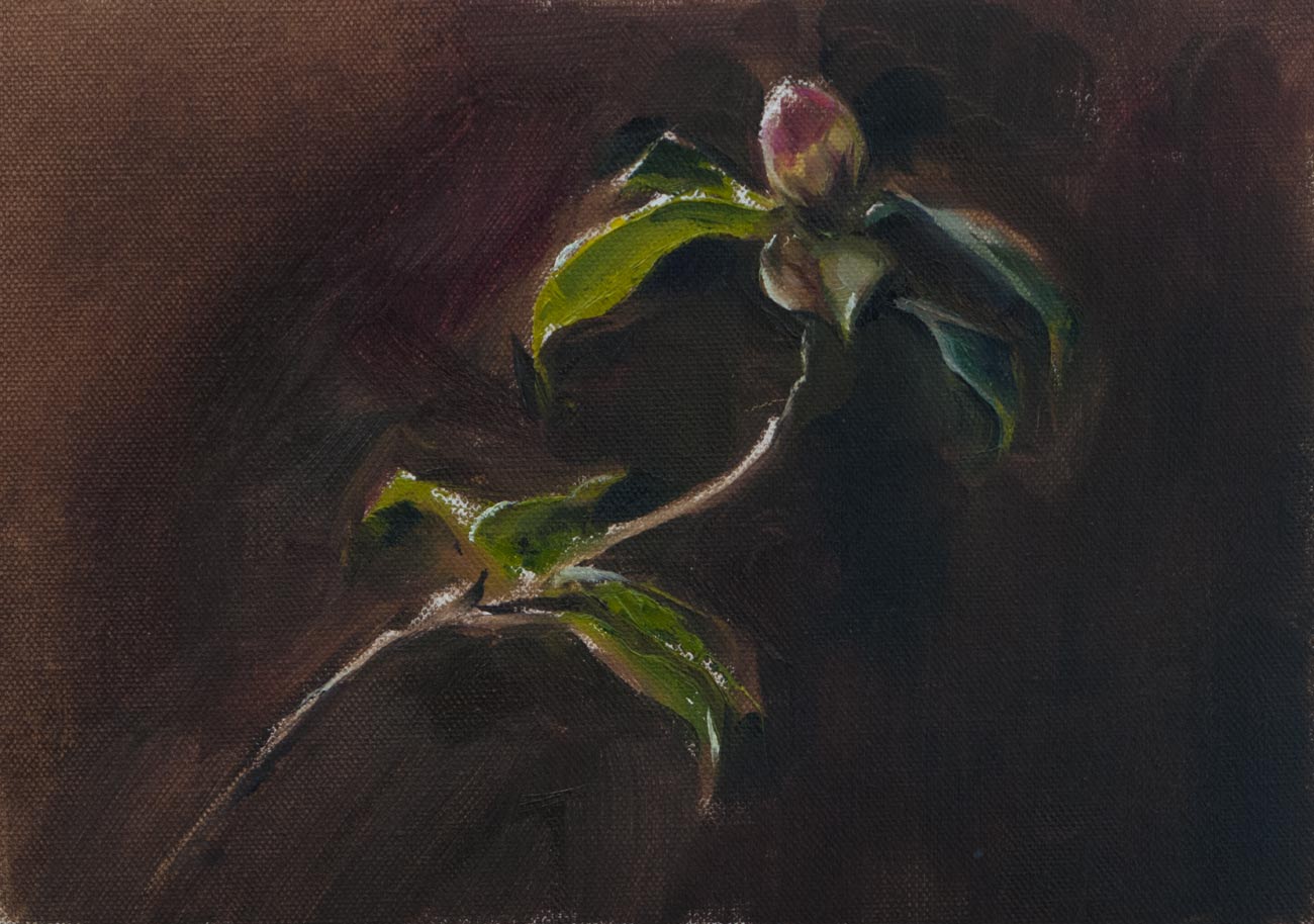
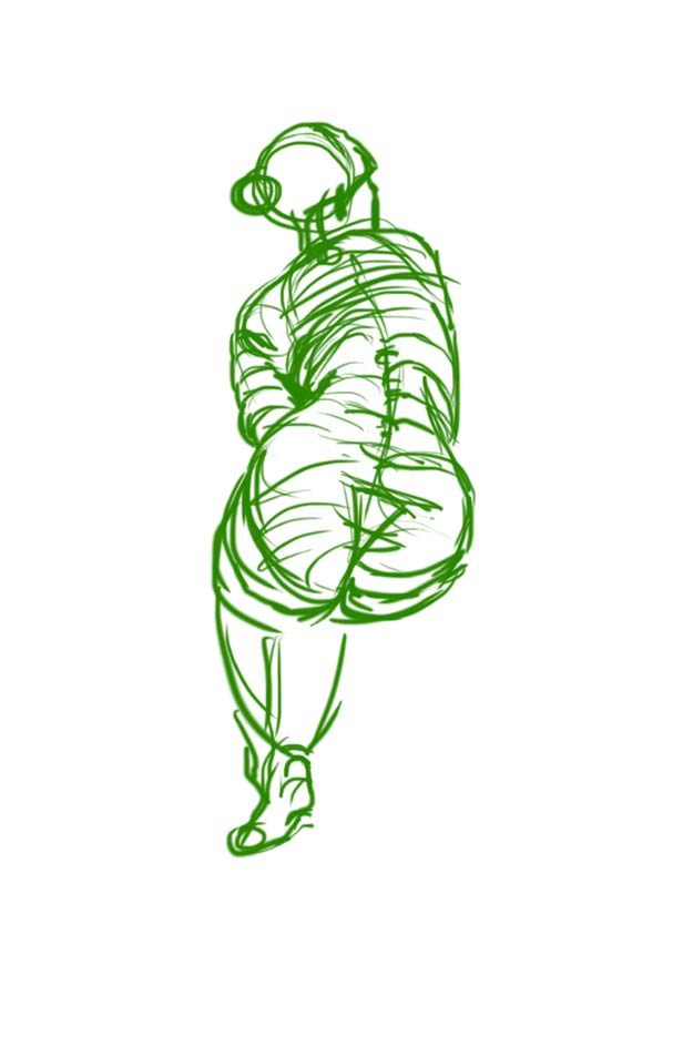
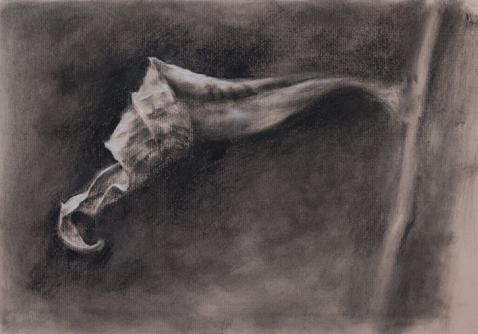
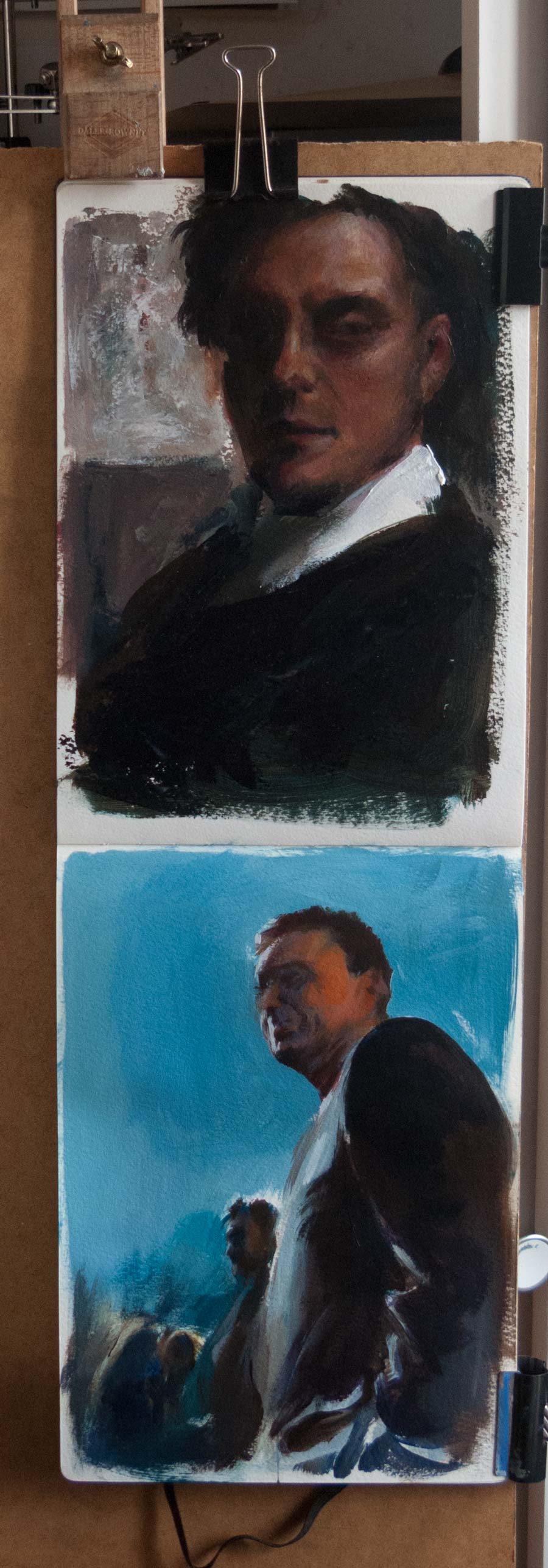
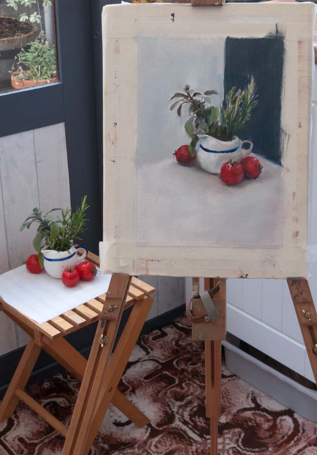
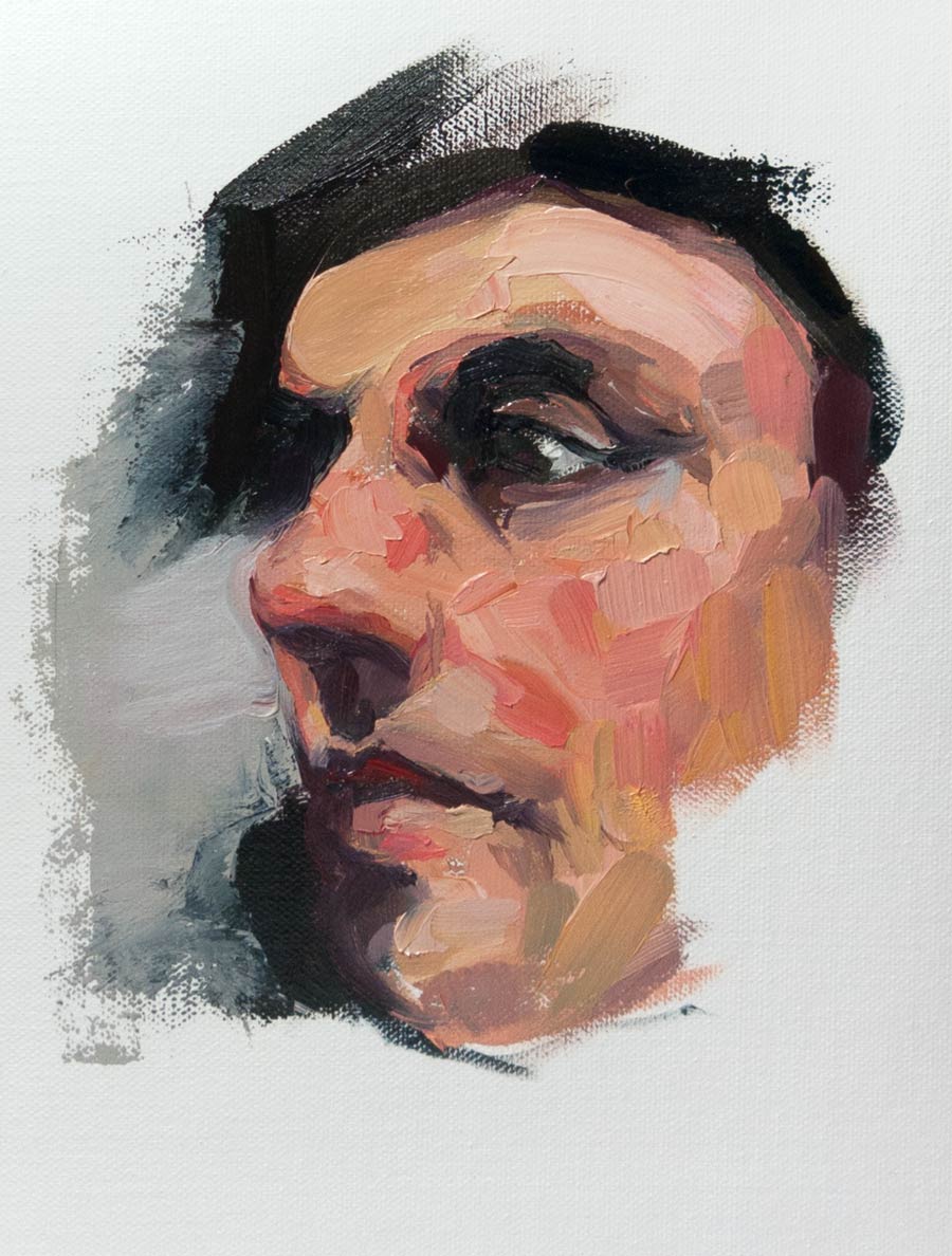
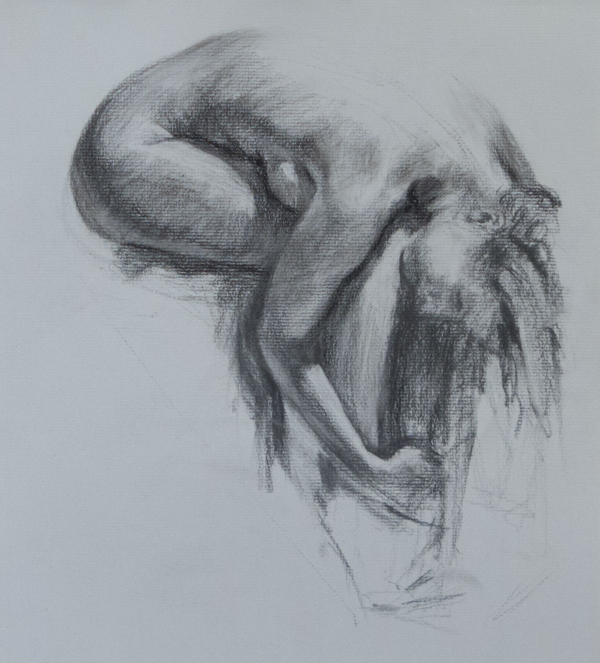
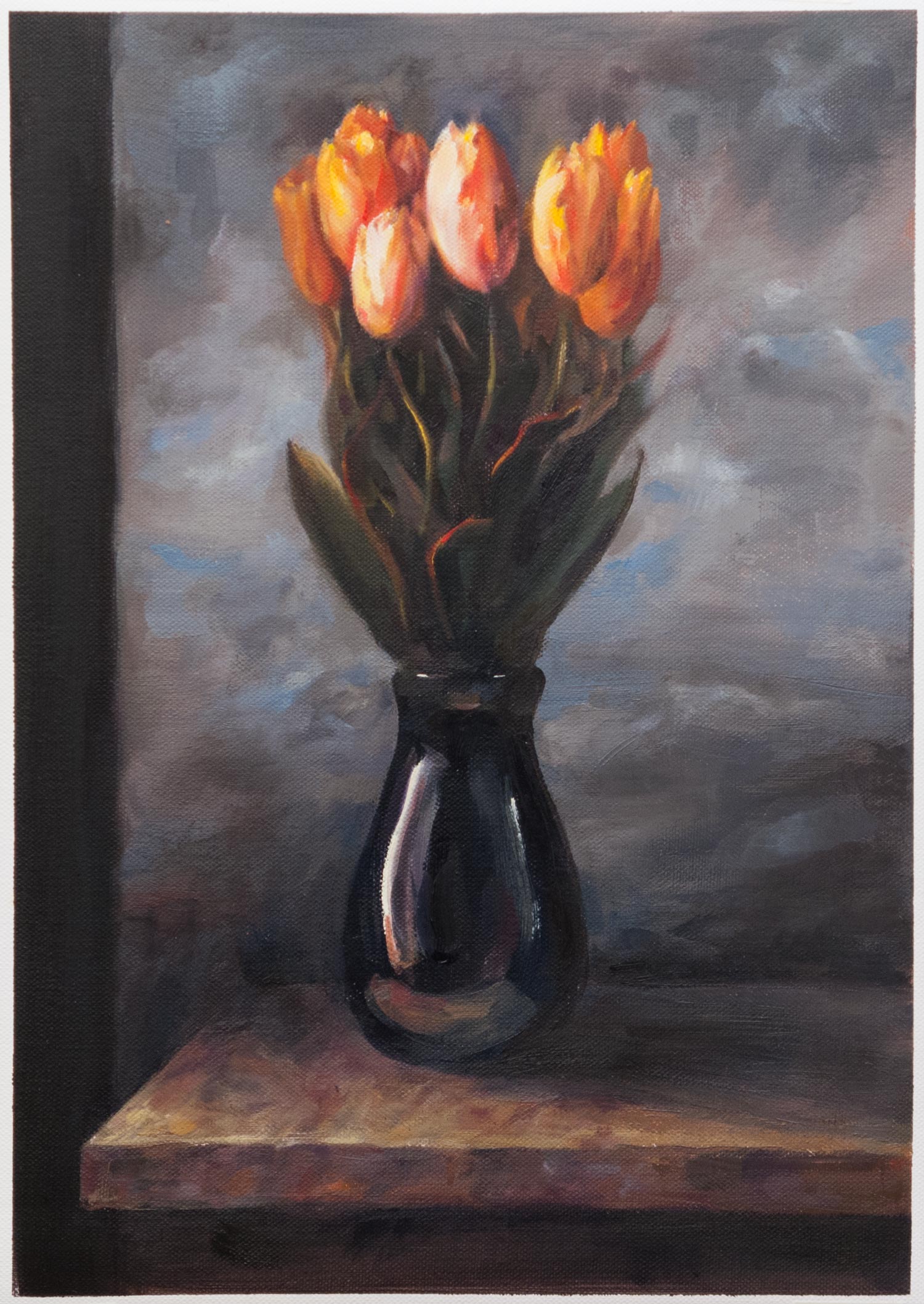
Of course, the ones shown here are a selected batch — many of the sheets are filled with unremarkable 1 minute gesture drawings. quick sketches, warm-ups, or overworked dark-grey multi-lined smudges — a necessary graveyard of lemons. They all end up being stuffed into a corner of a cupboard, so I take a snapshot of some of the ones that have something interesting about them, or sometimes I’ll take a photo just to record the way I draw at the moment. Hopefully, I’ll be able to look back in years to come and see an improvement.

When this box runs out, I’ll go online and order a ridiculous amount of cheap paper, probably not intended for artists but sold to wrap ornaments for a house move or to wrap fish & chips.

Someone once said, to become good at drawing you need to encircle the world with newsprint. I haven’t encircled the world, but I’m approaching the Ilfracombe & Barnstaple section.

flying by instruments

This should have been straightforward — I was drawing from a photo (from New Masters Academy) on to a prepared ground of leftover mud from a previous painting, smoothed on to a sheet of acrylic gessoed canvas. The surface was smooth enough that the raw umber underpainting could be lifted or modified with a rag. I went straight in with the brushes and no initial drawing, knowing I could move the paint around at will.

At first I fell in to my usual mistake of making the drawing progressively bigger as it expanded out. I hit the right edge of the canvas, erased that, then ran out of room at the top. Then began the real problem of constructing a believable figure. No matter how much I moved lines around, it just didn’t look convincing, and I couldn’t work out where the problem was.

Finally, after a few hours of chasing paint around, I gave up and literally went back to the drawing board. I had to be able to make a decent drawing if I was to have a hope of making a painting worth looking at.

After multiple attempts with charcoal and crayon, I found I just couldn’t get this pose down on paper. It’s not a complicated pose. There is some foreshortening from the base of the spine up to the head, but nothing extreme. But I just couldn’t get a convincing pose by eye.

In frustration, I ended up tracing over the photo with my basic graphic tablet, just to get the feeling of what it would be like to draw the right lines. The results of this tracing, despite the scratchy, rapidly drawn contour lines, look way more convincing than my freehand drawing by eye.

This made me realise that getting an accurate, believable figure is essential. If the basic shapes are in place, you can get away with any kind of treatment of line or tone or paint — the figure will be convincing.

Back to the painting — I ended up taking photos of my painting revisions, then overlaying them on the original photo in Photoshop. By doing that I could work out that I needed to raise a curve here, lower a line there. I had given up being able to do this intuitively by eye. Instead, I was flying by instruments, relying on this feedback from a computer overlay.

I’m happy with some of the edge treatment — bringing things in to focus or losing them in a kind of abstraction was fun. But the figure still isn’t convincing to me. Something isn’t quite right, despite all this Photoshop intervention. I need another pair of eyes to tell me what’s wrong.

Ingres received ridicule and criticism for this painting La Grande Odalisque because of the unusual proportions. HIs contemporaries used to tease him by guessing how many extra vertebrae were needed for that spine to be possible. But Ingres was a superb draughtsman and knew what he was doing. If he needed a longer spine to create a more elegant figure, then that’s what he would paint. There’s a world of difference between deliberately distorting a figure for a particular effect and not being able to draw accurately.

black and white

leaf-charcoal_1055

Charcoal and white Conté pencil on Strathmore toned charcoal paper, roughly 15 x 10 inches.

The process for this drawing was a little different in that I started with an image in my head and then went in search of the subject, rather than starting with the reference then deciding to draw. I still need to draw from something I can see — I can invent forms and lighting from my imagination to some degree, but all the detailed forms and textures of the subject and the many unexpected quirks of the scene just don’t appear clearly in my mind’s eye. In fact I find it hard to visualise anything with any clarity in my imagination — it’s more like a fleeting collection of fragments. I can get a mood, an appearance, but not a solid image which I can transfer.

So I went out with my camera, hunting for withered leaves. The photo this is based on was full of strong russets and oranges, but I took it in to Photoshop to make it easier to see it in black and white. I used vine charcoal, charcoal pencil, charcoal dust rubbed with paper and white Conté pencil. It was tempting to use sanguine and bistre Conté crayons as their colours were similar to the original leaf, but I decided that monochrome would be less distracting. Even the white pencil clashed with the other tones and I had to fade it back with a kneaded eraser. Just as with paints, I find it useful to think of white as being on the blue side of the colour wheel, and to be aware that sometimes it can cool and deaden, as well as lighten, the warmer tones.

blank pages

moleskine-acrylic-sketches_0947

The blank page can be an intimidating thing, especially when it’s a large blank page of good quality watercolour paper in an expensive A4 Moleskine sketchbook. The solution, of course, is to fill it with exquisite, delicate drawings of your best work. And that is why this sketchbook sat untouched on a shelf for many months… until I decided to strap it to an easel and attack it with large, cheap brushes loaded with acrylic paint.

It turned out to be ideal for these bold experiments: the large size gives some room for manoeuvre, and the thick watercolour paper can take the abuse without buckling.

The top picture is a rather dark version of a portrait of Louis Betts (without his glasses) by William Merritt Chase. The one below is based on a snapshot taken at a wedding. I often use photos for reference, but this somehow feels like it could never look like anything but a painting of a photo, no matter how I handled the paint. There’s something about the crop and angle of the picture which gives it away.

Comparing Louis Bett’s collar with the front of the wedding suit reminds me of a lesson in James Gurney’s book Colour and Light where he demonstrates how black surfaces in light can often appear lighter than white surfaces in shade.

one session

jug-tomatoes-625_0932b

jug-tomatoes-setup-625_0933

This one was deliberately completed in one session in an attempt to make me focus on the important elements of building up a painting. It’s so easy for me to get locked in to one particular area which grabs my attention rather than concentrating on developing the entire painting systematically. So the goal of finishing the painting in one go wasn’t so much to speed up the process but rather to get rid of woolly thinking and to have a plan, at least with regard to the mechanics of painting: laying-in, mixing colours, building up the lights and darks.

A large synthetic filbert was useful for creating the sage leaf shapes, and I used the end of the brush handle to scrape out some of the rosemary leaves. I’m sure there’s a whole range of these Bob Ross techniques that I’ve yet to learn.

The crop of the picture makes a big difference to the final effect. Left as I painted it on the A4 canvas, the subject seems lost and flat, but is improved by a tighter, more square crop.

And to continue the efficiency drive, the laborious clean up of brushes after oil painting can be avoided by dipping the brushes in safflower oil with a few drops of clove oil added. Wipe off any excess paint before dipping, then either leave them on a brush holder or put them in a plastic bag. The slow-drying oils keep the bristles supple and in good condition for days if not weeks. At the next painting session, just remove the excess oil with a rag and continue painting. Full instructions for using brush dip and brush care in general can be found here.

training tiles

forte-tiles-copy-900-img_1079

This is a copy in oils of a painting by Felicia Forte which impressed me with the way the image was built up of flat tiles of colour. Copying this style was an exercise in making deliberate strokes with plenty of paint (it was surprising how much paint was needed to make a solid tile) and was a good antidote to my tendency to apply paint thinly and then dab and fuss.

Instead, it ensures I make a decision, mix a colour, load the brush, apply the paint with one stroke. Then leave it. Assess what needs to be done, then repeat for the next stroke.

I think this would apply to any style of painting. The most valuable lesson for me was to not make a mark until I’d made a decision about the very next stroke, which sounds obvious, but it’s so easy to just dive in and hope for the best.

vine charcoal

figure-226_0827

Trying out vine charcoal and a PITT soft charcoal pencil on Strathmore toned paper, model courtesy of On Air Video.

Vine charcoal is so soft it will darken to pure black and as there are no waxy binders it will erase back to plain paper with a kneaded eraser making it unexpectedly versatile to play with. It can be also be lifted with a soft dry brush or a chamois leather. I haven’t tried the chamois yet though I’ve heard it’s good for the wipe out technique on a ground of charcoal dust. Charcoal paper has a tooth which holds on to the grains; smooth papers run the risk of the line disappearing into a cloud of black dust though there are beautiful and delicate drawings made on hot pressed paper.

The toned paper makes a satisfying mid tone, though the lightest light can only be the light grey of the paper (white chalk or pencil will be future experiments), so all the values are compressed into a small range and the success of the drawing is going to depend on whether I’ve pitched those halftones right. Some license can be taken with reflected light, but getting the values right is key, (along with anatomy, proportion, composition, gesture… ) — it’s like being addicted to spinning plates.

pyrrole red, cadmium yellow

Spring-after_Juliette_Aristides-1500-v2-0817

A copy in oils of Spring by Juliette Aristides. I love the way she makes vibrant colour stand out in a mostly neutral painting.

I copied this painting from the back cover of her book Classical Painting Atelier. In writing this post, I looked for an online version to link to and was surprised to find the original has a different crop (I didn’t realise that was a patterned column on the left) and lacks the red cast of the printed version which turned the original vibrant greens towards olive. It also has darker clouds in the background, making the flowers stand out even more, though this could be partly due to the glowing pixels of the screen. Paintings are notoriously hard to photograph, and I wonder if the true original looks different again.

So besides the overly-large blooms and the colour shift, one of the main differences that I can see between my copy and the book version is the handling of the edges. The original achieves a softness in both the background and the receding blooms which adds to the pop of the central flowers. The original is roughly twice the size of my A3 copy so paint handling at that scale might be slightly different, but I need to get more control over that final finish. Much of the beauty of a painting depends on the handling of edges: it’s not enough to just put down roughly the right colour in roughly the right place.

I was trying out two new tubes of paint which I hadn’t used before: cadmium yellow and pyrrole red. Up until now my palette used permanent rose (PV19) and imidazalone yellow (PY180), both of which are transparent and the yellow in particular gets lost in a mix, even though it’s a bright mid yellow on a white background. Cadmium yellow seemed to be the yellow on everyone’s palette and I couldn’t work out why it was so popular considering it’s often two or three times the price of other yellows. Now, after seeing how powerful it is when mixed with other colours and how sparingly it needs to be added, I see the value of having an opaque yellow. This might be a new way of creating a colour palette: as well as warm or cool versions of each primary, I could try transparent and opaque paints. Paint handling in mixes seems to be as much of a factor as the colour itself.

The pyrrole red (Winsor Red, PR255 and PR254) is much closer to orange than the permanent rose and also holds up well in a mix. In the past, I’ve sometimes found it hard to hit a bright mid red, so this is a useful addition.

I still prefer a limited palette, but it’s useful to see how shifting around to different pigments can change the way I think about mixing colour.