black and phthalo blue

flowervase_747_9049

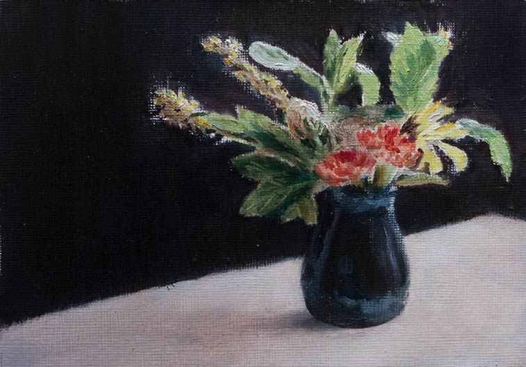
Copied from a photo and from life using oils on paper, this painting took a beating as I tried to get it in to shape.

The first problem was finding the right mix of paints to match the intense, saturated mid-green colour of the transmitted light passing through the mint leaves (yes, they’re mint leaves). I had ultramarine blue and azo yellow but really needed something like phthalo blue to get that high chroma acid green which could be adjusted with yellow and titanium white.

I ended up buying a tube of Winsor Blue which had the colour labelled as PB15:3. Only later did I realise that I’d bought Winsor Blue Red Shade when I really needed Green Shade (PB15). Also, the tube was regular oil paint, not the water-miscible oil I was using. I was hoping (after reading online forums) that I could clean up the brushes with just soap and water, after all it is just oil. It does clean up but needs a lot more working in to the bristles of a lot more detergent than is needed for the Holbein Duo Aqua oils, and phthalo blue being an intense staining colour doesn’t help.

Anyway, all that palaver resulted in the rather insipid green on the right-hand leaves.

The backdrop was a black shirt hung up behind the vase which was sitting on some white kitchen roll. (I thought a white surface would be an improvement on the imitation wood formica table top — am I ruining the mood?)

I managed to mix up the background black a little too well, and the first draft looked dead and flat. Closer inspection of the flowers showed they had more depth and variety of values than I had initially painted, so I decided to try glazing on some darker values to create more contrast.

Instead of burnt umber I used a mix of more translucent paints for the glaze, hoping I could build up tones while letting the colours beneath shine through. In my haste the glaze mixed in with the titanium white of the table top which I hadn’t allowed to dry. The resultant murky mess was nothing like the subtle glazes found in the paintings of the old masters, instead it looked as if I’d spilt something.

I used more kitchen towel to scrub off the ‘glaze’ and tried a few more times, with similar results.

Eventually I got to that point where I knew the painting was lost. So I patched up the table top and shadows as best I could and drew a line under the whole exercise. The murky grey brown lighting doesn’t complement the inaccurate greens. The lighting is flat, the arrangement of flowers too literal (what’s going on above the carnations?). Composition, colour, value, lighting — there’s a lot to learn. At least now I know some of the ways not to do it.

egg shell

acrylic_egg-800_9026

I found this egg shell on a walk in some local woods. It was caught in a patch of light which made it stand out from the surrounding browns, greens and greys. The outside of the shell turned out to be almost exactly the hue of phthalo blue except for a slight green cast from the light coming through the foliage. This gave me a chance to try some acrylic glazing medium mixed with flow improver. After spreading the clear medium over part of the shell, a small amount of dilute grey green paint could be dropped in then spread and blended with a large clean damp brush.

A blackbird’s egg perhaps, or a song thrush. I’ve no idea if the contents escaped or were eaten.

hard hands

hands-625_9021

Copy of a Leonard Starr panel.

Copy of a Leonard Starr panel.

hands-900_9015

hands-900_9018

hands-900_9017

hands-900_9016

hands-900_9019

Hands are hard to draw, aren’t they? One slip of the pencil and a finger turns into a misshapen sausage, a thumb develops an extra joint. More than once have I tried to sketch a hand from memory only to find I’ve drawn five fingers and a thumb.

Andrew Loomis tells us to ‘get rid of the idea that hands are hard to draw. They are simply confusing to draw unless you know how they operate. Once understood, hands become fascinating.’

It’s helpful to keep the rules of proportion in the back of the mind while drawing, but the most useful advice from Loomis is more practical and vivid:

‘The most important fact to remember about the hand is that it is hollow on the palm side and convex on top. The pads are so arranged around the palm that even liquid can be held in the hand. The hand served primitive man as a cup…’

‘In the drawings above, note how the hollow of the hand has been carefully defined. Also note the resulting curve of the back of the hand. Hands never look natural or capable of grasping until the artist understands this feature of the hand. All these hands look as if they could take hold of an object. … A hand that does not look capable of clasping is badly drawn. Study your own hands.’

So, continuing the philosophy of ‘if you can’t draw noses, draw lots of noses’, I’m going through the process of copying drawings and photos of hands, hoping that something will stick.


gouache heads

Gouache heads

I chickened out of starting the freshly bound book and carried on using a spiral bound Seawhite sketchbook which contains “all-media” paper, a sized cartridge paper which I’ve found can take a watercolour wash or several layers of fairly dry gouache. Too much pen work with a fine nib will roughen the surface enough for water to get in and break up the fibres.

These heads were inspired by seeing the court drawings of Jane Rosenberg and heads drawn by James Gurney. Both artists manage to divide the head up in to distinct planes which are painted with confident strokes. In trying to imitate that approach I find I fiddle and blend too much, especially when I mix up the wrong colour, with a result that some of the vitality of the figure is lost.

The stone head was snapped in a church doorway near Stoney Littleton, Somerset. The portrait on the right was drawn from a paused video of a David Malan lecture. Paused videos can be a great way to find a specific pose or expression for a quick sketch.

sketchbook binding

Muslin glued on to the stitched book block

Muslin glued on to the stitched book block

Closed sketchbook

The embossed dolphin saved Alan Titchmarsh from the knife.

Open sketchbook

30 blank pages, ready to go.

One thing that will stop one of my experimental sketches from going any further is when the surface of the paper starts to break up due to too much overworking with wet paints and inks. Watercolour paper can take all kinds of abuse and the hot pressed variety is smooth enough for ink drawings, but shop-bought watercolour sketchbooks are quite expensive and tend to have textured paper. The ideal solution is to make my own, which works out to be quite cheap and I can choose the size and type of paper.

This sketchbook was made from a couple of imperial (30 x 22 inch) sheets of 90lb Fabriano Artistico HP, cut, stitched and bound by following the instructions found in the links on Ed’s sketchbooks and paper page. This makes a 30 page (60 side) 5½ x 7½ inch book.

The covers were cut from an old hardback, bought from a charity shop for £1 (very nearly an Alan Titchmarsh novel, but that was saved by the embossed dolphin on Michelle Paver’s Gods and Warriors). The hardback covers are slightly too wide, but this will help protect the pages when being stuffed into a backpack. The height needed to be trimmed down close enough to the pages so that clips can be attached when sketching on a windy day. I used a craft knife to cut through the cardboard just enough to peel it away from the backing paper, which was then folded over and glued down to make a clean edge.

Apart from the stitching between the folios, the whole thing is held together with PVA white glue. By chance, I found some bookbinding tape in an old sewing basket which was ideal for joining the two hard covers and making a flexible spine. Another tip from Ed: during the final stage of pressing the sketchbook under a pile of heavy books while the glue dries, place some thin plastic between the cover and the end leaves to prevent the pages from buckling.

Now to pluck up the courage to sully the first page…

ink wash

diamine_dali_8967

diamine_fancy_dress_8965

After spending some time filling pens with permanent, waterproof inks, I’ve ended up going for the opposite effect by dissolving Diamine Prussian Blue with a waterbrush. I love the blue-black colour of Prussian Blue, and the dissolved ink fades out the drawn line in a satisfying way to make an ink wash which becomes permanent once dried.

The top picture is a copy of a Dali study. The figures in fancy dress were drawn from a photo of my grandmother’s works party, taken around 1925. I’ve made them look a little sombre; they’re having much more fun in the photo.


walk on

walking_8917

walking_8919

walking_8918

walking_8920

Sketches from photographs.

Walking involves all sorts of subtle shifts of balance: the heel tends to land towards the midline; the top of the foot splays outwards; even if there isn’t an obvious arm movement, the weight of the opposite side of the body provides a counter-swing.

I don’t know of any other way to practice sketching these poses other than from photographs. It’s hard enough to sketch someone unless they remain quite still; the slightest change in position throws off the remembered line. But it must be possible as there are plenty of artists who create scenes including action poses completely from imagination. Perhaps they made many sketches from life (or photos), and that, combined with knowledge of anatomy and human proportions, is enough to create a novel scene.

Photo credits: Mark AllisonFelix LupaMichael Reichmann.

three leaves

leaf-1_625-8909

leaf-2-625_8909

leaf-3-625_8906

The perennial leaf returns, this time as two quick pen sketches and one in gouache. I wanted to see how different styles of drawing affected the process and the final result.

The first sketch was a simple fountain pen outline with dilute drawing ink for shading (Winsor & Newton Peat Brown in a waterbrush).

The second used a Pentel Brush Pen for part of the outline and also for the darkest shadows. Now the pen had two roles: outline and shading. Extra shading was applied with the dilute ink as before, but now the black ink of the brush pen presented a problem: do I describe an edge with a black line as I did with the fountain pen, or do I make the drawing more painterly by using black ink only for the shadows.

The final gouache painting was in some ways the easiest as none of these decisions about edges or shading had to be made. The paint was mixed to match the hues and values, and laid down in a copy of the shapes in front of me. In other words, no translation had to be made. There was no need to question whether to use a black ink line to draw an edge that was facing the light, for instance, which is where I became confused in the second ink brush sketch.

Drawing with ink seems to need a different ‘eye’, a different way of processing what I see, compared to a more literal approach when using paints. I find the simple ink line needs much more thought before it can be laid down.

light copy

maiko-625_8849

An attempt to copy the lighting in Phil Couture’s beautiful painting “Maiko Satohana“, using acrylics in a sketchbook. I went straight in with the paints as this was more about reproducing the lighting than getting accurate proportions (the face is skewed and distorted).

I’d like to know how he made his painting: Did he work from a model or a photograph? How did he decide on the background colours, the composition? It’s always interesting to hear about what is going through an artist’s head as they make these choices.

Tea break

acrylic-tibetan-1200_8428

Painted in acrylic from an old magazine cutting taken from an article about Tibet. It looked like such a satisfying moment.

The photo in the cutting was so dark that the figure was just a silhouette. I had to take it into Photoshop to bring out enough detail to paint. In some ways this made it easier as the noise-filled image was already broken down into large blocks of colour, the digital equivalent of squinting – another example of how a poor reproduction can make a good practice subject.